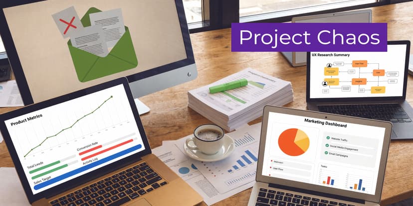
9 Excel Tricks for How to Manage Multiple Projects

If you're trying to manage five projects from four spreadsheets, two chat threads, and a stream of “quick status” messages, the underlying problem usually isn't effort. It's fragmentation.
Individuals don't lose control because they forgot how to plan. They lose control because every project has its own sheet, its own deadline logic, its own owner list, and its own reporting format. By the time you know what matters, half your day is already gone.
That pressure is common. The vast majority of project managers work in a portfolio setup, with 59% managing between two and five projects simultaneously, 11% handling six to ten, and 15% overseeing ten or more at once, according to these project management statistics. If you're juggling several initiatives at once, you're not the exception. You're the norm.
Spending too much time on Excel?
Elyx AI generates your formulas and automates your tasks in seconds.
Sign up →Excel is still one of the most practical places to bring order back. Not because it's glamorous, but because it's flexible, fast, and already part of how most operations teams work. If you build the right structure, Excel becomes a control tower. If you pair that structure with AI for the repetitive parts, it stops being a reporting burden and starts becoming a decision tool.
Your Starting Point The Chaos of Competing Priorities
A familiar workday looks like this. One project is slipping because a vendor hasn't delivered. Another needs a status report by noon. A third looks healthy until you notice the same analyst is assigned to all three. Your spreadsheet says “on track,” your inbox says otherwise, and your brain is doing dependency mapping in the background all day.
That kind of overload pushes people into reactive work. You answer whoever shouts loudest. You update the sheet that has the meeting attached to it. You postpone the deeper planning work because the admin load feels more urgent.
Why good people still lose visibility
The issue usually isn't poor discipline. It's that teams manage multiple systems instead of multiple projects.
A few signs show up fast:
- Scattered status tracking means one project lives in Excel, another in email, and another in someone's head.
- Conflicting priorities make every request feel urgent, even when it isn't.
- Hidden dependencies stay invisible until one late deliverable blocks another team.
- Manual reporting turns simple updates into copy-paste work.
If you're trying to improve how to manage competing priorities, the practical shift is to stop treating prioritization as a daily gut decision and start treating it as a visible system.
You can't manage multiple projects well if each one is asking for attention in a different format.
What control actually looks like
Control doesn't mean every project runs smoothly every day. It means you can answer four questions quickly:
- What matters most right now?
- Who is overloaded?
- What is blocked?
- What needs to be communicated today?
That requires one working model across all projects. Excel handles that better than people give it credit for, especially when you use it as a portfolio workspace instead of a single-project task list.
A useful mindset shift comes from data-driven decision-making in operations work. The point isn't to collect more information. It's to make decisions from a clean, comparable set of signals.
When teams ask how to manage multiple projects without burning out, the answer usually starts here. One source of truth. Standard fields. Clear priorities. Less manual stitching.
Building Your 3 Core Project Management Frameworks in Excel
Most Excel trackers fail before the first formula. They start as lists, not management systems.
A strong setup begins with three frameworks. They give your spreadsheet judgment, not just storage. They also address real pressure points. 62% of project managers say insufficient quality under competing deadlines is their primary concern, and nearly 70% identify project dependencies as a significant challenge, according to this research on managing multiple projects.
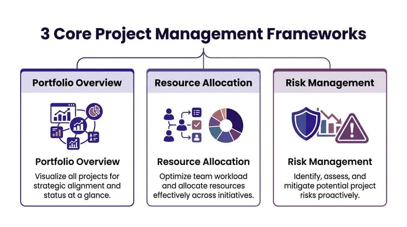
Framework 1 Portfolio overview
Create one sheet called Portfolio Overview. Each row is one project. Keep it high level.
Use these columns:
| Column | What it tells you |
|---|---|
| Project ID | Unique reference for lookups and reporting |
| Project Name | Plain-language label |
| Owner | Who is accountable |
| Priority | Critical, High, Medium, Low |
| Status | On Track, At Risk, Blocked, Complete |
| Start Date | When work began |
| End Date | Planned finish |
| Dependency | Key upstream project or task |
| Next Milestone | Immediate checkpoint |
| Risk Level | Low, Medium, High |
This sheet should fit on one screen width if possible. You're building for decision speed, not documentation depth.
Framework 2 Capacity planner
The second sheet shows whether your plan is realistic.
List team members down the rows and active projects across columns. In each intersecting cell, enter a simple workload label such as Lead, Support, Review, or blank. If your team prefers numbers, use estimated hours or effort bands.
The point isn't precision down to the minute. The point is to see clashes early.
Practical rule: if one person appears on too many critical-path items at the same time, that isn't flexibility. It's a scheduling risk.
Use conditional formatting to highlight crowded rows. Red for overloaded, amber for stretched, green for manageable. A simple visual often catches issues faster than a long project meeting.
If you want examples of how teams map work cleanly before they automate it, this guide on modelling business processes is useful background. It helps clarify where handoffs, approvals, and bottlenecks sit.
Framework 3 Risk triage grid
The third sheet is your pressure valve. Teams often track risks too late and too vaguely.
Set up a grid with these columns:
- Risk description with one specific sentence
- Related project so it ties back to the portfolio
- Probability such as Low, Medium, High
- Impact such as Low, Medium, High
- Trigger for what would make the risk real
- Response owner for who acts
- Mitigation action for the next step
Keep the language operational. Avoid entries like “stakeholder issue” or “resource problem.” Write what can happen. For example, “finance sign-off may delay vendor onboarding.”
Why these three frameworks work together
Portfolio overview tells you what exists. Capacity planning tells you whether the work can happen. Risk triage tells you what could derail it.
Once those are in place, your tracker becomes much easier to build because the logic already exists. If you want a head start, these Excel templates for small business operations are a useful reference for layout ideas and standard fields.
Creating Your 1 Dynamic Master Project Tracker
The master tracker is where most of the daily work happens. This is the sheet you'll filter in meetings, update during check-ins, and pull into dashboards.
The goal is simple. Every project, milestone, and key task lives in one integrated table. That matters because a proven resource optimization method starts by building a master plan across all projects, milestones, and tasks in one schedule, and aligned schedules can reduce resource conflicts by up to 40% in shared-resource environments, according to Forecast's guidance on managing multiple projects.
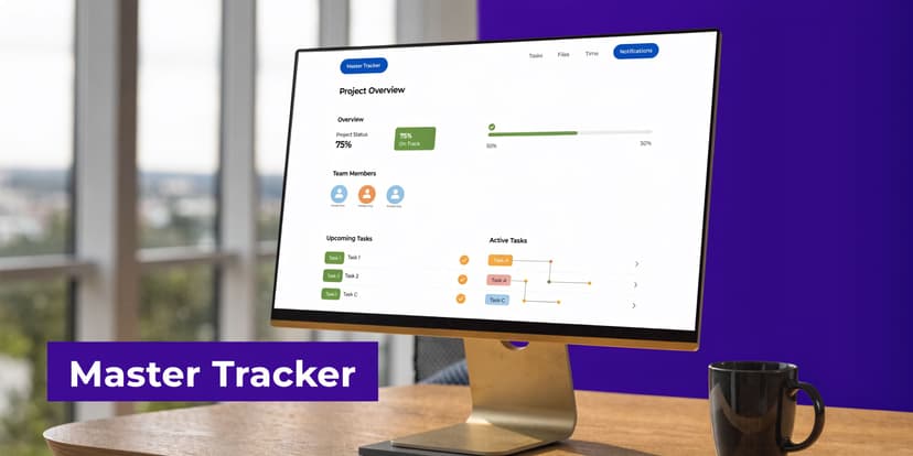
The columns that matter most
Set this up as an Excel Table, not a loose range. Press Ctrl+T so filters, formulas, and structured references stay clean as the file grows.
A practical starting structure looks like this:
| Column | Purpose |
|---|---|
| Project ID | Connects tasks to a project |
| Project Name | Human-readable label |
| Task ID | Unique reference for each task |
| Task Name | The actual work item |
| Owner | Person responsible |
| Start Date | Planned or actual start |
| Due Date | Planned finish |
| Status | On Track, At Risk, Blocked, Complete |
| Priority | Critical, High, Medium, Low |
| Dependency | What must happen first |
| Risk Flag | Yes or No |
| Percent Complete | Progress view |
| Notes | Short update or blocker |
| Last Updated | Freshness check |
Use dropdowns for Status, Priority, and Risk Flag with Data Validation. Standardized values matter more than people expect. If one person writes “Done,” another writes “Complete,” and another writes “Finished,” your summaries break.
How to build the dropdowns
Create a second sheet called Lists and enter your allowed values in separate columns.
For example:
- Status: On Track, At Risk, Blocked, Complete
- Priority: Critical, High, Medium, Low
- Risk Flag: Yes, No
Then:
- Select the cells in your Status column.
- Go to Data > Data Validation.
- Choose List.
- Point the source to your status list.
Repeat for each controlled field.
This small setup prevents a lot of reporting friction later.
Use formulas to reduce manual updates
A simple formula can standardize progress labels. One example is:
=IF(C2="Complete","100%","In Progress")
It performs these actions:
- IF tests whether a condition is true.
C2="Complete"checks whether cell C2 contains the word Complete.- If true, Excel returns 100%.
- If false, Excel returns In Progress.
In real trackers, you'll often point this to your Status column. If your status is in H2, the formula would be:
=IF(H2="Complete","100%","In Progress")
That gives you a quick text-based progress indicator. You can also extend the logic later with nested IF statements if you want Blocked or Not Started labels.
Another useful formula is a due-date warning:
=IF(TODAY()>G2,"Overdue","On Time")
Explanation:
- TODAY() returns the current date.
G2is the due date.- If today's date is greater than the due date, the task is overdue.
- Otherwise, it stays on time.
Make the tracker readable at a glance
Conditional formatting is where the sheet stops looking like raw admin.
Apply color rules such as:
- Red fill when Status = Blocked
- Amber fill when Status = At Risk
- Green fill when Status = Complete
- Bold date format when Due Date is approaching
Freeze the top row. Keep filters always visible. Avoid merged cells. Those are small habits, but they make the sheet usable during live meetings.
The best tracker is the one you can scan in thirty seconds while someone asks for an answer.
Keep task detail and portfolio logic separate
Don't overload the tracker with every comment, every subtask, and every meeting note. If you need detailed execution notes, keep those on a support sheet or in the project workspace.
The master tracker should answer operational questions fast:
- What is late?
- Who owns it?
- What is blocked?
- What project is affected?
- What needs escalation?
If you want a visual example of how this kind of structure feeds reporting, a project tracking dashboard template in Excel is a useful companion.
Implementing 2 Smart Scheduling and Tracking Techniques
Once the tracker works, the next step is visibility. Raw rows don't help much when leadership wants to see overlap, bottlenecks, and slippage quickly.
Two views do most of the heavy lifting in Excel. A timeline view shows where work collides. A dashboard shows where management attention belongs.
PMI benchmarks cited by Planview indicate that critical path tracking in multi-project environments improves on-track performance by 28%, and risk management is the top factor preventing 40% of failures. The same guidance stresses monitoring via dashboards so teams can adjust with real-time data and keep the big picture visible in this Planview article on managing multiple methodologies.
Technique 1 Build a simple Gantt-style timeline
You don't need a dedicated project tool to create a useful schedule view.
Set up a new sheet with:
- Project or task names in the left columns
- Start Date
- Due Date
- A row of calendar dates across the top
Then apply conditional formatting with a formula that fills cells between the start and due dates.
A standard pattern is:
=AND(J$1>=$F2,J$1<=$G2)
How it works:
J$1refers to the date in the header row.$F2is the task start date.$G2is the task due date.- AND checks whether the header date falls between those two dates.
- If true, Excel shades the cell.
This gives you a visual bar across the calendar. When several bars stack on the same dates for the same owner, you can spot overlap immediately.
If your dates need cleaning or extension logic, this guide on adding days to a date in Excel is useful for handling schedule calculations correctly.
Technique 2 Build a summary dashboard with PivotTables
PivotTables are still one of the fastest ways to manage multiple projects in Excel because they summarize without forcing you to rewrite formulas each week.
A good dashboard usually includes:
- Projects by status so you can see risk concentration
- Tasks by owner to spot uneven workload
- Upcoming deadlines filtered to the next review window
- Blocked items by project for escalation planning
Create a PivotTable from your master tracker table. Then build a dashboard sheet that places the summaries in one place.
A practical layout looks like this:
| Dashboard element | Why it helps |
|---|---|
| Status count | Shows overall health fast |
| Owner workload | Reveals concentration risk |
| Upcoming due dates | Supports daily and weekly planning |
| High-risk items | Keeps mitigation visible |
Add slicers if you want easy filtering by owner, project, or status. They're especially useful in review meetings because people can ask questions live without breaking the sheet.
A dashboard doesn't replace judgment. It shortens the time between noticing a problem and acting on it.
Automating Your Project Reporting with 1 AI Command
Manual reporting is where good Excel systems start to slow down. Building the tracker is valuable. Rebuilding summaries, charts, and weekly status packs from it over and over is where the drag returns.
That friction is now a recognized problem. A 2025 PMI survey indicates that 68% of multi-project managers cite data overload and manual reporting as top challenges, as summarized in Asana's resource on managing multiple projects.

What manual reporting usually looks like
In many teams, the weekly cycle still goes like this:
- Filter the tracker for active items.
- Copy data into a new sheet.
- Build a PivotTable by owner or status.
- Insert charts.
- Format titles and colors.
- Check for missing updates.
- Export or paste into slides.
None of that is hard. It's just repetitive. It consumes the time you should be spending interpreting the signal.
A better use of AI inside Excel
An AI agent inside the spreadsheet changes the workflow. Instead of asking for formula help, you give the file an instruction and let it execute the steps.
One option is Elyx AI, an Excel add-in that can carry out multi-step actions directly in a workbook, such as cleaning data, creating PivotTables, generating charts, and formatting output from a plain-language request.
A practical command looks like this:
From the Master Project Tracker, create a new dashboard sheet. Summarize projects by status and owner using a pivot table. Add a bar chart showing the status count and a pie chart for workload by owner. Format the sheet using blue and grey theme colors. Flag blocked tasks in red and place upcoming deadlines in a separate table.
That single instruction replaces a chain of mechanical work. You still review the result. You still make the decisions. But you stop spending the middle of your day assembling the same report structure again.
A short demo makes this easier to picture:
Where AI helps most in multi-project work
The strongest use cases aren't abstract. They're the chores that happen every reporting cycle.
- Cross-project consolidation when different project tabs need one clean summary
- Recurring dashboard refreshes when stakeholders want the same cuts every week
- Trend spotting when status changes or overdue items need highlighting
- Formatting cleanup when raw outputs need to look presentation-ready
Let the spreadsheet handle mechanics. Keep your time for trade-offs, escalation, and decision-making.
That's the practical shift. AI shouldn't replace project management judgment. It should remove the repetitive Excel work that gets in the way of it.
Conclusion From Overwhelmed to In Control in 2026
Managing multiple projects doesn't get easier because the work gets smaller. It gets easier when the system gets clearer.
The useful pattern is straightforward. Start with three frameworks so you can see priorities, workload, and risk. Build one master tracker so every active project follows the same logic. Turn that tracker into timeline and dashboard views so problems show up before they become meeting surprises. Then automate the reporting work that keeps draining attention.
That combination changes how Excel feels. It stops being a dumping ground for updates and starts acting like an operating system for delivery.
If you're searching for a practical answer to how to manage multiple projects, don't start with a bigger task list. Start with structure. Teams typically already have the data. They just don't have a clean model for using it.
A good setup won't eliminate trade-offs. You will still have deadline conflicts, dependencies, and overloaded people at times. But you'll see them earlier, communicate them faster, and make better calls with less scrambling.
That's what being in control looks like in 2026. Not perfect calm. Clear visibility, fewer manual steps, and more time spent on decisions that matter.
If you want to make Excel do more than store project data, Elyx AI is worth exploring. It works inside Excel as an AI agent that executes full spreadsheet workflows from a plain-language request, which is useful when your project tracking system is solid but the reporting, formatting, and recurring analysis still eat up too much time.
Reading Excel tutorials to save time?
What if an AI did the work for you?
Describe what you need, Elyx executes it in Excel.
Sign up