7 Steps to Build a Dynamic Project Tracking Dashboard Template in Excel

Staring at a wall of project data in a spreadsheet is enough to make anyone’s eyes glaze over. The real magic isn't in just collecting that information, but in making it tell a story. A well-built project tracking dashboard template in Excel does exactly that—it turns rows of complex data into a simple, one-page summary that instantly shows you a project's health, risks, and progress. The goal is for you to leave with a practical solution, ready to build a powerful tool that solves the concrete problem of tracking complex projects.
The 3 Stages of Building Your Project Dashboard
Transforming a basic spreadsheet into a go-to decision-making tool is about more than just dropping in a few charts. It takes a bit of planning to make sure your dashboard is not only easy on the eyes but also accurate and simple to update. A great template can save project managers hours on reporting every week.
It really boils down to three main stages:
Spending too much time on Excel?
Elyx AI generates your formulas and automates your tasks in seconds.
Sign up →- Getting Your Data Straight: Clean, organized data is the bedrock of any dashboard you can trust.
- Choosing the Right KPIs: You need to pick the metrics that actually matter and tell the true story of your project.
- Visualizing the Story: This is where you turn those numbers into charts that make the insights impossible to ignore.
This flowchart maps out the basic workflow I follow.

The flow is simple but incredibly effective: start with clean data, figure out your key performance indicators (KPIs), and then build clear charts to bring them to life. Sticking to this progression helps you create a dashboard that provides clarity, not more confusion. If you want to dive deeper, understanding solid dashboard design best practices is a huge help in making your visuals truly effective.
To give you a clearer picture, here are the seven essential components I make sure to include in any effective project dashboard.
7 Core Components of an Effective Project Dashboard Template
| Component | Purpose & Key Benefit |
|---|---|
| 1. Raw Data Table | The source of truth. A well-structured table makes everything else (PivotTables, charts) work smoothly. |
| 2. Key Performance Indicators (KPIs) | High-level metrics (e.g., Overall Budget, Task Completion %) that give you a quick health check. |
| 3. Project Timeline / Gantt Chart | Visualizes the project schedule, task durations, and dependencies. Instantly shows if you're ahead or behind. |
| 4. Budget vs. Actuals Tracker | Compares planned spending against actual costs. Crucial for financial control and avoiding surprises. |
| 5. Task Status Breakdown | A chart (like a pie or donut) showing tasks by status (e.g., Not Started, In Progress, Complete). |
| 6. Resource Workload Chart | Helps you see who is working on what and prevents team members from being overallocated. |
| 7. Risk & Issue Log | A summary of open risks or roadblocks, often highlighted to draw immediate attention where it's needed most. |
Nailing these seven elements gives you a comprehensive view of your project from every important angle.
Speeding Up the Process with Artificial Intelligence
Of course, creating all these elements from scratch can be a real time-sink. The good news is that building, updating, and analyzing reports can be done much faster now. AI tools integrated into Excel can automate these complex tasks, turning simple text instructions into complete reports and charts. The Elyx AI add-in for Excel, for instance, allows you to generate formulas, clean data, and create dashboards just by describing what you need. This frees you up to focus on making smart decisions instead of getting stuck doing the same spreadsheet tasks over and over.
The goal is to build a living tool that helps you stay ahead of problems. A great dashboard should instantly answer your biggest questions—"Are we on budget?" or "Which tasks are falling behind?"—without making you hunt for the answers.
Building a Rock-Solid Data Foundation in 2 Simple Steps
The flashiest dashboard is useless if the data behind it is a mess. Before we even think about charts and graphs, we have to get our raw data organized. If you skip this step, you will spend hours trying to fix broken formulas and inaccurate visuals later. This is a practical skill that forms the backbone of any reliable analysis in Excel.
Think of your data as the foundation for a house. If it’s weak or uneven, everything you build on top of it will be unstable. We're going to create a simple, clean table in a dedicated tab—I always call mine "Raw Data"—that will be the single source of truth for the entire dashboard.
This structure is what allows Excel's most powerful features, like PivotTables, to work their magic. Without a clean, tabular format, they just won't cooperate.
Step 1: Define the 6 Essential Data Columns
For any project tracker, there are a few non-negotiable columns you'll need. This is the bare minimum to get a clear picture of what's happening.
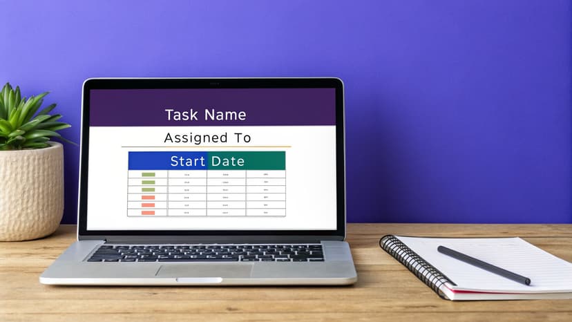
Your table should capture the key details for every single task:
- Task Name: A short, clear description of what needs to be done.
- Assigned To: The person who owns the task.
- Start Date: The day work is scheduled to kick off.
- Due Date: The deadline. No excuses.
- Status: The current stage of the task (e.g., Not Started, In Progress, Complete).
- Budget: The allocated cost for the task, which is crucial for tracking project spend.
Here’s a quick look at how clean and simple this should be. Notice there are no merged cells, no blank rows, and no fancy formatting. Just pure data.
| Task Name | Assigned To | Start Date | Due Date | Status |
|---|---|---|---|---|
| Draft Marketing Copy | Ana | 01-Oct-24 | 05-Oct-24 | In Progress |
| Design Ad Creatives | Carlos | 04-Oct-24 | 10-Oct-24 | Not Started |
| Launch Social Campaign | Maria | 11-Oct-24 | 15-Oct-24 | Not Started |
Step 2: Avoid These 3 Common Data Pitfalls
In my experience, inconsistent data is the #1 reason dashboards fail. A single typo can throw off your entire analysis. For example, if one team member enters "in-progress" and another types "In Progress," Excel sees them as two completely different categories. Suddenly, your metrics are skewed. To maintain data integrity:
- Enforce a Single Source of Truth: All project information must live in this single, perfectly organized table. This is what makes your dashboard dependable, accurate, and incredibly easy to refresh.
- Use Data Validation: A great pro-tip is to use Excel's Data Validation feature to create dropdown lists for columns like 'Status' or 'Assigned To'. This forces consistency and eliminates frustrating typos.
- Clean Before You Build: If you find yourself with an already messy dataset, address it immediately. You can explore modern solutions for AI-powered data cleaning in Excel to get things back on track quickly.
Picking the 5 KPIs That Actually Matter for Your Project
A dashboard cluttered with dozens of metrics is just noise. Your project tracker is only valuable if it tells you, at a glance, whether you're winning or losing. The key is to focus on a handful of Key Performance Indicators (KPIs) that paint a clear, honest picture of your project's health.
It's no surprise that project dashboards have become standard practice. In fact, a solid 65% of users say reports and dashboards are the most critical feature in their project management tools. When done right, the payoff is huge. Some companies have even cut the time they spend creating reports by 32% after implementing a good dashboard. You can dig into more of these project management trends over at Plaky.com.
So, for our Excel dashboard, I'm going to walk you through the five essential KPIs I always start with. They give a balanced view of your progress, budget, and potential roadblocks.
Crunching the Numbers with 5 Essential Excel Formulas
To get these KPIs working, we'll be leaning on that clean data table we built earlier. A few powerful Excel functions will do all the heavy lifting for us. Each formula provides a practical solution to a specific tracking need. If you want a deeper dive into these, our guide on essential Excel formulas is a great resource.
1. Task Completion Rate (%)
This is your most basic "are we moving forward?" metric. It simply shows what percentage of all tasks are done.
- Formula:
=COUNTIF(StatusColumn, "Complete") / COUNTA(StatusColumn) - Explanation:
COUNTIF(StatusColumn, "Complete"): This part counts the number of cells in your status column that contain the exact text "Complete".COUNTA(StatusColumn): This counts all non-empty cells in the status column, giving you the total number of tasks.- Dividing the completed tasks by the total tasks gives you a clean percentage of overall progress.
2. On-Time Completion Rate (%)
This one digs a little deeper. It doesn't just care if a task was completed, but whether it was done on schedule. This is a fantastic gauge of your team's ability to hit deadlines.
- Formula:
=COUNTIFS(StatusColumn, "Complete", CompletionDateColumn, "<="&DueDateColumn) / COUNTIF(StatusColumn, "Complete") - Explanation:
COUNTIFS(StatusColumn, "Complete", CompletionDateColumn, "<="&DueDateColumn): This function counts rows that meet multiple criteria. It looks for tasks that are both "Complete" and have a completion date that's on or before the due date.COUNTIF(StatusColumn, "Complete"): We divide by the total number of completed tasks to see what percentage of finished work was on time.
3. Budget Variance
This tells you the difference between what you planned to spend and what you've actually spent. A positive number means you're under budget (good!), while a negative number is a red flag that you're over budget.
- Formula:
=SUM(PlannedBudgetColumn) - SUM(ActualCostColumn) - Explanation: This is a simple but powerful one. The
SUMfunction adds up all values in your planned budget column, and then we subtract the sum of your actual costs column to find the difference.
4. Resource Utilization (Task Count)
Understanding your team's workload is key to preventing burnout and bottlenecks. A straightforward way to start tracking this is to simply see how many tasks are on each person's plate.
- Formula:
=COUNTIF(AssignedToColumn, "TeamMemberName") - Explanation:
COUNTIFcounts how many times a specific team member's name appears in the 'Assigned To' column. You can create a small summary table with this formula for each person on the project to see task distribution at a glance.
My Two Cents: For a more accurate picture of utilization, you can assign "effort hours" to each task. Then, instead of counting tasks, you can use
SUMIFto total the hours assigned to each person. This shows you who has a 2-hour task list versus who has a 40-hour list.
5. Open vs. Closed Risks
Finally, you absolutely need a KPI for risk. A simple count of open risks keeps potential problems from falling off the radar.
- Formula:
=COUNTIF(RiskStatusColumn, "Open") - Explanation: In a separate 'Risks' tab or table,
COUNTIFcounts any risk that is still marked "Open." It's a simple number, but it’s a powerful reminder of what needs your immediate attention.
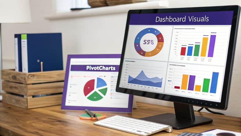
Creating 4 Key Visuals with PivotTables and Charts
Alright, your data is clean and you know which KPIs matter. Now for the fun part: turning all those numbers into a dashboard that actually tells you something useful. This is where we bring your project’s story to life.
We're going to rely on Excel’s powerhouse combo: PivotTables and PivotCharts. Think of a PivotTable as a smart summary tool that does all the heavy lifting—grouping, counting, and summing up your data—without you having to touch a single formula. A PivotChart is just a visual layer on top that updates automatically as your data changes.
Let's build out four essential visuals for our dashboard.
1. The Task Status Donut Chart
First up, we need a quick, at-a-glance view of how work is progressing. A donut chart is perfect for showing the proportion of tasks that are done, in progress, or haven't even been started.
To get this built, just select your entire data table and head over to Insert > PivotTable. In the new PivotTable Fields pane, you’ll want to drag the 'Status' field into two different boxes: the Rows area and the Values area. Excel will instantly give you a count of tasks for each status.
From there, click anywhere on your new PivotTable and go to PivotTable Analyze > PivotChart. Pick the Donut chart option. Just like that, you have a clear visual showing your project’s momentum.
2. The Budget vs. Actuals Bar Chart
Next, let's get a handle on the financials. A simple bar chart comparing your planned budget to your actual spending is a must-have for any project manager.
Go ahead and create a second PivotTable from your main data sheet. This time, pull 'Task Name' (or maybe 'Project Phase') into the Rows box. Then, drag both 'Budget' and 'Actual Cost' into the Values box. You'll see a neat table summarizing the budget and spending for each item.
Now, insert a Clustered Column Chart from this PivotTable. It will place bars for budget and actuals side-by-side for every task, making it incredibly easy to see where you might be overspending.
3. The Timeline Gantt-Style Chart
Excel doesn’t have a built-in Gantt chart, but we can create a pretty convincing one with a little trick using a Stacked Bar Chart. This visual is absolutely critical for tracking your project timeline.
This one requires a bit of setup. Make sure your data includes a 'Start Date' column and a 'Duration' column (which you can calculate as Due Date – Start Date).
Create a new PivotTable with 'Task Name' in Rows. Then, put both 'Start Date' and 'Duration' into the Values area. From this table, insert a Stacked Bar chart. Here's the magic part: right-click the bars that represent the 'Start Date', go to "Format Data Series," and change the Fill to "No Fill." This makes the first part of the bar invisible, leaving just the 'Duration' part floating—exactly like a Gantt chart.
Pro Tip: Slicers are what make a dashboard truly interactive. Select any of your PivotCharts and go to PivotTable Analyze > Insert Slicer. Pick a field like 'Assigned To' or 'Status'. Now you have buttons that can filter your entire dashboard, which is fantastic for drilling down into specifics during team meetings.
4. The 4 Interactive KPI Cards
Finally, you need a place to display those big-picture metrics we talked about, like the overall completion rate or total budget variance. These aren't charts, but rather dynamic "cards" that show your most important numbers.
Making these is surprisingly simple. Just pick an empty cell on your dashboard sheet, type the = sign, and then click on the cell in your data sheet that contains the KPI calculation. This creates a live link.
Just format these cells with a large font and bold text to make them stand out. Now your most critical metrics are front and center.
As you get comfortable with these tools, you'll start to see all sorts of possibilities. There are tons of other creative Excel use cases for business analysis that can take your reports from good to great.
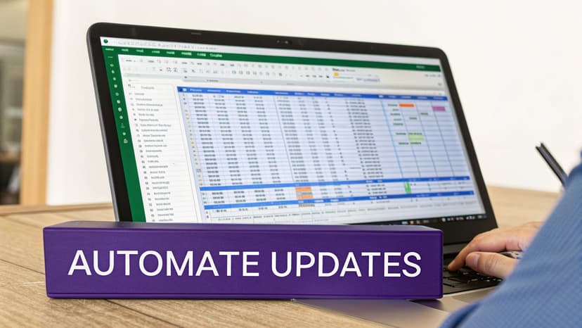
How to Automate Your Workflow with Excel AI in 2 Ways
Getting your project tracking dashboard built is a great first step. Honestly, it feels like a big win. But the real work? It’s keeping that thing updated. Manually plugging in new data, refreshing pivot tables, and rebuilding charts week after week is not just a drag—it’s how mistakes creep in and hours get wasted.
This is where a good Excel AI assistant really shines. It handles the repetitive grunt work for you, allowing you to focus on the high-value task of analysis.
Instead of a long, click-heavy process, you just tell the AI what you need in plain English. This completely flips the script, letting you spend your time actually figuring out what the data means, not fighting with the spreadsheet to get it.
1. From Prompt to Polished Dashboard
Let's say you have all your raw project info in a sheet you've called 'ProjectData'. Normally, you'd start the whole pivot table and chart creation dance. With an AI tool like ElyxAI, you can skip all that.
You can just give it a single, multi-step instruction right in a chat panel. Something like this:
"From the 'ProjectData' tab, create a new sheet named 'Dashboard'. Build a pivot table showing the count of tasks by status and another showing the sum of budget vs. actuals by project phase. Create a donut chart for the status pivot and a column chart for the budget pivot."
The AI just does it. It creates the new sheet, builds both pivot tables, and even makes the charts for you. This isn't just about getting a formula suggestion; it's about having an assistant that completes the entire task from start to finish.
2. The Business Impact of Automated Insights
This isn't just about saving a few minutes. Having instant access to accurate project data has a real impact. One organization we followed saw a 25% improvement in on-time project delivery after implementing a live dashboard. They were also able to flag high-risk issues 40% faster.
When you bring AI into your Excel process, your dashboard template stops being a static file and becomes a living, breathing tool. If you want to dig deeper into what’s possible with artificial intelligence in your spreadsheets, our guide on the benefits of an Excel AI assistant is a great place to start. It frees you up to focus on making the tough calls—the strategic work where your experience really counts.
4 Common Questions About Project Dashboards in Excel
Once you start using a project dashboard, you'll inevitably run into a few questions. That's a good thing—it means you're pushing the template to fit your real-world needs. Let's walk through some of the most common hurdles I see people face and how to get past them with practical, actionable tips.
1. How Do I Handle Data From Multiple Projects in One Dashboard?
This question comes up all the time, especially from program managers trying to get a portfolio-level view. The secret isn't to build a separate dashboard for every project. Instead, you create one master "Raw Data" tab for everything.
The key is to add a single column: "Project Name" or "Project ID". That's it. This one field lets you tag every task, cost, and milestone to its parent project.
With that column in place, you can drop a Slicer onto your main dashboard and link it to the "Project Name" field in your PivotTables. Now, anyone can filter the entire dashboard to see stats for one project, or a few, or all of them combined. It’s an incredibly clean way to see the big picture without drowning in different files.
2. What Is the Best Way to Share the Dashboard With My Team?
Whatever you do, don't start emailing copies of the Excel file around. It’s a fast track to version control madness, where nobody knows which file has the right numbers.
Your best move is to use a shared cloud service like SharePoint or OneDrive. Storing the file there turns it into a living document. The whole team can access and even edit it in real-time, so everyone is always looking at the latest data.
A dashboard on a shared platform becomes your single source of truth. It’s always on and always up-to-date, which stops people from making decisions based on old information—a classic spreadsheet management mistake.
This approach also gives you great control over who can do what. You can set stakeholders to "View Only" and let your project team have "Edit" access to update their tasks. That balance of easy access and tight control is perfect for keeping your data accurate.
3. How Do I Fix a Slow or Laggy Dashboard in Excel?
If your dashboard starts to feel sluggish as you add more data, don't panic. Performance issues almost always boil down to one of these three culprits.
- Too Many Volatile Formulas: Functions like
NOW(),TODAY(), andOFFSET()are resource hogs because they recalculate every time any cell changes. Replace them with static values or let Power Query handle calculations upon refresh. - Massive Datasets Living in the Sheet: Pasting tens of thousands of rows directly into your workbook bloats the file. Use Excel’s Data Model (Power Pivot) to connect to your data source. This keeps the raw data external, making your file dramatically smaller and faster.
- Inefficient Full-Column References: Using a formula like
SUM(A:A)makes Excel check over a million rows. Instead, turn your data range into a formal Excel Table (Ctrl+T). Then use structured references likeSUM(ProjectTable[Budget]), which are far more efficient.
4. Can I Automate the Data Import Process?
Yes, and you absolutely should. Manually copying and pasting data is not only boring, it's a primary source of errors. Excel has a fantastic tool built right in for this: Power Query. You'll find it in the "Get & Transform Data" section on the Data tab.
With Power Query, you can set up a connection to almost any data source—another Excel file, a CSV from an app, or a direct link to a database. You only have to define the connection and data-cleaning steps once.
From then on, all you have to do is hit the "Refresh All" button. Your data is imported, cleaned, and your entire dashboard updates automatically. It saves a ton of time and gives you confidence that your project tracking dashboard template is always showing the true picture.
Ready to stop wrestling with manual updates and start getting instant insights? The Elyx AI add-in for Excel acts as your personal data assistant, automating everything from data cleaning to chart creation with simple text commands.
Start your free trial and save hours on your Excel tasks today
Reading Excel tutorials to save time?
What if an AI did the work for you?
Describe what you need, Elyx executes it in Excel.
Sign up