7 Steps: How to Make Excel Spreadsheet in 2026

A lot of people open Excel with a clear business need and no clear build process. They know they need a tracker, a report, or a summary table, but they start clicking around the ribbon, formatting cells too early, and end up with a sheet that looks finished while still being fragile.
That's usually the core problem behind the search for how to make excel spreadsheet. It's not about learning where the bold button is. It's about building something that still works when the file grows, when someone else opens it, or when you need to turn raw rows into decisions.
From Blank Sheet to Insight in 7 Steps
A useful spreadsheet starts before the first formula. The fastest builders don't treat Excel as a canvas for manual formatting. They treat it as a small data system with a purpose, a structure, and an output.
Spending too much time on Excel?
Elyx AI generates your formulas and automates your tasks in seconds.
Sign up →That changes the order of work. Instead of starting with borders, colors, and merged titles, start with the record layout. Ask what each row represents, what each column should contain, and what summary you'll need later. That single shift prevents most spreadsheet pain.
A professional spreadsheet is usually simple underneath. One row per record, one column per variable, and formatting added after the data model is stable.
This is also why so many beginner tutorials fall short. They teach isolated features. They show how to resize columns, center text, or add a chart. They don't show the full workflow from blank workbook to usable report.
The practical sequence looks like this:
- Define the job the sheet needs to do.
- Design the columns before data entry.
- Enter clean records in a consistent format.
- Convert the range into a Table so it scales.
- Add formulas that answer business questions.
- Apply visual layers that make patterns obvious.
- Automate repeat work once the workflow is clear.
If you need a starting point for transaction-style documents, ReceiptGen's free receipt templates are useful because they show what a structured Excel file looks like when the end goal is already clear.
The manual process still matters because you need to understand what good structure looks like. But once you understand the sequence, modern AI tools can handle a large part of the mechanics for you. The smart move isn't skipping fundamentals. It's learning the fundamentals once, then letting automation execute them faster.
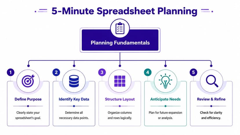
Planning Your Sheet Structure in 5 Minutes
Most spreadsheet mistakes happen before data entry. People start typing into random cells, add blank rows for visual spacing, merge headers, and only later realize they can't sort, filter, or analyze the file cleanly.
The fix is simple. Plan the sheet as a table first, not as a page.
Start with one clear record type
Pick what one row means. In a sales tracker, one row might represent one order. In a hiring tracker, one row might represent one applicant. In an expense log, one row might represent one transaction.
Once that's clear, columns become easier to define. A basic sales tracker could use:
- Date for when the sale happened
- Region for where it was sold
- Product for what was sold
- Units Sold for quantity
- Revenue for money collected
That structure gives you something Excel can work with later. It also keeps you from mixing notes, totals, and raw records in the same block of cells.
Use headers that mean one thing only
Good headers are short and specific. “Date” is better than “Date Info.” “Revenue” is better than “Financial Output.” Avoid duplicate column names and avoid multi-line headers if you can.
Microsoft's accessibility guidance says a spreadsheet should use a simple table structure with clearly identified column headers and should avoid merged cells because screen readers rely on that structure to move through rows and columns in a usable way, as shown in Microsoft's video on accessible tables in Excel.
That matters beyond accessibility. It's also what makes the sheet readable by formulas, filters, pivot tools, and AI assistants.
Practical rule: If a human can't tell what each column means in two seconds, Excel won't be easy to work with either.
Decide data types before typing values
A clean sheet separates dates, text, numbers, and percentages from the start. Don't store revenue as text with a currency symbol typed into every cell. Don't mix date formats in the same column. Don't place comments inside numeric fields.
This planning step is exactly why many analysts use Excel like a light database before they use it like a report. If that idea is useful for your workflow, this guide on using Excel as a database is a good next read.
A quick planning pass usually takes a few minutes. Rebuilding a messy workbook takes much longer.
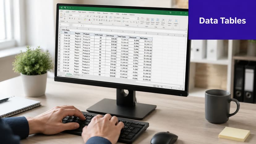
Entering Data and Creating Your First 3 Smart Tables
Open a blank workbook. Put your headers in row 1. Then enter data so each row follows the same structure. That sounds basic, but it's the point where many spreadsheets go off track.
Microsoft's documented workflow is straightforward: start a blank workbook, enter headers, input data, then convert the range into a formal Excel Table because Tables add structured references and auto-expanding ranges, which helps reduce formula breakage when rows are added later, as shown in Microsoft's basic Excel tasks guide.
Format columns before the sheet gets crowded
Set the column type early. If a column holds dates, format it as Date. If it holds money, format it as Currency or Accounting. If it holds IDs, keep it as text if leading zeros matter.
That one habit prevents common cleanup problems like text dates that won't sort properly or revenue values that can't be summed.
Three table patterns cover a lot of daily business work:
| Table type | What each row represents | Typical columns |
|---|---|---|
| Transaction table | One sale, expense, or event | Date, Item, Amount, Category |
| Reference table | One lookup value | Product, Price, SKU |
| Summary-ready table | One clean record for analysis | Region, Rep, Product, Units, Revenue |
Build these separately when the roles are different. Don't mix lookup lists into the middle of raw transactions.
Press Ctrl+T earlier than you think
As soon as your range is contiguous, turn it into an Excel Table with Ctrl+T. This is one of the highest-value actions in Excel.
Why it matters:
- Auto-expanding ranges keep formulas and analysis aligned as new rows come in.
- Filter buttons let you inspect subsets fast.
- Structured references make formulas easier to read than raw cell coordinates.
- Consistent formatting makes the sheet easier to scan.
A loose range looks harmless at first. Later, it breaks formulas, excludes new rows from summaries, and creates uncertainty about what data is in scope.
If you're cleaning incoming files before making the table, duplicate rows are one of the first issues to fix. This guide on how to identify duplicates in Excel is useful when your source data isn't clean.
A short walkthrough helps if you want to see the mechanics in action.
What doesn't work well
Beginners often build “tables” that are really formatted blocks of cells. The warning signs are familiar:
- Merged title rows above the headers
- Blank rows inserted for visual spacing
- Totals mixed into the raw data
- Different formats in the same column
- Notes typed directly into the dataset
Those choices make the file feel handcrafted. They also make it harder to analyze, maintain, and automate.
Unlocking Insights with 5 Essential Formulas
A spreadsheet becomes useful when it answers questions. How much did we sell? What's the average order size? Which rows meet a condition? Can we pull the right value from another table?
Excel formulas do that work because each formula follows function syntax, and clean tabular structure makes those functions reliable. Microsoft's guidance on analysis tools and formula structure also notes that Excel's built-in Data Analysis ToolPak is commonly used to generate descriptive statistics such as mean, median, and mode from a selected input range when the data is clean and tabular, as covered in this Excel analysis walkthrough.
SUM and AVERAGE for fast rollups
Use SUM when you need a total.
=SUM(E2:E100)
If column E contains revenue, this adds every value from E2 through E100.
- SUM adds numeric values in the selected range.
- If text appears in the range, Excel ignores it.
- This is the fastest way to total sales, cost, units, or hours.
Use AVERAGE when you need the central value for a range.
=AVERAGE(E2:E100)
This returns the arithmetic mean of the selected numbers. In business terms, it can answer questions like average revenue per transaction or average units sold per order.
IF and COUNTIF for classification
Use IF when a row needs a rule-based label.
=IF(E2>1000,"High","Low")
This checks whether the value in E2 is greater than 1000. If yes, Excel returns “High.” If not, it returns “Low.”
That's useful for quick segmentation, such as flagging large orders, overdue balances, or acceptable versus unacceptable results.
If you can describe the rule in a sentence, you can usually build it with IF.
Use COUNTIF when you need to count rows that match one condition.
=COUNTIF(B2:B100,"West")
If column B contains regions, this counts how many rows equal “West.”
You can use it for simple operational questions:
- How many orders came from one region
- How many tasks are marked complete
- How many invoices are overdue
VLOOKUP for pulling values from a reference table
Use VLOOKUP when one table contains a code or name and another table contains the value you want to bring back.
=VLOOKUP(C2,H2:J20,3,FALSE)
Here's what each argument does:
- C2 is the lookup value, such as a product name
- H2:J20 is the reference table
- 3 tells Excel to return the value from the third column of that table
- FALSE requires an exact match
If column C contains a product and the reference table contains Product, SKU, and Price, this formula can pull the price into your main dataset.
For finance work, formulas often lead into ratio analysis and summary metrics. If you need examples of which ratios matter and how they're interpreted, this definitive financial ratios guide is a strong companion resource.
If you want a deeper walkthrough on writing formulas step by step, this article on how to make a formula in Excel is worth keeping open beside your workbook.
Making Your Data Speak with 3 Visual Layers
A good spreadsheet doesn't just calculate. It helps someone see the answer quickly. That usually comes from stacking three visual layers on top of the raw table.
The first layer is readability. The second is signal. The third is summary.
Layer 1 for readability
Start with the obvious fixes that improve scan speed:
- Widen key columns so headers and values aren't cut off
- Use number formats that match the data, such as date, percentage, or currency
- Style the header row so labels are easy to distinguish from records
This isn't decoration. It reduces interpretation errors. A well-formatted revenue column tells the reader what kind of value they're looking at before they read a single formula.
Layer 2 for signal
Conditional formatting is where the sheet starts helping you think. Instead of scanning every row manually, let Excel highlight what matters.
Use it to:
- Flag low values that need action
- Highlight top performers in a sales column
- Show data distribution with color scales
- Mark duplicates when reviewing imports
Watch for this mistake: strong color doesn't equal strong insight. If every row is highlighted, nothing stands out.
The best conditional formatting rules point to exceptions, thresholds, or comparisons that matter to the business.
Layer 3 for summary
Charts belong after the table is stable. A simple bar chart of sales by region, a column chart of monthly revenue, or a line chart of trend over time can do more than a page of numbers when the audience needs a quick read.

A useful pattern is to keep one sheet for clean data and another for presentation. That separates record-keeping from reporting and avoids accidental edits to the source table.
If you build reports often, this guide on Excel data visualization gives more ideas for turning raw tables into dashboards that people can effectively use.
The main trade-off is simplicity versus density. A dense report can hold more detail, but it slows down decision-making. Generally, a clean table plus one strong chart beats a dashboard packed with visual noise.
The 1-Prompt Method to Automate Your Spreadsheet Workflow
The full manual workflow is reliable, but it's repetitive. You plan the structure, clean the input, convert the range into a Table, build formulas, apply formatting, and create the final visual summary. That's solid practice. It also consumes time when the same pattern repeats every week.
The smarter direction is workflow automation. Not because fundamentals no longer matter, but because once you know what “good” looks like, you shouldn't have to rebuild it from scratch every time. If you want the broader concept in plain language, this explainer on what workflow automation is is a practical place to start.
What the manual process usually looks like
A recurring Excel task often includes several moving parts:
- Clean the data by fixing formats and removing duplicates
- Reshape the dataset into a consistent table
- Calculate outputs like totals, averages, or labels
- Build the report view with sorting, formatting, and charts
None of those steps is hard on its own. The drag comes from doing them in sequence, repeatedly, under deadline.
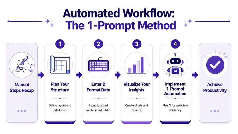
What the automated version looks like
An AI agent changes your role from operator to reviewer. Instead of carrying out each ribbon click and formula insertion yourself, you describe the end result in plain language.
For example, a prompt could look like this:
Clean this dataset, create a sales report by region, calculate total and average sales, add a chart for regional performance, and format the workbook professionally.
That's the same workflow you'd do manually. The difference is that the instruction is packaged once instead of executed step by step by hand.
This approach works best when your spreadsheet already follows the structural habits covered earlier. Clean headers, one row per record, and a proper table still matter. AI speeds up execution. It doesn't rescue a chaotic layout nearly as well as people hope.
The practical trade-off is simple. Manual work gives you full low-level control. Prompt-driven work gives you speed and consistency for repeated reporting jobs. In real teams, the best setup is usually both: know how to build it yourself, then automate the parts that don't deserve another hour of your day.
If you want that kind of automation directly inside Excel, Elyx AI is built for it. It works as an Excel add-in that can execute multi-step spreadsheet tasks from a plain-language instruction, including data cleaning, table creation, chart generation, formatting, and report building, so you spend less time on mechanics and more time checking the output that matters.
Reading Excel tutorials to save time?
What if an AI did the work for you?
Describe what you need, Elyx executes it in Excel.
Sign up