12 Excel Data Visualization Techniques for Impactful Reports

Excel data visualization is all about turning those overwhelming spreadsheets into something everyone can understand. It’s the art of creating charts, graphs, and even interactive dashboards in Excel that tell a clear story from your raw numbers. A good visual makes trends, patterns, and oddities jump right off the page. The goal of this guide is to equip you with practical skills, from data preparation with formulas to leveraging AI, so you can build professional reports.
Your 7-Step Foundation for Flawless Excel Data Visualization
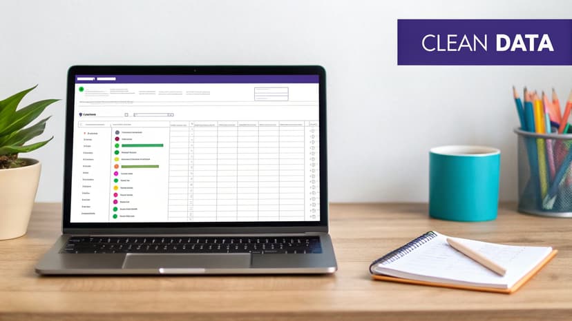
Before you even think about picking a chart type, the success of your visualization lives or dies with the quality of your data. The mantra "garbage in, garbage out" is the single biggest reason why most Excel projects fail to deliver. A few minutes spent cleaning up your data now will save you hours of headaches and prevent you from sharing misleading information.
This simple flow captures the essence of the journey, from a messy spreadsheet to a clear insight.
Spending too much time on Excel?
Elyx AI generates your formulas and automates your tasks in seconds.
Sign up →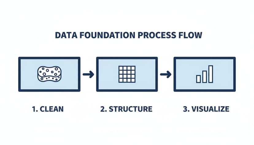
The takeaway here is that cleaning and structuring your data aren't optional steps. They are absolute must-dos before you can build anything meaningful.
Why Messy Data Is a Project Killer
Think about it. You're trying to build a sales report, but your city column has entries like "New York," "NY," and "new york city." To Excel, those are three different places, which completely throws off your numbers. Little things like inconsistent formats, extra spaces, typos, and empty cells are the silent killers of data integrity. They stop PivotTables from working correctly and can lead to charts that are just plain wrong.
The real goal of data prep isn't just to fix typos. It's to create a standardized, machine-readable dataset that Excel can understand without any confusion. This foundational work ensures your visuals are built on a bedrock of truth.
A 7-Step Prep Checklist with Formula Examples
Here are seven essential actions to whip a chaotic spreadsheet into shape. This checklist turns a messy dataset into something clean and ready for analysis.
- Kill Duplicates: The first thing to do is use Excel’s "Remove Duplicates" tool (found in the Data tab). It’s a one-click way to get rid of identical rows.
- Standardize Your Text: Hunt down inconsistencies like "USA" vs. "United States" and fix them with Find and Replace (Ctrl+H). Consistency is key.
- Trim Pesky Spaces: The
=TRIM()formula is your best friend. It removes sneaky leading or trailing spaces that make two identical entries look different. For a cellA2containing " New York ", using=TRIM(A2)returns "New York". - Deal with Blanks: You need a plan for empty cells. Will you fill them with "N/A"? A zero? Or remove the row? To replace all blanks in a range with zero, select the range, press F5, go to Special, select "Blanks," type 0, and press Ctrl+Enter.
- Check Your Formats: Make sure your dates are formatted as dates, numbers as numbers, and so on. Mismatched formats are a classic source of errors.
- Split Combined Data: If you have data in one cell (like "John Smith"), use the "Text to Columns" feature to split it into "First Name" and "Last Name" columns.
- Make It an Official Table: This is a big one. Select your data and hit Ctrl+T to turn it into an official Excel Table. This gives you dynamic resizing, easy formatting, and clean formulas.
For a deeper dive, our guide on AI-powered data cleaning in Excel has even more advanced tips.
Let AI Handle the 7 Tedious Prep Steps
While this prep work is crucial, it’s also incredibly boring and time-consuming. Productivity studies have found that professionals can waste up to 40% of their week on repetitive tasks like cleaning data. This is where AI tools like ElyxAI are a game-changer.
Instead of manually slogging through those seven steps, you can just tell the AI what to do. A single command like, "Clean this dataset by removing duplicates, trimming spaces, and standardizing the country column," is all it takes.
ElyxAI acts like an assistant right inside your spreadsheet, executing that entire workflow for you. It intelligently finds and fixes the issues, turning a process that could take an hour into a job done in seconds. Before you can visualize data effectively, you have to get the fundamentals right, including collecting and analyzing data for business growth. By automating these foundational steps, you free yourself up to focus on what actually matters: finding the story in the data.
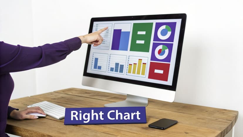
11 Essential Chart Types and When to Use Them
Picking the right chart is where your data story truly begins. After you’ve done the hard work of cleaning and organizing your data, the next move is to choose a visual that presents your findings clearly and persuasively. It’s tempting to stick with the basics, but moving beyond a simple pie chart will give you a much richer and more accurate way to communicate.
This isn't just about making things look pretty. The wrong chart can actively mislead your audience. For example, using a line chart to connect unrelated categories can create a false sense of connection and completely hide the real insight you're trying to share.
1. & 2. The Workhorses: Bar and Line Charts
Bar charts are your go-to for comparing different, distinct categories. They answer questions like "how much?" or "how many?" A vertical column chart is perfect for showing monthly sales by product, while a horizontal bar chart is often better when you have long category labels. They make direct comparisons effortless.
Line charts, on the other hand, are all about showing trends over a continuous timeline. Think of tracking monthly revenue or daily website visitors. The key word here is continuous. A line connecting discrete data points, like sales figures for different countries, just doesn’t make sense and can confuse your audience.
3. & 4. Showing Parts of a Whole
Everyone knows the pie chart, but it becomes nearly impossible to read with more than a few slices. When you need to show how a total is broken down, Excel has far better options.
- Treemap Charts: These are fantastic for hierarchical data. Imagine you want to see sales by region, then drill down into the countries within that region. A treemap uses nested rectangles, where the size of each box instantly shows its proportion to the whole.
- Sunburst Charts: Think of a treemap, but in a circle. It looks like a multi-layered donut chart. The inner ring represents your top-level category, and each outer ring shows a deeper level of the hierarchy. It’s a visually impressive way to show how a whole is divided.
5. & 6. Visualizing Financials and Funnels
Some business stories have charts that were practically made for them. Two of my favorites for this are the Waterfall and Funnel charts because they tell a story with incredible clarity.
A Waterfall chart is a finance department’s secret weapon. It’s built to show how an initial value is affected by a series of positive and negative changes. It visually walks you from gross revenue, through all the costs, and down to the final net profit.
The Funnel chart is perfect for visualizing any multi-stage process, especially a sales or marketing funnel. It immediately shows you where the drop-offs are happening, pointing directly to the bottlenecks in your process.
By mastering these specialized charts, you move from simply presenting numbers to building a compelling visual narrative. A Waterfall chart doesn't just show profit; it tells the story of how that profit was earned.
7. & 8. Uncovering Relationships and Distributions
Sometimes, your goal isn't to compare totals but to see if two different things are related. For this kind of analysis, scatter plots and combo charts are invaluable.
A Scatter plot is the classic tool for spotting correlation. By plotting two different numerical variables on the X and Y axes, you can see if a relationship exists. For example, does higher ad spend actually lead to more sales? The pattern of the dots will tell you.
A Combo chart lets you overlay two different chart types, like columns and a line, on the same graph. This is incredibly handy for comparing two different kinds of metrics that share an axis, like showing monthly sales volume (columns) against the average discount percentage (line).
You can dive deeper into how these visuals are used across different business functions in our guide to various Excel use cases.
9. to 11. Other Essential Chart Types
To round out your toolkit, here are three more specialized charts that are extremely useful in the right situation:
- Area Charts: These are basically line charts, but with the area under the line filled in. This helps emphasize the volume or magnitude of change over time.
- Stock Charts: As the name suggests, these are designed specifically for financial data, letting you track the high, low, open, and close prices for a stock over time.
- Map Charts: If your data has a geographical component—like sales by state, country, or even postal code—a map chart is a game-changer. It turns a boring table of numbers into an intuitive visual that anyone can understand in a second.
5 Powerful PivotTable and PivotChart Strategies
So you've picked the right chart. Now what? The next step is to make your reports truly dynamic, and for that, PivotTables and PivotCharts are your best friends. They are the workhorses behind almost every insightful, filterable Excel dashboard. They let you take a massive, overwhelming dataset and boil it down with just a few drags and drops, solving the concrete problem of summarizing large amounts of data.
Forget about those static charts that only show one slice of the story. The magic happens when you build something that your team can actually explore on their own.
1. Summarize and Analyze with a Basic PivotTable
Imagine you have a giant spreadsheet filled with thousands of sales transactions. A PivotTable is your fastest way to turn that chaos into a clean summary. Say your boss wants to see total sales by region. Instead of fumbling with complex SUMIFS formulas, you can get it done in seconds.
- Click anywhere inside your data.
- Go to Insert > PivotTable.
- Drag "Region" into the Rows box and "Sales Amount" into the Values box.
Boom. You instantly have a summary table showing total sales for each region. This is the foundation for countless reports. And from here, you can create a PivotChart, which is just a chart that’s directly linked to your new PivotTable.
2. Create Calculated Fields for Deeper Insights
What happens when your data doesn't have the exact metric you need? For example, maybe you have "Revenue" and "Cost" columns but no "Profit Margin." You could add another column to your source data, but a cleaner way is to create a Calculated Field right inside the PivotTable. This keeps your original data untouched.
To create a profit margin calculation, you would:
- Click on your PivotTable, go to the PivotTable Analyze tab, and find Fields, Items, & Sets > Calculated Field.
- Give it a name, like "Profit Margin."
- Enter the formula:
= (Revenue - Cost) / Revenue.
Just like that, "Profit Margin" becomes a new field you can drop into your PivotTable, instantly showing you profitability by region or product.
3. Group Data to Spot Trends
One of my favorite PivotTable features is its ability to group data, which is absolutely critical for trend analysis. The most common use case here is grouping by dates. If you have daily sales records, you can roll them up into months, quarters, and years with a couple of clicks.
Just right-click any date in your PivotTable’s rows or columns and hit "Group." Excel will give you options to group by days, months, quarters, and years. This is how you turn granular, noisy data into a clean line chart showing quarterly performance.
The ability to group data is a cornerstone of effective analysis. It lets you zoom out from the daily noise to see the bigger picture, revealing patterns that would otherwise be hidden in the details.
4. Add Slicers and Timelines to Make It Interactive
This is where your dashboard truly comes alive. Slicers and Timelines are simple, user-friendly filters that let anyone—even someone who’s never heard of a PivotTable—explore the data.
- Slicers: Think of these as sleek, clickable buttons for your charts. You can add a slicer for "Region" or "Product Category." When someone clicks a button, all your connected charts instantly update.
- Timelines: These are a special type of slicer built just for dates. They give you a visual slider you can drag to filter your report to a specific period, like "last quarter" or "the month of May."
Hooking up a few slicers to your PivotCharts transforms a static report into an interactive tool. If you're curious about taking this further, our guide to AI-powered data analysis shows how automation can accelerate this whole setup.
5. Automate Everything with an AI Assistant
While these strategies are fantastic, they still involve a lot of clicking. Large companies, which account for 55% of the $6.6 billion data visualization market, are well aware of this cost. In fact, analysts can spend up to 37% of their time just formatting visuals. You can explore the full data visualization tools report for more on that.
This manual grind is exactly what AI assistants like ElyxAI are designed to eliminate. Instead of going through all those steps, you can just ask for what you want in plain English. For instance, you could just type: "Create a sales report by region with a PivotChart showing profit margin. Add a slicer for product category."
ElyxAI works like an autonomous agent inside your spreadsheet. It understands the request, does all the heavy lifting in the background, and gives you a finished, interactive report in seconds. It handles all the data summarization and visualization, letting you jump straight to finding the actual insights.
9 Design Principles for Persuasive Dashboards
A great dashboard does more than just show charts; it tells a story. The best Excel visualizations are built with a clear purpose, guiding your audience straight to the most important insights without any fluff. By sticking to a few core design principles, you can take a cluttered dashboard and turn it into a professional report that gets people's attention.
These nine principles are my go-to's for creating dashboards that answer specific business questions clearly.
1. Establish a Consistent Color Palette
Color isn't just for making things look pretty; it's a powerful communication tool. A random mix of clashing colors looks amateurish. The best approach is to define a simple, consistent color palette. If your company has brand colors, start there.
Getting this set up in Excel is straightforward:
- Navigate to Page Layout > Colors > Customize Colors.
- You can plug in the specific HEX or RGB codes for your brand.
- Once you save it, this custom theme becomes your default for any new chart, keeping everything looking professional and consistent.
2. Maximize the Data-Ink Ratio
This is a game-changing concept from data visualization pioneer Edward Tufte. The data-ink ratio is simply the amount of "ink" on a chart that directly represents data, compared to the total ink used. Anything that doesn't show data—think heavy gridlines, dark chart borders, or 3D effects—is "chart junk." Get rid of it. A high data-ink ratio creates minimalist, clean charts that let the data itself be the hero.
3. Declutter by Removing Unnecessary Elements
This idea builds directly on the data-ink ratio. You need to be ruthless about removing anything that doesn't add real value. Before you finalize a chart, ask yourself: Are these gridlines actually helping? Does this chart need a border? Are the axis labels redundant? For instance, if your chart title is "2024 Monthly Sales," you don't need a horizontal axis title that also says "Month." Just delete it.
4. Use Strategic Titles to Guide the Viewer
A chart title shouldn't just be a boring label like "Sales by Quarter." A truly effective title gives the reader the main takeaway before they even look at the data. Instead of a passive title, write an active one like, "Q3 Sales Spiked by 25% Following New Marketing Campaign." This immediately frames the data and tells a story, turning your chart from a simple picture into a persuasive argument.
5. Design for a Clear Visual Hierarchy
When someone glances at your dashboard, their eyes should naturally go to the most important piece of information first. You can control this flow using a few simple tricks:
- Size: Make your most important chart or KPI the biggest element on the page.
- Position: We read from top-left to bottom-right. Put your headline number or key insight in that top-left corner.
- Color: Use a single, bright, or contrasting color to make a key data point pop.
6. Keep It Simple and Focused
Don't fall into the trap of trying to cram every piece of data onto a single screen. A dashboard that tries to show everything ultimately communicates nothing at all. Before you start, figure out the one main question the dashboard needs to answer, and then only include the visuals that help answer it.
A dashboard is for at-a-glance understanding. If it takes more than a few seconds to figure out a visual, the design has failed. Always choose clarity over complexity.
7. Choose a Clean and Legible Font
This might feel like a minor detail, but your font choice really does matter. Stick with clean, easy-to-read sans-serif fonts like Calibri, Arial, or Segoe UI. Just as important, make sure the font is large enough to be read comfortably, especially for axis labels and data points.
8. Use White Space Intelligently
White space—that empty area around your charts and text—is one of your most important design tools. Don't be afraid of it! Packing everything tightly together makes a dashboard feel cramped and overwhelming. White space gives your visuals room to breathe, separates different sections, and dramatically improves readability.
9. Let AI Handle the Formatting
Applying all these principles manually can be a real time sink. This is where AI can be a massive help. With an intelligent assistant like the ElyxAI Excel add-in from Microsoft AppSource, you can automate a huge chunk of the design work. You can give it a simple instruction like, "Format this dashboard using our company colors, a clean layout, and highlight the top-performing region." The AI agent can instantly apply these design rules to deliver a professional-looking dashboard in seconds.
Your 4-Step Guide to AI in Excel Visualizations
If you've mastered the manual techniques for creating charts in Excel, you know they're powerful. But you also know they take time. The next leap forward is letting AI do the heavy lifting for you, transforming a multi-step process into a single command. Tools like ElyxAI act like an expert colleague sitting right inside your spreadsheet.
The AI market for this is booming. Valued at $4.2 billion in 2024, it’s expected to double to $8.2 billion by 2033. This isn't just hype; the value is real. For instance, financial consultants using these tools have seen a 35% drop in errors when visualizing complex data. You can dig deeper into the numbers by checking out the complete data visualization market report.
The AI-Powered Workflow in 4 Steps
Let's make this concrete. Imagine you have a messy sales export. You can give an AI agent like ElyxAI a single, multi-step instruction in plain English and watch it get to work.
Try giving it a prompt like this:
"Clean this sales data, create a pivot table showing sales by product category, generate a bar chart for the top 5 products, and format the report in blue tones."
This isn't just one command; it's an entire project brief. A smart AI agent breaks it down and executes it in four key steps:
- Data Cleaning: The AI scans your data for common issues. It removes duplicates, trims extra spaces, and standardizes formats to ensure your numbers are accurate.
- Pivot Table Creation: It then builds a PivotTable, automatically summarizing your sales figures and grouping them by product category, just as you asked.
- Chart Generation: From there, it creates a bar chart based on the pivot data, filtering it down to only the top five products.
- Professional Formatting: Finally, it applies the blue color scheme, adds a clean title, and removes chart clutter for a presentation-ready visual.
What used to be a 30-minute manual slog can now be done in less than a minute. That’s the core power of an autonomous AI agent. It handles the tedious tasks, freeing you to analyze what the data means.
How Your Data Stays Secure with AI
It's normal to be concerned about data privacy when you hear "AI." Top-tier tools like ElyxAI are built with a privacy-first design where your Excel file and its contents never leave your computer.
- When you type a command, only the instruction and necessary data structure (like column headers) are sent to the AI model.
- The AI model processes your request and sends back a sequence of actions.
- The ElyxAI add-in then executes those actions locally, right inside your instance of Excel.
This secure process ensures your data remains completely private. It's never stored on a server or used to train the AI.
The AI doesn’t "see" your confidential numbers. It only understands the structure of your request and your data, then translates your goal into a series of automated steps performed on your own device.
More Than a Helper—An Autonomous Colleague
There's a big difference between a simple AI helper and an autonomous agent. An autonomous agent takes ownership of the entire workflow. It understands complex, multi-step tasks and executes them from start to finish, solving a real problem for the user. If you want to see more of this in action, our page on using an AI agent inside Excel has plenty of examples. This transforms AI from a passive assistant into an active partner.
3 Common Questions About Excel Data Visualization
As you get more comfortable with building visuals in Excel, you'll probably run into a few common hurdles. Here are practical answers to three of the most frequent questions about Excel data visualization.
What Is the Fastest Way to Create a Dashboard in Excel?
If you're building a dashboard by hand, the quickest path is through PivotTables and PivotCharts. They do the heavy lifting of summarizing your data, and then you can add Slicers to make everything interactive. It's a solid, efficient combination.
But if you want the absolute fastest way, an AI agent is the answer. A simple, plain-English command given to an AI assistant like ElyxAI can build the entire thing for you in seconds.
For example, you could just type: "Create a sales dashboard from this data with KPIs for revenue, profit, and units sold." The AI connects the data, builds the pivots, generates the charts, and arranges them into a functional dashboard. It’s done almost instantly.
How Do I Make My Excel Charts Interactive?
The secret to making your reports feel alive is using Slicers and Timelines. These are your best friends for interactivity. They’re basically fancy, user-friendly filters that connect directly to your PivotCharts.
- Slicers are visual buttons that let anyone filter your charts by categories like region, product, or team member.
- Timelines are a special kind of slicer made just for dates. They give you a slick sliding bar to filter by year, quarter, month, or even day.
When someone clicks a slicer or drags the timeline, all the connected charts refresh on the spot. This creates a really polished and engaging experience for your audience without you having to write a single line of complex code.
Can AI Help Me Choose the Right Chart for My Data?
Absolutely, and it's a huge time-saver. Excel’s built-in "Recommended Charts" feature is a decent starting point, but it's pretty basic. A true AI agent goes much deeper because it understands the context of what you're asking. So if you tell it to "show the trend of monthly sales," it knows you’re looking for change over time and that a line chart is the perfect fit. Then it just builds it for you. This takes all the guesswork out of the equation and helps you tell a much clearer story with your data.
Ready to stop wasting time on manual Excel work and start getting insights faster? Elyx AI acts as your autonomous data expert directly inside your spreadsheet. Automate everything from data cleaning to creating interactive dashboards with a single command. Try it now and see how much time you can save. Get your free trial of Elyx AI today.
Reading Excel tutorials to save time?
What if an AI did the work for you?
Describe what you need, Elyx executes it in Excel.
Sign up