Guide to Understanding Key Performance Indicators in 2026

You have a workbook like this right now.
One tab has raw exports. Another has a pivot table someone built months ago. A third has charts for a weekly meeting. You keep updating the file, but each refresh raises the same question: which numbers matter?
Many individuals struggle with understanding key performance indicators at this point. They don’t lack data. They lack a small set of signals that tell them whether the business is moving in the right direction.
Spending too much time on Excel?
Elyx AI generates your formulas and automates your tasks in seconds.
Sign up →A KPI is not just a number on a report. It’s a number tied to a goal, a decision, and an owner. If a metric doesn’t help someone act, it’s just background noise.
If you’re still sorting out the difference between raw data, analysis, and decision-ready insight, this short guide on exploratory data analysis helps frame the first step before KPI design becomes useful.
1 Navigating the Data Fog with Clear Signals
A junior analyst once showed me a dashboard with dozens of measures. Revenue. Leads. Calls. Web sessions. Open items. Ticket counts. Average values by week, by month, by region.
It looked impressive. It was also hard to use.
The sales manager didn’t want fifty numbers. She wanted answers to basic questions. Are we creating enough pipeline? Are deals moving? Are we keeping customers? That’s the heart of understanding key performance indicators. A KPI cuts through clutter and points to business health.

What a KPI does that a raw metric doesn’t
A spreadsheet can hold thousands of values. A KPI does something more selective.
- It connects data to a goal. Revenue matters because growth matters.
- It has context. A churn rate is useful because it reflects retention performance.
- It helps someone decide. If lead conversion rate drops, a team can inspect qualification, messaging, or follow-up speed.
Practical rule: If a number changes and nobody knows what action to take, it probably isn’t a KPI.
Think of KPIs as dashboard warning lights
Your car gives you lots of information. Speed, fuel level, outside temperature, trip distance. But the warning lights matter most when something needs attention.
Business works the same way. Many metrics describe activity. A smaller set of KPIs tells you whether the business is healthy, improving, or drifting off course.
That distinction matters even more in Excel. If you build reports manually, every extra metric adds maintenance work. More formulas. More chart updates. More chances to misread the story.
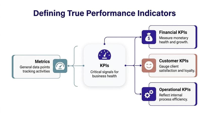
2 Defining the 3 Types of True Performance Indicators
Most confusion starts here. People use metric and KPI as if they mean the same thing. They don’t.
A metric is any measurable value. A KPI is a metric that is important enough to track against a meaningful business objective.
Think about a car dashboard. Your speed is a metric. Useful, yes. But if your goal is reaching a destination on time, then estimated arrival, fuel remaining, and engine warnings become more like KPIs because they affect the outcome you care about.
Type 1 Leading indicators
Leading indicators tell you what may happen next.
Examples include:
- Sales demos booked
- Website traffic trends
- Marketing qualified leads
- Average sales cycle activity in progress
These don’t confirm success yet. They give you an early read on whether future results are likely to improve or weaken.
If a sales team books more demos this month, that doesn’t guarantee revenue. But it does suggest future pipeline movement.
Type 2 Lagging indicators
Lagging indicators tell you what already happened.
Common examples include:
- Annual revenue
- Customer churn rate
- Final project completion rates
- Net profit generated
These are essential because they confirm outcomes. But they arrive late. If churn spikes, the damage has already happened.
The useful mental model is simple. Leading indicators are your windshield. Lagging indicators are your rearview mirror.
You need both views to drive well.
Type 3 Strategic indicators
A third group sits above team activity. These are strategic indicators. They reflect overall business direction.
Examples include:
- Return on investment
- Market share
- Revenue growth rate
- Gross profit margin
Executives monitor 1-2 strategic KPIs and several operational ones, and KPI practice became more formal with frameworks like the Balanced Scorecard (1992), which combined financial and non-financial measurement (KPI.org basics).
Why balance matters
The strongest KPI systems mix prediction and confirmation. Leading indicators predict future performance based on current activities, while lagging indicators measure historical outcomes. Research demonstrates that organizations tracking both indicator types simultaneously achieve 40% better alignment between operational execution and strategic objectives (Splunk on KPIs).
In Excel terms, that means don’t build a dashboard with only final outcomes. Add the upstream measures that influence them.
3 Using the SMART Framework to Select Your 5 Most Powerful KPIs
Most bad dashboards don’t fail because the formulas are wrong. They fail because the team tracks too many things.
I’ve seen analysts monitor every available field just because the data existed. That creates a noisy report and weak decisions. A tighter shortlist works better. If you want a broader mindset for this, this piece on data-driven decision-making is useful because KPI selection is really decision design.
Why fewer KPIs work better
Strategic plans with fewer than 20 total elements, ideally nine core KPIs, demonstrate measurably superior performance outcomes. Each additional metric beyond the essential nine creates decision paralysis and dilutes management attention (ClearPoint Strategy).
For many teams, I'd recommend starting with 5. That forces discipline.
Use SMART as a filter
Take any candidate KPI and pressure-test it with SMART.
Specific
The KPI should point to one clear outcome.
Bad example: “Improve sales”
Better example: “Lead conversion rate”
If the wording is vague, nobody will know what to change.
Measurable
You need a stable formula and a consistent data source.
In Excel, that means defining the numerator, denominator, and date window before building the chart. If one manager calculates churn one way and finance calculates it another way, the KPI becomes untrustworthy.
Achievable
A KPI should stretch the team without becoming fantasy.
This doesn’t mean “easy.” It means the team can influence it through real work.
Relevant
This stage removes vanity metrics.
A number can be interesting without being useful. Social followers, report views, or workbook downloads might matter in some contexts. But if they don’t tie to a real goal, they don’t belong on the main KPI page.
Time-bound
Every KPI needs a review window.
Monthly, quarterly, weekly. Pick one. Otherwise the number floats without a clear cadence.
A quick KPI checklist
Before you add a KPI to your dashboard, ask:
- Does it map to one business objective?
- Can the team influence it directly?
- Will a change in this number trigger action?
- Can we define it the same way every time?
- Does it belong in the main view, or just a supporting report?
If a metric is interesting but not actionable, move it to analysis notes, not the KPI panel.
Example of turning a weak KPI into a strong one
Suppose marketing tracks “website traffic.”
That’s too broad by itself. A stronger version might be “website traffic trends tied to content downloads” if the primary goal is generating qualified demand. Same data family, much better business meaning.
That’s the discipline behind understanding key performance indicators. You are not collecting numbers. You are choosing levers.
4 Finding Your KPIs with 15 Real-World Examples
A junior analyst often asks for a master KPI list. The instinct makes sense. If the right numbers already exist somewhere, why not copy them into Excel and start reporting?
Because KPI selection works more like choosing dashboard gauges for a vehicle than filling a shopping list. A sales manager, a marketing lead, and an HR partner are all trying to steer different parts of the business. They need signals that match the decisions they own.
Since teams adopted frameworks such as the Balanced Scorecard, KPI sets have become broader. Financial results still matter, but so do operational, customer, and people signals. The useful question is not "What do other companies track?" It is "What question must this team answer every week or month?"
Use the examples below as starting patterns. Then define each one carefully in Excel, assign an owner, and decide whether ElyxAI should pull and refresh the data automatically instead of leaving someone to update it by hand.
| Department | KPI Name | What It Measures |
|---|---|---|
| Sales | Number of contracts signed per quarter | Closed deals over a quarter |
| Sales | Dollar value of new contracts | Value of new business won |
| Sales | Average sales cycle | How long deals take to close |
| Sales | Lead conversion rate | How efficiently leads become customers |
| Marketing | Cost per acquisition | Cost to acquire a customer |
| Marketing | Website traffic trends | Direction of demand and audience interest |
| Marketing | Marketing qualified leads | Leads showing strong buying interest |
| Marketing | Engagement rates | Audience interaction with content |
| Finance | Annual revenue | Total revenue over a year |
| Finance | Gross profit margin | Profitability after direct costs |
| Finance | Return on investment | Return compared with cost |
| Finance | Net profit generated | Bottom-line financial result |
| Operations | Sales by region | Performance differences across territories |
| Operations | Customer churn rate | Share of customers lost in a period |
| HR | Employee turnover rate | How often employees leave |
Match the KPI to the decision
A KPI earns its place when it helps someone choose an action.
That is the practical filter junior teams often miss. They collect numbers first and ask business questions later. Strong KPI design reverses that order.
Sales
Sales KPIs usually support three kinds of decisions.
- Do we have enough pipeline?
- Are deals progressing at a healthy speed?
- Are we winning business with enough value?
For example, number of contracts signed per quarter shows outcome. Average sales cycle shows process health. If contract count looks stable but cycle length keeps rising, the sales manager knows where to investigate. In Excel, those two measures often sit side by side in a monthly review sheet. With ElyxAI, the CRM export and refresh can happen automatically, which reduces version-control problems and missed updates.
Marketing
Marketing KPIs need a chain of logic. Attention alone is not enough. Business impact alone can arrive too late to diagnose what changed.
- Website traffic trends show whether interest is growing or shrinking.
- Marketing qualified leads show whether that interest is turning into likely pipeline.
- Cost per acquisition shows efficiency.
- Engagement rates add context for content and channel performance.
That sequence matters. Traffic is the top of the funnel. Qualified leads sit further down. Cost per acquisition tests whether the program is economically sensible. Teams building campaign dashboards may also find Mastering Learning and Development Metrics useful as a cross-functional example of linking activity metrics to business outcomes.
Finance
Finance KPIs answer the question every leadership team eventually asks. Did the business create value, and at what quality?
Annual revenue and net profit generated confirm results. Gross profit margin shows whether revenue is healthy revenue. Return on investment helps compare the payoff from spending choices. Two business units can report similar top-line growth and still produce very different outcomes if one protects margin and uses capital more carefully.
Operations and HR
Operations and HR KPIs often reveal the causes behind later financial results.
Sales by region can expose uneven execution, territory imbalance, or local market issues. Customer churn rate highlights retention pressure before it appears as a revenue problem. Employee turnover rate can point to workload, manager quality, or process strain. If those measures live in separate files maintained by different teams, Excel quickly becomes a patchwork of manual exports. ElyxAI helps by pulling source data into one repeatable workflow so the KPI review starts with analysis, not data cleanup.
A short KPI list usually beats a crowded one. If a manager can explain why each metric exists, how it is calculated, and what action it should trigger, the list is probably strong.
5 How to Set Targets and Benchmark Your KPIs
A KPI without a target is just a labeled number.
If your dashboard says lead conversion rate is 12 percent, the obvious next question is: good compared to what? That’s why target setting matters. It turns observation into judgment.
Three useful benchmark types
Internal benchmarks
This is the cleanest starting point. Compare current performance against your own past results.
Examples:
- This quarter versus last quarter
- This month versus the same month last year
- Current churn trend versus the prior rolling average
Internal benchmarking is the most practical option because you already trust the definitions and the data source.
Competitive benchmarks
This compares your KPI against direct rivals.
Use this carefully. Definitions differ across companies, and public data is often incomplete. Still, it can help when leadership wants outside context.
Functional benchmarks
This compares your process to strong performers in any industry, not just your own.
A finance team may benchmark reporting turnaround against best-in-class operations teams elsewhere. An HR team may study frameworks used in training analytics. If you work on employee capability reporting, Mastering Learning and Development Metrics offers a practical example of how teams connect people metrics to business outcomes.
Don’t mistake noise for change
One of the easiest reporting mistakes in Excel is overreacting to normal variation.
Effective KPI use requires at least eight data points to detect small changes and three for big shifts outside normal variability, per XmR chart theory (ThoughtSpot on KPIs).
You need enough observations to tell the difference between a signal and a wobble, as one bad week rarely indicates a broken process.
A simple Excel habit that helps
Build a trend table before you build a target chart.
Include:
- Date period
- Actual value
- Target value
- Variance
- Comment
For variance, use a basic formula like:
=Actual-Target
If actual is in cell B2 and target is in C2:
=B2-C2
This returns the gap. Positive or negative depends on the KPI, so label the interpretation clearly.
Then add a variance percentage if the target is nonzero:
=(B2-C2)/C2
Format that cell as a percentage. This helps managers see not only whether they missed target, but by how much relative to the goal.
6 The 4 Keys to Monitoring KPIs in Excel
A junior analyst opens the monthly workbook on Monday morning. One tab holds raw exports, another has last month’s pivot table, a third contains a chart that no longer matches the source data, and the leadership review starts in two hours. The KPI problem is no longer choosing a metric. It is building a monitoring system people can trust.
Excel can do this well if you treat it like a control room, not a storage closet. A good KPI workbook helps a manager answer four questions fast: What are we watching, how often do we check it, where are we off target, and what needs attention now?
1 Centralize the view
Start with one place to read performance.
Your raw data can live in separate tables, but the decision view should live on a single dashboard sheet with controlled references. That setup works like an aircraft instrument panel. The engine, fuel system, and navigation tools are separate underneath, but the pilot reads one panel.
In practice, that means:
- Store raw inputs in Excel Tables with stable column names
- Keep calculations in a staging area, not mixed into the dashboard
- Pull KPI outputs into one summary page for review
- Label each metric clearly so no one has to guess the formula or business definition
Once the team has one agreed view, review meetings shift from “which number is right?” to “what should we do about it?”
2 Set a reporting cadence
KPIs need a rhythm that matches how the process behaves.
A daily support backlog may need daily checks. Revenue per account may make more sense weekly or monthly. If the review cadence is too slow, problems sit unnoticed. If it is too fast, the team chases normal fluctuation.
A simple rule helps. Review each KPI at the pace where a decision is still possible. If a weekly check lets the team reassign staff, adjust campaign spend, or fix a workflow before the month closes, weekly is useful. If nothing can change until quarter-end, monthly noise adds little value.
Document that cadence inside the workbook. Add a small field beside each KPI for update frequency, owner, and last refresh date. That removes ambiguity, especially when several analysts touch the same file.
3 Analyze variance, not just values
A KPI without comparison is only a number.
Executives rarely care that sales were $420,000 or that churn was 3.8% in isolation. They care whether the result beat target, improved from last period, or underperformed a comparable segment. Variance gives the number meaning.
Your Excel view should make room for at least three comparisons:
- Actual versus target
- Current period versus previous period
- Segment versus segment
- Leading indicator versus final outcome
That last comparison matters more than it gets credit for. If qualified leads are falling now, closed revenue may fall later. Monitoring both in one sheet helps analysts explain cause before the lagging KPI drops.
A strong dashboard answers “what changed?” before the meeting begins.
4 Add alerts and exceptions
People do not need to scan every row every time. They need the workbook to point at the few items that deserve attention.
Excel already gives you the building blocks:
- Conditional formatting for missed targets or out-of-range values
- Icon sets for direction of change
- FILTER views to isolate exceptions
- Pivot tables to check which product, region, or manager is driving the shift
Design matters here. If everything is highlighted, nothing stands out. Use alerts sparingly and reserve color for true exceptions. If you want a cleaner visual structure before building the final workbook, these dashboard design best practices can help.
Where manual KPI monitoring starts to fail
The weak point is usually not the formula. It is the repeated human effort around the formula.
Analysts refresh exports, repair broken pivots, reapply chart formatting, and reconcile slightly different KPI definitions across departments. After a few reporting cycles, the workbook becomes harder to maintain than to build. The same pattern appears in training analytics, where teams trying to track learner progress often spend more time cleaning updates than interpreting performance.
This is also why teams start looking beyond hand-built spreadsheet routines toward workflow automation in Excel. An AI agent such as ElyxAI can handle the repetitive parts of KPI tracking, including data preparation, dashboard updates, and recurring reporting steps, while the analyst stays focused on interpretation and decision support.
7 Automating Your KPI Workflow in 3 Steps with ElyxAI
At some point, the question stops being “How do I define KPIs?” and becomes “How do I maintain this without rebuilding it every week?”
That’s where automation inside Excel becomes useful.

Step 1 Prepare the workbook structure
Keep your raw data in a clean table with stable headers.
Typical fields might include:
- Date
- Region
- Sales amount
- Lead status
- Customer status
- Cost category
You don’t need a perfect dashboard first. You need a usable dataset.
Step 2 Describe the output in plain language
Instead of manually creating every object, use a workflow automation approach inside Excel. If you’re new to the concept, this overview of workflow automation gives the right mental model.
A natural-language request could look like this:
“Using the sales data, create a KPI dashboard showing total sales, average deal size, and lead conversion rate by month. Include a trend line chart for each and format in our company colors.”
That kind of request is where ElyxAI, an AI-powered Excel add-in, fits. It can execute multi-step spreadsheet work from one prompt, including cleaning data, creating pivot tables, generating charts, and formatting the report inside Excel.
Step 3 Review and refine
No automation should end with blind trust.
Check three things:
- Definitions are correct
- Date filters reflect the intended period
- Visuals support quick decisions
You can then request adjustments in normal language, such as changing a chart type, adding a regional breakdown, or highlighting target variance.
That’s the practical end state of understanding key performance indicators. You choose a small set of meaningful signals, define them clearly, monitor them consistently, and remove as much reporting friction as possible.
If you spend too much time cleaning exports, updating pivots, and rebuilding KPI dashboards by hand, Elyx AI gives you a more direct way to work inside Excel. You describe the report you want in plain language, and the add-in executes the workflow in the spreadsheet so you can focus on analysis instead of spreadsheet mechanics.
Reading Excel tutorials to save time?
What if an AI did the work for you?
Describe what you need, Elyx executes it in Excel.
Sign up