What Is Exploratory Data Analysis? A 7-Step Guide for Excel Users

Let's get straight to it. Think of Exploratory Data Analysis (EDA) as your first conversation with a new dataset. Before you jump to conclusions or build complicated models in Excel, you need to get to know your data—what its quirks are, where the interesting stories might be hiding, and if there are any red flags. It’s like being a detective, sifting through the initial evidence to understand the scene, all within your spreadsheet.
The 4 Primary Goals Of Exploratory Data Analysis in Excel

Jumping into formal analysis without first exploring your data is like trying to build a house on a foundation you haven't inspected. You’re taking a huge risk. EDA is that crucial inspection phase where you simply look, poke, and prod to understand the main characteristics of your data, usually with the help of charts and basic Excel formulas.
Spending too much time on Excel?
Elyx AI generates your formulas and automates your tasks in seconds.
Sign up →The whole idea isn't to prove a theory you already have. Instead, it’s about letting the data speak for itself and tell you what’s interesting.
This concept was really brought to life by the statistician John Tukey back in the 1970s. He argued that we should spend more time exploring our data with an open mind rather than just trying to confirm preconceived ideas. His 1977 book on the topic was a game-changer and has been referenced in over 10,000 academic papers since. It fundamentally shifted how we approach data.
Uncovering The Story In Your Data
So, what are we actually trying to accomplish with EDA? The main point is to develop a solid, intuitive feel for your dataset. This groundwork helps you avoid making poor business decisions based on flawed or misunderstood information.
The greatest value of a picture is when it forces us to notice what we never expected to see. – John W. Tukey
EDA isn't a single action but a mindset focused on four key objectives. Getting these right sets the stage for everything that follows.
This table breaks down the main goals of any good data exploration.
The 4 Main Goals of Exploratory Data Analysis
| Goal | Description | Example Question Answered in Excel |
|---|---|---|
| Spot Mistakes & Anomalies | Finding outliers, typos, or other strange data points that could throw off your analysis. | Is there a sale recorded for $1,000,000 when most are under $100? |
| Understand Data Structure | Getting a feel for the variables, their data types (text, numbers, etc.), and the overall shape of the data. | How many rows and columns are there? Are the dates formatted correctly? |
| Identify Important Variables | Figuring out which factors seem to have the biggest impact on the outcomes you care about. | Does customer age seem to have a strong relationship with purchase size? |
| Formulate Initial Hypotheses | Seeing patterns or relationships that lead to educated guesses you can test more formally later. | It looks like sales spike on weekends. Is that a consistent trend? |
Nailing these four goals ensures your final analysis is built on a solid understanding of the data's reality.
For anyone serious about building these skills, looking into a formal program to become a Certified Data Analytics Professional can be a great way to deepen your expertise.
Ultimately, a good EDA process saves you from chasing dead ends or analyzing garbage data. And thankfully, modern tools make this easier than ever. You can even find AI-powered tools to speed up the process right inside your spreadsheet software. Check out how you can use AI to make your Excel workflows faster at https://getelyxai.com/en/excel-ai.
7 Core EDA Techniques You Can Perform In Excel
Okay, let's move from theory to action. This is where the real value of exploratory data analysis comes to life. We're going to walk through seven foundational EDA techniques you can do right inside Microsoft Excel. Don't worry, you don't need a Ph.D. in statistics; think of each method as a different lens for looking at your data, helping you build a complete picture.
1. Uncovering Key Insights With Summary Statistics
Before you even think about making a chart, your first move should always be calculating summary statistics. These are like the vital signs of your dataset—a few key numbers that tell you a lot about the whole. They give you a quick, high-level sense of your data's personality.
Excel makes this ridiculously easy. Let’s say you have a column of sales figures in cells B2:B101. You can get an instant feel for the data with just a few formulas:
=AVERAGE(B2:B101): This gives you the mean, or the simple average. It's a great starting point for understanding the typical sale value.=MEDIAN(B2:B101): This finds the median, which is the true middle value if you lined up all your sales from smallest to largest. Unlike the average, the median isn't easily fooled by a few giant or tiny sales.=STDEV.P(B2:B101): This calculates the standard deviation, a fancy term for how spread out your data is. A small number means your sales are pretty consistent, while a large number signals a lot of variation.
These three numbers work together to tell a story. For instance, if your average is way higher than your median, that's a huge red flag that a few massive sales are skewing the big picture.
2. Understanding Data Shapes With Histograms
Summary stats are a great first step, but they don't show you the shape of your data. For that, you need a histogram. It’s just a special type of bar chart that groups your numbers into ranges (or "bins") and shows you how many data points fall into each one.
A histogram instantly answers questions like: Do we have a ton of small sales and only a few big ones? Are things pretty evenly spread out? Creating one in Excel is simple: just select your data, head to the Insert tab, click the Statistic Chart icon, and pick Histogram. It’s the fastest way to see the peaks and valleys in your data’s landscape.
3. Spotting Anomalies With Box Plots
Another fantastic visual tool is the box plot, sometimes called a box-and-whisker plot. This compact little chart shows you the five most important numbers in your dataset: the minimum, the maximum, the median, and the 25th and 75th percentiles.
A box plot's real superpower is spotting outliers—data points that are way off from everything else. These weirdos show up as little dots floating beyond the "whiskers" of the plot, making them impossible to miss.
To make one, just highlight your numbers, go to Insert > Statistic Chart, and choose Box and Whisker. It's an incredibly efficient way to see your data's range and flag any potential errors or interesting anomalies that deserve a closer look.
4. Finding And Handling Missing Values
Let's be honest: real-world data is messy. It's almost always incomplete. Missing values can seriously mess up your analysis and lead you to the wrong conclusions, so dealing with them is a non-negotiable step.
First, you have to find them. The =COUNTBLANK() function is your best friend here. If your dataset covers the range A1 to D100, just pop =COUNTBLANK(A1:D100) into a cell to see how many empty cells you're dealing with.
Once you know they're there, you can use Excel's Filter tool to isolate them:
- Select your entire table.
- Go to the Data tab and click the Filter button.
- Click the little dropdown arrow in a column header.
- Uncheck "(Select All)" and scroll down to check the box for "(Blanks)".
This nifty trick hides everything except the rows with missing data in that column. Now you can decide what to do: delete the rows, fill them in with a sensible default, or figure out why the data is missing in the first place.
5. Measuring Relationships With Correlation Analysis
So far, we've looked at one variable at a time. But the real magic happens when you see how variables interact with each other. Correlation analysis does exactly that—it measures the strength and direction of the relationship between two different sets of numbers.
Excel’s =CORREL() function calculates the correlation coefficient, which is always a number between -1 and +1.
=CORREL(array1, array2): This formula takes two ranges of data and calculates their correlation.
Here's how to interpret the result:
- A number close to +1 means you have a strong positive relationship (when one goes up, the other tends to go up).
- A number close to -1 points to a strong negative relationship (when one goes up, the other goes down).
- A number near 0 means there's pretty much no connection.
For example, want to see if your ad spending (column C) is related to your sales (column D)? Use the formula =CORREL(C2:C101, D2:D101). To really bring this to life, create a scatter plot by selecting both columns and choosing Insert > Scatter. The pattern of the dots will give you an immediate visual feel for the relationship. If you want to really master this kind of spreadsheet work, an official Diploma in Excel course can be a great investment.
6. Validating Your Data Integrity
This technique is less about fancy formulas and more about good old-fashioned common sense. Data integrity is all about making sure your data is accurate and consistent to avoid the classic "garbage in, garbage out" problem. It's a manual check, but it's absolutely crucial.
Here are a few simple checks to run in Excel:
- Hunt for Duplicates: Use Conditional Formatting > Highlight Cell Rules > Duplicate Values to instantly light up any repeated entries.
- Check Data Types: Make sure a column that's supposed to have numbers doesn't have text mixed in. Are all the dates in the same format?
- Look for Sensible Ranges: Do the values make sense? A column of percentages shouldn't have numbers over 100, and an age column shouldn't have negative values.
7. Telling A Story With Data Visualization
Finally, the most powerful technique is turning your analysis into a compelling story with visuals. While histograms and scatter plots are great for your own exploration, other charts are better for showing your findings to others. Excel is packed with options:
- Bar Charts: The workhorse for comparing different categories, like sales per region.
- Line Graphs: Perfect for showing how things change over time, like monthly revenue.
- PivotCharts: These are dynamic charts linked to a PivotTable. They let you (or your audience) slice and dice the data interactively to explore it from different angles without touching the original dataset.
Each chart helps you communicate a specific part of your data's narrative, turning a boring spreadsheet into a clear and convincing story. To get even better at this, you can learn more about specific Excel formulas for data analysis in our other guides.
A 5-Step Workflow for Conducting EDA on Any Dataset
Knowing the individual techniques for EDA is one thing, but having a systematic plan is what separates a decent analysis from a truly great one. A structured workflow is your roadmap—it keeps you from getting lost in the weeds and ensures you cover all the important ground. Think of it as your pre-flight checklist before taking off on any major analytical journey.
This repeatable 5-step process works for virtually any new dataset, turning what could be a chaotic dive into an efficient and insightful exploration. By following these steps, you build a comprehensive understanding layer by layer, making sure no critical insight slips through the cracks.
This visual guide breaks down the core components of a solid EDA process, showing the natural flow from basic stats to cleaning and visualization.
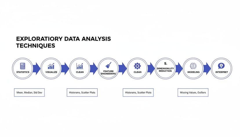
The flowchart shows how a good analysis is built on a sequence of statistics, visualization, and data cleaning. Each step plays a vital role in revealing the story hidden in your data.
1. The Initial Data Health Check
Before you even think about calculating an average or plotting a chart, your first move should be a quick, high-level check of your dataset's basic health. This isn't about deep analysis; it’s about understanding the raw materials you're working with.
In Excel, this means getting quick answers to a few simple but critical questions:
- Dimensions: How many rows and columns are you dealing with? A quick glance at the bottom-right of your Excel window after highlighting the data gives you an instant count.
- Data Types: Are the columns formatted correctly? A column of dates should be a "date" type, not "text." A column for revenue needs to be a number, not just general text.
- Completeness: Are there obvious large gaps or missing values? The
=COUNTBLANK()function is your best friend here for a quick assessment.
2. The Single-Variable Deep Dive
Once you’ve got the lay of the land, it’s time to zoom in and look at each variable one by one. We call this univariate analysis, and its whole purpose is to understand the distribution and characteristics of each column on its own.
For every key variable, you’ll want to do two things:
- Calculate Summary Statistics: Use Excel functions like
=AVERAGE(),=MEDIAN(),=MIN(),=MAX(), and=STDEV.P()to get a numerical snapshot. - Visualize the Distribution: A histogram is perfect for seeing the "shape" of your numerical data. For text data, a simple bar chart is great for seeing the frequency of different categories.
This is often where you'll spot your first interesting insights, like a surprisingly high average or one category that shows up way more often than you expected.
3. Two-Variable Relationship Mapping
With a solid feel for each variable, you can now start exploring how they interact with each other. This is bivariate analysis, and it’s where you begin to uncover relationships, correlations, and potential clues about what causes what.
The goal is to see if a change in one variable seems to correspond with a change in another. For example, does an increase in marketing spend line up with a rise in sales? In Excel, you can use scatter plots to visualize the relationship between two numerical variables and the =CORREL() function to put a number on its strength.
This stage is where you really start forming hypotheses. Finding a strong relationship doesn't prove one thing causes another, but it gives you a powerful lead to investigate further.
4. Investigating Outliers and Anomalies
As you dig into your variables, you'll almost certainly spot data points that just don't fit the pattern. These outliers, or anomalies, can be some of the most valuable clues in your entire dataset. They might be simple data entry errors, but they could also represent unique events that demand a closer look.
Don't just delete them. Investigate them. Use Excel's filter to isolate these odd data points and examine the entire row. Ask why that specific entry is so different. Is there a logical explanation, or does it point to a data quality issue that needs to be fixed? Taking the time for effective AI data cleaning can make this process much faster and more reliable.
5. Documenting Your Key Findings
This last step is the most important: summarizing what you've learned. EDA is useless if you forget all the insights a week later. As you work through the first four steps, keep a running list of your key observations, questions, and ideas.
Your final summary should include:
- A brief overview of the data quality and any cleaning you performed.
- The most important patterns or distributions you uncovered.
- Any significant relationships or correlations you identified.
- A list of questions or hypotheses to explore in a more formal analysis later on.
This documentation becomes the foundation for all your future modeling and reporting. It ensures your work is built on a solid, well-understood base.
How AI Can Tackle Your 4 Toughest EDA Tasks In Excel
Let's be honest—the most critical parts of exploratory data analysis are often the most tedious. Manually cleaning your data, wrestling with formulas to get basic stats, and figuring out the right chart in Excel takes a lot of patience and a keen eye for detail. This is where AI steps in, not as a replacement, but as a seriously powerful assistant. It automates the grunt work, freeing you up to focus on what really matters: interpreting the story your data is trying to tell.

Tools like ElyxAI work right inside your spreadsheet, turning what used to be a multi-step headache into a single, simple command. A task that could easily eat up 30 minutes of your day can now be done in about 30 seconds.
Here’s a look at how AI helps you power through four of the biggest EDA roadblocks.
1. Automated Data Cleaning
Anyone who works with data knows that cleaning it can feel like 80% of the job. It's the endless hunt for duplicates, the mind-numbing task of filling in missing values, and the frustration of correcting inconsistent formatting. Manually, you're juggling conditional formatting, filters, and functions like TRIM() or PROPER(). It’s a chore.
With an AI agent, you just tell it what to do in plain English. For example: “Find and remove all duplicate rows using the ‘Order ID’ column, fill any blanks in the ‘Region’ column with ‘Unknown,’ and fix the capitalization in the ‘Product’ column.” The AI just does it. Instantly. This saves a huge amount of time and cuts down on the risk of human error.
2. Instant Statistical Summaries
Getting a quick statistical overview is fundamental to EDA, but calculating everything for multiple variables is repetitive. You find yourself writing the same formulas—=AVERAGE(), =MEDIAN(), =STDEV.P()—over and over again for each column you need to check.
An AI tool completely changes this workflow. You can just ask for a full summary of your data, and it will generate a neat table with all the key metrics for every important column, all at once.
You could type something as simple as: "Give me a statistical summary for the 'Sales', 'Quantity', and 'Profit' columns." In seconds, you’ll get the mean, median, standard deviation, min, and max for each one. No formulas required.
This gives you a solid starting point for where to dig deeper. If you're curious about this process, you can find more in our guide on AI data analysis.
3. Smart Chart Recommendations
Choosing the right chart is everything. A good visualization can make a complex insight immediately obvious, but Excel’s long list of options can be overwhelming. Knowing when to use a histogram for distribution, a scatter plot for correlation, or a bar chart for comparison usually comes from experience.
AI takes the guesswork out of the equation. Instead of highlighting data and clicking through menus, you just state your goal. You might ask, "Show me the relationship between ad spend and revenue," and the AI will know that a scatter plot is the best tool for the job and create it for you. This doesn't just save time; it helps you follow data visualization best practices without having to second-guess yourself.
4. Proactive Trend And Outlier Detection
Finding strange patterns or outliers is often where the most valuable insights are hiding. But in a massive spreadsheet, these needles in the haystack are incredibly easy to miss. Sure, you can build box plots or set up conditional formatting rules, but you still have to know what you're looking for.
An AI agent, on the other hand, can be proactive. It actively scans your data and flags anomalies you might not have even thought to look for. It could point out that sales on one Tuesday were 300% higher than the monthly average or that a specific product has a return rate that is way off the charts. This lets you spend less time hunting for clues and more time investigating the important findings the AI brings right to your attention.
The time difference between manual work and an AI-assisted workflow is staggering. Here's a quick comparison of what it looks like in practice.
Manual EDA In Excel vs AI-Powered EDA With ElyxAI
| EDA Task | Manual Excel Process (Time & Steps) | ElyxAI Process (Time & Steps) |
|---|---|---|
| Data Cleaning | 15-30 mins. – Use Find Duplicates tool.– Write IF/ISBLANK formulas.– Apply TRIM, PROPER functions.– Filter for inconsistencies. |
<1 min. – Type one plain-English command to clean the entire dataset. |
| Statistical Summary | 5-10 mins. – Write =AVERAGE(), =MEDIAN(), etc. for each column.– Copy and paste formulas. – Organize into a table. |
<30 secs. – Ask: "Give me a summary of sales and profit." – AI generates the complete table. |
| Chart Creation | 2-5 mins. – Select data range. – Go to Insert > Charts.– Choose chart type. – Format axes and titles. |
<30 secs. – Ask: "Plot revenue vs. ad spend." – AI creates the correct chart automatically. |
| Outlier Detection | 10-20 mins. – Create a box plot or scatter plot. – Apply conditional formatting rules. – Manually sort and scan for extreme values. |
1-2 mins. – Ask: "Find outliers in my sales data." – AI highlights unusual data points. |
As you can see, using an AI agent like ElyxAI doesn't just shave off a few minutes—it can reduce hours of tedious manual work to mere seconds, letting you get to valuable insights faster than ever before.
3 Common Mistakes To Avoid During Your Analysis
Knowing the right techniques is one thing, but even experienced analysts can fall into common traps that derail their work. Staying aware of these pitfalls is the key to making sure your findings are sound, insightful, and truly reliable.
Let's walk through three of the most common mistakes I see people make and, more importantly, how you can avoid them.
1. Falling for Confirmation Bias
We’re all human, and we have a natural tendency to look for, interpret, and remember information that confirms what we already think. This is confirmation bias, and in data analysis, it’s a killer. It’s like a detective deciding who the culprit is before even visiting the crime scene.
Imagine a marketing manager who is convinced their latest campaign was a smash hit. When they dive into the data, they might focus only on the impressive spike in website traffic. But they could conveniently ignore the fact that the bounce rate also skyrocketed and conversion rates didn't budge. They found evidence for the story they wanted to tell, not the whole story.
How to avoid it: Go in with an open mind. Instead of trying to prove yourself right, make a genuine effort to prove yourself wrong. Actively hunt for data points that challenge your initial gut feeling. This is how you force yourself to see the complete picture, not just the convenient parts.
2. Ignoring Poor Data Quality
You've heard it a million times: "garbage in, garbage out." It’s a cliché for a reason—it’s 100% true. The most advanced analysis in the world won't save you if your source data is a mess. Rushing into your analysis without first cleaning and validating your dataset is a recipe for disaster.
Think about a sales team trying to forecast next quarter's numbers using a dataset filled with duplicate entries and gaping holes where customer data should be. Their projections will be worthless, potentially leading to bad inventory decisions and missed revenue targets. If you find yourself hitting these walls often, you can find solutions for many common Excel errors in our comprehensive guide.
Here’s a quick checklist to keep your data clean:
- Hunt for duplicates: They can seriously inflate your numbers and skew your averages.
- Investigate missing values: Don't just delete rows. Figure out why the data is missing. Is it a system error? A user issue? The "why" often tells a story.
- Validate data types: Make sure your numbers are formatted as numbers and dates as dates. Simple mistakes here can cause all sorts of calculation headaches.
3. Over-Interpreting Small Patterns
It's tempting to get excited when you spot what looks like a new trend. But hold on—is it a real, meaningful pattern or just random noise? A tiny, one-off spike in sales doesn’t automatically signal a new market trend. It could just be a blip.
For example, an online store sees a 10% sales bump for a specific product on a Tuesday and immediately decides to triple its inventory. If that spike was just a random fluctuation and not the start of a genuine trend, they’re now stuck with a warehouse full of products they can't sell.
To avoid this, always look for more evidence. Does the pattern hold up over a longer time frame? Does it pop up in other related datasets? Use your summary stats and charts to see the big picture. This disciplined approach ensures you’re making decisions based on solid ground, not statistical mirages.
3 Common Questions About EDA in Excel
When you're just getting your feet wet with exploratory data analysis, it's normal for a few questions to pop up. It can feel a little abstract at first. Let's walk through some of the most common ones to give you a clearer picture.
1. Exploratory vs. Confirmatory Analysis: What's the Difference?
This is a classic point of confusion. The easiest way to think about it is to compare a detective gathering clues to a lawyer presenting a case in court.
Exploratory Analysis (The Detective): This is the discovery phase. You're sifting through the evidence (your data) with an open mind, looking for patterns, oddities, and interesting leads. You aren't trying to prove anything yet; you're just trying to figure out what's going on. You're asking, "What story is this data trying to tell me?"
Confirmatory Analysis (The Lawyer): This happens after you have a specific theory. You’ve already gathered your clues and formed a hypothesis. Now, you’re using formal statistical tests to prove your case beyond a reasonable doubt. The goal is to answer a specific question like, "Did our new marketing campaign actually increase sales?"
In a nutshell, EDA is about generating a hypothesis, while CDA is about testing one. You explore first to find the right questions, then you confirm the answers with more formal methods.
2. How Much Time Should I Really Spend On EDA?
This is a fantastic question, and the honest answer is: it depends, but probably more time than you think.
A good rule of thumb is that EDA can easily take up 30% to 70% of your total project time. That might sound like a lot, but this upfront work saves you from massive headaches down the road.
Think of it like reading the instructions before building IKEA furniture. Rushing ahead might feel faster, but you'll likely miss a key step and have to take the whole thing apart later. A thorough EDA ensures your final analysis is built on a solid foundation of clean, reliable data. It's your best defense against drawing the wrong conclusions from messy or misunderstood information.
3. Can I Do EDA Without Advanced Statistical Knowledge?
Absolutely. While a deep understanding of statistics is crucial for complex modeling, the heart of EDA is accessible to everyone, especially with a tool as familiar as Excel. You don't need a Ph.D. to spot a trend in a chart.
The core techniques are built on simple concepts and intuitive visuals that anyone can handle:
- Summary Stats: Functions like
AVERAGE,MEDIAN, andMAXare pretty straightforward. - Visuals: Creating a histogram or scatter plot is just a few clicks away on Excel’s "Insert" tab.
- Data Cleaning: Excel has simple, built-in tools for finding duplicates or filtering blank cells.
And today, AI tools make it even simpler. With an assistant like ElyxAI, you don’t even have to remember the formulas. You can just ask a question in plain English, like, "Show me the outliers in my sales data," and the AI does the legwork. This frees you up to focus on what really matters: understanding your business, not wrestling with software.
Ready to stop wrestling with manual Excel tasks and let AI do the heavy lifting? ElyxAI is an autonomous agent that handles everything from data cleaning to chart creation with simple text commands. Start your free 7-day trial and see how much time you can save.
Reading Excel tutorials to save time?
What if an AI did the work for you?
Describe what you need, Elyx executes it in Excel.
Sign up