7 Management Reports Samples to Use in 2026

At 11:12 a.m., someone asks for a clean sales summary before noon. The numbers exist, but they are scattered across Excel files, CRM exports, accounting downloads, and a shared folder full of renamed versions. The actual work is not pulling data. It is turning it into a report that leadership can read in minutes and trust enough to act on.
I have seen the same reporting loop in finance and operations teams for years. Someone copies last month's workbook, patches formulas, updates charts, fixes broken references, and calls it done. The report goes out, but half the effort went into rebuilding the package instead of explaining what changed, why it changed, and what needs attention.
Good management reports solve that problem with structure. They put the headline first, keep KPIs visible, show actual versus target, and highlight exceptions before the reader has to ask. If the financial section is part of your pack, a quick refresher on how profit and loss statements are structured and read helps keep the summary tight and the commentary useful.
Spending too much time on Excel?
Elyx AI generates your formulas and automates your tasks in seconds.
Sign up →This guide takes a more practical angle than a gallery of static screenshots. Each report type comes with an Excel template you can download, adapt, and use. Then we go one step further and show how to build, customize, and automate the same reports inside Excel with natural-language prompts using an AI agent like ElyxAI.
The seven samples below are the report formats I see used most often in real operating reviews. They are built for speed, consistency, and easier maintenance, especially when reporting needs to happen every week or every month without another manual rebuild.
1. Financial Performance Report (with ElyxAI)
Monday morning, the CFO wants three answers before the operating review starts. Are we on plan. Where did margin move. What needs action this month. A financial performance report earns its place because it answers those questions fast, without forcing anyone to dig through a full set of statements.
The best version in Excel does more than restate the P&L. It gives leadership a compact read on revenue, gross margin, operating cost, cash position, and the few variances that warrant explanation. Strong management report examples are organized for quick scanning and drill-down, and the finance section should follow that same logic.
What to include in Excel
I usually build this report with four sheets, even for smaller teams. The structure keeps the file maintainable once monthly reporting starts to pile up.
- Raw data sheet: Trial balance, budget, prior period actuals, and department detail if you report by function
- Mapping sheet: Account-to-line mapping so the report survives chart-of-accounts changes
- Calculation sheet: Variance, trend, and ratio formulas
- Presentation sheet: KPI cards, charts, commentary, and exception flags for the review pack
For variance, keep the math obvious:
=Actual-Budget
Then label the result so readers do not guess at the sign:
=IF(Actual>=Budget,"Favorable","Unfavorable")
That formula is simple, but it solves a problem I see often in board packs and monthly reviews. Revenue variances and expense variances do not behave the same way, and unclear signs waste time in meetings.
Practical rule: Add a sign convention note anywhere actual-versus-budget numbers appear. Finance understands the logic. Busy department heads often do not.
How ElyxAI fits into the workflow
ElyxAI is useful once the report structure is clear and the team wants to stop rebuilding it every close. Inside Excel, it can generate variance columns, summarize material changes, build a profit bridge, and format the output into a management-ready layout from a natural-language prompt.
That is the actual time saver. The gain is not just faster formulas. It is faster assembly of the whole reporting pack, including commentary and visuals that usually get done last.
A prompt like this is specific enough to get a usable first draft:
Build a monthly financial performance report from the P&L, budget, and prior month sheets. Show actual vs budget and month-over-month variance, flag major exceptions, create a profit bridge chart, and format for executive review.
If your management pack also ties finance to commercial activity, it helps to align the structure with the sales side early. This companion guide on how to make sales reports in Excel is useful when you want finance and pipeline reporting to read like one system instead of two disconnected files.
What works and what breaks
What works is traceability. ElyxAI writes formulas into the workbook, so the team can inspect cell logic, adjust mappings, and keep control over audit-sensitive lines. For anyone tightening the narrative around margin and operating income, this guide to understanding profit and loss statements is still a good reference.
What breaks is inconsistent source data.
If one export uses "Marketing," another uses "Mktg," and a third only has account codes, no AI tool can guess your reporting policy with enough reliability for finance. The fix is a clean mapping layer and clear naming rules. AI speeds up the build and reduces repetitive work, but finance still owns classification, materiality, and commentary.
2. Sales Activity & Pipeline Dashboard
Sales reports fail when they mix too much detail with too little structure. A manager doesn't need every opportunity note in the weekly review. They need to see if pipeline quality is improving, stalling, or slipping.
A good Excel dashboard built from a CRM export does that well. Pull in lead source, owner, deal stage, expected close date, and amount. Then summarize new leads, stage movement, rep performance, and open pipeline by period. If your team already builds reports manually, use these ideas alongside this practical guide on how to make sales reports.
The layout that executives actually read
Put the top row to work:
- New leads and qualified leads: Show current period volume
- Pipeline by stage: Use a funnel or stacked bar
- Rep performance: Rank by closed deals or value
- Aging view: Highlight deals stuck too long in one stage
For stage counts by rep, COUNTIFS is usually enough:
=COUNTIFS(StageRange,"Proposal",RepRange,A2)
This counts how many proposal-stage deals belong to the rep named in cell A2. It's more reliable than hand-filtering every week.
If the pipeline dashboard doesn't show blocked stages clearly, managers spend the meeting debating anecdotes instead of fixing the funnel.
The main trade-off is freshness. A dashboard based on CSV exports is easy to own in Excel, but someone still has to pull the latest CRM file unless you connect it through a workflow. For many teams, that's acceptable because the weekly sales meeting needs one clean snapshot, not a live BI environment.
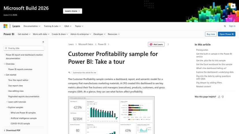
For inspiration on layout and KPI grouping, review examples on the Databox sales dashboard gallery. Then simplify. Most sales dashboards become better when you remove half the widgets.
3. Project Management Status Report
The best project report is often the shortest one in the stack. Leadership usually wants one page that answers four questions: Are we on track, where are we late, what's at risk, and what needs a decision?
That's why the one-page status report remains one of the most useful management reports samples. In Excel, it works especially well when you standardize sections for summary, milestone progress, budget status, risks, and next actions.
A clean status format
Use a simple RAG structure with conditional formatting. Red for material issues, amber for items that need attention, green for stable areas. Then support the colors with plain language, not vague labels.
A practical sheet layout includes:
- Summary block: Overall status, sponsor, reporting date
- Milestone tracker: Planned date, actual date, variance note
- Budget area: Approved budget, actual spend, remaining estimate
- Risk log: Issue, owner, mitigation, due date
- Action list: Decision required and next step
If you're building a reusable workbook, pair it with a project tracking dashboard template so project managers don't invent a new format each cycle.
The real trade-off
Standardization helps executives compare projects across teams. It can also flatten nuance. A project can be technically “green” while a vendor dependency is already slipping beneath the surface.
That's why I prefer a brief comment line under each status color. One sentence is enough. “Green” means very little. “Green, but data migration sign-off is still pending” gives sponsors something to react to.
For downloadable formats and starter layouts, the Smartsheet business report templates library is a practical benchmark. Adapt the structure to your governance style rather than copying it exactly.
4. HR & Employee Performance Dashboard
HR reports often swing too far in one of two directions. They're either overly operational, full of hiring steps and payroll details, or so polished that they hide where workforce problems are forming.
A strong HR dashboard in Excel sits in the middle. It tracks headcount movement, recruiting flow, turnover trend, and team-level signals that leadership can act on. If you're tying workforce data to output, this guide on how to measure team productivity helps frame the discussion without turning HR into a surveillance function.
Metrics worth keeping
Not every people metric belongs in a management pack. Keep the ones that influence staffing decisions and business continuity:
- Headcount by department: Shows growth and pressure points
- Recruitment pipeline: Open roles, stage movement, delayed hiring
- Turnover trend: Useful when shown over time, not as a single isolated number
- Survey indicators: Best used as directional context
Excel handles this report well because HRIS exports are usually tabular. Use PivotTables for departmental cuts, and keep personally identifiable information off the presentation sheet. The audience needs insight, not raw employee-level data.
Manager's note: HR dashboards are easy to over-design. If a leader can't tell which department needs attention within a few seconds, the report is too decorative.
You can borrow visual ideas from the Klipfolio HR dashboard examples. Just be careful with interpretation. Satisfaction or engagement signals can point to a problem, but they rarely explain it on their own. That's where manager notes and context matter more than chart variety.
5. Operations & Inventory Management Report
Inventory is where reporting quality shows up in cash. If stock data is late, incomplete, or disconnected from sales, the report becomes a history lesson instead of a control tool.
A practical operations report in Excel should connect inventory position, movement, and fulfillment performance. This is one of the most useful management reports samples for product businesses because it ties operational discipline directly to margin and working capital.
Formulas that do real work
Two Excel formulas carry a lot of weight here.
=SUMIFS(OnHandRange,CategoryRange,A2)
This totals stock for the category listed in A2. It's the fastest way to build category views without touching filters every time.
=IFERROR(VLOOKUP(A2,SalesTable,3,FALSE),0)
This matches an item code in A2 to a sales table and returns the third column. If the item isn't found, it returns 0 instead of an error. That matters because unmatched SKUs are common in messy exports.
Use those formulas to join sales and inventory, then build an ABC-style view so high-value items get the most attention. Add reorder flags, aging stock, and fulfillment exceptions.
What this report reveals fast
- Fast movers with low cover: Reorder risk
- Slow movers with high stock: Cash trapped on shelves
- Frequent order delays: Process or supplier issue
- Category imbalance: Forecasting or assortment issue
For operations teams handling large product structures, the underlying data model matters as much as the report. In one manufacturing case study, Amplifi describes a manufacturer managing 1.7 million style configurations, identifying 500,000 new styles for sale, and reducing processing time from months to as little as 90 minutes. That's not a generic dashboard template, but it shows why reporting improves when data is standardized before it reaches Excel.
For broader governance around software-heavy operations environments, I also like LicenseTrim's licensing insights. The lesson carries over. Track assets consistently or your management report will always be compensating for weak inventory discipline.
6. Customer Service & Support Ticket Analysis
Support reports look simple until you try to make them useful. Ticket volume alone doesn't tell you much. A busy team can still be ineffective, and a low backlog can hide aggressive ticket closure habits.
The report I trust most combines speed, quality, and category insight in one sheet. Pull a weekly CSV from Zendesk, Intercom, or a similar tool, then summarize first response time, resolution time, ticket source, category, and satisfaction feedback.
Build for decisions, not vanity
This report works best when the top half is operational and the bottom half is diagnostic. Show response and resolution trends first. Then show why demand is showing up.
A simple structure:
- Top row: Ticket volume, first response trend, resolution trend
- Middle: Volume by channel and by category
- Bottom: Open issues requiring product, docs, or staffing action
The biggest mistake is treating all tickets as equal. Five password resets and five billing disputes don't represent the same business problem. Categorization matters more than a flashy chart.
Teams that read ticket comments alongside the KPI summary usually find the real issue faster than teams that only watch averages.
For a visual starting point, the Venngage customer service KPI report example is helpful. In Excel, keep the presentation simpler than the template. Support managers need to see queue pressure and recurring issue types quickly, then route ownership to product, documentation, or staffing.
7. Executive Summary Dashboard (Power BI Inspired)
Monday morning, the leadership team wants a single page that answers three questions fast. Are we on plan, where are we off track, and who owns the next action? That is the job of an executive summary dashboard.
Excel handles this well if the page stays disciplined. The strongest version is not a collage of department charts. It is a tightly edited summary that pulls one decision-grade signal from each function, then points the reader to the supporting tabs for context.
What belongs on one page
Use Tier-1 metrics only. If a number would not change an executive decision this week, leave it out.
A practical layout usually includes:
- Finance: Profitability, cash position, or budget variance
- Sales: Pipeline coverage, close rate, or booked revenue
- HR: Headcount movement, hiring progress, or regretted attrition
- Operations: On-time delivery, capacity constraint, or inventory exception
- Support: Service level trend, backlog risk, or customer satisfaction movement
The hard part is not design. It is metric selection. I have seen teams waste a good dashboard by squeezing in ten extra KPIs that belong in functional reviews, not in an executive readout. A board member or GM should be able to scan the page in under a minute and know where to ask the next question.
Excel can get close to the clean feel of a BI tool with number cards, sparklines, conditional formatting, and a restrained color palette. For spreadsheet-friendly dashboard design best practices, use simple visual hierarchy and keep labels doing more work than decoration.
How to make it useful, not just polished
A good executive dashboard has a clear reading order. Start with enterprise health at the top. Put the cross-functional KPIs in the center. Reserve the bottom section for exceptions, owners, and actions due this week.
That structure works because executives rarely need more data on page one. They need faster orientation. The detail can sit in linked tabs for finance, pipeline, workforce, operations, and support.
If you are building this from one of the downloadable Excel templates in this guide, set up the dashboard as the final layer, not the first. Get each source report stable, standardize definitions, then let ElyxAI generate a draft summary sheet from natural language prompts inside the workbook. From there, edit aggressively. AI is good at assembling the first version. Management judgment decides what earns a place on the page.
For a BI-style reference point, the Microsoft Power BI sample on customer profitability reporting is useful because it shows how strong executive views favor scan speed over detail density. The trade-off is real. You get alignment across teams, but you lose context unless each KPI links cleanly to a supporting report or notes tab.
Management Report Samples: 7-Point Comparison
| Report Type | Implementation Complexity 🔄 | Resource Requirements ⚡ | Expected Outcomes 📊 | Ideal Use Cases 💡 | Key Advantages ⭐ |
|---|---|---|---|---|---|
| Financial Performance Report (with ElyxAI) | High 🔄: data mapping, formula automation, prompt tuning | ⚡ Excel, clean ledgers, possible API/ETL, finance expertise | 📊 Accurate P&L/BS/CF, variance & trend analysis for month-end | 💡 Monthly close, FP&A, executive finance reviews | ⭐ Saves time, reduces formula errors, traceable calculations |
| Sales Activity & Pipeline Dashboard | Medium 🔄: CRM mapping, funnel visuals, refresh automation | ⚡ CRM export (CSV), Excel, periodic refresh or API | 📊 Pipeline health, conversion rates, rep performance | 💡 Weekly sales reviews, forecasting, coaching sessions | ⭐ Clear pipeline view, customizable KPIs, actionable coaching |
| Project Management Status Report | Low–Medium 🔄: template setup, RAG logic, manual updates | ⚡ PM inputs (Smartsheet/Excel), Gantt/RAG formatting | 📊 Snapshot of timeline, budget variance, risks & milestones | 💡 Weekly/bi‑weekly sponsor updates, multi‑project reporting | ⭐ Easy to scan, standardizes reporting, promotes accountability |
| HR & Employee Performance Dashboard | Medium 🔄: combine HRIS and survey data, privacy controls | ⚡ HRIS exports, survey data, data governance, Excel | 📊 Headcount, turnover trends, hiring pipeline, eNPS signals | 💡 HR reviews, board reports, recruitment planning | ⭐ Centralizes HR KPIs, supports strategic workforce decisions |
| Operations & Inventory Management Report | Medium–High 🔄: joins, ABC analysis, inventory formulas | ⚡ Inventory & sales data, disciplined entry, Excel formulas | 📊 Inventory turnover, DSI, reorder triggers, carrying cost impact | 💡 Retail/manufacturing inventory control, supply‑chain ops | ⭐ Directly improves cash flow and profitability, reorder clarity |
| Customer Service & Support Ticket Analysis | Low–Medium 🔄: CSV import, KPI calculations, optional text analysis | ⚡ Helpdesk export (Zendesk/Intercom), Excel, qualitative review | 📊 Response/resolution trends, CSAT, ticket volume by channel | 💡 Weekly support reviews, staffing decisions, quality improvement | ⭐ Turns ticket data into service improvements and headcount justification |
| Executive Summary Dashboard (Power BI Inspired) | Medium 🔄: aggregate feeds, compact design, automation for refresh | ⚡ Inputs from department reports, Excel dashboarding skills | 📊 One‑page business health: top KPIs and trend indicators | 💡 C‑level/board meetings, monthly/quarterly business reviews | ⭐ 360° view, leadership alignment, concise decision-ready snapshot |
From Sample to System: Automate Your Reporting in Excel
Monday morning. The CFO wants the board pack by noon, sales has sent a late pipeline export, operations changed SKU mappings again, and the file everyone depends on still has last month's formulas copied three tabs too far. That is the moment when a report sample stops being helpful on its own. You need a reporting system.
The seven management reports in this guide work best when each template becomes part of a repeatable Excel workflow. Raw exports land in source tabs. Checks and mappings sit in calculation tabs. Final charts and commentary pull into a presentation sheet. Once that structure is stable, AI can take over a large share of the repetitive build work inside the workbook.
Elyx AI helps with the spreadsheet work that usually eats the reporting cycle. It can clean inconsistent exports, create summaries, insert formulas, build PivotTables, generate charts, and format output from a plain-language prompt. For finance and operations teams, that changes the process in a practical way. The gain is not just speed. It is fewer handoffs, fewer formula errors, and less time spent rebuilding the same report every month.
Good reporting packs also stay tight. Leaders usually want the headline first, the variance next, and the operational implication right after that. If a manager needs ten minutes to understand page one, the report is carrying too much detail in the wrong place.
Start with one report and make it run cleanly. Monthly financial reporting is often the right first build because it forces chart of accounts mapping, version control, and commentary discipline. If your reporting pain sits closer to the front line, use the sales, project, or inventory template first. Then standardize the layout, the prompts, and the refresh steps before you add another report.
One caution matters. Automation handles production. Managers still decide what deserves attention, which variance is explainable, and when a trend is serious enough to escalate. AI can build the pack. It cannot own the judgment.
Download the template that matches your reporting bottleneck, connect it to live data, and automate the next reporting cycle inside Excel instead of rebuilding from scratch. That is how report samples become an operating system for management decisions.
If you already build recurring reports in Excel, Elyx AI is worth testing in a live workflow. As noted earlier, it works inside the spreadsheet, follows natural-language instructions, and executes multi-step reporting tasks such as cleanup, summaries, charts, and management pack formatting without forcing your team out of Excel.
Reading Excel tutorials to save time?
What if an AI did the work for you?
Describe what you need, Elyx executes it in Excel.
Sign up