How to Measure Team Productivity: An Excel Guide

Your team looks busy. Slack is active, spreadsheets keep growing, meetings are full, and everyone says they’re overloaded. Then a director asks a simple question: “Are we becoming more productive?”
Teams frequently encounter this sticking point.
The problem usually isn’t a lack of data. It’s that the data is scattered across task trackers, exported CSVs, time logs, QA notes, and half-finished Excel files. Someone tries to combine it all manually, formulas break, names aren’t consistent, dates import in three different formats, and the dashboard turns into a monthly cleanup project nobody wants to own.
Spending too much time on Excel?
Elyx AI generates your formulas and automates your tasks in seconds.
Sign up →I’ve seen this happen over and over in operations. The hard part of how to measure team productivity isn’t deciding that productivity matters. The hard part is building a repeatable system that turns raw work data into something managers can trust and teams can use.
Excel is still the most practical place to do that. It’s already where many teams track work, clean exports, build reports, and explain performance. Add AI inside Excel, and the job changes again. Instead of spending your time removing duplicates, fixing date formats, and rebuilding PivotTables, you can spend it interpreting patterns and deciding what to improve.
Beyond Busywork How to Truly Measure Productivity
A team can be fully occupied and still underperform.
That sounds harsh, but it’s the truth for many “busy” departments. One analyst spends all week updating reports by hand. A project manager closes many small tasks but misses strategic milestones. A developer logs long hours on one feature while another ships several smaller items. If you only look at effort, everybody looks productive. If you look at outcomes, the picture gets more honest.
Activity is easy to count. Output is harder
Many managers default to visible signals because they’re available. Online status, hours logged, number of messages sent, and meeting attendance are all easy to observe. They’re also weak indicators on their own.
A 2023 Slack survey found that executives often use visibility and activity as a productivity signal (27%), while individual contributors prioritize outcomes instead. That mismatch is one reason teams feel misunderstood when leadership says productivity is dropping. The data point comes from Hubstaff’s summary of team performance metrics.
What works better is a combination of measures that reflect output, flow, and business impact.
Practical rule: If a metric rewards looking busy more than finishing valuable work, it will distort behavior.
The spreadsheet problem is usually a workflow problem
Teams often possess sufficient information to measure productivity. They don’t have a clean process for using it.
You can absolutely build a useful productivity system in Excel. In many cases, that’s still the fastest route because Excel handles exports, formulas, PivotTables, and charts in one place. The friction comes from setup. Manual cleanup is repetitive, and repetitive work gets skipped. Once data quality slips, trust in the dashboard goes with it.
A solid productivity model should answer three things:
- What got done
- How smoothly it moved through the workflow
- Whether it helped the business
That’s the shift from busywork to measurement that people can act on.
Selecting the 5 Key Productivity Metrics for Your Team
Don’t start with every metric you can track. Start with the few metrics you can defend.
Most bad dashboards fail for the same reason. They pile together task counts, hours, and random status fields with no logic behind them. A useful scorecard is balanced. It covers output, flow, quality, team health, and improvement.
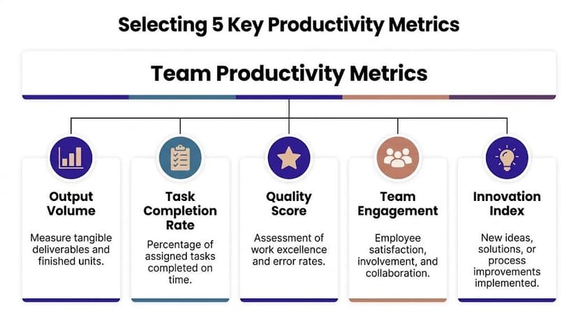
Pick one anchor metric per category
Use five categories, but don’t overcomplicate them. One anchor metric in each category is enough for a strong first version.
| Category | What to measure | Why it matters |
|---|---|---|
| Output volume | Finished deliverables or completed tasks | Shows whether work is actually leaving the system |
| Task completion | Share of assigned work completed on time | Exposes planning and follow-through |
| Quality | Error rate, revision count, or first-pass acceptance | Separates fast work from usable work |
| Engagement | Feedback trend or collaboration signal | Adds context when output changes |
| Innovation | Process improvements implemented | Captures smarter work, not just more work |
Many teams overvalue quantity. More completed tasks doesn’t always mean better performance. A reporting team may close fewer items but produce cleaner, decision-ready analysis. A developer may complete less volume during a sprint because they handled the hardest work.
Match metrics to the role, not the org chart
A balanced scorecard still needs role-specific judgment.
- For analysts: measure report turnaround, revision cycles, and stakeholder acceptance.
- For support teams: use resolution flow and task cycle time.
- For software teams: planned work versus completed work is often more useful than raw ticket count.
- For marketing teams: content volume without quality review can create noise instead of value.
The broader point is that productivity has to connect to meaningful outcomes. If you want a deeper framework for defining KPIs before you build the dashboard, this guide on understanding key performance indicators is a useful reference.
A good scorecard avoids the visibility trap
The fastest way to damage trust is to measure people with a proxy they don’t respect.
A team member usually knows when leadership is confusing activity with contribution. That’s why metrics like utilization rate and task cycle time are more valuable than simple presence signals. Utilization rate shows how much available time goes into productive work. Task cycle time shows how long work takes from start to completion. Together, they reveal capacity gaps and bottlenecks without pretending that “online” means “effective.”
When a metric starts arguments every week, the problem is often the metric, not the team.
Keep the first version simple. If your scorecard fits on one screen and each metric answers a different question, you’re on the right track.
Your 7-Step Guide to Collecting and Cleaning Data in Excel
A productivity dashboard lives or dies on data quality.
If your assignee names aren’t standardized, dates don’t parse correctly, and status labels vary between “Done,” “done,” and “Completed,” your formulas will return nonsense. Teams often do not face a measurement problem initially. They have a cleaning problem.
Start with one raw table
The easiest way to keep Excel manageable is to keep all source data in one structured table. Each row should represent one task, ticket, report, request, or work item.
Use columns like these:
- Task ID
- Assignee
- Team
- Project
- Start Date
- End Date
- Status
- Planned Effort
- Actual Hours
- Quality Flag
- Notes
That table becomes the single source for formulas, PivotTables, and charts.
Follow these 7 steps in order
Consolidate exports first
Pull data from Jira, Asana, Monday, ticketing tools, or manual logs into one sheet before touching formulas.Convert the range into an Excel Table
Press Ctrl+T. Structured tables expand automatically and make formulas easier to maintain.Standardize text fields
Hidden spaces and inconsistent capitalization break lookups and summaries. UseTRIMto clean extra spaces.Example:
=TRIM(B2)This removes leading, trailing, and repeated spaces in the text from cell B2.
Fix date formats early
If dates stay as text, cycle time calculations will fail. Apply a single date format across the table.Remove duplicates carefully
Use Excel’s built-in Remove Duplicates tool, but only after deciding which field defines a true duplicate. Usually that’s Task ID plus date or Task ID alone.Create controlled input lists
Use Data Validation for fields like Status, Team, and Priority so new entries stay consistent.Check missing values before analysis
Blank end dates, missing owners, or empty status cells can distort completion rates and averages.
Why this matters beyond spreadsheet hygiene
Productivity measurement should connect to goals, not just reporting. Methods such as Management by Objectives tie employee output to company goals, while the team effectiveness ratio focuses on gross profit generated per salary dollar instead of raw activity. That makes cleaning your underlying task and cost data more than an admin step. It’s the base layer for a metric system that rewards useful work. The underlying concepts are summarized in this overview of employee productivity methods.
If you also manage staffing and absence data in Excel, it helps to build a smarter Excel annual leave tracker so capacity planning and productivity reporting don’t live in separate, conflicting files.
What’s painful to do manually
The repetitive part isn’t intellectually hard. It’s just annoying.
You clean one export, then next week the system adds two new columns, one manager spells a name differently, and your dashboard logic breaks again. That’s why preprocessing matters so much. If you want a more detailed breakdown of this stage, this article on what is data preprocessing covers the logic behind structuring raw spreadsheet data before analysis.
Clean data doesn’t make your team productive. It makes your productivity claims believable.
Calculating 9 Essential KPIs with Excel Formulas
Once the table is clean, Excel becomes useful fast.
You don’t need a giant model. You need a short set of KPIs that translate raw task data into patterns you can discuss with a team lead or department head.

1. Task completion rate
Formula:=COUNTIF(G2:G100,"Done")/COUNTA(G2:G100)
If column G contains status values, this divides the number of items marked “Done” by the total number of non-empty status cells.
Why COUNTA? It counts filled cells, which is useful when your range contains text labels rather than numbers.
2. On-time completion count
Formula:=COUNTIFS(G2:G100,"Done",F2:F100,"<="&H2:H100)
In practice, many teams handle this with a helper column because direct row-by-row comparisons are easier to audit. Put a deadline in one column and completion date in another, then mark each task as on time or late.
Business meaning: This tells you whether work is just getting finished, or getting finished when it still matters.
3. Average task cycle time
Formula:=AVERAGEIFS(I2:I100,G2:G100,"Done")
Here, column I contains cycle time in days or hours. The formula averages only completed items.
Interpretation tip: Rising cycle time with stable output often means hidden bottlenecks. Review handoffs, approvals, or review queues.
4. Utilization rate
Formula:=SUM(J2:J100)/SUM(K2:K100)
If column J contains productive hours and column K contains available hours, this gives you utilization.
A simple example from the verified data makes the concept concrete. If someone has 40 available hours and only 20 go to focused, billable work, utilization is 50%. That doesn’t automatically mean poor performance. It may indicate underassignment, tool friction, or interruptions.
5. Output per team member
Formula:=COUNTIF(B2:B100,"Alex")
For a more flexible setup, use a summary sheet where the team member name is in A2:
=COUNTIF($B$2:$B$100,A2)
This counts how many items a specific person completed or owned, depending on how you define the column.
6. Rework count
Formula:=COUNTIF(L2:L100,"Rework")
If you track whether an item required correction, this gives a quick quality signal.
Important: Rework should never be read alone. High-output people sometimes touch the hardest work.
7. Quality pass rate
Formula:=COUNTIF(M2:M100,"Pass")/COUNTA(M2:M100)
If column M stores a simple pass/fail review result, this shows first-pass quality.
8. Planned-to-done ratio
Formula:=COUNTIF(G2:G100,"Done")/COUNTA(N2:N100)
If column N contains all planned sprint tasks, this gives the completed share of planned work.
For agile teams, the planned-to-done ratio is one of the clearest planning KPIs. Top-performing teams consistently achieve 80% to 90%, and a ratio below 70% often points to scope creep or weak estimation. Calibrating estimates over 3 to 5 sprints improves reliability, according to Business.com’s overview of agile productivity metrics.
9. Team effectiveness ratio
Formula:=Gross_Profit/Total_Salary_Cost
In a worksheet, that may look like:=P2/Q2
This metric shifts the conversation away from hours and toward commercial output. It’s especially useful for agencies, consulting teams, and service operations.
A quick note on formula maintenance
If you’re building these from scratch, consistency matters more than complexity. Use named ranges or Excel Tables where possible. That makes formulas easier to read and much easier to fix later.
For readers who want a separate walk-through on structuring formulas cleanly, this guide on how to make a formula in Excel is worth keeping open beside your workbook.
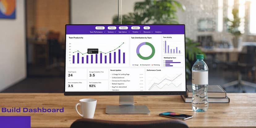
Building Your First Productivity Dashboard in 4 Steps
A dashboard should answer a management question in seconds.
If somebody opens the file and has to inspect three tabs, click into formulas, and guess what changed since last month, you don’t have a dashboard. You have a workbook.
A lot of teams collect data but never turn it into decisions. That gap is widespread. Only 21% of organizations have standardized productivity measurement methods, which is exactly why dashboards matter. They create a bridge between numbers and action, as discussed in Orangescrum’s write-up on team productivity metrics.
Step 1 Build a PivotTable layer
Create a separate sheet for summaries. Insert PivotTables from your cleaned Excel Table and group them around the few questions you ask most often.
Examples:
- completion rate by month
- average cycle time by project
- output by assignee
- quality pass rate by team
This gives you a reliable calculation layer without hard-coding dozens of summary formulas.
Step 2 Turn summaries into visuals
Use simple chart types.
- Line chart: trend over time for completion rate or cycle time
- Bar chart: compare output across teams or individuals
- Column chart: show planned versus completed work
- KPI cards: display a current snapshot for headline metrics
Avoid decorative charts. Productivity dashboards are operational tools, not design portfolios.
Step 3 Add filters people actually use
Slicers are one of the best parts of Excel dashboards. Add slicers for date, team, project, and assignee.
This lets a manager answer practical questions fast:
- Is one project dragging down cycle time?
- Did a staffing change affect output?
- Which team has rising rework?
If you want to see how AI can assist the reporting layer itself, this article on an Excel AI dashboard shows how automated dashboard generation fits into everyday Excel reporting.
Here’s a video walkthrough if you prefer seeing the dashboard flow in action before building your own:
Step 4 Lay it out like a manager will read it
Put the most important numbers on top. Trends in the middle. Detail views lower down.
A clean layout often looks like this:
- Top row: core KPIs
- Middle row: trend charts
- Bottom row: filtered detail tables
One practical change in this workflow is that AI inside Excel can now handle much of the setup work. Elyx AI is one example. It works as an Excel add-in that can execute multi-step tasks from a natural language request, such as cleaning data, creating PivotTables, generating charts, and formatting a dashboard in one pass. That matters because dashboard building is usually less about analytical difficulty and more about repetitive setup.
A dashboard earns trust when someone can trace each visual back to a clean, understandable table.
6 Ways to Interpret Results and Avoid Common Pitfalls
A metric can be accurate and still be used badly.
That’s the dangerous part of productivity reporting. Once a dashboard exists, people assume the interpretation is obvious. It usually isn’t. Context matters. Definitions matter. Role differences matter even more.

1 Look for trends, not single bad weeks
One rough week can come from shifting priorities, missing inputs, vacations, or a high-complexity project. Don’t turn a short-term dip into a performance verdict.
Use rolling views where possible. Monthly patterns are often more useful than daily noise.
2 Compare like with like
Using one formula for every role is one of the fastest ways to create bad conclusions. A developer’s focus pattern is different from a salesperson’s. A reporting analyst’s output doesn’t look like a customer support queue.
That’s why effective measurement should account for context such as meeting load, seniority, and work environment. AIHR’s discussion of employee productivity measurement makes that point directly.
3 Separate bottlenecks from performance issues
If cycle time increases, don’t start with “Who is underperforming?”
Start with workflow questions:
- Are approvals slow?
- Is work entering the queue half-defined?
- Did priorities change midstream?
- Is one person handling all reviews?
A dashboard should help you diagnose the system before you judge the individual.
Most productivity problems show up in people first, but start in process.
4 Watch for metric gaming
Every metric changes behavior.
If you reward task volume alone, people will prefer small tasks. If you reward speed alone, quality will fall. If you reward visible activity, people will optimize for responsiveness instead of deep work.
Use pairs of metrics to balance each other:
| If you track this | Pair it with this |
|---|---|
| Output volume | Quality pass rate |
| Utilization rate | Cycle time |
| Planned-to-done ratio | Rework count |
| Individual output | Team outcome or project result |
5 Use the dashboard to start conversations, not end them
A productivity dashboard is not a courtroom exhibit.
The best managers use it to ask better questions. Why did one team improve after a process change? Why did another team’s output drop while quality rose? What changed operationally?
If you want to sharpen that kind of diagnostic reading, learning the basics of what is exploratory data analysis helps a lot. It trains you to investigate patterns before making claims.
6 Keep interpretation tied to business value
The final check is simple. Ask whether the metric reflects work that helps the business.
A team can improve a local KPI while making the broader operation worse. Closing tickets faster doesn’t help if rework rises. High utilization doesn’t help if the team is overloaded and strategic work gets delayed.
Good productivity measurement should support decisions like these:
- rebalance workloads
- redesign approvals
- change planning assumptions
- protect focus time
- retire manual reporting steps
When the dashboard leads to those decisions, measurement is doing its job.
From Data to Decisions Your Path to Continuous Improvement
The practical version of how to measure team productivity is simpler than commonly believed. Pick a small set of balanced metrics. Clean the raw data properly. Calculate KPIs in a way people can audit. Put the results in a dashboard that answers real operational questions.
Then keep going.
The best measurement systems aren’t built once. They’re refined through regular review, better definitions, and fewer manual steps. If you’re also working on the process side of productivity, this guide on how to improve team efficiency with routines and automation pairs well with the Excel workflow because it focuses on the habits behind the numbers.
Start with one team. Use one workbook. Track a few metrics consistently.
That’s enough to move from “we’re busy” to “here’s what’s improving, here’s what’s blocked, and here’s what we’re changing next.”
If you want to do this work inside Excel without spending hours on cleanup and dashboard setup, Elyx AI is built for that workflow. It works as an AI agent in Excel that can execute multi-step tasks from a plain-language request, including data cleaning, PivotTables, charts, formatting, and trend analysis, so you can spend more time interpreting results and less time preparing the file.
Reading Excel tutorials to save time?
What if an AI did the work for you?
Describe what you need, Elyx executes it in Excel.
Sign up