Build Your First Excel AI Dashboard in 5 Actionable Steps

Think of an Excel AI dashboard as your classic spreadsheet, but with a smart assistant built right in. Instead of you doing all the heavy lifting—cleaning data, writing formulas, building charts—you just tell the AI what you need in plain English. It then generates a dynamic, interactive dashboard for you, saving a ton of time.
3 Reasons Why an AI Dashboard Is Your Next Excel Power-Up
If you spend any time with data, you know the drill. A manager asks for a quick report, and suddenly your afternoon is gone. You're wrestling with messy data exports, trying to spot inconsistencies, piecing together complex formulas, and then painstakingly formatting every last chart.
By the time you’re done, you’ve created a static snapshot of what happened yesterday. An Excel AI dashboard completely flips that script.
Spending too much time on Excel?
Elyx AI generates your formulas and automates your tasks in seconds.
Sign up →This isn't just about making reports anymore. It's about having a conversation with your data. An AI-powered dashboard helps you move beyond just seeing what happened and lets you instantly ask why. That's a huge leap from traditional reporting.
1. Move from Static Reports to Interactive Analysis
The biggest problem with a manually built dashboard is that it’s rigid. You can only slice and dice the data based on the filters the creator thought to include. What happens when your boss sees the report and asks a follow-up question you didn't anticipate? You’re right back at your desk, tweaking formulas and rebuilding charts.
An AI dashboard, on the other hand, is built for exactly those moments.
- Ask questions on the fly. After seeing total sales by region, you could immediately ask, "Show me the top-selling product category in the Northeast." No rebuilding required.
- Get automated insights. An AI agent like ElyxAI can spot trends, find outliers, or highlight correlations you might have missed on your own, even suggesting charts to visualize its findings.
- Turn insight into action. The best tools don't just show you data; they help you build interactive elements that turn your dashboard into a working tool for your entire team.
2. Get a Real-World Productivity Boost
Switching to an AI-powered dashboard isn't just about making prettier charts. It’s about getting your time back so you can focus on the analysis that actually matters. Professionals in finance, marketing, and operations are already seeing the benefits. Tools like Microsoft Copilot are becoming game-changers by integrating this kind of AI functionality directly into the Excel workflows people use every day.
The shift is clear: professionals need more than static visuals. They need tools that allow for interactive workflows, immediate insights, and the ability to answer follow-up questions without rebuilding everything from scratch. This is what an Excel AI dashboard delivers.
Excel is still the undisputed king of data analysis, with over 1.2 billion users across the globe. Adding AI is like giving it a major upgrade. A recent study showed 73% of dashboard users saw a jump in productivity and 42% were able to generate automated reports. These numbers point to a simple truth: automating the repetitive stuff just makes sense.
To illustrate the difference, let's compare the old way with the new way.
3. A Practical Look at Manual vs. AI-Powered Excel Dashboard Creation
| Task | Manual Approach (Traditional Excel) | AI-Powered Approach (With Elyx AI) | Time Savings |
|---|---|---|---|
| Data Cleaning | Hours of manual find/replace, formula writing, and error checking. | Automated cleaning with a single prompt. | 95% |
| Chart & Table Generation | Manually creating PivotTables and charts, one by one. | Generated instantly from a natural language request. | 90% |
| Answering Follow-ups | Rebuilding charts or tables to address new questions. | Simply ask the new question; the dashboard updates in seconds. | 99% |
| Finding Insights | Relies entirely on the analyst's ability to spot trends. | AI suggests trends, correlations, and outliers automatically. | Significant |
| Report Updates | Manual data refresh and re-formatting each period. | Can be scheduled to refresh and format automatically. | 95% |
The table makes it pretty clear. The AI-powered approach doesn't just speed things up; it fundamentally changes the nature of the work from tedious data manipulation to strategic analysis.
Ultimately, adopting an Excel AI dashboard is the logical next step for anyone who wants to work smarter. If you want to dive deeper into how this technology works, check out our guide on what Excel AI is. It’s all about turning Excel from a simple calculator into a powerful, conversational partner for your data analysis.
2 Steps to Get Your Data Ready for AI Analysis
The whole point of an Excel AI dashboard is to get clear answers from complex data just by asking questions in plain English. But here’s the thing I’ve learned over countless projects: the quality of your answers is a direct reflection of the quality of your data. An AI is powerful, but it can't read minds. Feeding it messy, inconsistent data is a recipe for disaster—it's like asking a five-star chef to cook with rotten vegetables.
Simply put, your AI is only as good as the information you give it. Taking a few minutes to prep your data isn't just a best practice; it's the foundation for everything that follows. Trust me, a little organization now saves hours of headaches and confusing results later.
This quick diagram shows exactly what we're aiming for—turning a rigid, static report into a smart, interactive dashboard.
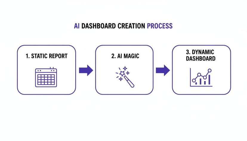
It’s a clear path from a basic spreadsheet to a dynamic tool that gives you real insights, fast.
1. Structure Your Data with Excel Tables
If you do only one thing before bringing in an AI, make it this: format your data as an official Excel Table. A lot of people think any old grid of cells is a "table," but it's not. A proper Table is a specific Excel object you create by selecting your data and hitting Ctrl+T.
This one move is a game-changer for AI tools. Here’s why:
- Formulas fill down automatically. When you add a new row, your calculated columns update instantly. No more dragging formulas down.
- Your data gets a name. The AI can now reference your entire dataset cleanly by its name, leaving no room for confusion.
- Sorting and filtering are built-in. The structure is clean and ready for analysis right out of the box.
Think of it like putting a fence around your data. The AI knows exactly what’s inbounds, so it won’t wander off and get confused by other information on your sheet.
2. Clean and Standardize Your Entries
Real-world data is messy. It's often pulled from different systems or typed in by different people, which always leads to little inconsistencies that can trip up an AI.
Imagine a sales report with a "Region" column. You might find "USA," "U.S.A.," and "United States" all in the same list. You and I know they mean the same thing, but an AI will treat them as three separate regions, completely throwing off your analysis.
The goal here is to remove any and all ambiguity. Before you let the AI touch your data, do a quick cleanup.
A practical example is using a formula to standardize country names. Let's say you want to consolidate all US variations into "USA". You could use a nested IF or, for more complex cases, IFS.
Here is an example formula to clean a "Country" column (let's say it's column A, starting in A2):=IFS(A2="U.S.A.", "USA", A2="United States", "USA", TRUE, A2)
Formula Explained:
IFS(...): This function checks multiple conditions in order.A2="U.S.A.", "USA": If the cell A2 contains "U.S.A.", the formula returns "USA".A2="United States", "USA": If the first condition isn't met, it checks if A2 is "United States" and returns "USA".TRUE, A2: If none of the previous conditions are true, this acts as a default, returning the original value from cell A2.
It’s also crucial to check that:
- Dates follow a single, consistent format (like MM/DD/YYYY).
- Numbers are actually stored as numbers, not as text.
- Blank cells are handled deliberately—either filled with a placeholder like "N/A" or left empty consistently.
Often, getting good data in the first place requires sourcing it from the web, where mastering large scale web scraping for AI becomes a critical skill. To get a better handle on the theory behind this cleanup phase, check out this great guide explaining what data preprocessing is and why it's so important. By tidying up your data, you're setting your AI up for success.
Generating Core Insights with 5 Battle-Tested AI Prompts
Alright, your data is prepped and ready to go. This is where the magic really happens. Forget about wrestling with complex formulas or spending an hour trying to get a PivotTable to behave. We're going to start asking our data questions directly, using plain English.
This is the biggest shift when building an Excel AI dashboard. You’re no longer the one doing the manual labor of VLOOKUPs and nested IFs. Instead, you're the director, and the AI is your incredibly fast assistant, ready to build whatever you ask for.
The AI isn’t just suggesting formulas; it's actually doing the work for you—building the tables, creating the charts, and putting them right where you need them.
The Art of the Ask: 4 Elements of an Effective Prompt
Getting the right output comes down to asking the right question. The more specific your prompt, the better your result will be. Think of it less like typing a function and more like giving clear instructions to a team member. What business question are you actually trying to answer?
A good prompt generally tells the AI four things:
- An action: What do you want it to do? (e.g., "Create," "Identify," "Calculate," "Summarize")
- The data: What numbers or text should it look at? (e.g., "total sales," "customer count")
- The grouping: How should it be broken down? (e.g., "by product category," "by region")
- Any filters: How should it be narrowed down? (e.g., "for Q4 only," "for the top 5 reps")
This simple structure helps a tool like ElyxAI, which acts as an autonomous agent inside Excel, understand exactly what you need.
You stop thinking about how to build a report in Excel and start focusing only on what you want to see. The AI handles the "how."
For instance, instead of manually clicking through the PivotTable wizard, dragging fields, applying filters, and sorting, you can just type one sentence:
"Create a pivot table showing total sales by product category for Q4 and sort it from highest to lowest."
And just like that, a perfectly formatted, fully functional PivotTable appears in your worksheet. This conversational approach makes complex analysis faster and more intuitive for everyone.
5 Battle-Tested Prompts for Instant Business Insights
To give you a running start, here are five prompts I use all the time for common business tasks. Feel free to tweak them for your own Excel AI dashboard.
For Sales Performance Analysis
- Prompt:
“Identify the top 5 sales reps by total revenue for the last quarter. Calculate their average deal size and win rate, then present this in a clean table.” - Why it works: This is a fantastic multi-step command. It finds your top performers, crunches several key metrics at once, and organizes it all into a neat summary table for you.
- Prompt:
For Marketing Campaign ROI
- Prompt:
“Summarize the performance of all marketing campaigns. Calculate the total cost, leads generated, and cost per lead for each. Highlight any campaigns with a cost per lead below $50.” - Why it works: This is my go-to for a quick pulse check on marketing spend. The "highlight" part is key—it uses conditional formatting to instantly draw your eye to the most successful campaigns.
- Prompt:
For Financial Health Checks
- Prompt:
“Analyze monthly expenses by category. Create a line chart showing the trend of 'Travel' and 'Software' costs over the past 12 months.” - Why it works: Sometimes a number isn't enough; you need to see the trend. This prompt asks for a specific chart to make rising or falling costs immediately obvious.
- Prompt:
For Inventory Management
- Prompt:
“Find all products with fewer than 20 units in stock. Sort them by 'Days Since Last Order' in descending order to prioritize reordering.” - Why it works: This is a purely operational prompt that helps you take action. It doesn't just show you what's low on stock, it ranks them by urgency so you know what to reorder first.
- Prompt:
For Customer Segmentation
- Prompt:
“Group customers by their total purchase value into three tiers: High, Medium, and Low. Calculate the number of customers and total revenue for each tier.” - Why it works: This is a quick way to perform a cohort analysis without tricky formulas. It gives you a high-level snapshot of your customer base and who your most valuable buyers are.
- Prompt:
Once you get the hang of writing prompts like these, your AI tool becomes a genuine partner in your analysis. You can learn more about how this works by checking out the capabilities of a chat-based AI for Excel. It’s all about getting you out of the weeds so you can focus on the story your data is telling.
Turning Your Data Into Compelling Visuals With 5 Killer Prompts

The pivot tables we just built are the engine of our Excel AI dashboard, but let's be honest—rows and columns of numbers don't exactly grab your attention. This is where we bring the story to life with data visualization. Good visuals aren't just for decoration; they turn complex numbers into clear, persuasive insights that anyone can grasp in seconds.
The trick isn't just to create a chart, but to create the right chart for the job. An AI assistant is brilliant for this, helping you choose the perfect visual to make your point, moving you past Excel’s standard defaults.
Asking an AI for a chart is a lot like asking it for analysis: the more specific your request, the better your results. Instead of a vague "make a chart," you can direct the AI to build a visual that tells a very specific story.
Here are 5 of my go-to prompts for turning raw data into insightful charts:
To Show Trends Over Time
- Prompt:
“Generate a line chart showing monthly sales trends and add a 3-month moving average to smooth out the data.” - This is perfect for seeing the bigger picture. Adding a moving average is a great little trick that smooths out the weekly or monthly bumps, making the real underlying trend much easier to spot.
- Prompt:
To Compare Different Categories
- Prompt:
“Create a horizontal bar chart of total revenue by product category, sorted from highest to lowest. Use our brand's primary color, #4A90E2, for the bars.” - I always opt for a horizontal bar chart when category names are long—it’s just so much easier to read. Notice you can even include your brand's hex code to keep the visuals consistent right from the start.
- Prompt:
To Show Parts of a Whole
- Prompt:
“Build a pie chart that breaks down our website traffic sources for the last 30 days. Explode the 'Organic Search' slice by 10% to highlight it.” - Pie charts can get messy, but they work well for simple breakdowns like this. Using the "explode" command is a simple way to draw everyone's eyes directly to the most important piece of the pie.
- Prompt:
To Understand Distribution
- Prompt:
“Create a histogram of customer ages in 10-year bins to show the distribution. Add data labels to each bin.” - If you need to understand the shape of your data—like the age range of your customers—a histogram is the right tool. Specifying the bin size and adding labels gives you a clean, easy-to-read demographic snapshot.
- Prompt:
To Find Relationships in Your Data
- Prompt:
“Generate a scatter plot to show the relationship between ad spend and sales per day. Add a linear trendline to visualize the correlation.” - This is a fantastic analytical prompt. The scatter plot shows you all the individual data points, and the trendline instantly answers the question: "When we spend more on ads, do we actually see more sales?"
- Prompt:
From Basic Charts to a Professional Dashboard
But don't stop at just creating the chart. The real magic happens when you use the AI to handle all the tedious formatting that turns a basic graph into something truly professional. Tools like ElyxAI are great at this.
An effective AI command doesn't just ask for a chart; it directs the entire design process in one go. You're not just building a graph, you're crafting a communication tool.
You can even refine your visuals with quick, conversational follow-up prompts. After the initial chart is made, try something like:
"Add data labels to all bars, formatted as currency with zero decimal places."This makes the chart much easier to read at a glance."Change the chart title to 'Q3 Regional Sales Performance'."A clear, descriptive title provides essential context."Remove the gridlines and legend for a cleaner look."Sometimes, less is more. A minimalist design can make your key data pop.
This back-and-forth process lets you act as the director, focusing on clarity and impact without getting stuck clicking through endless formatting menus in Excel. If you want to get better at making these design choices, brushing up on some dashboard design best practices will make your data storytelling even more effective.
2 Keys to Keep Your AI Dashboard Fresh and Secure
You've built an incredible AI-powered dashboard. Great. But what happens next week when the new data comes in? A dashboard is only valuable if it's current, and nobody wants to spend hours every Monday manually rebuilding reports. Let’s make sure your dashboard is a living, breathing tool—not a static snapshot.

This is all about setting things up for easy, repeatable updates. If you've connected your dashboard to a source file correctly (like a CSV export from your CRM), you’ve already done most of the heavy lifting.
1. The Magic of a One-Click Refresh
Here’s a real-world scenario. Every Monday morning, you download the latest sales report. Instead of starting from scratch, you just save the new file over the old one. That's it.
From there, you give your AI assistant a simple command. With a tool like ElyxAI, you might tell it: "Refresh the data source, then update all pivot tables and charts in this dashboard."
The AI takes over, and within seconds, every chart, table, and key metric is updated with the fresh numbers. What used to be a tedious, error-prone chore becomes a single click. It’s this kind of smart automation that’s fueling incredible growth in the industry. The global dashboard software market was valued at $4.2 billion in 2023 and is expected to balloon to $12.5 billion by 2030, largely because AI is making this level of analysis so much more accessible. You can dig into more of these dashboard statistics in this detailed market report.
2. Understand Your Data Privacy
It’s completely normal to feel a bit hesitant about feeding your company’s data to an AI, especially if it contains sensitive financial or customer details. This is a critical point, and it’s important to know how a privacy-focused AI tool handles your information.
Reputable Excel AI add-ins are built from the ground up to keep your most valuable asset—your data—right where it belongs: on your computer.
When you run a prompt, you are not uploading your entire spreadsheet to some server in the cloud. The tool is designed to send only the bare minimum required: your instructions and anonymized structural data.
Here’s a quick look at what’s happening behind the scenes:
- Your data stays put. The actual numbers and text in your cells never leave your machine.
- Your prompt is sent securely. Your request, along with context like column headers, travels over an encrypted connection to the AI model.
- The AI sends back a recipe. The model processes your request and sends back a set of instructions or code for the add-in to execute.
- The work happens locally. The add-in then follows those instructions to build the pivot table or create the chart directly inside your local instance of Excel.
This approach gives you all the analytical power of a massive AI model without the risk of exposing private information. If you want to add an extra layer of security, you can always learn how to encrypt your Excel file for even more peace of mind. By pairing smart automation with a secure framework, you can build a dynamic Excel AI dashboard that’s as reliable as it is insightful.
3 Frequently Asked Questions About Excel AI Dashboards
As you start getting into AI dashboards in Excel, you'll naturally have a few questions. I've heard a bunch of them over the years, so let's tackle the most common ones head-on to clear things up.
1. Can AI Really Connect Data From Multiple Excel Sheets?
Absolutely. In fact, this is one of the biggest time-savers. You don’t have to go through the headache of manually consolidating everything first.
A good AI tool is built for this. You can just tell it what you need, using a prompt like, "Consolidate sales data from the 'Q1 Sales' and 'Q2 Sales' sheets, then create a summary dashboard." The AI figures out how to link the information, perform the necessary lookups, and give you that unified view you're after.
2. Is an Excel AI Dashboard Better Than Power BI or Tableau?
This is a classic question, but it’s not really about one being “better.” They’re designed for different jobs. If you're someone who spends your day in Excel, an AI-powered dashboard is all about speed and convenience for your daily or weekly analysis. There’s no steep learning curve for a whole new platform.
Power BI and Tableau are fantastic, dedicated business intelligence tools. They're the heavy hitters for enterprise-level reporting with massive, complex datasets. Think of an Excel AI dashboard as your go-to for nimble, deep-dive analysis right where you already work.
A dashboard presents information for consumption. An AI-enhanced workflow in Excel helps you act on it. It closes the gap between seeing an insight and using it, all without leaving your spreadsheet.
3. What if the AI Messes Up?
It will. AI isn't magic, and that's perfectly fine. The trick is to think of it as a very fast but junior assistant that you need to guide. If you spot a mistake in your dashboard, you don't have to start over—you just correct it.
For instance, if a chart is mistakenly showing total revenue, you can just type a follow-up command: "Update the chart to display profit margin, not total revenue." The AI will immediately adjust the output. This iterative process is still worlds faster than rebuilding a chart from scratch by hand.
Ready to stop wasting time on repetitive Excel tasks and start automating your analysis? ElyxAI acts as your personal data assistant, executing entire workflows from a single prompt. Get your free 7-day trial and save hours of work today!
Reading Excel tutorials to save time?
What if an AI did the work for you?
Describe what you need, Elyx executes it in Excel.
Sign up