Templates for Charts in Excel: 5 Time-Saving Templates for

You already know the pattern. The data is ready, the analysis is done, and then the slow part starts. You copy last month’s chart, fix the colors, adjust the axis labels, remove the ugly gridlines, resize the legend, and try to make this week’s report look like it belongs next to the last one.
That isn’t analysis. It’s maintenance.
For anyone building recurring reports, templates for charts in excel are one of the few built-in features that remove repeat work. They give you a reusable visual standard instead of asking you to redesign the same chart every time. And once you understand how to save, apply, and troubleshoot them, they become part of a reliable reporting workflow instead of a hidden Excel trick.
Spending too much time on Excel?
Elyx AI generates your formulas and automates your tasks in seconds.
Sign up →Why Manually Formatting Excel Charts Wastes Hours
The biggest cost of manual chart formatting isn’t the first chart. It’s the tenth one.
A finance team closes the month and needs the same revenue bridge, margin trend, and product mix visuals. A sales analyst updates pipeline charts every Monday. A marketing lead rebuilds campaign performance visuals for each region. The chart types rarely change much, but the formatting always has to be touched. Colors drift. Labels move. Fonts stop matching. Someone decides one report should use a secondary axis and now the whole pack looks inconsistent.
That’s a problem because charts aren’t decoration. They change how fast people understand the data. By 2023, over 1.2 billion users relied on Excel for data tasks, and Microsoft notes that well-designed charts can improve comprehension by up to 400%, while professionals using templates report saving an estimated 3 hours weekly on visual formatting alone, according to Microsoft’s chart template documentation.
Practical rule: If you rebuild the same chart style more than twice, it should become a template.
The usual fix is to create a chart once, save the styling, and apply it again later. That’s the traditional Excel answer. It works well when your reports are repetitive and your team needs consistency. It’s also much better than copying and pasting old charts between files, which tends to carry hidden formatting problems with it.
There’s a broader pattern here too. The same professionals who automate slides, reports, and visual assets elsewhere often look for tools that can generate multi-slide social media posts because they’re tired of rebuilding layouts by hand. Excel chart work sits in that same category. Repetition hides inside “just five minutes” tasks.
If your spreadsheets also need cleanup before the visuals are even usable, a solid companion workflow is to standardize the worksheet first. This guide on formatting Excel spreadsheets fits well with a chart-template process because the cleaner the source sheet, the more reliable the visual output.
Creating Your First Chart Template in 4 Steps
A good chart template starts with one well-built chart. Don’t save a rough draft and hope to refine it later. Build the visual exactly the way you want it to look in future reports, then turn that into a reusable file.
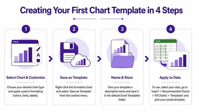
Step 1 build a master chart
Start with real data, not placeholder numbers if you can avoid it. Insert the chart type you want, then format everything you’d otherwise redo later:
- Colors and fills that match your company or reporting style
- Font choices for titles, labels, and legends
- Axis settings such as number formats, min and max bounds, and tick spacing
- Gridlines and borders so the chart stays readable without clutter
- Data labels if your audience needs exact values on the visual
This is the part that usually takes the longest. The value of the template comes from preserving these decisions.
Step 2 save it as a template
When the chart looks right, right-click the chart and choose Save as Template. Excel stores the chart style as a template file. In the workflow described in this Excel chart template walkthrough, the saved file is a .crtx file kept in a user profile folder, and this method can reduce per-chart formatting time from over 15 minutes to under 5, which is a 60% time saving for BI professionals.
Save only after you’ve checked labels, legend position, and axis formatting. Small mistakes get baked into every future chart.
Name the file clearly. “Sales_Line_Blue_Minimal” is better than “ChartTemplate1.” You want future-you to know what it does without opening it.
Step 3 know where Excel stores it
The storage location matters because it explains why templates sometimes disappear after device changes or why a colleague can’t see yours. Excel places the file in a templates folder tied to your user profile.
That makes templates easy to reuse on your own machine, but not automatically shared across a team. If you want consistency across departments, save a backup copy of your template library in a shared workspace and document the naming rules. For teams that already standardize workbook structures, this pairs well with a broader guide to how to create Excel templates.
Step 4 apply the template to new data
To use the template, select your new dataset and insert a chart. In the chart selection dialog, go to All Charts and then Templates, then pick the template you saved.
A short checklist helps avoid bad results:
- Match the chart type. A template built for a line chart won’t magically fix a messy source table.
- Check series structure. If your original template had two series and your new chart has four, expect to review labels and colors.
- Review number formats. Percentages, currency, and unit abbreviations can still need adjustment if the source data changed.
The first time you do this, it feels modest. After several recurring reports, it becomes one of the simplest time-saving habits in Excel.
5 Design Best Practices for Reusable Chart Templates
A reusable template isn’t just a pretty chart saved to disk. It’s a chart style that survives new data, new users, and new reporting cycles without falling apart.

1 use your brand on purpose
If your company has approved colors, fonts, and label conventions, your chart template should enforce them. Otherwise every analyst makes slightly different decisions and your dashboard pack starts to look stitched together.
Consistency matters more than creativity in recurring business reporting.
Brand styling also reduces revision cycles because stakeholders stop commenting on cosmetic differences and can focus on the numbers.
2 build for changing data
Static templates are useful. Dynamic templates are better.
A 2025 survey of 2,500 data analysts found that interactive charts using dynamic data ranges boost insight accuracy by 35%, yet 72% of professionals struggle with manual pivot table and chart linking, according to this analysis of interactive Excel chart workflows. That trade-off shows up constantly in real work. People want charts that update with new rows or slicer selections, but the setup is fragile if the workbook structure isn’t disciplined.
A simple formula pattern can help when you want source ranges to expand predictably. For example, teams often define named ranges around a growing list and use formulas that reference nonblank cells. The exact setup depends on your workbook, but the principle is the same: the chart should depend on a range that grows with the data, not on a manually edited address every month.
If you want a deeper visual strategy for this, this guide to Excel data visualization is a strong next step.
3 remove chart junk
Most weak templates fail because they preserve too much, not too little. Excel loves default clutter. Business readers don’t.
Keep these elements only when they help interpretation:
- Gridlines only if the audience needs precise visual comparison
- Legends only when labels on the series aren’t enough
- Borders and backgrounds only if they separate multiple visuals clearly
- Decimals only when precision matters to the decision
A chart template should reduce attention friction. If a formatting choice doesn’t support the decision, remove it.
Here’s a useful visual explainer on cleaner chart design in Excel:
4 plan for awkward scenarios
The best templates don’t break when the data gets messy. Think about how the chart should behave if values are zero, negative, missing, or heavily skewed.
That matters a lot with financial and operational reporting. A chart that looks polished with tidy demo data can become misleading with real-world outliers. Before you save a template, test it with an ugly version of the dataset.
5 make accessibility part of the design
Good accessibility usually improves clarity for everyone. Use higher contrast, don’t rely on color alone to show meaning, and prefer direct labels where possible.
Manual Excel work starts to show its limits at this stage. You can design strong templates, but maintaining accessibility and interactivity at scale still takes effort. Templates help. They don’t remove the burden.
3 Powerful Chart Template Examples for Business
The most useful templates are the ones tied to recurring business questions. If a visual answers the same question every week or month, it deserves to become a repeatable asset.

Sales performance dashboard
This is the template I see used most often in commercial reporting. The goal is usually simple: compare actual performance against target over time, then break results down by region, rep, or product line.
A practical build often uses:
- a column chart for monthly actuals
- a line series for target
- optional slicers tied to a pivot source
- consistent colors for actual, target, and forecast
This works especially well when leadership wants one familiar view every reporting cycle. The key isn’t complexity. It’s repeatability.
Financial variance waterfall
Waterfall charts are strong when the business question is “What moved the total?” Finance teams use them to show how a baseline changed due to pricing, volume, mix, cost, or other drivers.
A good waterfall template needs disciplined category order and clear subtotal handling. If the sequence changes carelessly, the story breaks. This is one of the cases where a saved template helps visually, but the essential work is still in structuring the source table correctly.
A waterfall chart is only as trustworthy as the logic behind the movement categories.
KPI tracker with qualitative bands
This is one of the most effective advanced templates for executive reporting because it turns raw performance into clear status. Instead of showing only a single number, the chart shows the number against bands such as Poor, Fair, Good, and Excellent.
According to ExcelCampus on advanced charts, qualitative bands charts see 90% adoption in BI dashboards and outperform basic columns by 35% in insight comprehension in user A/B tests. The same source notes that the dumbbell chart allows for 50% faster trend analysis.
A simple classification formula can support the KPI band logic:
=IFS(B2<=0.6,"Poor",B2<=0.75,"Fair",B2<=0.9,"Good",TRUE,"Excellent")
How it works:
B2<=0.6,"Poor"returns “Poor” when the KPI value in B2 is at or below 0.6B2<=0.75,"Fair"checks the next threshold if the first condition failsB2<=0.9,"Good"handles the next performance bandTRUE,"Excellent"acts as the fallback result for anything above the previous thresholds
This formula matters because it converts numeric performance into categories that can drive helper columns, labels, or conditional formatting for the chart. If your KPI is stored as a percentage, Excel reads 0.6 as 60%, 0.75 as 75%, and so on.
For teams building recurring dashboards, a broader reference on dashboard design best practices helps connect the chart choice to the wider report layout.
Troubleshooting 3 Common Excel Template Issues
Templates save time when they work. When they don’t, they usually fail in predictable ways.
My chart doesn’t update correctly
The most common issue is a mismatch between the template’s original structure and the new dataset. If the saved chart expected a certain number of series, category labels, or data order, Excel may apply the look but not the logic cleanly.
Try this:
- Match the source layout so the new chart uses the same type of category and series structure as the original
- Check series count if labels, colors, or combo behavior look wrong
- Reapply axis settings when the incoming data uses a different scale or number format
This is why templates are strongest when the reporting model itself is standardized.
My colleague’s Mac shows something different
Cross-platform chart behavior is still awkward in Excel. A template created on Windows may not slot into a Mac workflow the same way, especially if the user expects the same insertion path or management options.
In practice, the safest workaround is to keep one master workbook with approved visuals, then let Mac users duplicate the chart object rather than rely entirely on identical template handling. It’s less elegant, but more reliable for mixed-device teams.
My template disappeared or became corrupted
This usually shows up after profile changes, system migrations, or Excel updates. If the template file is missing from the expected folder, Excel won’t show it in the template gallery. If the file became corrupted, the style may load partially or fail completely.
A simple protection routine helps:
| Issue | Likely cause | What to do |
|---|---|---|
| Template missing | User profile or device change | Restore the file from backup to the templates folder |
| Template opens oddly | Version or formatting conflict | Rebuild from the last working chart |
| Team can’t access it | File stored locally only | Keep a shared backup library with naming rules |
Back up your chart templates like any other business asset. If a visual standard matters, the file matters too.
Most template problems aren’t mysterious. They come from hidden dependencies between the chart and the data structure.
The Future: How ElyxAI Creates Custom Charts in 1 Prompt
Manual chart templates are useful, but they aren’t the finish line. They solve repeated formatting. They don’t solve repeated setup.
You still need to choose the chart type, prepare the range, build the visual, save the template, apply it correctly, test it against new data, and fix edge cases when the structure changes. That’s a better workflow than rebuilding charts from scratch, but it’s still a workflow built around manual intervention.

The more modern approach is to tell an AI agent what you want and let it execute the full sequence inside Excel. That changes the job from “format this chart again” to “create a monthly sales dashboard with branded visuals and executive-ready formatting.”
That shift matters because the hard part of charting in business isn’t just style. It’s combining data prep, chart selection, formatting, and revision handling without losing time. A 2025 Gartner report found that AI-customized charts reduce report revision cycles by 47%, and in 2026, AI add-in usage for charts surged 240% YoY, with 55% of queries involving custom formatting that manual templates don’t address well, according to this overview of AI-driven chart customization trends.
If your reporting workflow extends beyond Excel into decks, it’s worth comparing adjacent tools too. This roundup of top-rated AI tools for making presentations is useful because the same pattern applies. People don’t just want better templates. They want the work done.
For Excel users specifically, the practical next step is learning how an AI add-in fits inside the workbook itself. This guide on how to install Excel AI is the operational piece many teams miss.
The upgrade isn’t a prettier template library. It’s eliminating the need to manage one by hand in the first place.
If you’re ready to stop rebuilding charts and start delegating the work inside Excel, Elyx AI is built for exactly that. You describe the result in plain language, and the agent handles the steps directly in your spreadsheet, from cleanup and chart creation to formatting and revisions. It’s the fastest way to move from manual chart templates to automated reporting without leaving Excel.
Reading Excel tutorials to save time?
What if an AI did the work for you?
Describe what you need, Elyx executes it in Excel.
Sign up