A Guide to Formatting Excel Spreadsheets Manually and with AI

Formatting in Excel is more than just making your data look pretty. It's about making it clear, professional, and easy to grasp at a glance. When done right, formatting transforms a confusing wall of numbers into a powerful tool that guides your audience straight to the key insights.
Why Smart Spreadsheet Formatting Matters

Let's be honest—staring at a messy, unformatted spreadsheet is a nightmare. It's a common pain point for anyone working with data. You get a raw data export, and suddenly it's your job to turn that chaos into something that makes sense.
Spending too much time on Excel?
Elyx AI generates your formulas and automates your tasks in seconds.
Sign up →This is where many people miss the point. Good formatting isn't just about aesthetics; it has a real impact on business decisions. It's the crucial difference between a report that leaves everyone confused and one that inspires confident action. Think of a financial analyst presenting a quarterly report. A poorly structured sheet makes stakeholders second-guess the numbers and hunt for information. A clean, well-organized one? It puts the most important takeaways front and center.
The True Cost of Poor Formatting
All that time spent manually tweaking cells and fixing layouts really adds up. In fact, many professionals spend an average of 4-5 hours a week just on formatting spreadsheets. That’s a huge chunk of time that could be dedicated to actual analysis.
On the flip side, companies that make professional Excel formatting a priority see a 25-35% improvement in how quickly stakeholders understand their reports. It’s simple: clear formatting lets people see the story in the data immediately.
Formatting isn't a final, decorative step—it's an essential part of the data analysis process itself. A well-formatted spreadsheet prevents costly misinterpretations, reduces errors, and makes sure your hard work gets the attention it deserves.
From Manual Cleanup to Strategic Clarity
The real goal is to shift your mindset from tedious cleanup to intentional design. This is about more than just adding a splash of color or some borders; it's about building a logical structure that makes your data intuitive. A consistent approach to formatting delivers some big wins:
- Reduces Cognitive Load: A clean layout helps the brain process information faster, without getting bogged down in visual clutter.
- Minimizes Human Error: When data is clearly labeled and organized, the odds of making a mistake in a calculation or reading the wrong number drop dramatically.
- Enhances Professionalism: A polished report shows you pay attention to detail, which builds trust with clients, managers, and team members.
Of course, before you can format anything, your data has to be clean. This first step is non-negotiable. For a deep dive into getting your data ready, check out our guide on https://getelyxai.com/en/blog/data-cleaning-best-practices. It’s the foundation for everything we’ll cover next.
Mastering the Manual Formatting Essentials
Before we jump into the slick world of AI automation, it's crucial to get a firm handle on Excel's manual formatting tools. These are the absolute fundamentals—the bread and butter of any good spreadsheet. When you know these inside and out, you can take a wall of raw data and quickly shape it into a clear, professional report that actually tells a story.
Let's work with a common scenario: a simple sales tracker. You've just exported some data, and now you're staring at columns for Date, Product, Units Sold, and Revenue. Right now, it’s a jumbled mess of text and numbers that's tough to scan and even harder to analyze. Our mission is to use a few core formatting techniques to bring some much-needed order to this chaos.
Control Your Numbers and Dates
First things first, let's get the data types right. This is probably the most critical step because Excel has a bad habit of guessing wrong, often treating numbers as text or showing dates as a string of random digits. Fixing this is non-negotiable.
Go ahead and select the entire Revenue column. Head over to the Home tab, find the Number group, and from the dropdown menu, pick Currency. Just like that, you've added the dollar sign and standardized the decimal places. Now, anyone looking at it immediately knows they're dealing with money.
Next, do the same for the Date column. Ever see a date show up as something like 45321? That’s just how Excel stores them internally. To fix it, select the column, go back to the Number format dropdown, and choose Short Date. This simple tweak ensures your dates are consistent, which is essential if you ever want to sort your sales data chronologically.
Improve Readability with Text and Alignment
Nothing looks messier than long product names spilling into the next cell or getting cut off completely. That's where text control saves the day. Select the Product column—or any other cells with lengthy text.
On the Home tab, look for the Alignment group and click Wrap Text. This instantly adjusts the row height so everything fits neatly within the cell. No more hidden information.
Alignment also adds a subtle but powerful visual structure. Here's a quick rundown of what I always do:
- Center Align all the column headers. It makes them pop and clearly separates them from the data.
- Left Align any columns with text, like the
Productnames. It’s just easier on the eyes. - Right Align all your number columns, like
Units SoldandRevenue. This lines up the decimal points, making it a breeze to compare values.
Pro Tip: Proper alignment and text wrapping aren't just about making things pretty. They build a visual hierarchy that guides the reader's eye, making your spreadsheet feel less intimidating and much easier to digest.
Create Consistency with Cell Styles and Borders
Applying formats one cell at a time is a recipe for a headache. This is where Cell Styles come in—they're a massive time-saver for creating a polished, consistent look. You'll find them on the Home tab.
Instead of manually bolding your headers and picking a fill color, just select your header row and choose a built-in style like Heading 1. Better yet, you can create your own style that matches your company's branding, ensuring all your reports have a uniform, professional feel.
Finally, a few simple borders can work wonders for organization. Select your entire data set, apply a light gray border to all cells, and then add a slightly thicker bottom border to the header row. This cleanly separates the headers and gives your data a crisp, table-like structure.
And when you're dealing with a ton of data, you'll definitely want to keep those headers visible as you scroll down the page. The easiest way is to freeze the top row. For a detailed guide on this, check out our walkthrough on how to freeze rows in Excel.
Below is a quick reference table summarizing these core techniques and why they matter in a business context.
| Core Manual Formatting Techniques and Their Impact |
|---|
| Formatting Tool |
| Number Formatting |
| Text Wrap & Alignment |
| Cell Styles |
| Borders |
These manual skills are your foundation. By mastering them, you can turn any raw data dump into a clear, understandable document, which is the perfect starting point for any deeper analysis or visualization you have planned.
Creating Dynamic Reports with Advanced Formatting
Once you've got the hang of the basics, it's time to build spreadsheets that do the heavy lifting for you. Static reports are a thing of the past; modern data needs to be interactive and responsive. This is where you can use advanced formatting to transform your spreadsheet from a simple grid of numbers into a dynamic dashboard that surfaces insights automatically.
The goal is to create reports that react to new information without you having to constantly tweak them. Imagine a marketing campaign dashboard where performance metrics instantly change color based on their status or a project tracker that flags overdue tasks on its own. These aren't crazy-complex features—they're accessible tools that help you work smarter, not harder.

Automatically Highlight Key Data with Conditional Formatting
Conditional Formatting is your secret weapon for making data talk. Instead of digging through rows to find trends, you can make them jump right off the page. This feature applies specific formatting—like cell color, font style, or data bars—to any cells that meet criteria you set.
Let’s say you're managing a sales team's monthly performance. You want to quickly see who is crushing their targets and who might need a little support.
- First, select the column with all the sales figures.
- Then, head to Home > Conditional Formatting > Highlight Cells Rules > Greater Than.
- Pop in your sales target (for example, $50,000) and pick a format, like "Green Fill with Dark Green Text."
Just like that, every time a salesperson exceeds that target, their cell will automatically turn green. You can then add another rule to highlight sales figures below a certain threshold in red. This simple change gives you an immediate visual summary of performance, no manual review required. The time savings add up; marketing pros using these techniques report making decisions about 40% faster. That's a huge deal when the average team spends 6-8 hours a week just on formatting reports.
Supercharge Your Rules with Formulas
While the built-in rules are handy, the real magic of Conditional Formatting is unlocked when you start using custom formulas. This lets you create incredibly specific, dynamic rules based on how different cells relate to each other.
Think about a project management tracker with columns for "Due Date" and "Status." You want to highlight an entire row if a project is marked "In Progress" but is already past its due date.
- Start by selecting the entire data range you want the rule to apply to (e.g., A2:D100).
- Navigate to Home > Conditional Formatting > New Rule.
- Choose the option "Use a formula to determine which cells to format."
- Enter a formula like this one:
=AND($D2="In Progress", $B2<TODAY())
Let’s break down what this formula is doing:
$D2="In Progress"checks if the status in column D for the current row is "In Progress." The$before theDfreezes the column reference, ensuring Excel always looks at column D, but the row number (2) is relative, so it adjusts as the format is applied down the list.$B2<TODAY()checks if the due date in column B is earlier than today's date. Again, the column is locked, but the row is relative.- The
AND()function requires that both conditions are true for the formatting to be applied.
Now, just set your format (a light red fill is a good choice for warnings), and Excel will automatically flag every overdue task that's still active.
Conditional formatting with formulas moves you from being a data organizer to a data storyteller. Your spreadsheet is no longer just holding information; it's actively pointing out what needs your attention right now.
Bring Structure and Simplicity with Excel Tables
If you aren't using Excel Tables yet, you're missing out on one of the most powerful features for formatting Excel spreadsheets. It's incredibly easy: just select your data range and press Ctrl+T. This one little action does way more than just apply a nice design.
Converting a plain range to a formal Table gives you immediate perks:
- Automatic Formatting: New rows and columns you add will instantly take on the table's formatting. No more re-applying styles!
- Easy Sorting and Filtering: Filter buttons are automatically added to each header.
- Structured References: Formulas become much clearer and easier to read (e.g.,
=[Sales]*.1instead of the cryptic=C2*.1). - Total Row: With a single click, you can add a total row that calculates sums, averages, counts, and more.
This structure makes your data so much easier to handle, especially as it gets bigger.
Demystifying PivotTable Layouts
Once your data is in a Table, the next logical step for analysis is often a PivotTable. PivotTables are the best tool for summarizing massive datasets without writing a single formula. They let you drag and drop fields to slice, dice, and look at your data from all sorts of different angles. For a complete walkthrough, check out our comprehensive guide: https://getelyxai.com/en/blog/excel-pivot-table-tutorial
Choosing the right layout is critical. To really make your data tell a compelling story, you need to visualize financial data like a pro. The structure of your PivotTable directly affects how easy it is to pull insights from it. Before you start dragging fields around, always ask yourself what question you're trying to answer—let that guide your layout for maximum clarity.
How to Automate Formatting with Elyx AI
We’ve covered the ins and outs of formatting Excel sheets by hand, which gives you a great foundation for building clean, dynamic reports. But now it’s time to move beyond the manual grind and into smart automation. This is where you can start getting hours back in your week by letting technology do the heavy lifting.
Bringing an AI-powered Excel add-in like Elyx AI into your workflow completely changes the game. Instead of hunting through menus, trying to remember formulas, or building conditional rules piece by piece, you can just describe what you want in plain English. This simple shift turns you from the operator into the director, letting you focus on the final report, not the tedious steps to get there.
The Power of a Single Prompt
Picture this: you've just been handed a messy data export. The dates are inconsistent, text is all jumbled, and numbers are just raw digits. Cleaning and formatting this manually could easily eat up anywhere from thirty minutes to a couple of hours. With an integrated AI tool, that whole process shrinks down to a single request.
You could just tell it:
"Make the headers blue with bold font. Format the 'Sales' column as currency, wrap the text in the 'Notes' column, and highlight any negative numbers in red."
In seconds, the AI gets to work and applies these changes right on your spreadsheet. No formulas to look up, no multi-step processes to follow. The job is just… done. This is what separates a true AI agent from a simple formula generator—it doesn't just tell you how to do something; it does it for you.
From Messy Data to Polished Report Instantly
Let’s walk through a real-world before-and-after. Imagine a raw project status report with columns for Task, Owner, Due Date, and Status. The data is all there, but it’s a visual mess and looks completely unprofessional.
Before AI Formatting:
- Dates are just numbers (like 45321).
- Long text in the 'Task' column gets cut off.
- Headers look the same as the rest of the data.
- There are no visual cues for overdue or completed tasks.
After a Single AI Prompt:
- Dates are now in a clean "DD-MMM-YYYY" format.
- Text wrapping is on, so every task description is readable.
- Headers pop with a bold font and a professional background color.
- Rows marked "Completed" are automatically shaded green, and overdue tasks are flagged in yellow.
This jump from a chaotic data dump to a presentation-ready report happens almost instantly. The time savings are huge, of course, but the real win is the drop in human error. No more mis-clicked buttons, incorrect range selections, or formula typos. Your formatting is always accurate and consistent.
This kind of automation lets you shift your mental energy away from the monotonous formatting and toward higher-level analysis and strategic thinking. You're no longer just organizing data; you're actually interpreting it.
The True Benefits of AI-Driven Formatting
Automating your formatting workflow does more than just save time. It really changes how you work with your data and what you can get done in Excel.
Here are a few of the core advantages:
- Massive Time Savings: Repetitive formatting jobs that used to take hours are now done in seconds. For anyone who spends a big chunk of their week prepping reports, this reclaimed time is a lifesaver.
- Elimination of Human Error: AI follows instructions perfectly, getting rid of common mistakes like applying the wrong format or missing a section of data. Your reports will be beautiful and reliable.
- Focus on Analysis, Not Mechanics: When you let AI handle the "how-to" of formatting, you get to concentrate on the "what" and "why" behind your data. Let the tool worry about the presentation so you can focus on the insights.
- Accessibility for All Skill Levels: You don't have to be an Excel master to create sophisticated, polished reports. If you can describe what you want, the AI can build it, which makes advanced formatting available to everyone.
To really appreciate how much AI can streamline your work, it’s helpful to understand the broader capabilities of AI and where the technology is headed. Seeing the bigger picture shows how these tools are quickly becoming essential partners in data management. As they get more powerful, they’ll take on even more complex tasks, freeing us up to focus on creative problem-solving and strategy.
If you want to go deeper on this topic, you can learn more about different Excel AI tools and how they compare in our detailed guide.
Building Complete Reports with AI Workflows
Getting your spreadsheet to look good is one thing, but that's rarely the end goal. The real win is transforming raw, messy data into a finished, insightful report as fast as possible. This is where AI assistants like Elyx.AI really change the game. We're moving beyond asking for one-off fixes to delegating the entire multi-step process from a single, conversational prompt.
Think of it as graduating from a simple formatting assistant to a personal data analyst. Instead of micromanaging every little change, you can hand off the entire reporting sequence. It’s a seamless approach that handles everything from the initial data cleanup to the final analysis and charts.
From Single Tasks to a Full Workflow
Let's say you've just exported a bunch of raw sales data. The old way meant slogging through a long checklist: remove duplicates, fix the date formats, calculate revenue, create a PivotTable, build a chart, and then, finally, make it all look presentable.
With a workflow-driven AI, you can collapse that entire checklist into one simple request.
For instance, you could just type:
"Analyze this sales data. Find the top 5 products by total revenue, create a bar chart to show the results, and format the report with our company branding."
The AI doesn't just spit back a formula; it actually does the work. It cleans, analyzes, visualizes, and formats, delivering a finished report without you having to click a single menu or write any code. It’s a huge leap in productivity.
This visual perfectly captures how a complex manual process becomes a simple, prompt-driven workflow.
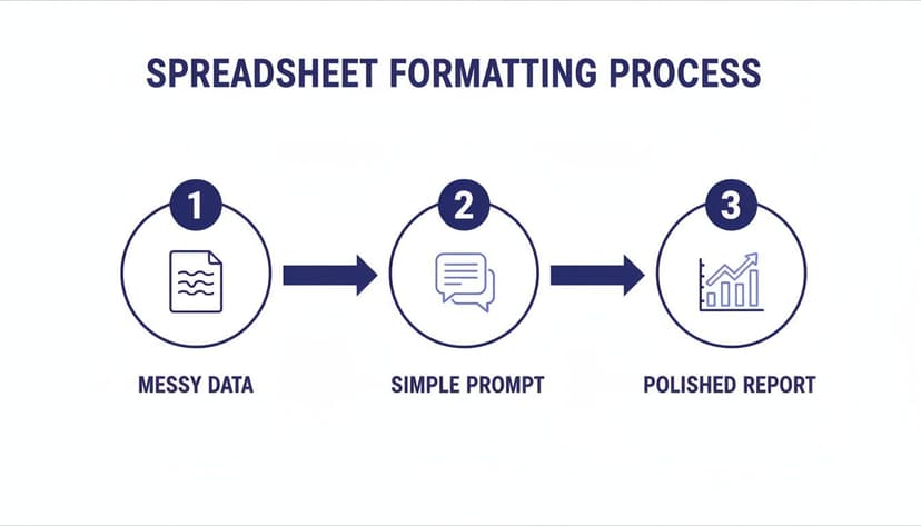
The takeaway here is the massive drop in complexity—what used to be multiple tedious stages is now a single automated action.
A Practical Project Management Example
This workflow approach is incredibly flexible. Imagine you have a data dump of project tasks with start and end dates. Manually wrestling that into a useful timeline would take ages.
With an AI agent, your request becomes much simpler:
"Clean this project data by removing duplicate tasks. Then, calculate the duration of each task in days. Finally, create a Gantt-style timeline chart to visualize the project schedule."
The AI understands the sequence. It knows it has to clean the data first, then calculate the durations before it can build the final chart. This ability to interpret and execute a logical series of steps is what makes it so powerful. You're not just formatting a spreadsheet; you're directing a complete analytical process from start to finish.
By thinking in workflows instead of individual tasks, you can automate entire reports. This frees you up to focus on what the data actually means, not the manual grind of preparing it.
The Real-World Benefits
Adopting an AI-driven workflow gives you some clear advantages over doing things by hand or even using single-task automation.
- Total Efficiency: You completely eliminate the time wasted switching between different jobs, like cleaning data, then building a pivot, then creating a chart. The AI handles the whole chain of events in one go.
- Less Mental Strain: Forget trying to remember the exact order of operations or the specific formulas you need. Just describe the outcome you want, and let the AI figure out how to get you there.
- Rock-Solid Consistency: Automating the full workflow ensures your reports are always generated with the same logic and formatting. This makes your work more reliable and professional every time.
By chaining commands together, you can build sophisticated, repeatable processes for all your common reports. To dive deeper, check out our guide on how to automate Excel reports for more strategies to streamline your work.
Common Questions About Excel Formatting
Even with all the best tools at your disposal, it's easy to get stuck on a tricky formatting problem. We've all been there. Let's walk through some of the most frequent questions that pop up and get you some clear, practical answers.
How Can I Apply Formatting to Multiple Sheets at Once?
This is a classic time-saver, especially when you're setting up a workbook with a consistent structure. Instead of repeating the same clicks on every single sheet, you can group them together.
Just click the tab for your first sheet, then hold down the Ctrl key and click on the other sheet tabs you want to include in your group. Now, any change you make—adjusting column widths, applying a header style, setting up print areas—will automatically apply to every single sheet you selected. It's a game-changer for consistency.
What Is the Quickest Way to Copy Formatting?
The Format Painter is your best friend here. You've probably seen that little paintbrush icon on the Home tab, and it's incredibly powerful for quickly cloning a style from one place to another.
Here's the quick rundown:
- Click on a cell that looks exactly the way you want.
- Click the Format Painter icon. Your cursor will turn into a paintbrush.
- Now, just click the cell (or drag across a range of cells) where you want to paste that formatting.
Pro Tip: Need to apply that same style to several different spots? Double-click the Format Painter. This locks it in "on" mode, so you can keep clicking and painting the format wherever you need it. Just hit the Esc key when you're all done.
Can AI Fix Inconsistent Date Formats Automatically?
Absolutely. This is where an AI assistant like Elyx.AI really shines. We’ve all seen datasets where dates are a complete mess—you've got "10/05/2024," "May 10, 2024," and "2024-05-10" all in the same column. Trying to sort, filter, or analyze that is a nightmare.
Instead of manually fixing each one, you can just give a simple instruction like, "Standardize the 'Order Date' column to a DD-MMM-YYYY format." The AI figures out all the different styles, converts them, and makes the entire column uniform. What used to take ages is now done in seconds.
Why Is My Conditional Formatting Rule Not Working?
It's frustrating when a rule you've carefully set up just doesn't seem to fire. From my experience, the problem is usually one of a few common culprits.
Here's what to check first:
- Incorrect Cell References: This is the big one, especially with formulas. Pay close attention to your absolute (
$A$1) and mixed ($A1orA$1) references. Getting this wrong is the most common reason a rule doesn't apply the way you expect across a range. - The Order of Your Rules: Excel processes rules from top to bottom as they appear in the "Conditional Formatting Rules Manager." If a cell meets the criteria for multiple rules, the one that's higher up on the list will win out if they conflict.
- "Stop If True": In the Rules Manager, there's a little checkbox for "Stop If True." If that's ticked, as soon as a cell meets that rule's criteria, Excel stops looking and won't apply any other rules further down the list to that cell.
I'd say that checking these three things will fix the issue 90% of the time.
Ready to stop wasting hours on manual formatting and let AI build your reports for you? Elyx AI is an autonomous agent that executes complete workflows inside your spreadsheet from a single prompt. Get your free 7-day trial and see how it transforms your productivity. Try Elyx AI for free.
Reading Excel tutorials to save time?
What if an AI did the work for you?
Describe what you need, Elyx executes it in Excel.
Sign up