Sales Pipeline Reporting in Excel: A 6-Step Guide for 2026

You export your CRM, open Excel, and tell yourself this will take half an hour.
Then the work starts. Stage names don't match. Close dates are text in one row and dates in another. Reps have left dead deals sitting in the pipeline for months. Your pivot table looks fine until a sales leader asks the question that matters: “Can I trust this?”
That's the part most articles skip. Building a sales pipeline report is easy. Building one that is reliable enough to drive a forecast is where the work is.
Spending too much time on Excel?
Elyx AI generates your formulas and automates your tasks in seconds.
Sign up →The manual path still matters because it teaches you what good reporting looks like. If you can clean the data, structure the logic, and build the core reports yourself in Excel, you'll know when an automated workflow is helping and when it's just producing polished nonsense. That's the standard to aim for in sales pipeline reporting.
Define Your 7 Essential Sales Pipeline KPIs
A weak report usually starts with a weak metric list. If you dump every CRM column into Excel and hope a pivot table will reveal the answer, you'll get noise. Good sales pipeline reporting starts by deciding which questions the report must answer.
Typically, seven KPIs do the heavy lifting. They tell you whether the pipeline is big enough, moving fast enough, converting well enough, and producing deals of the right quality.
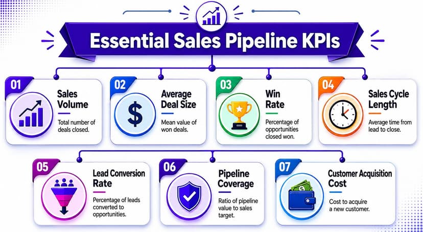
Use KPIs that answer a management question
Here's the framework I use when training junior analysts. Every KPI needs a job.
| KPI | What It Measures | Why It's Important |
|---|---|---|
| Sales Volume | Total number of deals closed | Shows output over a period |
| Average Deal Size | Mean value of won deals | Helps explain revenue quality, not just quantity |
| Win Rate | Share of qualified opportunities that close won | Reveals sales effectiveness |
| Sales Cycle Length | Average time from lead to close | Exposes friction and delay |
| Lead Conversion Rate | Share of leads that become opportunities | Tests top-of-funnel quality |
| Pipeline Coverage | Pipeline value relative to target | Shows whether pipeline can support quota |
| Customer Acquisition Cost | Cost to acquire a new customer | Connects pipeline performance to efficiency |
One KPI deserves special attention: pipeline coverage. A widely used benchmark is a 3:1 ratio of pipeline value to revenue target, meaning many teams want roughly three dollars of qualified pipeline for every dollar of quota they hope to close, and Salesforce notes pipelines should be updated at least weekly, with many teams reviewing them daily in high-volume periods or near quarter-end, as summarized in Monday's pipeline reporting guide.
Practical rule: If your report can't explain whether a coverage problem comes from too few deals, low conversion, or slow movement, it isn't finished.
Separate activity metrics from health metrics
A common mistake is mixing “what reps did” with “what the pipeline can produce.” Calls logged and meetings booked matter, but they don't replace pipeline health metrics.
The list above works because each number supports a decision:
- Sales Volume: Helps leaders spot whether output is rising or falling.
- Average Deal Size: Prevents teams from celebrating win count while revenue quality drops.
- Win Rate: Tells you whether qualification and execution are working.
- Sales Cycle Length: Surfaces delays that hurt timing and forecast confidence.
- Lead Conversion Rate: Shows whether demand generation is feeding the right opportunities.
- Pipeline Coverage: Tests capacity against target.
- Customer Acquisition Cost: Keeps commercial performance tied to efficiency.
If you also work across operational reporting, it's worth looking at how other reporting environments structure dependable outputs. A useful example is Coreties' reporting solution, which is relevant because it highlights the same core discipline: define the business questions before you build the report.
For readers who want a broader refresher on selecting metrics before touching Excel, this guide on understanding key performance indicators is a solid companion.
Master These 5 Data Cleaning Steps in Excel
Most pipeline reporting problems aren't reporting problems. They're data hygiene problems wearing a reporting costume.
When a report is wrong, the pivot table usually isn't the culprit. The issue is upstream: duplicate deals, broken dates, stage labels that don't match, blank owner fields, and stale opportunities that should have been closed out weeks ago.
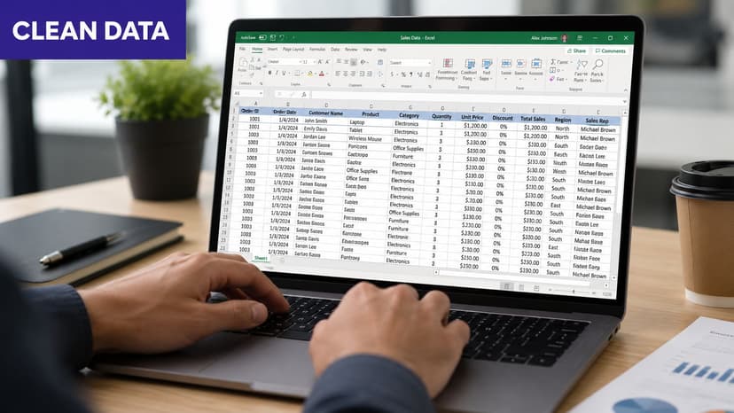
Clean the five issues that break most reports
Start with a raw CRM export in a separate tab. Turn it into an Excel Table first with Ctrl + T so formulas and pivots expand properly.
Remove duplicate opportunities
Before: the same deal appears twice after a CRM sync or export merge.
After: one record per opportunity.Use Data > Remove Duplicates on your unique deal ID column. If you need to flag duplicates before deleting them, use:
=COUNTIF($A:$A,A2)If the result is greater than 1, that deal ID appears more than once. This formula counts how many times the value in cell A2 appears in the full A column.
Standardize stage names with VLOOKUP
Before: “Demo”, “demo”, “Product Demo”, and “Demo Scheduled” all sit in the same dataset.
After: one approved stage label per deal.Create a small mapping table with raw stage names in one column and approved names in the next. Then use:
=VLOOKUP(C2,$J$2:$K$20,2,FALSE)This formula looks up the raw stage in C2 inside the mapping table J2:K20, then returns the standardized name from the second column.
FALSEforces an exact match.Fix text dates with DATEVALUE
Before: close dates sort incorrectly because Excel reads them as text.
After: proper date serials you can group by month or quarter.Use:
=DATEVALUE(D2)This converts a text date in D2 into a real Excel date. If Excel already recognizes the value as a date, you won't need it. If not, this formula fixes the field so pivots and time analysis work.
Treat blanks and stale deals as reporting risks
Handle blanks intentionally
Before: blank owner, source, or next-step fields make your summaries misleading.
After: explicit categories you can filter and investigate.For text fields, use:
=IF(E2="","Missing",E2)If E2 is blank, Excel returns “Missing”. Otherwise it returns the original value. That's better than leaving blanks invisible inside a report.
Purge stale opportunities
Before: the pipeline looks larger than reality because dead deals are still open.
After: a report that reflects active selling motion.Expert guidance recommends purging deals older than 180 days during the first 30 days of data-hygiene work, then building a weekly dashboard and review cadence over the next 60 days, according to DealHub's guidance on sales pipeline reporting.
Old deals don't just clutter a report. They distort coverage, inflate confidence, and waste manager attention.
A simple helper formula can flag aged opportunities if your created date is in F2:
=TODAY()-F2
This returns the number of days since the deal was created. Once you have that, you can filter the rows that exceed your stale-deal threshold.
If you want more examples of how AI can handle repetitive cleanup inside spreadsheets, this walkthrough on Excel AI data cleaning shows the same tasks from an automation angle.
Build 4 Key Reports with Excel Pivot Tables
Clean data is where credibility starts. Pivot tables are where the report becomes useful.
This is still the best manual skill to learn because it forces you to think about dimensions, measures, and filters. It also exposes how much repetitive setup goes into recurring sales pipeline reporting.
Build the pipeline by stage report first
If I could only create one report from a CRM export, it would be Pipeline by Stage. It answers the first management question: where is the money sitting right now?
Set it up like this:
- Rows: Stage
- Values: Sum of Deal Value
- Values: Count of Opportunity ID
- Filters: Owner, Segment, Region, Close Month
Then sort stages in your real sales-process order, not alphabetically. If “Proposal” appears above “Discovery,” the report may be technically correct and operationally useless.
An effective workflow also requires stage-by-stage conversion analysis. The conversion rate for a stage is calculated as ((opportunities that advance ÷ opportunities entering the stage) × 100), which is useful because it exposes where deals stall or slip, as explained in CaptivateIQ's sales pipeline analysis guide.
Build a pivot table for distribution. Build helper logic outside the pivot for conversion. Don't force one object to do both jobs badly.
Add three more reports leaders actually use
Once the stage view is working, create three additional pivots. Each one answers a different question.
Win and loss analysis by rep
Use these fields:
- Rows: Rep Name
- Columns: Deal Status
- Values: Count of Opportunity ID
This report compares closed-won and closed-lost outcomes by seller. It's useful for coaching because it avoids vague statements like “Rep A feels behind.” You can see outcomes directly.
Pipeline by source
Use:
- Rows: Lead Source
- Values: Sum of Deal Value
- Values: Count of Opportunity ID
- Filters: Stage or Status
This one helps marketing and sales speak the same language. If a source produces plenty of opportunities but little qualified pipeline, the report will show it.
Average sales cycle length
This usually needs a helper column first:
=CloseDate-CreatedDate
That formula returns the number of days between creation and close, assuming both cells are valid Excel dates. Then build a pivot:
- Rows: Rep, Segment, or Source
- Values: Average of Sales Cycle Days
A chart helps here. A simple clustered bar chart often works better than something flashy because managers need comparison, not decoration.
If pivot tables still feel awkward, this tutorial on how to create a pivot table is a practical refresher.
The limitation is obvious once you've built all four reports manually. Any schema change, bad export, new stage label, or added filter means rework. Excel can do it. It just won't do it for you.
Implement 3 Advanced Forecasting Techniques
A pipeline report tells you what exists. A forecast tells you what is likely to happen. Mixing the two is where teams get into trouble.
A large open pipeline doesn't mean a strong forecast. It could mean nobody has challenged the assumptions yet. That's why forecasting in Excel needs both math and judgment.

Use three methods, not one
I like to compare three views side by side instead of betting on a single number.
Historical trend with FORECAST.ETS
If you have time-series revenue data by month, Excel's FORECAST.ETS function can project the next value based on historical patterning.
Example:
=FORECAST.ETS(A14,B2:B13,A2:A13)
Here's what each part does:
- A14 is the target date or period you want to forecast
- B2:B13 is the historical values range
- A2:A13 is the matching timeline range
This method is useful when you want a top-down trend view. It won't tell you whether specific deals are healthy, but it can show whether current expectations line up with historical direction.
Weighted pipeline forecast
This is the method most sales teams build first. Assign a probability to each stage, multiply deal value by that probability, then sum the weighted values.
The logic is simple. Early-stage deals contribute less to forecast confidence than later-stage deals. The downside is equally simple. If stage discipline is poor, the weighting model inherits bad CRM behavior.
Scenario analysis
Build three scenarios in Excel: best case, most likely, and worst case. Change assumptions around close timing, stage movement, and deal inclusion criteria.
This doesn't need a complex model to be useful. Even a structured workbook with separate assumption cells can make forecast conversations much more honest.
Add credibility checks on top of the model
Forecasting gets stronger when you stop treating stage as proof. A major underserved angle in modern reporting is pipeline credibility. Many reports capture seller activity instead of verified buyer progress, and advanced reporting is shifting toward governance and credibility metrics such as slippage rate and stage-velocity exceptions to reduce forecast error, as discussed in Zime's review of must-have pipeline reports.
That changes how I read a forecast. I don't just ask, “What stage is this deal in?” I ask:
- Has the close date slipped repeatedly
- Is deal movement consistent with normal stage velocity
- Is there evidence of real buyer progression
- Is the opportunity stale but cosmetically active
For readers building forward-looking models in Excel, this sales forecast template guide for Excel is a useful reference point.
A forecast becomes valuable when it combines numeric structure with skepticism. Without that second part, Excel just helps you present uncertainty more neatly.
Automate Your Entire Workflow with ElyxAI in 1 Prompt
Open a raw CRM export on a Monday morning and the pattern is usually the same. Dates are half text and half real Excel dates. Stage labels don't match. A few duplicate deal IDs slipped in. Someone left owner blank on opportunities that still show up in pipeline. Before you can answer a single management question, you are doing cleanup work.
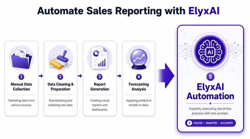
That manual process is still the right foundation to understand. You should know what has to happen in order: import the export, normalize the fields that drive reporting, check for duplicates, flag missing values, rebuild pivots, refresh charts, and lay out a forecast tab someone can read in two minutes. The problem is not that the steps are wrong. The problem is that they are repetitive, easy to miss under deadline, and hard to reproduce the same way every week.
What one prompt can replace
An AI agent inside Excel changes the job from clicking through tasks to defining the workflow clearly.
A prompt could look like this:
Clean this CRM export. Remove duplicate opportunities based on deal ID, standardize stage names using a mapping table, convert text dates to Excel dates, flag blank owner and source fields, identify stale deals, build pivot tables for pipeline by stage, win/loss by rep, pipeline by source, and average sales cycle length, then create summary charts and a forecast sheet with weighted pipeline and a historical trend view. Format the workbook for executive review.
That instruction covers the same work an analyst would do manually. The difference is execution. Instead of rebuilding the workbook step by step, you review the output, spot-check the logic, and fix exceptions.
Why this matters operationally
Speed helps, but repeatability matters more.
A manual report often breaks in small ways. One week the stage mapping is updated. The next week a pivot still points to an old range. Then a chart excludes the newest rows because the source table was pasted outside the original selection. None of those errors are dramatic on their own. Together, they make pipeline reviews harder to trust.
ElyxAI fits this workflow because it works inside Excel and executes multi-step tasks such as cleaning, pivot table creation, chart generation, formatting, and trend analysis from a single natural-language request. That is different from a tool that only suggests the next formula.
In practice, the prompt gets translated into a sequence of actions:
- Data preparation: scan columns, identify likely IDs, dates, amounts, and categories
- Standardization: apply cleanup rules to labels and fields that break reporting consistency
- Report building: create pivots and charts from the cleaned table
- Output formatting: organize the workbook so leadership can use it without extra cleanup from the analyst
If you want to set that up in your own workbook, this guide on how to install Excel AI inside Excel walks through the setup.
The significant payoff comes after the workbook is built. Time shifts away from fixing date formats and rebuilding pivots, and toward the work that improves forecast quality: checking stage exceptions, questioning stale deals, and giving sales leadership a report they can use without debating whether the numbers were assembled correctly.
Adopt These 3 Best Practices for Reliable Reporting
A pipeline report becomes reliable when the operating routine is reliable.
Teams often focus on the workbook first. That matters, but it is not the part that usually fails. The failures show up earlier. Stage names drift. Close dates stop meaning what finance thinks they mean. A manager reviews pipeline on Tuesday one week and Friday the next, so the team keeps reacting to a different snapshot.
Three habits keep the report usable month after month.
Keep a fixed review cadence
A pipeline report needs a schedule, an owner, and a clear use case. Without that, even a well-built Excel file turns into a static summary that nobody acts on.
Match the review rhythm to the sales motion. Fast-moving SMB teams usually need tighter inspection because stages change quickly and stale deals pile up fast. Enterprise teams can work with a weekly cadence, but only if someone owns the prep, the definitions, and the follow-up.
The report is only finished when leadership can use it to make a decision.
Fix data at the source
Excel can clean a lot. It cannot invent discipline after a bad CRM process.
If reps use inconsistent stage labels, leave close dates blank, or keep dead deals open for weeks, the report will still break. It will just break in a cleaner-looking format. Reliable reporting starts with a few basic CRM rules that get enforced before export:
- Required fields: Stage, owner, source, amount, and expected close date should be filled for any deal that belongs in forecast discussions.
- Controlled labels: Keep stage names and other reporting fields standardized. Free text creates cleanup work every single cycle.
- Clear exit rules: Define when a deal is closed lost, inactive, or removed from active pipeline so reps handle edge cases the same way.
This is the trade-off. Tighter CRM rules create a little friction for reps, but they save hours of repair work later and make forecast reviews much easier to trust.
Trust the output, then verify it
Manual reports need validation. AI-built reports need validation too.
The difference is where your time goes. In a manual Excel process, analysts spend too much of that time fixing broken references, rechecking pivots, and tracing formula errors. With an AI agent such as ElyxAI handling the cleanup and build steps, the smarter use of time is verification. Check whether the logic matches the business, not whether a formula got copied down correctly.
A simple review routine catches most issues:
- Spot-check deals: Open a few records behind each summary number.
- Compare totals: Reconcile report totals to the cleaned source table.
- Inspect exceptions: Review unusual deal sizes, long stage aging, and improbable close dates before sharing the file upstream.
That is the standard to hold. Build the report, test the logic, and challenge the result.
Once that discipline is in place, automation starts paying for itself. The weekly job shifts from spreadsheet maintenance to revenue analysis. Less time goes to cleanup. More time goes to finding stalled deals, tightening forecast calls, and helping sales leadership act early instead of explaining numbers late.
If you want that workflow inside Excel, ElyxAI can act on a plain-language prompt and carry out the cleanup, report building, formatting, and analysis steps for you.
Reading Excel tutorials to save time?
What if an AI did the work for you?
Describe what you need, Elyx executes it in Excel.
Sign up