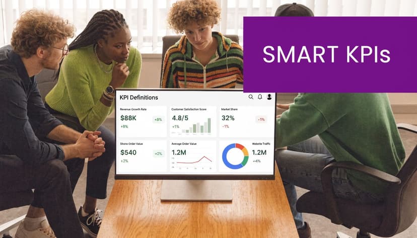
10 KPI Reporting Best Practices for 2026

You spend hours compiling the weekly sales report, updating pivot tables, fixing broken references, and nudging charts back into alignment. Then the file goes out, lands in inboxes, and half the team still asks the same questions in the meeting.
That’s the core problem with bad KPI reporting. It creates activity, not clarity.
Strong kpi reporting best practices do the opposite. They narrow attention, show what changed, explain why it matters, and make the next decision easier. The best reports aren’t the prettiest ones. They’re the ones people use.
Spending too much time on Excel?
Elyx AI generates your formulas and automates your tasks in seconds.
Sign up →In Excel, that usually means getting serious about structure. It means defining KPIs before building visuals, validating the source data before writing formulas, and designing views around the people who will read them. It also means reducing the manual work that eats up your week.
That’s where AI can help inside Excel. Instead of spending your time on repetitive cleanup, pivot rebuilds, and formatting, you can offload the mechanical work and keep your attention on interpretation. An AI agent like ElyxAI fits best when the process is repetitive but the judgment still belongs to you.
Below are 10 practical ways to make KPI reports more useful, easier to maintain, and far less painful to produce.
1. Define Clear, Measurable, and Aligned KPIs
A reporting file usually goes off track before the first chart is built. A sales lead calls it pipeline. Finance calls it forecasted revenue. Operations treats it as demand. Everyone opens the same workbook and sees a different number because nobody agreed on the KPI definition first.
Many KPI problems start at that stage. Teams pull in interesting metrics, label them as KPIs, and fill the dashboard with numbers that do not support a clear decision.
A KPI needs a specific job. It should connect to a business objective, use a defined calculation, and show what acceptable performance looks like. If it does not guide action, keep it as a metric and leave it out of the top layer of the report.
Build the definition before the dashboard
Start with a KPI register in Excel before you build charts, slicers, or scorecards. One worksheet is enough if the structure is clean. I usually set up a table with these columns:
- KPI name: Use the business term people already recognize.
- Business purpose: State the decision this KPI supports.
- Formula logic: Write the exact calculation in plain English.
- Source fields: List the tables, columns, and systems involved.
- Owner: Name the person who approves the definition.
- Review cadence: Weekly, monthly, or quarterly.
That worksheet saves time later.
It also prevents the common Excel problem where finance, sales, and ops all build their own version of the same KPI with different filters, date logic, or exclusions. Once that happens, the meeting shifts from performance review to reconciliation.
A good operating rule is simple.
Practical rule: If a metric is not tied to a decision and an owner, do not promote it to KPI status.
If you need a clean starting point for the terminology, ElyxAI’s guide on understanding key performance indicators covers the difference between broad metrics and decision-ready KPIs.
Use Excel to test whether a KPI is usable
Before a KPI earns a place on the dashboard, test it in Excel like you would test a formula you plan to reuse every week. Pressure-test it with a small working sheet first.
- Can you calculate it consistently
- Can you refresh it without manual edits
- Can someone outside your team understand it
- Can you explain movement in one sentence
Those checks sound simple, but they expose weak KPIs fast. A metric that needs manual cleanup every reporting cycle is expensive to maintain. A metric nobody can explain in plain language will create noise in review meetings.
The trade-off matters here. Teams often choose broad measures because they are easy to pull, even when they are weak for decision-making. Total leads is a common example. It is easy to report, but managers often need qualified pipeline by region, segment, or rep because that is where action happens. Manufacturing teams may get more value from line efficiency by plant than from a rolled-up production total. Retail teams usually need same-store comparisons and inventory movement, not just top-line sales.
Excel is also where the tedious part starts. Definitions drift, formulas get copied badly, and lookup logic breaks when source columns change. ElyxAI helps by handling repetitive worksheet setup, formula drafting, and data cleanup inside Excel, which gives analysts more time to review whether a KPI is aligned and useful.
Clear KPI definitions make every later step easier, especially when the workbook has to survive weekly refreshes, handoffs, and stakeholder scrutiny.
2. Implement Near-Real-Time Data Refresh Cycles
At 9:00 a.m., the sales manager opens the workbook to decide whether to shift budget between regions. If the numbers are still showing yesterday morning’s pipeline, the meeting starts with a data argument instead of a decision.
Near-real-time reporting matters when the business can still act on the change. In Excel, that usually means setting a refresh rhythm that matches how fast the team needs to respond, then making that rhythm reliable enough that nobody has to ask whether the file is current.
Match refresh frequency to the business question
Different KPI reports need different cadences.
A daily sales tracker can drive action. A board pack usually needs stability more than constant movement. Finance variance reporting often follows close cycles, while inventory, service levels, or fulfillment exceptions may need updates several times a day.
The practical mistake is using one refresh standard for every report. That creates wasted effort on low-urgency reports and stale data on operational ones.
A simple structure works well:
- Operational views: Refresh frequently because supervisors and frontline teams act on them the same day.
- Management views: Refresh on a daily or weekly schedule so trends stay stable enough to review.
- Executive reviews: Refresh on a controlled cadence with clear period labels, sign-off rules, and limited mid-cycle changes.
Excel handles this well if the workbook is built for refresh instead of manual patching. Power Query connections, structured tables, and pivot tables tied to a clean data model give you a reporting file that updates on schedule instead of one that has to be repaired each cycle. If you want to improve the layout side while keeping those refreshes readable, this guide to dashboard design best practices in Excel is useful.
Here’s a useful walkthrough if you’re thinking about refresh-friendly reporting workflows:
Automate the boring middle
The primary time sink starts after the data lands in Excel.
Columns need standardization. Formulas need to fill correctly. Pivot caches need updating. Exception rows need review. Named ranges, charts, and traffic-light formatting all need to point to the latest data. One broken lookup can inadvertently push the wrong number into a leadership pack.
Manual Excel processes are the problem. Excel itself is not.
That is why an AI agent inside the workbook can be useful in a very specific way. ElyxAI can run repetitive cleanup and reporting steps from natural-language instructions, which reduces the usual refresh chores analysts end up doing by hand. I have seen this matter most on weekly reporting packs, where the logic is stable but the prep work keeps stealing an hour or two from every cycle.
A good refresh process answers three questions without ambiguity: when the report updated, what reporting period it covers, and whether the figures are still provisional or final.
Once that timing is clear, readers spend less energy checking the report and more energy using it.
3. Create Role-Based Dashboards and Customized Views
One dashboard for everyone usually works for no one.
Executives want a short performance summary. Managers want team trends and exceptions. Analysts want detail, drill paths, and data they can question. If you force all of that into one worksheet, you get clutter.
Design for the reader, not for the dataset
The easiest fix is to create separate Excel views from the same structured data model.
For example:
- Executive view: A few core KPIs, trend lines, and brief commentary.
- Manager view: Department splits, target gaps, and recent movement.
- Analyst view: Pivot-ready detail, filters, and supporting calculations.
This is also where restraint matters. The implementation guidance from Ascent CFO argues that organizations should start with only 3 to 5 strategically aligned KPIs, cap teams at 5 metrics, and cap individuals at 4 to avoid overload during rollout Ascent CFO on implementing KPIs without overwhelming the team.
That advice matches what works in practice. A dashboard fails when it asks readers to parse too many signals at once.
If you’re refining the layout side, ElyxAI’s article on dashboard design best practices is worth a read.
An Excel setup that works
Keep one source-data sheet, one calculation sheet, and separate dashboard tabs for each audience. Use slicers, structured tables, and named ranges only where they make maintenance easier. Don’t add interaction just because Excel allows it.
A role-based dashboard should answer the first question that audience asks, without making them scroll.
ElyxAI can help by generating filtered pivots, charts, and layout variants from a single request. That’s useful when you need three report versions built from the same base data and don’t want to duplicate hours of setup work.
A good role-based view makes the report feel smaller, even when the data behind it is large.
4. Establish Context and Narrative Around KPIs
Monday’s leadership review starts in ten minutes. The dashboard says revenue fell, service levels rose, and churn held flat. Without context, the room spends half the meeting asking basic questions about timing, definitions, and whether the change is even material.
That is the core job of KPI reporting. Give readers the number, then give them the interpretation they need to act on it.
Add explanation where readers need it
Place a short narrative block next to the chart or scorecard it explains. Keep it focused on decision-making, not commentary. In practice, the strongest notes answer three questions:
- What changed
- Why it changed
- What happens next
A glossary also matters. If finance defines gross margin one way and operations reads it another way, the report creates confusion instead of alignment. Include a definitions tab in the workbook for KPI names, formulas, refresh timing, and any exclusions. For a good example of reporting that combines metrics with interpretation, see this guide to a business intelligence report.
Trend context helps just as much. A single monthly value can trigger overreaction. A 12-month chart often shows whether the result is part of a pattern, a seasonal swing, or a one-off event.
Excel formulas that support the story
Excel should do the arithmetic so the analyst can focus on explanation.
Month-over-month change=(B2-A2)/A2
Use this to compare the current period in B2 with the prior period in A2. Format it as a percentage and pair it with a small arrow or color cue only if that visual improves readability.
Rolling average=AVERAGE(B2:B4)
Use a rolling average when one noisy period hides the underlying trend. I use this often in service and operations reporting, where a single outage or late shipment spike can distort the monthly view.
Variance to target=B2-C2
If B2 is actual and C2 is target, this shows the gap. Add a second column for variance percent if absolute variance alone does not tell the full story.
The trade-off is straightforward. More context makes reports easier to interpret, but too much commentary turns the workbook into a memo. Keep the narrative tight and attach it only to the KPIs that drive decisions.
ElyxAI is useful here because writing commentary, updating definitions, and rebuilding summary notes every reporting cycle is repetitive work. It can help draft explanations from the latest workbook outputs, surface unusual changes worth checking, and save time on the parts of KPI reporting that are tedious but still necessary.
5. Implement Tiered KPI Hierarchies with Drill-Downs
A flat KPI list hides cause and effect.
When a top-line number changes, readers need a path into the detail. Otherwise the meeting gets stuck in speculation. Someone says “sales are weak,” someone else blames region performance, and nobody can trace the issue quickly.
Build a top-down structure
The cleanest reports use hierarchy.
For revenue, that might look like this:
- Top level: Total revenue
- Second level: Revenue by product line
- Third level: Revenue by region
- Fourth level: Revenue by account manager
The point isn’t to create complexity. It’s to connect strategy to operations. A leadership team can see the enterprise view, then managers can investigate where the change came from.
This is also where multidimensional KPI design matters. Research highlighted by Private Equity CXO notes that many frameworks focus too narrowly on financial metrics and neglect operational efficiency, customer satisfaction, human capital development, and sustainability indicators, creating blind spots that can limit transparency and adaptability Private Equity CXO on underused KPI types.
That’s a real reporting issue in Excel. Teams often have one workbook for finance, another for HR, and another for operations. The hierarchy breaks because the data lives in separate silos.
Make drill-down usable in Excel
You don’t need a full BI stack to create drill paths. In Excel, use:
- Pivot tables: For expandable category levels.
- Linked summary cards: For top-level KPI display.
- Slicers: For controlled filtering by period, team, or region.
- Detail tabs: For transaction-level inspection.
A good drill-down doesn’t just reveal more rows. It reveals the next useful question.
ElyxAI can speed this up by creating nested pivots and chart breakdowns without the usual setup friction. That matters when you’re under time pressure and don’t want to build each layer manually.
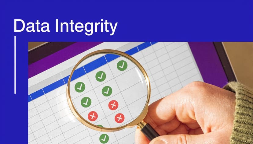
6. Establish Data Quality Checks and Validation Rules
Monday morning, the KPI pack goes out. By lunch, someone spots duplicate customer IDs in the sales sheet, and every conversion rate on the dashboard is now in question.
That is why data quality checks belong inside the reporting process, not in a cleanup scramble after the charts are built. In Excel, a clean-looking dashboard can hide broken joins, missing dates, or imported text values that distort the result.
Validate before you visualize
Set up checks on the raw data tab or a dedicated prep tab before anything feeds the final KPI view. Keep the rules simple, visible, and tied to failure conditions your team sees in weekly reporting.
A few Excel formulas catch a large share of reporting errors:
- Missing values:
=COUNTBLANK(range) - Duplicate IDs:
=COUNTIF($A$2:$A$100,A2)>1 - Out-of-range dates:
=AND(B2>=DATE(2025,1,1),B2<=TODAY()) - Impossible percentages:
=AND(C2>=0,C2<=1)
Each formula checks one condition. That makes failures easier to trace and easier to explain when someone asks why a KPI changed.
The duplicate rule is a good example. If Excel returns TRUE, flag the row with conditional formatting and stop that record from flowing into the summary pivot until it is fixed. The date rule does similar work for stale exports, future-dated transactions, and date fields that arrived as text during import.
If your team is still correcting those issues manually every week, ElyxAI can reduce the cleanup time. Its guide to Excel AI data cleaning shows where AI fits best and where a fixed validation rule is still the safer choice.
Add a visible quality layer
I usually add a small data health panel on a hidden prep tab or in the dashboard footer. It should show record count, refresh timestamp, duplicate count, blank-field count, and a simple pass or fail status for each rule.
That extra layer helps in two ways. Analysts catch issues before distribution, and stakeholders gain a quick confidence check without reading the workbook logic. If a check fails, hold the report. A chart is not ready for decision-making just because it rendered correctly.
The trade-off is maintenance. Every new KPI source adds another place where bad data can enter, so keep the rule set focused on the fields that can break reporting. In Excel, disciplined checks beat a long list of controls nobody monitors.
7. Use Benchmarking and Comparative Analytics
Monday morning, the dashboard shows churn up 1.8 points. That number can trigger the wrong reaction fast if the report does not show what it should be compared against.
A benchmark gives the KPI a frame. Without one, readers are left to guess whether the result is seasonal, expected, or a real performance problem. In practice, I want every important KPI to answer one follow-up question on the same screen: compared to what?
The comparisons that matter usually fall into three categories:
- Historical comparison: Versus last week, month, quarter, or the same period last year
- Target comparison: Versus budget, forecast, SLA, or operating goal
- Peer comparison: Versus other regions, teams, channels, or product lines
Use all three only when they help a decision. A crowded report full of reference lines, variance columns, and ranking labels gets hard to read in Excel very quickly. For executive views, one primary benchmark per KPI is often enough. For manager-level tabs, add the second layer if it changes the action someone should take.
Keep the benchmark comparable
Bad benchmarking creates false alarms.
A field sales team should not be compared to an inbound channel with a shorter cycle and different conversion pattern. A support team should not compare a holiday week to a standard staffing week without labeling the exception. The comparison has to match the operating reality, or the variance is noise dressed up as insight.
In Excel, keep benchmark values in a separate reference table instead of typing targets into formulas or chart labels. That setup makes updates safer and audit checks faster when a target changes mid-quarter.
=XLOOKUP(A2,$H$2:$H$20,$I$2:$I$20)
If A2 contains the KPI name, this formula returns the mapped benchmark from the reference table. It also cuts one of the most common reporting errors in Excel: hidden hardcoded targets scattered across tabs.
Show variance in a way people can scan
The useful part is not the benchmark itself. It is the gap.
Add variance columns for absolute difference and percentage difference. Then use restrained formatting so readers can spot exceptions without turning the sheet into a traffic-light wall. I usually reserve color for misses that cross a real threshold, not every small movement.
If your team is already generating reports from Excel data, benchmarking logic should be built into that repeatable workflow rather than added manually at the end. ElyxAI can help with the repetitive Excel work here too. Its guide to AI Excel automation for recurring reporting tasks is a practical fit for maintaining comparison tables, variance calculations, and repeated report updates.
Benchmarking turns KPI reporting from a status display into a decision tool. The number matters less than its position against history, target, and peers.
8. Automate Report Generation and Distribution
If your reporting process depends on one analyst remembering every step, it isn’t a process. It’s a risk.
Manual reporting breaks in familiar ways. Someone copies the wrong tab. Someone forgets to refresh a pivot. Someone sends the draft instead of the final version.
Standardize the workflow first
Before you automate anything, lock the sequence down.
For most Excel KPI reports, the repeatable workflow looks like this:
- Import data: Pull exports or connected-source data into a clean staging area.
- Transform data: Standardize dates, categories, and labels.
- Calculate KPIs: Apply formulas or pivot logic from controlled definitions.
- Format output: Update charts, comments, and layout.
- Distribute report: Send or publish the correct version to the right audience.
That last step matters too. If you’re building a process for generating reports from Excel data, distribution rules should be part of the design, not an afterthought.
ElyxAI’s article on AI Excel automation speaks directly to this kind of end-to-end spreadsheet workflow.
Use AI where repetition is highest
ElyxAI is built for that repetitive middle layer inside Excel. You describe the report task in natural language, and the tool executes the multi-step workflow in the workbook. According to ElyxAI’s product information, users report saving 3+ hours weekly by automating repetitive Excel work.
That’s a practical use case for KPI reporting because so much of the job is deterministic. The data changes, but the steps don’t.
“Automate the mechanics. Keep the judgment.”
That’s the right split. Let the tool handle the refresh, cleanup, pivots, charts, and formatting. You handle the exceptions, the commentary, and the business call.
Automation won’t fix a bad KPI strategy. But it will stop wasting strong analysts on routine spreadsheet labor.
9. Establish KPI Review and Governance Processes
Monday’s dashboard review starts, and the first 15 minutes disappear into an argument about what “qualified pipeline” means. I’ve seen that happen more than once in Excel-driven reporting. The workbook was updated on time, the charts looked polished, and the meeting still stalled because nobody owned the definition.
That is a governance problem.
Good KPI governance keeps reporting useful after the dashboard is built. Priorities change, source systems change, and teams start using the same metric in different ways unless someone maintains the rules. In practice, that means assigning an owner, documenting the calculation, setting a review cadence, and removing KPIs that no longer influence a decision.
Build a KPI registry in Excel
A dedicated registry tab is one of the simplest ways to keep control. It gives analysts, managers, and report consumers one place to verify what each KPI means before they debate the result.
Include fields such as:
- KPI title
- Business definition
- Calculation logic
- Business owner
- Report owner
- Source system
- Refresh cadence
- Last review date
- Status
- Retirement reason
In Excel, use a structured table for this registry so filters, formulas, and lookups stay stable as the list grows. Add data validation for status values like Active, Under Review, and Retired. Use conditional formatting to flag KPIs that have missed their review date.
That setup sounds simple because it is. It also prevents a common reporting failure: KPI sprawl.
Review the KPI set, not just the KPI values
A monthly or quarterly governance check should answer a few direct questions:
- Is the KPI still tied to a current business objective?
- Does anyone still act on it?
- Has the source data changed?
- Has the formula drifted from the original definition?
- Should this KPI be split, revised, or retired?
This review is different from the normal reporting meeting. The reporting meeting looks at performance. The governance review checks whether the metric itself still deserves space in the report.
That distinction matters in Excel because old tabs, copied formulas, and inherited workbooks tend to preserve metrics long after the business has stopped using them.
Use Excel to make governance visible
The governance process should live inside the workbook, not in a separate document nobody opens.
A practical approach is to add:
- A Definitions tab for KPI logic
- A Change Log tab with date, editor, and revision note
- A Review Tracker tab for upcoming governance checks
- Cell comments or notes on sensitive formulas
- Named ranges for approved KPI calculations
That structure makes handoffs cleaner and audits faster. It also reduces the risk of two analysts maintaining slightly different versions of the same metric.
ElyxAI helps on the tedious side of this work. If a governance review requires pulling historical periods, checking trend breaks, or rebuilding comparison tabs in Excel, the agent can handle the repetitive workbook steps while the analyst focuses on whether the KPI still belongs in the pack.
If your reporting stack is getting broader, it also helps to understand the surrounding tool options. This overview of marketing data analytics tools, including BI platforms is useful context for teams deciding which governance tasks should stay in Excel and which should move into a shared reporting environment.
One rule keeps the whole process honest. If a KPI does not change a decision, it should not survive on legacy status alone.
10. Integrate Excel Workflows with BI Platforms
Monday morning usually starts the same way. An analyst is checking formulas in Excel, a manager wants the latest KPI view, and leadership expects one shared version of the numbers. If the workbook stays local, distribution breaks down. If everything gets pushed into BI too early, the team loses the speed that makes Excel useful in the first place.
The practical answer is a split workflow with clear responsibilities.
Keep analysis in Excel. Publish stable KPIs in BI.
Excel still does the messy work better than most systems. It is faster for testing logic, reconciling source extracts, reviewing exceptions, and pressure-testing a new KPI before other teams rely on it.
BI platforms earn their place once the metric is stable and the audience gets bigger. Power BI and Tableau are better suited to shared dashboards, permission control, scheduled refreshes, and a consistent view across departments.
That handoff point matters. Move a KPI into BI too early and analysts spend time rebuilding definitions that are still changing. Leave it in Excel too long and version control turns into a reporting risk.
A workable model looks like this:
- Use Excel for data prep, formula checks, and KPI prototyping
- Lock the business logic before publishing the metric more broadly
- Push approved outputs into the BI layer for distribution and self-serve access
- Keep one definition of each KPI across both tools
This is also where ElyxAI earns its keep. In Excel, the slow part is rarely the analysis itself. It is the repeated cleanup, tab updates, comparison pulls, and workbook prep that happen before a number is ready for review. ElyxAI can handle those repetitive steps so analysts spend more time validating the metric and less time maintaining the file.
Teams evaluating their stack often need a wider tool comparison, not just an Excel-versus-Power-BI debate. This roundup of marketing data analytics tools, including BI platforms is useful for deciding which reporting tasks belong in spreadsheets and which should move into a shared BI environment.
The goal is not to replace Excel. The goal is to stop using it for jobs that BI handles better, while keeping it where analysts work fastest.
KPI Reporting Best Practices: 10-Point Comparison
| Practice | 🔄 Implementation Complexity | Resource Requirements | ⭐ Expected Outcomes | 📊 Key Advantages | 💡 Ideal Use Cases |
|---|---|---|---|---|---|
| 1. Define Clear, Measurable, and Aligned KPIs | Medium–High, stakeholder alignment required | Moderate, workshops, analyst time, documentation | ⭐⭐⭐⭐ Clearer decisions and aligned objectives | Prevents vanity metrics; improves accountability | Strategic planning, company-wide performance tracking |
| 2. Implement Near-Real-Time Data Refresh Cycles | High, infrastructure and scheduling complexity | High, ETL/streaming, devops, monitoring | ⭐⭐⭐⭐ Timely, actionable data for fast decisions | Reduces lag and manual work; faster anomaly detection | Trading, e‑commerce, operations monitoring |
| 3. Create Role-Based Dashboards and Customized Views | Medium, design and access controls needed | Moderate, dashboard dev, role definitions | ⭐⭐⭐ Adoption and faster role-specific decisions | Reduces information overload; enforces access control | Executives, managers, front-line reps |
| 4. Establish Context and Narrative Around KPIs | Medium, analytic effort per metric | Low–Moderate, analysts, templates | ⭐⭐⭐⭐ More actionable insights and reduced misinterpretation | Connects metrics to causes and recommended actions | Executive summaries, monthly performance reviews |
| 5. Implement Tiered KPI Hierarchies with Drill-Downs | High, data modeling and relationships required | High, data modeling, UX, tool capabilities | ⭐⭐⭐⭐ Strong strategic alignment and traceability | Enables root‑cause analysis and clear accountability | Large enterprises, revenue/supply chain mapping |
| 6. Establish Data Quality Checks and Validation Rules | Medium–High, rule definition and monitoring | Moderate, validation rules, alerts, audits | ⭐⭐⭐⭐ Higher trust and accuracy in reported KPIs | Prevents bad decisions; provides audit trails | Finance, compliance, operational reporting |
| 7. Use Benchmarking and Comparative Analytics | Medium, sourcing and normalizing benchmarks | Moderate, external data, analysis effort | ⭐⭐⭐ Contextualized performance insights | Highlights gaps and best practices; motivates teams | Market positioning, performance improvement |
| 8. Automate Report Generation and Distribution | Medium–High, initial setup and error handling | Moderate, automation tools, templates | ⭐⭐⭐⭐ Time savings and consistent delivery | Ensures timeliness, reduces manual errors | Periodic reports (daily/weekly/monthly), alerts |
| 9. Establish KPI Review and Governance Processes | Medium, organizational coordination | Moderate, governance meetings, registries | ⭐⭐⭐⭐ Maintains KPI relevance and accountability | Controls metric proliferation; enforces ownership | Quarterly reviews, enterprise governance forums |
| 10. Integrate Excel Workflows with BI Platforms | High, integration and architecture work | High, BI licenses, engineers, governance | ⭐⭐⭐⭐ Scalable self‑service analytics and consistency | Single source of truth; advanced visualization | Enterprise dashboards, company-wide reporting |
Turn Your KPI Reports into a Strategic Advantage
Most KPI reporting problems aren’t caused by a lack of charts. They’re caused by weak definitions, stale data, overloaded dashboards, and too much manual work hidden behind the scenes.
That’s why solid kpi reporting best practices matter. They force clarity.
When you limit the number of KPIs, define them properly, validate source data, tailor views by audience, and review the whole system regularly, the report changes role. It stops being a weekly obligation and starts becoming a decision tool. That’s the fundamental shift many organizations require.
Excel is still central to that process because it gives analysts flexibility. You can test logic quickly, reconcile edge cases, build custom formulas, and shape the output exactly how stakeholders need it. But flexibility has a cost when everything is manual. Repetitive cleanup, pivot rebuilding, formatting, and distribution drain time that should go into interpretation.
That’s where automation becomes practical, not just fashionable. The right workflow automation inside Excel doesn’t replace analytical thinking. It protects it. It removes the repetitive steps so you can spend more time checking assumptions, investigating changes, and writing useful commentary around the numbers.
The strongest reporting teams usually do a few things consistently:
- They keep KPI sets tight.
- They document definitions.
- They build visible data-quality checks.
- They design reports for readers, not for themselves.
- They automate every repeatable step they can trust.
If you work in Excel every day, that last point matters a lot. An AI tool like ElyxAI is relevant because it operates inside the spreadsheet workflow many teams already use. It can help execute multi-step reporting work such as cleaning data, creating pivots, generating charts, and formatting outputs from natural-language instructions, while you stay focused on the business interpretation.
That’s the practical goal. Spend less time assembling reports. Spend more time making them useful.
A KPI report should help someone decide what to do next. If it doesn’t, improve the report until it does.
If you want to spend less time rebuilding Excel reports and more time analyzing them, take a look at Elyx AI. It works inside Excel as an AI-powered agent that can execute reporting workflows like data cleaning, pivot table creation, chart generation, formatting, and trend analysis from a natural-language request.
Reading Excel tutorials to save time?
What if an AI did the work for you?
Describe what you need, Elyx executes it in Excel.
Sign up