How to Measure Marketing Effectiveness Using Excel & AI

Measuring marketing effectiveness isn't just about tracking clicks and likes. It’s about drawing a straight line from your marketing spend to real business results, focusing on the metrics that actually move the needle—think Customer Acquisition Cost (CAC) and Return on Ad Spend (ROAS). Before you even think about complex software, you can build a solid game plan right inside Excel that defines your goals, picks the right KPIs, and creates a clear measurement framework.
Defining What Marketing Effectiveness Means for You
First things first, what does "effective" even mean for your business? This is the most critical question to answer. Without a clear definition, you'll end up chasing metrics that don't matter, drowning in data that tells you nothing about business growth.
This initial step is all about creating a roadmap that connects every marketing action back to your company's core objectives. It’s the only way to avoid the classic pitfall of getting excited about vanity metrics—like a spike in social media followers—that look great on a chart but do absolutely nothing for your bottom line.
Spending too much time on Excel?
Elyx AI generates your formulas and automates your tasks in seconds.
Sign up →Moving Beyond Vanity Metrics
The real goal here is to shift your mindset from chasing short-term tactical wins to building long-term, strategic value. Of course, immediate results like lead numbers and conversion rates are important. But the full picture must also include metrics that signal sustainable growth, like brand health and customer lifetime value.
It's a balancing act. The CMO Survey recently pointed out a major blind spot for many companies: they’re great at tracking short-term metrics like sales and digital performance but often neglect strategic ones like customer lifetime value. It's a disconnect that can really hold a business back.
This simple flowchart breaks down the foundational process: define what you want to achieve, pick the metrics that prove you're getting there, and build a scorecard to keep track of it all.
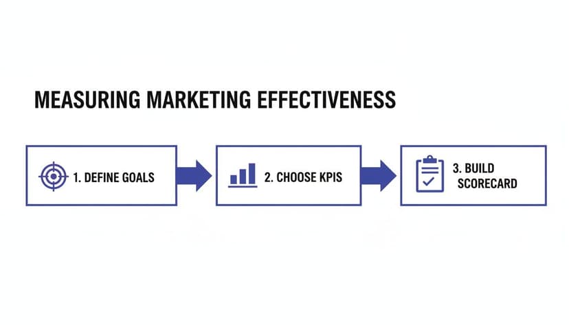
Following this process ensures every number you track has a purpose and directly ties back to your most important business goals.
Choosing KPIs for Each Stage of the Funnel
A truly comprehensive measurement plan needs KPIs that cover every stage of the marketing funnel. This gives you a complete view of the customer journey, from the moment someone first hears about you to the point they become a loyal advocate.
To get a full picture, you'll want a mix of metrics like these:
- Awareness: Are people finding you? Look at metrics like ad impressions and website traffic.
- Consideration: Are they engaging? Track things like email click-through rates, time on page, and lead magnet downloads.
- Conversion: Are they buying? This is where you measure the hard numbers: conversion rate, cost per acquisition (CPA), and ROAS.
- Loyalty: Are they coming back? Post-purchase metrics like Customer Lifetime Value (CLV) and repeat purchase rate tell you if you’re building a sustainable business.
The table below breaks down some essential KPIs by common business objectives, giving you a starting point for building your own measurement scorecard in Excel.
Essential Marketing KPIs by Business Objective
| Marketing Objective | Primary KPI | Excel Formula Example | Formula Explanation |
|---|---|---|---|
| Increase Brand Awareness | Impression Share | =B2/C2 |
Divides your total impressions (cell B2) by the total available impressions (cell C2) to show your market visibility. |
| Generate New Leads | Cost Per Lead (CPL) | =B2/C2 |
Divides your total ad spend (cell B2) by the total new leads generated (cell C2) to find the cost of each lead. |
| Drive Sales Revenue | Return on Ad Spend (ROAS) | =B2/C2 |
Divides the revenue from ads (cell B2) by the total ad spend (cell C2) to calculate the return for every dollar spent. |
| Improve Customer Loyalty | Customer Lifetime Value (CLV) | =(B2*C2)*D2 |
Multiplies Average Purchase Value (B2) by Purchase Frequency (C2) and then by Average Customer Lifespan (D2) to estimate total customer revenue. |
By aligning your KPIs this way, you create a powerful feedback loop that constantly informs your strategy.
A great marketing scorecard doesn’t just report on the past; it provides a clear, forward-looking view of what’s working and where to invest next. It balances the quick wins with the long-term strategic goals that build a resilient brand.
Ultimately, a huge part of this is mastering how to start tracking your marketing ROI from day one. When you set up a robust framework from the beginning, you create a foundation for a data-driven culture. And if you need to get a better handle on the competitive landscape first, our guide on essential market analysis techniques is a great place to start. This upfront planning is what makes every subsequent step—from data collection to dashboard creation—so much more powerful.
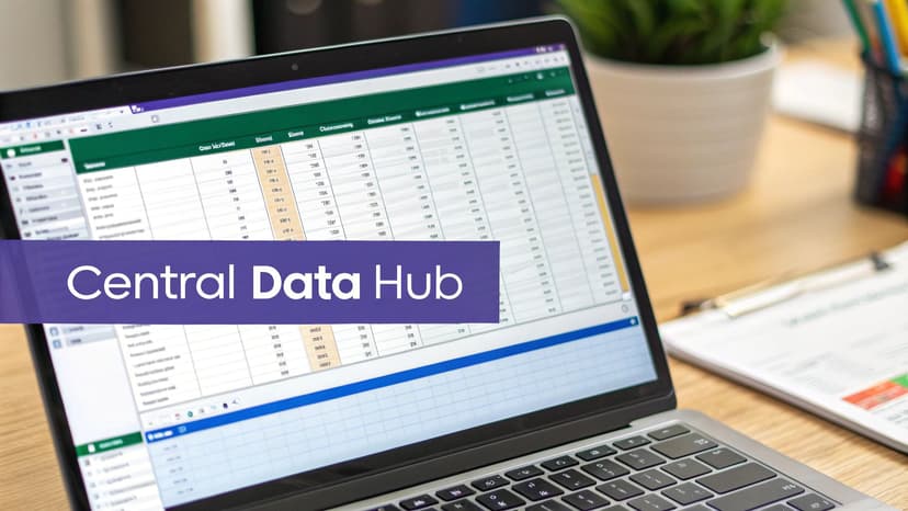
Building Your Central Data Hub in Excel
Before you can even think about calculating ROAS or LTV, you need to get your house in order. That means getting all your marketing performance data into one, organized place. This is where you’ll turn a blank Excel sheet into a powerful, centralized data hub—your single source of truth for everything that matters.
This isn’t just about copy-pasting numbers. It's about building a scalable foundation, so your spreadsheet grows with your campaigns instead of becoming a tangled mess you're afraid to open.

Gathering and Consolidating Your Data Sources
Your marketing data is probably scattered all over the place. The first job is to bring it all together. This means exporting data from your key channels and giving each one its own tab in a single Excel workbook.
Here are the usual suspects you'll need to round up:
- Website Analytics: All your traffic, user behavior, and conversion data from tools like Google Analytics.
- CRM System: Customer info, deal stages, and sales revenue from your CRM, whether it's Salesforce or HubSpot.
- Ad Platforms: The hard numbers on spend, impressions, clicks, and conversions from Google Ads, Meta Ads, and LinkedIn Ads.
- Email Marketing Software: Open rates, click-through rates, and unsubscribes from platforms like Mailchimp or Klaviyo.
This whole process of pulling different datasets together is called data aggregation. If that’s a new term for you, it's worth getting familiar with what data aggregation is. It’s the bedrock of a reliable measurement framework.
The goal isn't just to dump raw data. It’s to create a structured repository where each data source is clean, clearly labeled, and ready for consolidation into a master analysis sheet.
Structuring Your Excel Workbook for Success
A well-organized workbook will save you countless headaches down the road. Ditch the idea of a single, chaotic sheet and set things up logically. A smart structure I've used time and again looks like this:
- Raw Data Tabs: Give each data export its own tab (e.g., "GA_Data," "CRM_Leads," "Meta_Ads_Spend"). This keeps the original data untouched, so you always have a clean copy to fall back on.
- Cleaned Data Tab: Create one central "Master_Data" tab. This is where you’ll pull in, clean, and consolidate the information from all your raw data tabs.
- Analysis & Dashboard Tabs: Finally, use separate tabs for your calculations ("KPI_Calculations") and charts ("Dashboard"). This keeps your raw data completely separate from your final report.
This modular setup makes it much easier to update your data, spot errors, and see exactly how numbers flow from their source to your final analysis.
Tackling Messy Data with AI
Okay, this is where most marketing measurement projects fall apart. Real-world data is messy. It's filled with inconsistent campaign names ("Fall_Promo" vs. "fall-promo-23"), duplicate entries, and random blank cells. Cleaning this up by hand is not only mind-numbingly dull but also a huge source of errors.
This is where an AI agent in Excel, like Elyx.AI, can completely change the game. Instead of wrestling with complex formulas or manually deleting rows for hours, you can just tell the AI what to do in plain English.
Imagine you have three tabs with campaign data from Google, Facebook, and your CRM. Of course, the naming conventions are all slightly different. A simple prompt like, "Merge the campaign data from these three tabs, standardize campaign names based on the 'Fall Sale 2024' theme, and remove any duplicate rows" can do in seconds what would take a person hours of painstaking work.
By letting an AI handle the grunt work of data cleaning, you can get back to what you're actually supposed to be doing—finding the insights that will help you make smarter marketing decisions.
Crunching the Numbers: Your Core Marketing Metrics in Excel
Once your data is pulled together in one place, it's time for the fun part: turning all those raw numbers into real business intelligence. This is where we stop just collecting data and start actively measuring what’s working.
Let's walk through how to calculate three of the most important marketing metrics right inside Excel, with the exact formulas you’ll need.
Knowing how to do this is non-negotiable. With budgets always under scrutiny, you have to be able to prove your marketing efforts are paying off. It's surprising, but recent data shows only 38.2% of marketers consistently track the real business outcomes of their work, often getting stuck on vanity metrics. We're going to avoid that trap by focusing on what truly matters: revenue and profit.
Calculating Customer Acquisition Cost (CAC)
Your Customer Acquisition Cost (CAC) tells you, on average, exactly what it costs you to land a new customer. It’s a direct measure of how efficient your marketing and sales machine is. If your CAC is too high, it's chewing up your profits. A low CAC, on the other hand, is a great sign of a healthy, scalable business.
To get this number in Excel, you just need two things in your spreadsheet: the total you spent on marketing and sales for a given period, and how many new customers you brought in during that same time.
Let’s say your total marketing spend is in cell B2, and your new customer count is in cell C2. The formula is simple:
=B2/C2
B2: This cell contains your total marketing and sales costs for the period.C2: This cell contains the total number of new customers acquired in that period.- The formula divides the total cost by the customer count to give you your average CAC.
Mastering Customer Lifetime Value (LTV)
While CAC shows you the cost to get a customer, Customer Lifetime Value (LTV) reveals how much that customer is worth to you over their entire relationship with your business. The real magic happens when you put LTV and CAC side-by-side. For a business to be healthy, your LTV needs to be significantly higher than your CAC.
Calculating LTV can get complicated, but a simple, effective formula in Excel only requires three variables: Average Purchase Value, Purchase Frequency, and Average Customer Lifespan.
Imagine you have these data points in your sheet:
- Cell
D2: Average Purchase Value ($) - Cell
E2: Average number of purchases per year - Cell
F2: Average customer lifespan (in years)
The formula to calculate LTV would be:
=D2*E2*F2
D2*E2: First, this calculates the average annual value of a customer.*F2: Then, it multiplies that annual value by the number of years they remain a customer to find the total lifetime value.
This calculation gives you an incredibly valuable long-term view. It shifts your focus from a single sale to the total value a customer brings, which helps you make smarter decisions on where to invest in both acquisition and retention. To get a handle on your marketing's impact, you have to master various digital marketing performance metrics that directly influence your ROI.
The LTV to CAC ratio is one of the most critical health indicators for any business. A good rule of thumb is a 3:1 ratio—meaning for every dollar you spend to get a customer, you make at least three dollars back over their lifetime.
Tracking Return on Ad Spend (ROAS)
Return on Ad Spend (ROAS) is your go-to metric for figuring out if your ad campaigns are actually making money. It answers one simple but critical question: for every dollar I put into ads, how many dollars do I get back in revenue? It's essential for optimizing your ad budget and pouring more fuel on the channels that are on fire.
Calculating ROAS in Excel is just as direct. You'll need one cell for the revenue generated by your ads and another for your total ad spend.
If your ad-generated revenue is in cell G2 and your ad spend is in cell H2, the formula is:
=G2/H2
G2: This cell holds the total revenue directly attributable to your advertising campaigns.H2: This cell holds the total amount spent on those same campaigns.- The formula divides revenue by spend. A result of 4 means you're making $4 for every $1 you spend.
This metric gives you clear, immediate feedback on how your campaigns are doing, letting you quickly shift your budget away from what’s not working and double down on your winners. While ROAS gives you a hard financial signal, other metrics like the Net Promoter Score can provide vital feedback on customer loyalty. You can learn more in our deep dive on Net Promoter Score calculation.
Let an AI Assistant Handle the Math
While these formulas are straightforward, manually building them for different campaigns, channels, and time periods can get old fast. This is where an AI agent like Elyx.AI can save you a massive amount of time. Instead of fiddling with cell references and formulas, you just ask for what you need.
For example, you could type a prompt like, "Calculate the LTV to CAC ratio for each marketing channel in Q3 and highlight the top-performing channel."
The AI can do all the heavy lifting—running the calculations, summarizing the data, and even formatting the results. It turns a complex, multi-step analysis into a single request, which not only prevents formula errors but also lets you focus on what the numbers actually mean for your strategy.
Choosing the Right Marketing Attribution Model
Figuring out which marketing touchpoint actually deserves credit for a sale can feel like solving a complex puzzle. That's really the heart of marketing attribution: assigning value to the different channels a customer bumps into on their way to making a purchase. If you get this right, you'll have a much clearer picture of what’s truly working.
The attribution model you choose isn't just a technical detail—it’s a strategic decision that directly shapes how you see campaign performance. It's the framework that tells you which channels get more budget and which ones might get the axe. A poor choice here could mean you end up pouring money into channels that are great at closing deals but completely ignore the ones that bring new people to your brand in the first place.
This has become a huge headache for marketers. Data is often scattered all over the place, creating a murky, confusing picture. In fact, the 2023 Nielsen Annual Marketing Report revealed that a staggering 62% of marketers around the world are struggling to decide where to put their ad dollars. Many are juggling multiple, disconnected measurement tools, which just erodes their confidence in the data. You can read more about Nielsen's findings on consistent measurement to see just how common this challenge is.
Common Attribution Models You Can Use in Excel
You don't always need expensive, specialized software to get started with attribution. You can actually analyze several of the foundational models right inside Excel. While they might be simpler, they can still give you some incredibly valuable insights without a massive investment.
Here are three of the most common models you can start with:
-
First-Touch Attribution: This one is straightforward. It gives 100% of the credit for a conversion to the very first marketing channel a customer ever interacted with. It’s perfect for figuring out which channels are your heavy hitters for generating initial awareness.
-
Last-Touch Attribution: This model is the polar opposite. It gives all the credit to the final touchpoint right before the customer converted. It's the easiest to track and is great for identifying which channels are your best "closers."
-
Linear Attribution: This model takes a more democratic approach. It spreads the credit equally across every single touchpoint in the customer's journey. It’s built on the idea that each interaction played a part in the final decision.
Selecting the Right Model for Your Business
So, which one is best? The honest answer is: it depends entirely on your business goals and how long your sales cycle typically is. There’s no magic one-size-fits-all solution here.
If you run an e-commerce store selling low-cost items, the customer journey is probably pretty quick. In that case, Last-Touch Attribution is often more than enough. The final click is a very strong signal of what pushed the customer to buy.
On the other hand, if you're a B2B company with a six-month sales cycle involving multiple decision-makers, a Linear or First-Touch model will tell a much richer story. First-Touch shows you what content or ads first grabbed their attention months ago, while a Linear model gives credit to every blog post, webinar, and email that nurtured them along the way.
Your choice of attribution model is a statement about what you value. Do you value the channel that opens the door (First-Touch), the one that closes the deal (Last-Touch), or the entire journey (Linear)? Answering this helps align your measurement with your strategy.
Implementing a Simple Model in Your Spreadsheet
You can get a basic attribution analysis up and running in your central Excel hub. Start by listing each conversion and then mapping out the sequence of touchpoints that led to it. With a few functions like IF and VLOOKUP, you can start assigning credit based on the model you've chosen.
For example, to implement a Last-Touch model, you'd just credit the channel listed as the final interaction for each sale. It's a simplified view, for sure, but it’s a powerful first step. As you get more comfortable, you can start digging into more complex statistical methods. For anyone interested in taking that next step into predictive analytics, our guide on what is regression analysis is a great place to build a solid foundation.
Bringing Your Marketing Data to Life with AI-Powered Dashboards
Once you’ve wrestled with attribution models and calculated your core metrics, the real work begins: telling a story with your data. Raw numbers and isolated calculations are great, but to truly measure marketing effectiveness, you need to turn that analysis into a visual, dynamic dashboard that anyone—from the CMO to a junior analyst—can understand at a glance.
This isn't about creating another static, weekly report that’s stale the moment it hits someone's inbox. The goal is to build an interactive command center for your marketing performance, right inside of Excel. Think of it as a living document that pulls in fresh data, letting you and your team spot trends and make decisions without delay.
Moving from Static Reports to Dynamic Dashboards
A truly useful marketing dashboard is more than just a collection of pretty charts. It’s an interactive tool, typically built around pivot tables and slicers. If you haven't used them, slicers are basically user-friendly buttons that let anyone filter the dashboard's data—even if they’ve never written a formula in their life.
This interactivity is what separates a good dashboard from a great one. It lets you ask deeper questions on the fly. Instead of just seeing your overall ROAS, you can click a button to see ROAS for just your social media campaigns last month, then instantly compare it to your search campaigns from the previous quarter. No rebuilding required.
If you were to build this by hand, the process would look something like this:
- Start with Pivot Tables: You'd first use a pivot table to summarize all your raw data, maybe grouping your revenue and ad spend by channel or campaign.
- Create Pivot Charts: From there, you'd generate charts. A bar chart is perfect for comparing ROAS across channels, while a line chart is ideal for tracking how your CAC has changed over time.
- Add Slicers for Interactivity: Finally, you'd add slicers for key categories like "Date," "Channel," and "Campaign" to make the whole thing clickable and dynamic.
This gives you a powerful tool, but let's be honest—the initial setup can be a real time-sink and requires you to know your way around Excel's advanced features. For a more detailed breakdown of the manual process, our guide on how to automate Excel reports walks you through it step-by-step.
A well-designed dashboard does more than just present data; it invites curiosity. It empowers your team to explore the 'why' behind the numbers, turning every stakeholder into an analyst.
How AI Changes the Dashboard Game
This is where things get really interesting. Building a polished, interactive dashboard from scratch can easily eat up a few hours, especially when you’re wrestling with formatting and making sure all the interactive elements actually work together. An AI agent inside Excel, like Elyx.AI, can shrink that entire workflow down to just a few minutes.
The real game-changer is being able to use plain English to tell the AI what you need. You don't have to be a pivot table wizard or a chart design guru anymore. You just need to know what you want to see.
Picture this: you have your clean, consolidated marketing data ready in an Excel sheet. Instead of manually clicking through menus, you could just type a single command:
“Build a dashboard showing ROAS by channel and CAC trends over the last quarter. Include slicers for campaign and date, and format it using our company’s blue and grey branding.”
From that one simple request, the AI agent gets to work. It builds the necessary pivot tables from your source data, generates the right charts, links up all the interactive slicers, and even applies professional formatting to match your brand colors. What used to be a tedious, multi-step chore becomes a single, automated action. This doesn't just save a ton of time; it also cuts out the risk of human error during setup, ensuring your data story is both accurate and compelling.
Common Questions About Measuring Marketing Effectiveness
As you start digging into your marketing data in Excel, a few questions almost always pop up. Let's tackle some of the most common ones I hear from marketers trying to get a better handle on their numbers.

How Often Should I Measure My Marketing Effectiveness?
Honestly, there’s no one-size-fits-all answer. The right rhythm depends entirely on what you’re measuring. The trick is to find a cadence that lets you make smart decisions without drowning in spreadsheets.
Some metrics need your constant attention, while others are more of a long game.
- Daily or Weekly Checks: Think of things like ad spend, click-through rates (CTR), and daily conversions. These are your front-line indicators. If something is off here, you need to know now so you can tweak the campaign before you burn through your budget.
- Monthly or Quarterly Reviews: Strategic metrics like Customer Lifetime Value (LTV), overall marketing ROI, and brand sentiment don't fluctuate wildly day-to-day. Pulling back to a monthly or quarterly view gives you a much clearer picture of your long-term impact and helps guide bigger strategic shifts.
What's the Biggest Mistake to Avoid When Measuring Marketing in Excel?
The single biggest trap I see people fall into is obsessing over "vanity metrics." These are the numbers that feel good to report but don't actually tie back to business goals. We're talking about things like social media followers, raw page views, or email open rates.
Sure, a huge spike in website traffic looks great on a chart. But if none of those visitors turn into leads or customers, what did it accomplish? It's just noise.
The golden rule is to connect every metric back to the bottom line. Every KPI on your dashboard should help answer the question, "How did this activity impact revenue or profitable growth?"
Can AI Help If My Marketing Data Is a Mess?
Absolutely. In fact, this is where AI in Excel really shines. We've all been there—trying to manually merge, clean, and standardize data from a dozen different sources. It’s not just a soul-crushing task; it’s a minefield of potential errors that can throw off your entire analysis.
Instead of losing hours to that grunt work, you can use a simple, plain-English prompt.
Imagine just telling your spreadsheet, "Combine the campaign data from these three tabs, get rid of all the duplicates, make the 'Campaign Name' column consistent, and reformat the 'Date' column to MM/DD/YYYY." An AI agent can get that done in seconds. This isn't just about saving time; it's about shifting your energy from cleaning data to actually analyzing it.
Which Marketing Attribution Model Is Best for a Small Business?
For most small businesses, the Last-Touch attribution model is the perfect starting point. It’s straightforward, easy to set up, and gives 100% of the credit for a sale to the final touchpoint a customer had before converting.
Is it a perfect reflection of a long, complicated customer journey? No. But it gives you incredibly clear, actionable insight into which of your channels are closing the deal. As your marketing mix gets more sophisticated, you can graduate to something like a Linear model, which spreads credit equally across all touchpoints for a more holistic view.
Ready to stop wrestling with messy data and start getting instant insights? With Elyx.AI, you can automate data cleaning, generate complex formulas, and build dynamic dashboards in seconds using simple, natural language. Transform your Excel workflow and reclaim hours every week.
Start your free Elyx.AI trial today!
Reading Excel tutorials to save time?
What if an AI did the work for you?
Describe what you need, Elyx executes it in Excel.
Sign up