What is Data Aggregation: A Practical Guide for Excel Users

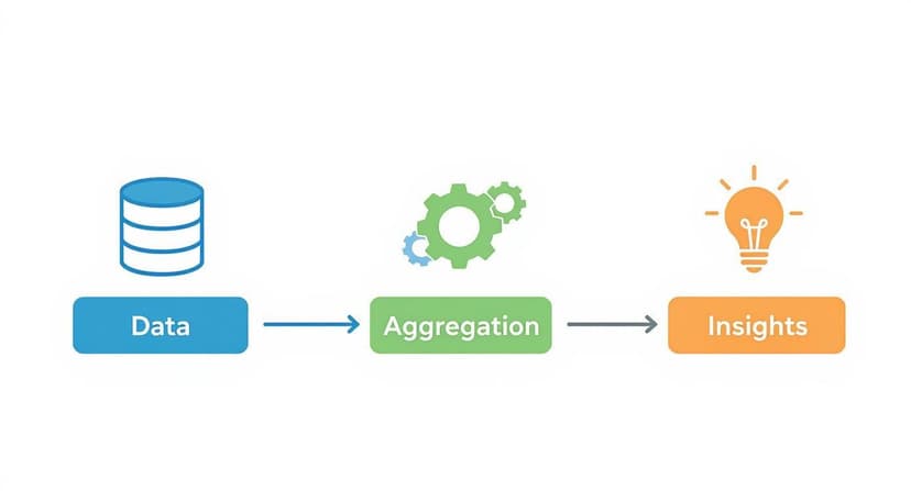
At its core, data aggregation is the process of gathering raw data from various sources and summarizing it into a more digestible, high-level format. It's the essential first step in transforming a mountain of individual data points into clear, actionable insights within your spreadsheet.
Think of it this way: instead of drowning in thousands of individual sales receipts in an Excel sheet, you get a clean, simple report showing your total monthly revenue. For anyone using Excel to make sense of their numbers, data aggregation is the bridge between raw information and a useful summary you can actually work with.
What Is Data Aggregation in Practice?

Spending too much time on Excel?
Elyx AI generates your formulas and automates your tasks in seconds.
Sign up →Imagine trying to understand a novel by looking at every single letter individually instead of grouping them into words and sentences. You’d never grasp the story. That’s what raw data in an Excel file often looks like—a jumble of disconnected cells. Aggregation is the process that groups those letters into words, giving you a coherent narrative.
This isn’t just about collecting data; it’s about transforming it. The process takes raw, granular information and applies a summary function to it—like SUM, AVERAGE, or COUNT—to present it in a more meaningful format. So, instead of trying to analyze a million individual website clicks in a massive spreadsheet, you can aggregate them to see the total number of visitors per day. Simple and effective.
The Foundation of Smart Decisions in Excel
Without aggregation, you’re just staring at a sea of numbers with zero context. This process is what turns messy spreadsheets into the clear, actionable insights that fuel smart business decisions. A retail manager, for instance, doesn't need a list of every single transaction. What they really need is aggregated data that shows them:
- Total sales by product category for the last quarter.
- The average purchase value for each customer.
- A count of items sold at each store location.
Each of these data points is a direct result of aggregation, often performed right inside Excel. It provides that essential big-picture view needed for strategic planning, helping you spot trends, see what’s working, and fix what isn’t. This idea is closely tied to how you structure data for analysis. If you want to go deeper, you can read our guide on what is data modeling to learn more about organizing your data for powerful insights.
Data aggregation is the bridge between raw data and meaningful intelligence. It converts the overwhelming noise of individual data points into a clear signal that tells a story about your business performance.
A Growing Business Necessity
The importance of this process is reflected in its massive economic impact. The global data integration market, which includes aggregation tools, was valued at $13.97 billion in 2024 and is expected to more than double by 2030. This explosive growth shows just how essential aggregation has become for any business that wants to stay competitive.
Ultimately, understanding data aggregation means seeing it as the starting line for any real data analysis. It gets your information ready for charts, reports, and more advanced analytics, making it a must-have skill for anyone who works with data in Excel.
Exploring Core Data Aggregation Methods

So, how does data aggregation actually work in the real world? It's really all about grouping your data along different dimensions to uncover the story hidden inside. Think of these methods as different lenses for your camera—each one gives you a unique perspective on the same subject.
These aren't complicated theories, either. They're practical, everyday approaches. If you've ever looked at a monthly sales report instead of a massive log of daily transactions, you've already used data aggregation to see the bigger picture.
Let's break down the main ways it's done.
Time Aggregation
This is probably the one you're most familiar with. Time Aggregation is simply the act of summarizing data over specific periods—days, weeks, months, or even years. Instead of getting bogged down in every single transaction, you group them to track performance over time.
For an e-commerce store, this is the difference between seeing thousands of individual order timestamps and a clean report showing:
- Total sales revenue per month.
- Average website traffic per week.
- Number of new customers acquired per quarter.
This method is fantastic for spotting trends, understanding seasonal slumps and spikes, and tracking long-term growth. Without it, you're just looking at a chaotic stream of information. In fact, many specific analytical tasks depend on this kind of grouping; learning how to calculate weighted average cost for inventory, for example, is a classic application.
Spatial and Categorical Aggregation
Next up is Spatial Aggregation, which is all about location, location, location. If you manage a retail chain, analyzing the performance of each individual store is useful, but it doesn't give you the whole story. By grouping store data, you can see how you're performing by city, state, or entire sales region.
Then there's Categorical Aggregation, which groups data based on shared traits. A marketing team might group customers by how they found the business (e.g., social media, email, organic search) to see which channel is bringing in the most valuable leads. A product manager could do the same thing by grouping sales data by product type to find out which category is flying off the shelves.
Aggregation methods are the building blocks of analysis. They transform raw, disconnected data points into a structured summary that answers key business questions about 'when,' 'where,' and 'what.'
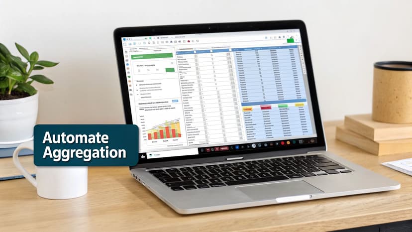
Manual vs. Automated Aggregation in Excel
So how do we get this done in Excel? For a long time, the answer was manual copy-pasting—a slow, painful process where one wrong move could throw off an entire report. Thankfully, we now have much better, automated options that are faster, safer, and far more reliable.
Let’s compare the two approaches.
Comparing Data Aggregation Methods
The table below breaks down the key differences between doing things by hand and letting a tool handle the heavy lifting.
| Attribute | Manual Aggregation (e.g., Excel Copy/Paste) | Automated Aggregation (e.g., PivotTables, AI Tools) |
|---|---|---|
| Speed | Extremely slow, especially with large datasets. | Nearly instantaneous, handling millions of rows in seconds. |
| Accuracy | High risk of human error from typos or mistakes. | 99.9% accurate, eliminating manual mistakes. |
| Scalability | Breaks down quickly as data volume increases. | Easily handles growing datasets without performance loss. |
| Repeatability | Must be manually repeated for every new report. | Processes can be saved and run automatically on a schedule. |
Ultimately, automated tools don't just save you a ton of time. They give you confidence that the numbers you're using to make big decisions are actually correct. This shift frees you up to focus on what really matters: analyzing the insights, not just wrestling with the data.
Why Data Aggregation Matters for Your Business
Let's be honest, raw data on its own is just noise. It’s a tidal wave of individual numbers, transactions, and clicks. Without data aggregation, you're swimming in that chaos, trying to find a clear signal. Aggregation is what turns that noise into a clear, understandable story about your business.
Think about it like this: you wouldn't try to build a house with just a giant pile of lumber, nails, and drywall. You need a blueprint. Data aggregation is that blueprint. It takes all the raw materials and organizes them into a coherent plan, showing you exactly what you can build.
That’s what aggregation does. It transforms disconnected facts into a clear picture of your performance, helping you spot opportunities, solve problems, and actually grow.
From Raw Data to Strategic Clarity
Every single department benefits when data is properly aggregated. It cuts through the overwhelming details and serves up actionable summaries, fueling smarter decisions from the ground up. This isn't just about pretty reports; it's about reacting to the market faster and with more confidence.
Here’s how it plays out in the real world:
- For Sales: A sales manager doesn’t need to see a list of 10,000 individual transactions. What they need is total revenue by region, which helps them send their best people to the hottest markets.
- For Marketing: Instead of sifting through thousands of comments, a marketing team can group customer feedback by sentiment (positive, negative, or neutral). Suddenly, it's crystal clear what customers love about a new product and what needs a quick fix.
- For Operations: An operations manager can summarize daily production numbers into weekly and monthly trends. This simple step helps them spot efficiency bottlenecks long before they turn into critical failures.
In every case, aggregation provides the high-level view you need to think strategically. To see this in action, check out how a wealth management solution increases efficiency and performance by consolidating complex data.
Unlocking Deeper Business Insights
The real magic happens when you use aggregated data as the foundation for deeper analysis. It’s the starting point for powerful predictive models and sophisticated analytics. In finance, firms aggregate market data to pinpoint emerging investment trends. In healthcare, aggregated patient data helps track disease outbreaks and guide public health policies.
This process directly powers key business functions:
- Inventory Optimization: A retailer can summarize sales data over time to forecast demand accurately. This means popular items stay in stock, and you aren't stuck with a warehouse full of things nobody wants.
- Customer Segmentation: By grouping customers based on demographics and purchase history, you can create targeted marketing campaigns that actually speak to them instead of shouting into the void.
- Financial Forecasting: When you consolidate financial data from every source into one place, your revenue projections become far more accurate, leading to smarter budget management.
Without data aggregation, you're essentially flying blind. You have all the instruments, but you can't read the dashboard. Aggregation is what organizes those readings into clear, understandable metrics that guide you toward your destination.
Ultimately, data aggregation turns your data from a passive collection of facts into an active tool for growth. It clears away the fog, letting you make confident, data-backed decisions that push your business forward. This jump from raw numbers to strategic intelligence is what gives you a real competitive edge.
How to Aggregate Data in Excel Step by Step
Alright, let's move from theory to action. Excel is an absolute powerhouse for data aggregation, packed with tools that can turn a sprawling spreadsheet into a clean, insightful report. You don't need complicated software to get the job done; the most powerful tools are probably already on your computer.
We'll start with a few foundational formulas perfect for quick, criteria-based summaries. After that, we’ll move up to PivotTables—Excel’s crown jewel for aggregation—which lets you build dynamic reports with a simple drag-and-drop interface. No code required.
Let's dive in.
Starting with Essential Formulas
Before we jump into the heavy-duty tools, it's a good idea to get comfortable with a few key formulas. Think of these as the building blocks for any manual aggregation. They're incredibly handy for straightforward summarizing tasks.
Let's say you have a basic sales sheet with columns for Region, Product, and Sales Amount. You need to answer a few simple questions on the fly.
- SUMIF: This one is a classic. It adds up numbers in a range, but only if they meet a condition you set. Want to know the total sales for the "North" region? A formula like
=SUMIF(A2:A100, "North", C2:C100)gets you the answer instantly. It’s a super-fast way to grab a subtotal without messing with filters or sorting your whole dataset. - COUNTIF: Just like its sibling, this function counts the number of cells that match your rule. To see how many sales transactions happened in the "North" region, you'd use
=COUNTIF(A2:A100, "North"). - AVERAGEIF: You guessed it—this one calculates the average for values that meet your criteria. It's perfect for finding the average sale amount for a specific product or in a particular region.
These formulas are fantastic for one-off calculations or building simple dashboards where you just need a few specific, static numbers. But when things get more complex, you’ll want something a bit more robust.
Leveling Up with PivotTables
When your aggregation needs go beyond simple sums and counts, PivotTables are your best friend. A PivotTable is an interactive summary tool that automatically groups, calculates, and reorganizes data from a larger table. Frankly, it's the most efficient way to aggregate data in Excel.
A PivotTable takes a flat, overwhelming list of data and reshapes it into a dynamic summary report. It lets you slice, dice, and rearrange your data on the fly to uncover trends that would otherwise stay buried in the raw numbers.
Let's walk through creating one with our sales data.
Step-by-Step Guide to Creating a PivotTable
- Select Your Data: Just click any single cell inside your data table. Excel is smart enough to figure out the entire range on its own, as long as you don't have any completely blank rows or columns breaking it up.
- Insert PivotTable: Head over to the Insert tab on the ribbon and click PivotTable. A little dialog box will pop up confirming your data range and asking where you want to put the report. A new worksheet is usually the best choice. Click OK.
- Build Your Report: A new sheet will open, and you'll see the PivotTable Fields pane on the right side. This is where the magic happens. You just drag and drop the fields you want into four different areas:
- Rows: Drag the
Regionfield here to list each region down the side. - Columns: Drag the
Productfield here to create a column for each product. - Values: Drag the
Sales Amountfield here. By default, Excel will sum up the sales for each region/product combo. - Filters: Got a
Yearcolumn? Drag it here to add a dropdown filter, letting you focus on specific time periods.
- Rows: Drag the
The diagram below shows this exact process—turning raw data into something you can actually use.
In just a few clicks, you’ve built a comprehensive summary that’s completely interactive. You can easily swap rows and columns or change the calculation from a sum to an average with a simple right-click.
For those who work with messier or more complex data, learning to clean and shape it before it even reaches your PivotTable is a true game-changer. For a deeper dive, check out our comprehensive Excel Power Query tutorial. Mastering data prep ensures your aggregation is always built on a clean, reliable foundation, saving you countless hours of grunt work.
Overcoming Common Data Aggregation Challenges in Excel
Data aggregation might sound like a business superpower, but getting to those clear, simple insights isn't always a smooth ride. You're almost certain to hit a few common roadblocks that can turn a straightforward task into a major headache. The good news? If you know what they are, you can get ahead of them.
The biggest and most destructive problem by far is poor data quality. If the raw data you’re pulling from is messy, incomplete, or all over the place, your final summary will be worthless. It's the classic "garbage in, garbage out" scenario. Just picture trying to calculate total sales when some numbers are formatted as text, others as currency, and a few are just typos.
Tackling Data Quality and Inconsistency
To get results you can actually trust, you have to clean and standardize your data first. That means fixing errors, figuring out what to do with missing values, and getting everything into a consistent format. For instance, you need to make sure all dates look the same (like MM/DD/YYYY) and that categories are labeled identically ("North Region" vs. "N. Region").
This initial cleanup can feel tedious, but it's absolutely non-negotiable for accurate aggregation in Excel.
The success of your entire data aggregation effort hinges on the quality of your raw data. A perfectly executed aggregation of flawed data will only give you a precise measurement of the wrong answer.
Breaking Down Data Silos
Another huge hurdle is the dreaded data silo. This is what happens when critical information is stuck in different systems that don't talk to each other. Your sales figures live in one place, your marketing metrics in another, and customer feedback is in a totally separate system. Trying to pull it all together is like assembling a puzzle with pieces from three different boxes.
The fix is to create a central hub for your data or use tools that can connect to all those sources at once, such as Excel's Power Query. By creating one unified view, you can pull everything together for a complete analysis, making sure you aren't missing a critical piece of the story.
Preparing for Scalability
Finally, you have to think about scalability. The manual copy-and-paste methods that work for a few hundred rows in Excel will completely fall apart when you're dealing with thousands or millions. As your business grows, your data grows with it. Trying to summarize massive datasets by hand isn't just slow—it's a recipe for human error.
This problem is only getting bigger. Businesses are now pulling in all sorts of information from new places. The alternative data market, which was valued at USD 4.9 billion in 2023, is expected to grow by over 28% each year. This includes messy, unstructured data from sources like social media or web traffic. As companies try to mix this with their traditional data, the need for scalable, automated aggregation tools becomes essential. You can learn more about this trend in this alternative data market analysis.
Using AI to Automate Data Aggregation in Excel
While PivotTables and formulas are fantastic tools, they still demand manual setup and a good bit of know-how. You have to know the steps and invest the time to build your report. But what if you could bypass all of that? What if you could get the exact summary you need just by asking for it?
This is exactly where modern AI tools built for Excel are changing everything.
Imagine shrinking hours of data work into a task that takes less than a minute. AI-powered add-ins, such as Elyx.AI, are built to do just that. They automate the entire process, making sophisticated analysis available to anyone, no matter their Excel skill level.
This approach tackles the two biggest headaches of the old way: the time-sucking manual work and the ever-present risk of human error. No more clicking, dragging, or wrestling with formulas—just simple instructions in plain English.
Turning Words into Aggregated Reports
The magic of AI-driven data aggregation is its simplicity. Instead of clicking through menus to create a PivotTable or typing out a tricky SUMIFS formula, you just give it a natural language prompt. The AI figures out what you want, crunches the numbers in your dataset, and spits out a perfectly aggregated table.
Let’s say you’re looking at a big sales spreadsheet. Instead of building a report from scratch, you could type a prompt like:
- "Summarize total sales by region and month."
- "Show me the average order value for each product category."
- "Count the number of unique customers we had each quarter."
The AI does all the heavy lifting—the grouping, the calculating, the formatting—and drops a clean summary table right into your sheet. It turns what used to be a technical, multi-step chore into a single, intuitive command. To get a better sense of how these tools fit into the bigger picture, check out our guide on the role of AI in Excel.
Practical AI Prompts for Instant Aggregation
The real strength of AI is its knack for understanding context and handling complex requests from simple commands. It's not just about basic sums and averages. A good AI can tackle nuanced questions that would normally take several steps to answer in Excel.
Here are a few real-world examples showing how a tool like Elyx.AI gets it done:
| Task | Traditional Excel Method | AI Prompt with Elyx.AI |
|---|---|---|
| Sales Analysis | Build a PivotTable, drag 'Region' to Rows, 'Month' to Columns, and 'Sales' to Values. | "Generate a table showing total sales for each region, broken down by month." |
| Customer Feedback | Use COUNTIFS for each sentiment, or create a PivotTable with filters. |
"Group customer feedback by sentiment and count how many we have for each product." |
| Project Management | Apply filters and use the SUBTOTAL function for each project status. |
"Summarize the total budget and hours logged for each project status." |
Think of AI automation as your personal data analyst sitting right inside Excel. It closes the gap between your question and the answer, taking care of the complex 'how' so you can focus on the 'what' and 'why' behind your data.
By taking the tedious mechanics of what is data aggregation off your plate, these tools let you spend more time actually understanding the results and making smart decisions. You go from being a data wrangler to a data-driven strategist, all without leaving your spreadsheet.
Got Questions? We've Got Answers
Even with a solid grasp of the basics, a few questions often pop up when you start applying data aggregation in the real world. Let's tackle some of the most common ones to clear up any confusion and help you move forward.
Data Aggregation vs. Data Integration: What's the Real Difference?
It’s easy to get these two mixed up, but they play very different roles.
Think of data integration as moving all your books from different rooms onto one giant bookshelf. You're not reading them or organizing them by genre yet—you're just getting everything into one central place. The goal is a single source of truth.
Data aggregation, on the other hand, is what happens after the books are on the shelf. It's the act of summarizing them: counting how many are thrillers, calculating the average page count, or finding the oldest publication date. Integration brings data together; aggregation summarizes it for analysis.
Why Does Everyone Keep Talking About Data Quality?
Simple: because "garbage in, garbage out" isn't just a cliché—it's the absolute truth in data analysis. You can have the most sophisticated tools on the planet, but if you feed them messy, inaccurate, or incomplete data, the summaries they produce will be completely unreliable.
Your aggregated reports are only as trustworthy as the data they're built on. Low-quality data doesn't just give you a vague answer; it gives you a precisely wrong one, which can send your entire strategy off a cliff.
Before you even think about summarizing a single number, you have to clean and standardize your data. It's the non-negotiable first step to getting insights you can actually trust.
I'm a Small Business. What's the First Step?
If you're just dipping your toes in, the key is to keep it simple. Don't try to boil the ocean. The idea is to start small, get a quick win, and build from there.
Here are three manageable first steps:
- Pick One Key Question: Don't try to analyze your entire business. Start with a single, high-impact question like, "Which product category brought in the most revenue last quarter?"
- Collect Just Enough Data: Gather only the specific data needed to answer that question. A simple sales report exported to an Excel sheet from your payment processor or e-commerce site is perfect.
- Master the PivotTable: Excel PivotTables are your best friend. They are designed for this exact task and let you create a summary table that answers your question in just a few clicks—no complex formulas required.
By focusing on one clear goal, you can prove the value of data aggregation to yourself and your team without getting overwhelmed.
Ready to skip the manual steps and automate your data aggregation in seconds? Elyx.AI integrates directly into your Excel workflow, allowing you to summarize, analyze, and visualize your data using simple, natural language prompts. Stop wrestling with formulas and start getting insights. Try Elyx.AI for free and transform how you work with data.
Reading Excel tutorials to save time?
What if an AI did the work for you?
Describe what you need, Elyx executes it in Excel.
Sign up