4 Ways to Create a Histogram in Excel (& 1 AI Shortcut)

Raw data in Excel, sales figures, call durations, survey scores, defect counts, is easy to store and hard to read. A histogram turns that column into a distribution you can evaluate in minutes.
For working analysts, the problem is rarely how to make a histogram. Excel gives you several ways to do it, and each one fits a different job. The built-in chart is fast. Pivot-based and formula-driven approaches give you more control. ToolPak workflows can be useful in older files or stricter reporting setups. The time sink is choosing the wrong method first, then rebuilding the chart when your question changes.
That choice matters more than many guides admit. If the goal is a quick sense check before a meeting, speed wins. If you need fixed bins, repeatable outputs, or a histogram that survives executive formatting requests, the best method changes. And if your source column contains blanks, text, or inconsistent number formats, clean it before you chart. A few minutes spent on data preprocessing in Excel prevents misleading output later.
Spending too much time on Excel?
Elyx AI generates your formulas and automates your tasks in seconds.
Sign up →This guide starts with that decision: which of the four histogram methods should you use, and when? Then it ends with the option that removes the decision entirely, ElyxAI, which can build, explain, and refine the histogram workflow from a single prompt.
Your 5-Step Guide to Understanding Data Distribution
If you only remember one thing, remember this: a histogram is not just a chart. It’s a decision tool. It helps you stop guessing about whether data is concentrated, scattered, lopsided, or split into separate groups.

Before you build anything, make sure your column is ready for analysis. If the dataset has blanks, text mixed into numeric fields, duplicate records, or inconsistent formatting, the histogram will still render, but the output can mislead you. A quick pass through data preprocessing in Excel often matters more than the chart itself.
The 5 steps that make histograms useful
Start with one numeric field
A histogram works on a single measure at a time. Good candidates include invoice amounts, processing times, ages, margins, or test scores.Decide what question you’re asking
Are you looking for the most common range, unusual values, or the general shape of the data? The question affects the method and the bin setup.Choose bin logic carefully
Bins are the value ranges. Wide bins simplify the picture but can hide detail. Narrow bins reveal detail but can make the chart noisy.Pick the Excel method that matches your need
Some methods are fast. Others give tighter control. Some refresh better when new data arrives.Interpret, don’t just decorate
The visual is only useful if you can explain what changed, what stands out, and what action follows.
Practical rule: If you need a fast first look, use the built-in chart. If you need repeatable reporting, use a more controlled method.
There are four manual routes worth knowing well. The built-in histogram chart is the fastest. The Data Analysis ToolPak is old but dependable for one-off outputs. The FREQUENCY function gives formula-level control. PivotTables sit in the middle when you want flexibility without building everything by hand.
Method 1 The Built-in Histogram Chart for 2-Minute Analysis
If you use a recent version of Excel, the built-in histogram chart is the quickest way to see distribution. For exploratory work, it’s often enough.
How to create it
Put your numeric data in one column with a header. Select the values, go to Insert, then open the statistical chart options and choose Histogram. Excel creates the bars automatically and assigns default bins.
That’s why this method is good for speed. You don’t need formulas, helper tables, or add-ins. If you’re already familiar with Excel Quick Analysis tools, this feels like the same philosophy. Excel tries to get you to a first answer quickly.
What to adjust immediately
The default output is rarely the final output. After the chart appears, click the horizontal axis and open Format Axis.
Look at these settings first:
- Bin width lets you define the size of each range.
- Number of bins gives Excel a target count instead of a width.
- Overflow bin groups all values above a threshold.
- Underflow bin groups all values below a threshold.
If you’re charting support ticket resolution times, a custom overflow bin can be useful because it separates the long-tail cases from the normal operating range. If you’re charting employee scores, a tighter bin width usually makes the distribution easier to read.
When this method works well
The built-in chart is the right choice when:
- You need a first read fast and don’t want setup overhead.
- You’re working alone and don’t need a reusable reporting structure yet.
- You want simple formatting controls without writing formulas.
- Your data won’t need complicated custom grouping beyond the axis options.
Where it falls short
This method gets awkward when precision matters. If your manager wants a separate table of bins and frequencies, the built-in chart isn’t ideal. If you need exact control over every boundary or want the chart tied to a dynamic reporting model, formula-based or PivotTable methods are stronger.
A fast histogram is useful for analysis. It’s less useful for governance if nobody can see how the bins were defined.
Another limitation is transparency. Excel makes several choices for you. That’s convenient until someone asks why a value landed in one interval instead of another. For one-off analysis, that trade-off is fine. For repeatable reporting, it usually isn’t.
3 Classic Histogram Methods for Unmatched Control
A fast histogram is easy. Choosing the right build method is what usually slows people down.
When the built-in chart stops being enough, I switch based on how the histogram will be used after today. Some versions are better for a one-time deliverable. Others are better when the file will be refreshed, audited, or folded into a larger reporting model. That decision matters more than the chart itself.
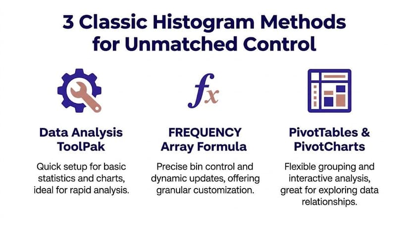
Option 1 Data Analysis ToolPak
The Data Analysis ToolPak is still a solid choice for static analysis.
Enable the add-in if needed, then go to Data > Data Analysis > Histogram. Excel asks for an input range and a bin range. If you select chart output, it creates both a frequency table and a chart in one pass.
That makes it useful in a specific situation. You need a clean output sheet, you already know your bins, and nobody expects the result to update automatically next week.
Use it when:
- You want a frequency table and chart together
- You already have custom bins listed in cells
- You need a static output for review or handoff
Skip it when the dataset changes often. The ToolPak output does not refresh naturally, so repeated reporting usually turns into repeated manual reruns.
Option 2 FREQUENCY formula
For manual methods, this is the one I trust most in analytical work. The formula is:
=FREQUENCY(data_array, bins_array)
You can review the syntax in this Excel FREQUENCY formula reference.
How the formula works
data_array is the range with your raw values
Example:B2:B200bins_array is the range with the upper boundary for each bin
Example:D2:D8
If your data is in B2:B200 and your bin cutoffs are in D2:D8, enter:
=FREQUENCY(B2:B200,D2:D8)
In current Excel versions, the results spill into multiple cells automatically. In older versions, you need to select the output range first and confirm it as an array formula.
Why analysts keep coming back to it
FREQUENCY puts the bin logic in plain sight. Anyone reviewing the workbook can see the bin boundaries, the counts, and the formulas that connect them. That matters in finance, operations, and any reporting process where someone may ask how the chart was built.
It also fits structured models well. You can connect it to named ranges, Excel Tables, or dynamic ranges, then chart the results with a standard column chart. If you care about transparency and reproducibility, formulas are usually the better trade-off.
The downside is setup time. You have to define bins, place the formula correctly, and build the chart yourself. Casual Excel users often find that overhead annoying, even though the result is cleaner.
Option 3 PivotTable grouping
PivotTables are the practical middle ground. They are less explicit than formula models, but much easier to refresh.
The basic setup looks like this:
- Create a PivotTable from your dataset.
- Put the numeric field in Rows.
- Put the same field in Values, summarized as Count.
- Right-click a row label and choose Group.
- Set the starting value, ending value, and interval size.
- Insert a PivotChart, usually a clustered column chart, then reduce the gap width.
I use this method when the histogram is part of broader reporting. If the same workbook already tracks counts by team, region, product, or month, a PivotTable histogram fits naturally into that workflow. Refreshing is simple. Styling usually takes more effort.
A decision table that actually helps
| Method | Best for | Main strength | Main weakness |
|---|---|---|---|
| Built-in Histogram Chart | Fast exploration | Quickest setup | Less transparent logic |
| Data Analysis ToolPak | One-off outputs | Table plus chart | Static result |
| FREQUENCY formula | Structured analysis | Precise bin control | More setup |
| PivotTable grouping | Refreshable summaries | Easy refresh inside reporting workflows | Chart styling takes extra work |
The question is not which method is best in general. It is which one matches the life of the chart.
Use the ToolPak if the histogram is a one-time output. Use FREQUENCY if the workbook needs visible logic and exact bin control. Use PivotTables if the file will be refreshed regularly by you or someone else. Use the built-in chart if speed matters more than documentation.
For presentation quality after the method is chosen, standard data visualization best practices still apply. Good bins and clear labels matter more than fancy formatting.
And this is the bigger point most Excel guides skip. Before you make a histogram, you first have to decide how much control, transparency, and refreshability the job requires. ElyxAI removes that decision entirely. You describe the distribution you want to analyze, and it handles the setup without forcing you to pick between wizards, formulas, and PivotTables first.
Customizing Your Histogram for 5-Star Reports
A raw histogram is functional. A polished histogram is persuasive. If the chart is heading into a report deck, board pack, or performance review file, formatting changes how quickly people understand it.
Start with the bins, not the colors
The biggest formatting decision is not visual. It’s analytical. Bin width changes the story more than any font or fill color ever will.
If the bins are too wide, different behaviors get merged into one bar. If they’re too narrow, the pattern breaks into noise. I usually adjust bin width before touching anything else, then check whether the mode and tails still make business sense.
After that, reduce the gap width between columns so the chart looks like a histogram rather than a standard bar chart. Histograms represent continuous numeric ranges, so the bars should sit close together.
Three upgrades that improve readability fast
Add data labels selectively
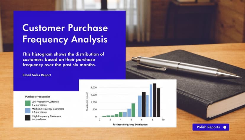
If the audience needs exact counts, labels help. If there are too many bins, labels clutter the chart.Rename the title to explain the message
“Histogram” is not a useful title. “Customer Purchase Frequency by Order Count” is much better.Format the axes with business language
If the x-axis shows days, dollars, or minutes, make that obvious. If the y-axis shows frequency, use “Number of records” or “Count of orders.”
Clean charts get read faster
When I format a histogram for reporting, I remove anything that doesn’t help interpretation. Heavy borders, unnecessary legends, loud gridlines, and decorative effects usually hurt more than they help.
If you want a broader set of design principles, TimeTackle has a solid guide to data visualization best practices that aligns well with how analysts should present charts in business settings. The same principles apply inside Excel.
You can also sharpen your presentation workflow by learning more about Excel data visualization techniques before you finalize the report.
Good histogram formatting removes friction. The reader should spend time on the pattern, not on decoding the chart.
A practical reporting checklist
| Element | What to check |
|---|---|
| Bins | Are the ranges intuitive and defensible? |
| Bars | Is gap width small enough to read as continuous distribution? |
| Labels | Do they clarify the counts, or just add clutter? |
| Title | Does it say what the distribution represents? |
| Axes | Are units and count labels obvious? |
One final note. Company colors are fine, but subtle colors work better than saturated ones in most analytical reports. The point is to show the distribution shape, not to turn the chart into branding collateral.
Interpreting Your Histogram with 6 Key Insights
Creating a histogram is easy compared with reading it well. The chart becomes valuable when you can explain what the shape says about the process, the customer base, or the business outcome.
1 Find the center of the data
Start with the tallest bar. That area shows where the data clusters most often. In practical terms, it tells you what “typical” looks like.
If you’re reviewing invoice values, response times, or cycle durations, this is often the first place people look. It gives a working definition of normal.
2 Look at the spread
A tight histogram suggests consistency. A wide histogram suggests variation.
That matters operationally. Two teams can have the same average handling time and still behave very differently if one team is tightly grouped and the other is scattered across a wide range.
3 Check for skew
A histogram that stretches farther to the right is right-skewed. One that stretches farther left is left-skewed. Skew tells you whether unusual values mostly sit above or below the common range.
Skew directly impacts how performance is discussed. A right-skewed distribution of delivery delays often means most deliveries are fine, but a smaller set of extreme delays needs investigation.
4 Count the peaks
One clear peak suggests a single dominant pattern. Two peaks often suggest two underlying groups.
That’s where histograms become diagnostic. If employee completion times split into two clusters, the issue might not be performance alone. You may have two processes, two regions, or two systems behaving differently.
When a histogram looks strange, don’t force a story onto it. Check whether the data actually contains mixed populations.
5 Watch for outliers
A few isolated bars on the far edges can point to unusual records. Sometimes they’re legitimate. Sometimes they signal data-entry issues, process exceptions, or category mismatches.
A histogram won’t tell you why those points exist. It only tells you where to investigate next.
6 Know what the histogram cannot show
This is the blind spot that many Excel tutorials ignore. A histogram shows variation, but it does not preserve sequence.
A critical limitation of traditional histograms is that they capture variation as a snapshot while losing temporal order, which creates a real gap for business users who need both distribution and timing context, as explained in this discussion of histogram limits in process analysis.
That means a histogram of daily resolution times can show the overall spread, but it won’t tell you whether performance worsened gradually, improved after a policy change, or collapsed during a specific week.
Use a companion chart when time matters
If you’re monitoring a process over time, pair the histogram with a line chart or date-based trend chart.
That combination answers two different questions:
- Histogram shows how values are distributed
- Time-series chart shows when the pattern changed
This is especially important in finance, operations, and service teams. A nice-looking distribution can hide a process that has been deteriorating steadily.
Automate Your Entire Histogram Workflow with 1 AI Prompt
Once you’ve used several manual methods, a pattern becomes obvious. The hard part is often not the chart itself. It’s the setup. You clean the data, choose the method, define bins, build the output, format the chart, then revise it when someone changes the requirement.
That’s exactly the kind of repetitive spreadsheet work that fits broader AI automation concepts in business workflows. Excel users usually know what they want. They just lose time on the mechanics.

What the manual process gets wrong
Manual histogram work forces you to make technical decisions before you can think about the analysis. Should this be a built-in chart? A FREQUENCY model? A PivotTable? Should the output be static or refreshable? Should the bins be fixed or automatic?
That friction matters because users don’t naturally think in Excel implementation paths. They think in business questions.
A request usually sounds like this:
- “Show me the distribution of turnaround times.”
- “Group these order values into useful ranges.”
- “Build a histogram and make it presentation-ready.”
It doesn’t sound like, “Use a formula-driven approach with custom bin cutoffs and a secondary chart object.”
What an AI-assisted workflow changes
Instead of translating your intent into a method, an AI agent can handle that translation for you inside the spreadsheet. You describe the outcome in plain language. The system reads the workbook structure, determines the relevant steps, and performs them.
That’s the practical difference between AI that only suggests and AI that executes. If you’re already trying to reduce repetitive spreadsheet work, this guide on how to automate repetitive tasks in Excel is a useful next read.
A prompt can be as direct as:
Create a histogram of delivery times in column D, use 5-day bins, add labels, and format it for a management report.
That removes the method decision entirely. You don’t need to pick between ToolPak, formulas, or PivotTables before getting the result.
Here’s a short demo showing that workflow in action:
Why this saves more than clicks
The benefit isn't just speed. It’s mental bandwidth. You stop spending time remembering menu paths, troubleshooting output structure, and rebuilding the same chart format over and over.
That leaves more room for the part that matters:
- Choosing sensible bins
- Questioning odd distribution shapes
- Adding the right companion chart when time matters
- Explaining the business implication clearly
For analysts, that shift matters. The spreadsheet should support your judgment, not consume it.
If you want Excel to handle histogram creation, formatting, and other repetitive analysis steps from a plain-English request, try Elyx AI. It works directly inside Excel and executes the workflow for you, so you can spend less time on chart mechanics and more time interpreting the data.
Reading Excel tutorials to save time?
What if an AI did the work for you?
Describe what you need, Elyx executes it in Excel.
Sign up