11 Powerful Ways to Use Excel Quick Analysis for Instant Insights

Ever found yourself staring at a wall of numbers in Excel, wondering where to even begin? Excel's Quick Analysis tool is your secret weapon for turning that raw data into clear, actionable insights in seconds. It’s that little icon that pops up when you highlight a range of cells, but many people just ignore it. Don't. It's also easily summoned with the Ctrl + Q keyboard shortcut.
This handy feature is all about speed, giving you one-click access to formatting, charts, totals, and more, without ever having to hunt through the ribbon. It's a practical solution for a common problem: how to quickly make sense of data without getting bogged down in complex features.
What Is Excel Quick Analysis and Why Should You Use It?
Think of the Quick Analysis tool as a smart assistant built right into your spreadsheet. It looks at your selected data and instantly suggests the most relevant ways to visualize or summarize it. No more guesswork, no more clicking through endless menus. The goal is for you to leave with a clear insight, not just a formatted sheet.
Spending too much time on Excel?
Elyx AI generates your formulas and automates your tasks in seconds.
Sign up →It’s a game-changer for anyone who needs to quickly make sense of their data. For instance:
- Marketing analysts can instantly apply color scales to see which campaigns are hitting it out of the park.
- Finance professionals can add running totals to a budget with a single click, making monthly tracking a breeze.
- Project managers can drop in data bars to create an instant progress report that stakeholders can understand at a glance.
A Major Leap in Productivity
When Microsoft rolled this out with Excel 2013, it was a huge deal for everyday users. Suddenly, tasks that used to take several minutes were reduced to a couple of clicks. In fact, for common operations like creating a quick chart or table, the Quick Analysis tool can slash your task time by up to 60%.
It’s that smart little button that appears at the bottom-right corner of your selection.

This tiny icon is your gateway to five powerful categories of data tools, each designed to make a different part of your analysis simpler and faster.
Your Quick Analysis Toolkit: 5 Core Functions
To give you a clearer picture, this table breaks down the five core functions packed into the Quick Analysis tool. Think of it as your cheat sheet for instant data mastery.
| Feature Category | What It Does for You | Best Used For |
|---|---|---|
| Formatting | Applies conditional formatting like data bars, color scales, and icon sets to highlight key values. | Quickly spotting trends, outliers, or top/bottom performers in a dataset. |
| Charts | Recommends and creates the most suitable charts (bar, line, pie) based on your selected data. | Visualizing data for presentations, reports, or just to understand relationships. |
| Totals | Instantly adds calculations like Sum, Average, Count, or Running Totals to the bottom or right of your data. | Summarizing columns or rows without writing a single formula. |
| Tables | Converts your data range into a formatted Excel Table or creates a PivotTable to summarize complex data. | Organizing and filtering large datasets or performing deeper analysis. |
| Sparklines | Inserts tiny, cell-sized charts (line or column) to show trends within a row of data. | Visualizing trends over time for individual items, like monthly sales per product. |
Each of these features is designed to give you a live preview, so you can see exactly how your data will look before you commit, ensuring you always get a useful result.
The 2 Core Benefits of Using Quick Analysis
The biggest win here is the sheer amount of time you save. What used to be a multi-step process—select data, navigate to the Insert tab, pick a chart, format it—is now practically instantaneous. This frees you up to spend more time thinking about what the data means instead of just wrestling with formatting.
The real magic of Quick Analysis is that it's context-aware. Excel isn’t just throwing random options at you; it’s analyzing your specific data and suggesting the tools that will tell the most compelling story. It removes the guesswork and helps you build a clear visual narrative in seconds.
2 Ways to Bring Your Numbers to Life with Formatting and Charts
Raw data is just a wall of numbers. To make it mean something, you need to give it some visual punch. This is exactly where the Formatting and Charts tabs in the Excel Quick Analysis tool come in, letting you turn a bland spreadsheet into a clear story that anyone can follow. The whole point of these features is speed—helping you visualize your data in just a couple of clicks.
The real magic here is getting instant feedback on what your data is trying to tell you. Since it was introduced, this tool has helped many of the 1.2 billion Microsoft 365 users make sense of their data on the fly. It's a big reason why Excel skills are still listed as essential in 81% of U.S. data jobs. In fact, analysts who use Quick Analysis can knock out conditional formatting tasks up to 70% faster, which frees them up for more important work.
1. Make Your Data Stand Out with Conditional Formatting
The Formatting tab is your best friend for making important data points jump off the page. Instead of manually highlighting cells one by one, you can set up rules to do the work for you. It’s a huge time-saver.
Here are a few ways I use it all the time:
- Data Bars: Got a list of project tasks with completion percentages? Just highlight those numbers and apply Data Bars. You’ll instantly get a mini progress bar inside each cell, making it super easy to spot which tasks are almost done and which are lagging.
- Color Scales: If you're a sales manager looking at quarterly numbers, Color Scales are perfect. Excel automatically applies a color gradient—like green for high sales and red for low—so you can instantly see your top-performing regions and which areas need a little more attention.
- Icon Sets: Managing inventory? Use Icon Sets to create a simple traffic light system. You can set a rule to show a green up-arrow for healthy stock levels, a yellow sideways arrow for low stock, and a red down-arrow for items that are out.
One of the best things about Quick Analysis is the live preview. As you hover your mouse over each formatting option, your actual data updates to show you what it will look like. You can try before you buy, which prevents a lot of clicking and undoing.
2. Find the Right Chart in Seconds
Figuring out the best chart for your data can be a pain, but the Charts tab takes the guesswork out of it. It looks at your selected rows and columns and recommends the chart types that make the most sense.
For example, if you highlight your monthly sales figures for different product lines, it will probably suggest a clustered column chart to compare them side-by-side. If you select website traffic data over the past year, it'll recommend a line chart to show the trend.
While Quick Analysis is fantastic for common charts, sometimes you need something more specific. For instance, to show data distribution clearly, you might want to create a Box and Whisker Plot. This can be a great next step after getting your initial insights from Excel.
Artificial intelligence can also play a role here. Modern AI tools can analyze your dataset and not only suggest a chart but also automatically generate it based on a simple text instruction, taking data visualization to the next level.
3 Ways to Calculate and Structure Data in Seconds
Sure, the Quick Analysis tool is great for making your data look pretty, but its real power lies in crunching numbers and organizing information in a flash. This is where we get into the nuts and bolts—the 'Totals', 'Tables', and 'Sparklines' tabs. Think of these features as your shortcut to getting answers without having to manually write formulas or structure your data from scratch.
When this tool first showed up in Excel 2013, it was right on time for the Big Data boom. Today, it’s a key part of why 63% of businesses rely on spreadsheet software for their short-term forecasting. Features like one-click totals and pivots have become massive time-savers, giving analysts back an estimated 2.5 hours every week. It's a small but mighty feature in a data analysis market projected to reach $72.3 billion by 2025. You can dig deeper into the global forecasting tool market over at intelmarketresearch.com.
1. Get Instant Answers with Totals
The Totals tab is your secret weapon for quick math. Forget about fumbling around to type =SUM() or =AVERAGE(). Just select your numbers, bring up the Quick Analysis tool, and see the magic happen as you hover over the options.
- Sum & Average: Instantly pop a total or average at the bottom of your selected columns.
- Count: Get a quick headcount of the entries in each column.
- % Total: See how much each column's total contributes to the grand total.
- Running Total: This one is a game-changer for tracking cumulative figures, like month-over-month sales growth or project spending.
For example, instead of manually calculating a running total with a formula like =SUM($B$2:B2), you can achieve the same result with a single click. The formula method involves typing the formula in the first cell (e.g., C2) and dragging it down, ensuring the first part of the range $B$2 is locked with absolute references. While powerful, the Quick Analysis 'Running Total' is far more direct for a quick overview.
2. Organize Your Data with Tables and PivotTables
Most of the time, our data starts as just a boring range of cells. The Tables tab is what turns that static block of information into something dynamic and intelligent.
Honestly, one of the best habits you can get into in Excel is converting your data into a proper Table. It automatically adds filter buttons, locks in formatting, and makes sure any new data you add is included in your formulas and charts. It's a lifesaver.
With just one more click, Quick Analysis can whip up a PivotTable for you. Imagine you have a massive sales log with thousands of rows. Instead of manually sorting and summarizing, you can instantly pivot that data into a clean report showing total sales by region or by salesperson. It’s the fastest way I know to get a bird's-eye view of a complex dataset. If you find yourself needing more advanced summaries, an AI formula generator can help you build the right formula without the headache.
The time you can reclaim is significant. Instead of spending minutes on tasks, you're down to mere seconds.
Quick Analysis vs Manual Method: 4 Time-Saving Examples
| Task | Manual Method (Est. Time) | Quick Analysis (Est. Time) | Time Saved |
|---|---|---|---|
| Summing 10 columns | 1-2 minutes | 5 seconds | ~95% |
| Creating a basic chart | 2-3 minutes | 10 seconds | ~93% |
| Adding conditional formats | 3-5 minutes | 15 seconds | ~95% |
| Building a PivotTable | 5-10 minutes | 30 seconds | ~95% |
As you can see, the efficiency gains add up quickly, freeing you to focus on interpreting the data rather than just wrangling it.
3. Visualize Trends with Sparklines
Last but not least, we have Sparklines. These are brilliant little charts that fit inside a single cell, sitting right next to your data. They give you an immediate visual of a trend for each row without cluttering up your entire worksheet with a full-sized chart.
Think of an investor tracking their stock portfolio. By adding a sparkline next to each stock’s performance data, they can see its trajectory—up, down, or flat—all in a single glance. It's all about making trends obvious and easy to spot.
7 Pro Tips for Mastering Quick Analysis
Ready to go from a casual user to a real pro with Excel's Quick Analysis tool? It's all about picking up a few smart habits that can save you a ton of time. These seven tips will help you fine-tune your workflow and get more out of every click.
1. Make Ctrl + Q Your Go-To Shortcut
The single fastest way to pull up the Quick Analysis options is with a keyboard shortcut. Forget reaching for the mouse. Just highlight your data and hit Ctrl + Q. Building this simple command into your muscle memory shaves precious seconds off every single analysis. It might not sound like much, but those seconds add up to serious time saved by the end of the week.
2. Take Advantage of the Live Preview
Don't just blindly click on a chart or formatting option. As you hover your mouse over the different choices in the Quick Analysis menu—whether it’s a color scale, a sparkline, or a chart type—Excel gives you a Live Preview. This feature lets you see exactly how the visualization will look with your actual data before you commit. It’s a huge help for avoiding that annoying cycle of applying, undoing, and reapplying formats until you find the right one.
3. Know Why the Button Sometimes Vanishes
Have you ever selected your data, and the little Quick Analysis icon is nowhere to be seen? This almost always happens for one reason: your data is already inside a formal Excel Table. Tables come with their own set of powerful tools for sorting, filtering, and adding totals, so Excel disables the Quick Analysis button to avoid overlap. If you really need to use it, you'll have to convert the Table back into a simple range first.
4. Combine It with Flash Fill for Super Speed
For a seriously efficient workflow, start pairing Quick Analysis with other time-saving features like Flash Fill. Let's say you have first names in one column and last names in another. You can use Flash Fill to instantly merge them into a new "Full Name" column. The moment it’s done, hit Ctrl + Q on that new data to immediately visualize or analyze it. This one-two punch automates both the prep work and the analysis.
The real secret to mastering Excel is seeing how different tools can work together. Quick Analysis is a great starting point, but when you chain it together with features like Flash Fill or PivotTables, you start building workflows that are incredibly fast and effective.
5. Dig Deeper with the 'More' Option
See that 'More' button at the end of each category, like Formatting or Charts? Don't gloss over it. Clicking it opens the full, detailed dialog box for that specific feature, unlocking every single customization option available. This is how you go from the handful of suggested charts to crafting a visual that’s perfectly suited for your specific report or presentation.
6. Quick Fixes for 2 Common Problems
If the tool isn't working the way you expect, check these two things first:
- Non-Adjacent Selections: The tool won't pop up if you've selected multiple ranges of cells that aren't touching. Your selection needs to be a single, continuous block of data.
- Protected Sheets: If the worksheet has been protected, most editing tools, including Quick Analysis, will be locked down.
7. Think Beyond the Defaults
The tool gives you some great standard options, but don’t forget that you can guide its suggestions. For instance, if you find yourself needing calculations that are more complex than the simple totals offered, it’s a perfect sign that it's time to expand your skills. To really unlock Excel's power, you need to understand its building blocks. A great next step is to check out our complete guide on Excel formulas and see what's possible.
Going Beyond Quick Analysis with AI in 3 Steps
Excel's Quick Analysis tool is fantastic for those quick, one-off tasks. Need to add a data bar, sum a column, or pop in a recommended chart? It’s your go-to. But what about when your analysis is more of a journey than a single step? That's where AI assistants like Elyx really start to shine, picking up right where Quick Analysis leaves off.
Think of Quick Analysis as the perfect launchpad for immediate insights. AI, on the other hand, is built for the bigger, more complex data challenges where you need true automation.
1. When Simple Clicks Just Aren't Enough
Let's walk through a real-world scenario. You've just exported a raw sales data dump from your company's CRM. Your goal isn't just to make one chart; it's a whole process.
First, you have to:
- Clean up the raw data by getting rid of empty rows and fixing messy formatting.
- Hunt down and remove duplicate entries so your numbers are actually accurate.
- Build a pivot table to start summarizing sales by region and product.
- Generate a chart from that pivot table to see how each region is performing.
- Finally, format the whole report to match your company’s branding.
Quick Analysis is great, but it was never designed for an end-to-end workflow like this. It can help with the chart part, but the other four steps demand a lot of manual clicking, navigating different tabs, and juggling formulas. This is precisely the gap AI was made to fill.
2. Automating the Entire Workflow with AI
An AI tool like the one from Elyx can turn that multi-step headache into a single, simple command. Instead of clicking through each task yourself, you just tell it what you want in plain English.
For instance, you could just type:
"Analyze this sales data by region. Clean it, remove duplicates, build a pivot table, create a summary report with a bar chart, and format it using a professional blue and grey theme."
The AI gets to work and executes that entire sequence for you, right inside your spreadsheet. It handles all the tedious data prep and the kind of analysis that Quick Analysis can't touch. This isn't just about saving a few minutes; it's about reclaiming hours of meticulous work. The AI acts like your personal data analyst, handling the mechanics so you can focus on what the data actually means.
This infographic shows the standard flow for using the built-in tool, which is perfect for quick wins.
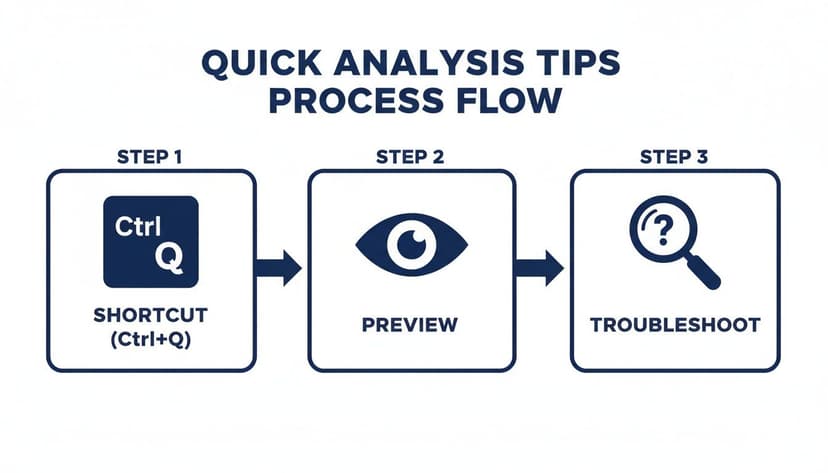
While the process above shows how efficient the standard tool is, AI takes this a huge step further by handling entire sequences of tasks, not just one-off actions.
3. From Data Janitor to Data Strategist
The real magic of bringing AI into your Excel routine is how it changes your job. You get to spend less time as a "data janitor"—cleaning, formatting, and wrestling with formulas—and more time actually thinking like a data strategist. The AI takes care of the "how," freeing you up to focus on the "why."
This is a game-changer for tasks like:
- Recurring reports: Automate your weekly or monthly reporting with a single prompt.
- Exploring massive datasets: Just ask the AI to find trends, correlations, or weird outliers you might have missed.
- Building complex models: Create financial forecasts or budget models without manually linking hundreds of cells.
If you're looking to explore what's possible, it’s worth checking out the broader landscape of AI productivity tools that can complement or build on what you do in Excel. These tools are quickly becoming essential for anyone working in a data-heavy role.
At the end of the day, Quick Analysis is still a vital feature for those fast, on-the-fly insights. But when your task list gets longer and more complex, an integrated AI assistant is the smartest way forward. By combining the speed of Quick Analysis for simple jobs with the intelligence of AI for complex ones, you build a powerful and modern way to work with data.
Answering Your 3 Top Excel Quick Analysis Questions
Let's dive into some of the questions I hear most often about the Excel Quick Analysis tool. I'll give you some straight, clear answers to help you solve common hiccups and get a better sense of where this tool fits in your workflow.
1. Why Did the Quick Analysis Button Disappear?
It’s a classic Excel moment: you go to use a feature, and it’s just… gone. If the Quick Analysis button isn't popping up when you select your data, it's almost always one of three simple things.
Here’s what’s likely happening and how to fix it:
- Your data is already an Excel Table. When you format data as a formal Table, Excel gives you a whole different set of tools under the
Table Designtab. To avoid confusion, it hides the Quick Analysis button. If you need it back, just click in your table, go toTable Design, and hitConvert to Range. - You've selected multiple, separate areas. The tool needs a single, connected block of cells to work its magic. If you’ve been holding down the
Ctrlkey to select cells all over your sheet, the button won’t show up. - The worksheet is protected. A locked sheet will disable most editing features, and Quick Analysis is one of them. Unprotect the sheet, and you should be back in business.
2. Can I Customize the Quick Analysis Options?
The short answer is no. You can't directly add or remove the options that Excel presents in the Quick Analysis menu. The tool is designed to give you instant, context-aware suggestions, not a fully customizable dashboard.
That said, you can influence it. For charts, if you create a chart with your preferred colors and styles and save it as a template, Excel is more likely to suggest it. It's an indirect way to nudge the tool in the right direction.
Think of Quick Analysis as your go-to for quick hits and initial exploration. When you need serious customization or have to wrangle millions of rows, that's when you bring out the big guns like Power Query for data shaping and Power Pivot for building sophisticated data models.
3. How Do I Turn Off the Quick Analysis Button?
While the tool is fantastic, that little pop-up button can sometimes block your view of the very data you’re trying to see in the bottom-right corner. It can be annoying. If you'd rather stick with the Ctrl + Q shortcut or just want it out of your way, turning it off is easy.
It only takes three clicks:
- Head over to
File > Options. - On the
Generaltab, look under theUser Interface optionssection. - Just uncheck the box that says Show Quick Analysis options on selection and click
OK.
And that's it. If you ever miss it, you can just follow the same steps to turn it back on. This little toggle puts you in control of your workspace.
Ready to go beyond what a single click can do and automate your entire Excel process? Elyx AI works like your own data analyst, tackling everything from messy data to full reports with a simple instruction. Stop fighting with manual steps and start getting answers.
Try Elyx AI for free and save hours every week.
Reading Excel tutorials to save time?
What if an AI did the work for you?
Describe what you need, Elyx executes it in Excel.
Sign up