How to Create a 2 Y Axis Excel Chart

So, what exactly is a 2 y axis Excel chart? You might have heard it called a dual axis or combination chart, but it all means the same thing: a single graph that plots data using two different vertical axes—one on the left and a second one on the right. This setup is perfect for visualizing two different types of data, like tracking revenue in dollars alongside the number of units sold.
Why a Dual Axis Chart Is Your Secret Weapon
Have you ever tried to plot your website traffic (in millions of visits) against your marketing budget (in thousands of dollars) on the same chart? It’s a mess. The smaller numbers get squashed down to the bottom, barely visible, while the larger numbers dominate the graph. The chart ends up telling you absolutely nothing. This is exactly the kind of data visualization headache a 2 y axis Excel chart is built to solve.

Spending too much time on Excel?
Elyx AI generates your formulas and automates your tasks in seconds.
Sign up →By adding that secondary scale, you can cleanly display two completely different datasets in one place. It transforms a jumbled, unreadable chart into a clear story, letting you spot connections that a standard chart would completely hide.
Unlocking Deeper Data Insights
The real power of a dual axis chart is its ability to reveal the relationship between two variables that you couldn't see otherwise. A second Y-axis is a practical solution in numerous real-world situations.
For instance, consider these scenarios:
- Magnitude vs. Percentage: Plotting raw sales figures (in dollars) on one axis and the profit margin (as a percentage) on the other.
- Different Units of Measure: Showing temperature changes in Celsius alongside rainfall in millimeters, or stock prices in USD against daily trading volume.
- Finding Correlations: Analyzing the link between your advertising spend and the number of new customers you've acquired over the last year.
This feature is a staple for data analysts. Microsoft Excel introduced this capability in version 5.0 back in 1993, and it fundamentally changed how professionals work with data. Suddenly, finance teams could easily compare revenue growth (in millions) against market share (as a percentage) on a single, easy-to-read graph.
To give you a better idea of when to use this chart, here’s a quick rundown of some ideal use cases.
When to Use a Dual Axis Chart
| Scenario | Primary Axis (Y1) Example | Secondary Axis (Y2) Example | Key Insight Uncovered |
|---|---|---|---|
| Sales Performance | Monthly Revenue ($) | Units Sold (Count) | See if higher revenue is driven by volume or price increases. |
| Marketing Campaigns | Marketing Spend ($) | Website Traffic (Visits) | Determine the direct impact of ad spend on site visits. |
| Operational Efficiency | Production Output (Units) | Machine Downtime (%) | Identify if production dips correlate with machine issues. |
| Financial Health | Stock Price ($) | Price-to-Earnings (P/E) Ratio | Analyze if the stock is overvalued or undervalued over time. |
This table just scratches the surface, but it shows how versatile these charts are for telling a more complete data story.
Simplifying Complexity with Modern Tools
While dual axis charts are incredibly useful, they can be tricky to get right. It's easy to create a misleading chart if the scales aren't set up properly or the visual story isn't clear.
Thankfully, today's tools make this much easier. AI-powered Excel tools can now handle some of the more tedious setup steps for you. This is especially true for dedicated business intelligence software options, where advanced visualization is a core feature. A well-made dual axis chart can turn a basic spreadsheet into a powerful analytical tool.
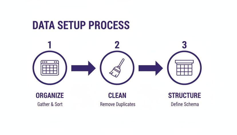
Setting Up Your Data for a Perfect Chart
Before you even think about creating a chart, the real work happens in your spreadsheet. A well-organized data table is the foundation for any clear and accurate 2 y axis Excel chart. If you get this step wrong, you’ll spend more time fixing problems than finding insights.
The goal is to keep things simple and logical. You need to organize your data into columns that all share a common category, which will become your X-axis. This is usually something time-based, like dates, months, or quarters, but it could also be categories like product names or sales regions.
Structuring Your Data Correctly
For a dual-axis chart to work properly, Excel expects your data to be laid out in a specific way. Let's say you're tracking monthly sales and the number of units sold. Your table should look something like this:
- Column A: Your shared category, like "Month." These are the labels for your X-axis.
- Column B: The data for your first Y-axis, like "Total Revenue." This becomes your primary vertical axis.
- Column C: The data for your second Y-axis, like "Units Sold." This gets plotted against the secondary vertical axis on the right.
Each row must correspond to a single point in time or a single category. For example, the row for "January" should contain both the total revenue and the total units sold for that month. Excel needs this clean, side-by-side structure to understand how your different data series relate to each other.
Avoiding Common Data Pitfalls
Most charting headaches start with messy data. Here are a few common traps that can trip you up before you even get started:
- Merged Cells: They might make your spreadsheet look tidy for a title, but merged cells are a nightmare for creating charts. They confuse Excel's ability to read your data range. Always unmerge any cells within your data set.
- Empty Rows or Columns: A blank row in the middle of your data can trick Excel into thinking your table ends there, which means your chart will be missing information. Make sure your data is in one solid block.
- Inconsistent Formatting: Check that your numbers are actually formatted as numbers and your dates are formatted as dates. Mixing text and numbers in the same column is a recipe for strange and unexpected chart behavior.
A clean dataset isn't just a "nice-to-have"—it's essential for good visualization. Spending five minutes cleaning up your data now will save you an hour of frustration later. It ensures your chart isn't just pretty, but actually correct.
Getting your data right from the start is the most important part of the whole process. If you want to go deeper, our guide on data cleaning best practices covers more advanced tips to get your data into perfect shape. When your data is structured properly, building the 2 y axis Excel chart becomes a breeze.
Bringing Your First 2 Y-Axis Chart to Life
Now that your data is prepped and ready, it's time for the practical part: creating the chart itself. We're going to turn those neat columns and rows into a visual that tells a clear story. While a 2 Y-axis Excel chart might sound intimidating, it comes down to a few clicks once you know where to look.
The key is a specific chart type built for this exact scenario: the Combo chart. This is a powerful option that lets you mix and match chart styles—like columns and lines—in a single graphic, which is exactly what we need to show two different types of data together.
Finding and Using the Combo Chart
First, select your entire data table, including headers. Once it’s highlighted, navigate to the Insert tab on the Excel ribbon. In the 'Charts' section, look for the icon labeled 'Insert Combo Chart' and click it. A dropdown menu will appear with a few pre-built options.
For most dual-axis charts, the best choice is 'Clustered Column – Line on Secondary Axis'. This option instantly turns one of your data series into columns and the other into a line, automatically plotting that line against a brand-new secondary axis on the right side of the chart.
Remember, getting your data structure right is the foundation for everything that follows. This simple workflow breaks down the process visually.
This process really drives home the point: a clean, logically arranged dataset is a must-have before you even think about inserting a chart.
Telling Excel Which Data Goes Where
This next step is the most important part of building a 2 Y-axis Excel chart. You have to tell Excel exactly which data series belongs to the new axis on the right. If you didn't pick the 'Line on Secondary Axis' preset, or if you want to make changes, you can easily do it manually.
Right-click anywhere on your chart and select 'Change Chart Type'. This brings up a dialog box. Look toward the bottom, and you'll see your data series listed, each with a dropdown to change its 'Chart Type' and, crucially, a checkbox for 'Secondary Axis'.
This is your control panel. Here, you can decide how each series looks and, with a simple click, assign one to the secondary Y-axis by ticking its box.
A Quick Tip from Experience: As a general rule, use columns for things that represent volume or quantity, like sales revenue. Then, use a line for data that shows a rate, a percentage, or a continuous metric—think profit margin or a customer satisfaction score. This creates an intuitive visual story for anyone looking at your chart.
In a world swimming with data, dual Y-axis charts are a go-to for finding hidden connections. Think about plotting quarterly revenue against the percentage of customer acquisition costs—a common analysis that 57% of intermediate Excel users perform regularly. With over 750 million users worldwide, it's no surprise that professionals keep an average of 2.6 spreadsheets open at once, glancing at them every 16 minutes. You can find some great insights on Excel's continued relevance at dev.to.
Once you assign a series to the secondary axis, it will pop up on the right, scaled perfectly for that data. You can then add other elements to make your chart even clearer, like a target line. For more on that, check out our guide on how to add a horizontal line to an Excel chart.
And just like that, you’ve built the core structure of your dual-axis chart. Now, it's ready for the final formatting touches to make it shine.
Designing a Chart That Tells a Clear Story
Getting the dual-axis chart on the screen is just step one. A basic chart shows the numbers, but a great chart tells a story. The real value comes from the final formatting and design tweaks that take your 2 y axis Excel chart from functional to genuinely insightful.

This final stage is all about making things crystal clear. The goal is for anyone—your boss, a client, a colleague—to look at your chart and immediately grasp the relationship between the two datasets without you having to say a word. To get there, we need to focus on the details: axis formatting, smart color choices, and clear labeling.
Customizing Each Axis for Clarity
One of the best things about a dual-axis chart is that you can format each Y-axis completely independently, giving you total control. Just right-click on an axis and select "Format Axis" to open up the control panel.
This is where you can really start to refine your story. Here are the adjustments I always make:
- Set Min/Max Bounds: Don't let Excel decide your scale for you. Its auto-scaling can sometimes create a misleading picture. Manually setting the minimum and maximum values—often starting an axis at zero—gives a much more honest view of the data's scale.
- Apply Number Formats: Make your units obvious. If one axis is revenue and the other is a percentage, apply the "Currency" format to the first and "Percentage" to the second. This tiny change gets rid of any guesswork.
- Adjust Major Units: You can also clean up the increments on each axis. If the default tick marks are too crowded or too far apart, you can set your own to create a cleaner look that emphasizes the right scale.
A well-designed chart prioritizes honesty and clarity above all else. By manually setting your axis bounds, you ensure that the visual story your chart tells is a true reflection of the underlying data, building trust with your audience.
Using Color and Labels to Guide the Eye
When you have two different scales on one chart, visual cues are essential. Color is your best friend for avoiding confusion. A simple but powerful trick is to match the color of each data series (the columns or the line) to the color of its corresponding Y-axis text.
Here's how to change the axis text color:
- Right-click the axis you want to change and choose Format Axis.
- Jump over to the Text Options tab.
- Under Text Fill, pick a color that perfectly matches the data series it represents.
This small move instantly connects the dots for anyone looking at the chart.
Don't forget to add a descriptive chart title, too. Something like "Monthly Revenue vs. Units Sold" is infinitely better than the default "Chart Title." Data labels can also be helpful, but use them with caution. They're great for highlighting key points but can quickly clutter your chart if you apply them to every data point.
To really nail the art of communication with your chart, it's worth exploring broader principles around the power of financial data visualization. Once your chart is polished and telling its story clearly, it’s ready for prime time. If you plan on using it in a slideshow, our guide on how to link Excel to PowerPoint will help you create dynamic presentations that update automatically.
Common Mistakes and How to Fix Them
Even experienced Excel users can get tripped up creating a dual Y-axis chart. They're incredibly powerful, but a few common pitfalls can quickly turn your insightful data story into a confusing mess—or worse, a misleading one. Knowing what to watch for is half the battle.
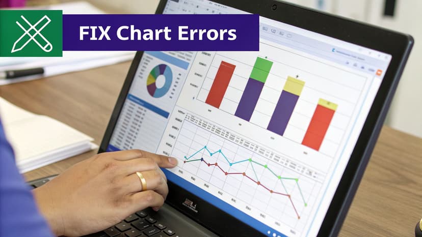
Most of these issues pop up when we let Excel's default settings take over. Without a few thoughtful manual tweaks, you can accidentally present a skewed picture of your data, leading your team to the wrong conclusions.
The Misleading Scale Trap
This is, without a doubt, the most critical mistake you can make. When Excel auto-scales your two Y-axes, it can create a false visual connection between your data sets. For example, one axis might run from 0 to 100, while the other goes from 800 to 1,000. This can make two unrelated trend lines look like they're moving in perfect harmony.
- What it looks like: Tiny fluctuations in one data set look like huge, dramatic swings, while major trends in the other get flattened out and seem insignificant.
- How to fix it: You have to take control and manually set the axis boundaries. Just right-click on an axis, choose "Format Axis," and define the minimum and maximum values yourself. If you're comparing growth or performance, always start both axes at zero. This gives you an honest baseline for comparison.
Making this one adjustment ensures the visual story on your chart actually matches the real mathematical story in your data.
A dual-axis chart's greatest strength—comparing different scales—is also its biggest risk. Never assume the default scales are telling the true story. Take control of your axes to maintain data integrity.
The "Too Much Information" Chart
The other classic blunder is simply cramming too much onto one chart. When you have a tangle of multiple lines, bars, unclear labels, and clashing colors, the whole thing becomes unreadable. Instead of bringing clarity, it just creates noise and forces your audience to work way too hard to figure out what you're trying to say.
This is a common pain point. A recent survey found that only 27% of professionals feel they are advanced Excel users, with many getting bogged down by tasks like syncing a secondary axis. This can waste hours every week, which is why AI tools are becoming so popular for handling these kinds of tasks through simple commands.
Here’s how to declutter your chart and bring back the clarity:
- Use Color with Purpose: Match the color of your data series (the line or bars) to the color of its corresponding axis label and numbers. It's a simple visual cue that makes a huge difference.
- Limit Your Data: Less is more. Try to stick to one series per axis. The classic combination of a single bar series and a single line series is often the clearest and most effective.
- Write a Crystal-Clear Title: Don't be vague. Your chart title should spell out exactly what you're comparing, like "Monthly Revenue ($) vs. New Customers (Count)."
By sidestepping these common errors, you'll be creating dual-axis charts that are professional, accurate, and genuinely insightful. And if you're frequently wrestling with complex data, you might find our guide on how to automate Excel reports to be a real time-saver.
Frequently Asked Questions
Once you get the hang of creating a basic 2 y axis Excel chart, you’ll probably start running into some more specific questions. These charts are incredibly flexible, which is great, but that flexibility can also open the door to some tricky situations. Let's tackle some of the most common questions that pop up.
Think of this as moving past the basic "how-to" and into the "what-if" scenarios you'll face in the real world.
Can I Have Multiple Series on the Secondary Axis?
Absolutely! This is a fantastic way to compare several related data points against a primary one. For instance, you could have your "Total Revenue" shown as columns on the main axis, and then plot both a "Customer Satisfaction Score" and your "Marketing Spend" as two separate lines on the secondary axis.
It's straightforward to set up. Just go into the Change Chart Type dialog box. You'll see a list of all your data series at the bottom. For any series you want to move to the right-hand axis, simply tick the Secondary Axis checkbox next to its name.
A quick word of advice from experience: while you can add several series to the secondary axis, it's easy to create a chart that’s a cluttered mess. If you're plotting more than two lines, make sure you're using very distinct colors and a super clear legend to keep things readable.
What Is the Difference Between a Combo Chart and a Dual Axis Chart?
This one trips a lot of people up, but the distinction is actually quite simple when you break it down.
A combo chart is a chart that mixes two or more chart types. Think columns and lines together in one visual. A dual y-axis chart isn't a chart type itself, but a feature you add to a chart—that second vertical axis on the right.
In the world of Excel, you almost always start with a combo chart to create a dual-axis chart. You mix your chart types first, then tell Excel which data series should be plotted against that secondary axis. So, a dual-axis chart is usually a combo chart, but the terms refer to different things: one is the structure, the other is a feature.
How Do I Stop My Two Y-Axes from Being Misleading?
This is easily the most critical question you can ask. A dual-axis chart is a powerful tool, but it's also easy to create a visual that accidentally (or intentionally) tells the wrong story. It all comes down to context and scale.
The single best practice is to align the zero points of both axes if you are comparing growth or trends over time.
You can force this by right-clicking each axis, choosing Format Axis, and manually setting the "Minimum" bound to 0. If you let Excel auto-scale both axes, you might end up with a chart that makes a tiny change look like a massive spike. Always step back and ask yourself: "Does the picture I've created truly reflect what the numbers are saying?"
Ready to stop wrestling with Excel and start getting answers? With Elyx.AI, you can generate complex charts, clean data, and automate entire reports using simple text commands. It's like having an expert Excel colleague available 24/7. Start your free 7-day trial and save hours of work this week.
Reading Excel tutorials to save time?
What if an AI did the work for you?
Describe what you need, Elyx executes it in Excel.
Sign up