How to Add a Horizontal Line to an Excel Chart: A Practical Guide

Adding a simple horizontal line to an Excel chart—to show a sales target, an average, or a budget limit—should be straightforward. The most reliable method is to create a "helper" column with your target value, add it to your chart as a new data series, and then change that series' chart type to a line. This simple technique creates a clean, dynamic, and professional-looking visual benchmark.
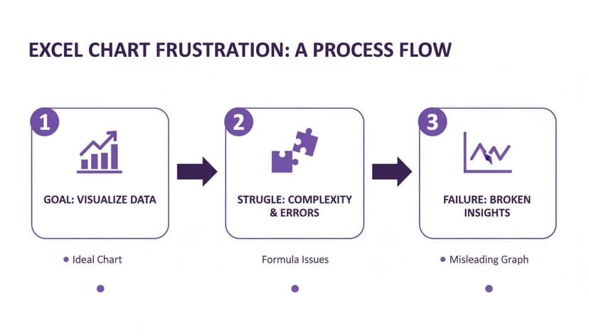
Why Adding a Simple Line in Excel Can Be Complicated
It seems like showing a sales target on a performance chart should be easy, but anyone who has tried knows it can feel like a strange puzzle. Excel doesn't have a simple "Add Target Line" button, which leaves most of us trying to figure out workarounds that are often clunky and take far too long.
This isn't a niche problem. It affects anyone who needs to show performance against a benchmark, like a project manager tracking expenses against a budget or a marketing analyst comparing key metrics to an industry average. The headaches are often the same:
Spending too much time on Excel?
Elyx AI generates your formulas and automates your tasks in seconds.
Sign up →- Lines that disappear: If you draw a line shape manually, it often gets left behind or completely misaligned as soon as you update or filter the chart's data.
- Incorrect alignment: It is surprisingly tricky to get a line to stretch perfectly across the entire chart area without a lot of manual nudging.
- Time-consuming formatting: Changing the color, style, or thickness of the line means digging through multiple menus, which feels like a waste of valuable time.
The real issue here is that something so intuitive—just drawing a line—isn't how Excel's charting engine thinks. To get what we want, we have to get a little creative and use the tools Excel does give us.
The Hidden Cost of Manual Workarounds
This isn't just a minor annoyance; it’s a genuine productivity killer. Professionals burn a surprising amount of time on these kinds of tedious formatting tasks. A Forrester report found that many people spend about 8.5 hours a week just on spreadsheet formatting. For a small team, that adds up to a staggering 442 hours a year. You can learn more about the impact of such inefficiencies and see how that lost time really compounds.
These manual methods aren't just slow; they're also a recipe for errors.
Thankfully, once you learn a few solid techniques, you can save yourself hours of future frustration. By mastering the right way to add a horizontal line to an Excel chart, you can build dynamic, professional visuals that update automatically with your data. This is a fantastic skill to have, and you can always build on it by exploring helpful add-ons for Excel that simplify complex tasks.
Use a New Data Series for a Dynamic Target Line
Hands down, the most reliable and flexible way to add a horizontal line to an Excel chart is by creating a new data series. This is the method I turn to almost every time because it anchors the line directly to your data. When your numbers change, the line moves with them. No more manually adjusting static shapes every time you refresh your report.
Let's imagine a classic business scenario: you're tracking monthly sales and need to show how they stack up against a quarterly target. Instead of drawing a line and hoping it's in the right place, we'll build it right into the chart's DNA.
We've all been there—staring at Excel, knowing what you want to do should be simple, but hitting roadblock after roadblock. It's a common frustration.
This process of hitting a wall is exactly what we want to avoid. Using a data series is the professional, reliable way to get the job done right the first time.
Setting Up Your Data Correctly
The key is a simple "helper column." Create a new column right next to your primary data (e.g., your monthly sales figures). I recommend naming it something clear, like "Sales Target."
Now, fill this column with your target value. If the sales goal is $75,000 for the quarter, enter that number in every cell of the helper column, corresponding to each month's sales data. This repetition is crucial—it tells Excel to plot a point at the $75,000 mark for every category on your x-axis, which creates a perfectly straight horizontal line.
Pro Tip: Don't hard-code the target value. Instead, place the target (e.g., $75,000) in a single, separate cell, like F1. Then, in your helper column, use an absolute cell reference. For example, the formula would be
=$F$1. Let's break this down:
- The
=starts the formula.F1is the cell containing your target value.- The dollar signs
$make it an absolute reference, meaning the reference to cell F1 won't change when you copy the formula down.Drag that formula down the entire column. Now, if your sales target ever changes, you only need to update cell F1, and your chart will instantly and automatically update. It’s a game-changer for creating dynamic reports.
Pros and Cons of the Data Series Method
Before you jump in, it's good to know the trade-offs. Here's a quick comparison to help you decide if this is the right approach for your chart.
| Advantages | Disadvantages |
|---|---|
| Fully Dynamic: Automatically updates when source data changes. | Slightly More Setup: Requires an extra column in your data. |
| Professional Look: Integrates seamlessly into the chart. | Can Clutter the Legend: Adds an extra item you may need to hide. |
| Highly Customizable: Format it just like any other data series. | Less Ideal for Static Reports: Might be overkill if data never changes. |
| Works on All Chart Types: The most universally compatible method. | Can Be Tricky on Some Combo Charts: Requires careful configuration. |
For most situations, the advantages of a dynamic, self-updating line far outweigh the minimal effort of adding one extra column to your data source.
Adding and Formatting the Line
Once your data is ready, the rest is easy. Right-click your chart and hit Select Data. In the pop-up window, add a new series, pointing it to your "Sales Target" helper column for the values.
At first, Excel will probably guess wrong and add it as more bars or columns, cluttering your chart. Don't worry, that's normal.
To fix it, just right-click on the new series directly on the chart and choose Change Series Chart Type. This brings up the Combo chart view. Leave your original sales data as a Column chart, but find your new "Sales Target" series in the list and switch its chart type to a Line. Boom. You've got a combo chart with a perfect horizontal line.
Now for the fun part—making it look good. You can format this line just like any other chart element.
- Color: Pick a strong, contrasting color like red or charcoal grey so it really pops.
- Weight: I like to bump up the thickness a bit so it doesn't get lost.
- Dash Type: Using a dashed or dotted line is a great visual cue to show it's a target or threshold, not actual data.
This technique is a cornerstone of solid data visualization in Excel. While we're making a simple target line, the same principle applies to more complex benchmarks. If you're working with more advanced datasets, knowing how to calculate weighted averages can be incredibly useful. And for those in finance, this same concept is used to create analytical tools like a Volume Weighted Average Price (VWAP) line.
Create a Quick Static Line with Error Bars
While adding a new data series is perfect for dynamic lines, sometimes you just need a simple, static threshold that stays put—a fixed budget cap, a project deadline, or a quality control limit.
For these situations, error bars offer a clever and incredibly fast workaround. You get your line without having to add a new column of repeating numbers to your worksheet.

This method feels a little like a magic trick. Instead of plotting an actual line, we're going to plot a single, invisible point on the chart. Then, we'll stretch a horizontal error bar out from that point to create the illusion of a line spanning the entire chart. It's surprisingly effective when you need a quick visual guide.
How to Add the Helper Point and Error Bar
First, you need an anchor point for your line. Let's imagine your chart shows sales data over six months, and you need a static target line at 500 units. You'll create a tiny, new data series with just one point. A good spot is right in the middle of your data range—say, at month three—with the value of 500.
Add this single point to your chart as a new data series. Don't be surprised if it shows up as just a lonely dot or a tiny sliver of a bar.
Now, click on that new point. Head over to the Chart Elements menu (the little green plus sign next to your chart) and check the box for Error Bars. Excel will immediately add both horizontal and vertical bars, which will look a bit chaotic.
The last part is cleaning it up. Double-click the horizontal error bar to pull up the formatting pane. Find the Error Amount section, pick Fixed Value, and punch in a number big enough to stretch across your chart. If you have six categories, a value of 6 should do the trick.
Finally, just click on the vertical error bar and hit your Delete key. All that's left is a clean, crisp horizontal line.
This method is fantastic because it's so fast and keeps your source data tidy. It's especially handy for statistical charts where you might need to show standard deviation or fixed control limits—any situation where the line's position is non-negotiable.
This is a great tool for horizontal lines, but what about the other direction? If you found this helpful, check out our guide on how to add a vertical line to an Excel chart for more visualization tricks.
Visualizing Averages with a Combo Chart

One of the most practical reasons to add a horizontal line to an Excel chart is to show an average. It’s a simple move that instantly gives your data context, making it clear which points are above the norm and which are falling behind. For this, the combo chart is your best friend.
A combo chart lets you mix and match chart types for different data sets. In this case, you can show your main data as columns and the average as a clean, simple line. This visual separation is key to telling a clear story. In my experience, and for the 72% of BI professionals who use benchmarks daily, this isn't just a nice-to-have; it's essential for clear communication. If you're interested in the nitty-gritty, you can find more details about how professionals use visualization tools to get their point across.
Let's imagine a common scenario: you’re tracking monthly website traffic for a year. You have the numbers, but you need a quick way to see which months were high-flyers and which were sluggish compared to the average.
Calculating a Dynamic Average
First, you need that average. You could calculate it once and paste the number down a column, but that is not best practice. A much smarter way is to use a dynamic formula. Why? Because if your data changes—and it almost always does—the average line on your chart will update automatically. No manual fixes needed.
In your spreadsheet, add a new column next to your monthly traffic data. Call it "Average Traffic" or something similar. In the first cell of that new column, type this formula:
=AVERAGE($B$2:$B$13)
Let's quickly unpack that:
=AVERAGE()is Excel's function for calculating the arithmetic mean.$B$2:$B$13is the range containing your monthly traffic numbers. The dollar signs ($) are the key—they create an absolute reference. This locks the range, so when you copy the formula down to other cells, it will always reference the exact same range,B2:B13, ensuring the average value is consistent in every row.
Once you’ve entered the formula, grab the fill handle (that tiny square at the bottom-right of the cell) and drag it down. Now you have a constant column of the average value, perfectly prepared for your chart.
Building the Combo Chart
With your data ready to go, select the whole table—months, traffic, and your new average column. Head over to the Insert tab and pick a standard Clustered Column chart.
You'll see a chart, but it will probably look a bit off, with two sets of columns for each month. Don't worry, this is where the magic happens.
Right-click anywhere on the chart area and choose Change Chart Type. In the window that pops up, go straight to the Combo category at the bottom. This screen is your control panel for mixing chart types.
- Find your "Monthly Traffic" series and make sure it’s set to Clustered Column.
- Now, for your "Average Traffic" series, change its chart type to Line.
Click OK. Instantly, your chart transforms. The monthly traffic stays as columns, but now a slick horizontal line cuts across them, showing the average. It's a clean, professional look that tells a much richer story.
Pro Tip for Formatting: An average line is a reference, not a hard target. To make this clear visually, I usually style it subtly. Try a medium-gray color and a dashed line style. This keeps the focus on your primary data while still providing that crucial benchmark.
The AI Shortcut: Add Lines Instantly
We’ve walked through the manual ways to add a target line to your chart—creating helper columns, fiddling with error bars, and tweaking combo charts. These methods are effective but require multiple steps. What if you could skip all that? Modern AI in Excel offers a much faster way, turning a complex process into a single, simple command.
Think about having a smart assistant right inside Excel. Instead of clicking through a maze of menus or trying to remember a specific formula, you just tell it what you want in plain English. This is where AI tools come in, handling the complicated backend steps for you.
From a Simple Request to a Perfect Chart
The entire process becomes incredibly straightforward. You just type what you want into an AI chat panel, the same way you’d ask a colleague for help.
For example, you could type a prompt like:
"Add a horizontal target line at $50,000 to my sales chart and make it a bold red dash."
The AI doesn't just give you instructions; it executes the task. In seconds, it interprets your request, identifies the correct chart, creates the necessary helper data series, and adds the line with the exact formatting you specified.
This approach neatly sidesteps all the common headaches:
- No more alignment issues: The line is generated from a proper data series, so it always stretches perfectly from one edge of the chart to the other.
- Instant formatting: Forget hunting for the format pane. The AI applies the color, dash style, and line thickness based on your words.
- It’s still dynamic: Because the AI builds the line the "right" way (using a data series), it remains connected to your data and will update automatically if things change.
Focus on Insights, Not on Clicks
When you can delegate the "how" to an AI, you're free to focus on the "why." Instead of getting bogged down in the mechanics of chart formatting, you can spend your time analyzing what the chart reveals. This transforms your relationship with Excel—it becomes less of a tool you must operate and more of a partner that helps you think.
This represents a huge leap in how we work with spreadsheets. If you want to see what else is possible, you can learn more about the broader applications of AI in Excel and how it’s changing the game for professionals everywhere. When you can hand off tedious tasks to a smart assistant, you get your time and brainpower back to focus on what really matters.
Frequently Asked Questions
Even with the best techniques, a few common headaches can pop up when you try to add a horizontal line to an Excel chart. Let's walk through some of the questions I hear most often and get your chart looking exactly right.
How Do I Make My Horizontal Line Touch the Edges of the Chart?
This is a classic. You've done everything right, but your line stops short, only spanning from the center of the first bar to the center of the last one. It leaves these awkward, unprofessional-looking gaps on the sides. The reason this happens is that Excel is plotting the line based on your data points, not the full width of the plot area.
Thankfully, the fix is much simpler than it seems. All you need to do is add a little "padding" to your source data.
- Start by inserting a blank row just before your first row of data.
- Next, insert another blank row right after your last row of data.
- Copy your target or average value into the helper column for these two new empty rows.
- Finally, just update your chart's data source to include this new "padded" range.
This simple trick forces Excel to extend the line across the entire plot area. The result is a clean, complete look that stretches neatly from edge to edge.
Can I Add More Than One Horizontal Line to a Chart?
Of course! In fact, it's a great way to add more context. You might want to show a baseline target, a stretch goal, and an average performance level all on the same chart. The process is just a simple extension of the data series method we've already covered.
For each new line you need, just add another helper column to your data table. You might have columns named "Target," "Stretch Goal," and "Average." Fill each one with its constant value, making sure to repeat it for every data point.
Then, add each of these new columns as a separate data series to your chart. Use the Change Chart Type dialog box to make sure your main data stays as columns (or bars), while you switch all your new benchmark series to the Line chart type. A little formatting with different colors or dash styles for each line will make them easy to tell apart at a glance.
Adding multiple lines transforms a simple chart into a rich performance dashboard. It allows you to tell a more complex story by showing how data performs against several key metrics simultaneously.
Why Does My Horizontal Line Show Up as a Single Dot?
Ah, the mysterious single dot. If you see a marker where a full line should be, it's almost always a sign of incomplete data in your helper column. This happens when you’ve only entered the target value once instead of repeating it for every data point.
Think of it this way: Excel needs a starting point and an ending point to draw a line. By repeating the target value for every single category on your x-axis, you’re giving Excel a value for each "stop" along the way. This tells the program to connect these dots into a continuous, perfectly straight line.
So, if you have sales data for 12 months, your "Target" column must also have that same target value repeated in all 12 rows. If it's only in one row, Excel will only plot the single point it has data for.
At Elyx.AI, we believe your time is better spent on analysis, not fighting with chart formatting. If you're tired of manual workarounds and want to create perfect charts instantly, our AI-powered Excel agent can do it all for you with a simple command. Discover how Elyx.AI can transform your workflow.
Reading Excel tutorials to save time?
What if an AI did the work for you?
Describe what you need, Elyx executes it in Excel.
Sign up