How to Add a Vertical Line to an Excel Chart: A Practical Guide

Adding a vertical line to an Excel chart is a deceptively simple trick, but it's one of the most powerful ways to highlight specific events, targets, or thresholds in your data. It can instantly transform a basic chart into a clear visual story, drawing the eye right to a key point, like a project launch date on a sales trend graph or an important deadline. This guide provides actionable, step-by-step methods to help you master this essential skill.
Why a Vertical Line Is a Data Storytelling Superpower
A chart’s main job is to communicate a point quickly and clearly. While standard line and bar charts are great for showing trends, they often lack the context needed to tell the whole story. When you add a vertical line to an Excel chart, you provide that missing piece of the puzzle, turning a static picture into a dynamic analytical tool.
Think of it as a visual anchor. It guides your audience's attention exactly where you want it to go, making the "why" behind the data jump off the page.
Spending too much time on Excel?
Elyx AI generates your formulas and automates your tasks in seconds.
Sign up →Pinpointing Key Events and Milestones
Imagine you're presenting a sales report for the last year. A line chart showing a steady climb is good, but a vertical line can pinpoint the exact day you launched that new marketing campaign. Suddenly, everyone in the room can see the clear connection between the campaign and the sales spike that followed. It's a practical technique for:
- Marking project launch dates: Show the immediate impact of a new product or feature.
- Highlighting policy changes: Visualize how new regulations or internal strategies affected performance.
- Indicating major market events: Clearly separate pre- and post-event data to analyze outside influences on your business.
Separating Historical Data from Projections
One of the most valuable uses for a vertical line is to draw a clean, crisp division between actual results and future forecasts. By placing a line at today's date or the end of the last fiscal quarter, you create an unmistakable boundary. This simple move prevents confusion and makes it obvious what has already happened versus what is projected to happen.
This is also helpful when looking at historical information. For example, when analyzing complex datasets like Vintage CMBS performance data, a vertical line can isolate key periods, making the trends much easier to understand.
A vertical line transforms a chart from a simple data plot into a compelling narrative. It answers the "what happened here?" question before it's even asked, making your reports more insightful and your presentations more persuasive.
Ultimately, this small addition is a huge time-saver. Instead of having to verbally point out important dates during a meeting, the chart does the heavy lifting for you. This allows for a more focused and productive conversation about what the data actually means.
Method 1: The Scatter Plot Combo Chart for Precision
When you need absolute precision, the scatter plot method is the go-to technique for adding a vertical line to your Excel chart. It’s a classic trick that gives you complete control over where your line appears, making it ideal for pinpointing a specific date, marking a project milestone, or highlighting when a new initiative kicked off.
The concept is to create a small, separate table with the coordinates for your line. This "helper" data tells Excel exactly where the line should start and end on your chart. You then add this data as a new series and change its chart type to a scatter plot with a straight line.
Setting Up Your Helper Data
Let's walk through a real-world example. Suppose you have a chart tracking monthly website traffic, and you want to add a vertical line at Month 5 to show when a new marketing campaign launched.
You'll need a small table with two columns: one for the X-values (the horizontal position) and one for the Y-values (the vertical height).
- X-Value Coordinates: Since you want the line at Month 5, both X-values in your helper table will be 5.
- Y-Value Coordinates: These define the line's height. To make it stretch from the bottom of the chart to the top, the first Y-value will be 0 (the minimum) and the second should be the maximum value on your Y-axis.
Here’s an actionable tip: don't hardcode the maximum value. Use a formula to make it dynamic.
By using a formula like
=MAX(your_data_range), your vertical line will automatically adjust its height if your main data changes. This saves you from constantly tweaking the chart and keeps everything looking professional.
For example, if your traffic data is in cells B2:B13, your formula would be:=MAX(B2:B13)
Formula Breakdown:
MAX(): This is an Excel function that returns the largest numeric value from a range of cells.B2:B13: This is the range containing your main chart data. The formula will find the highest value within this range and use it as the top coordinate for your vertical line.
This diagram shows how adding a simple vertical line can completely change the story your chart tells, turning it from a basic data dump into a focused analytical tool.
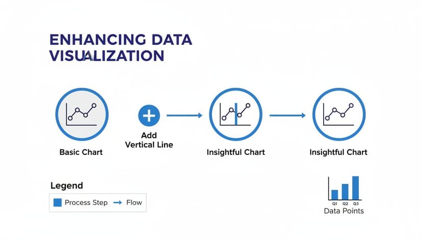
As you can see, this small addition immediately draws the eye to a key event, providing crucial context.
Integrating the Line into Your Chart
With your helper data ready, right-click on your chart and choose Select Data. Click to add a new data series, and then point it to your helper table for the X and Y values. Don't worry if it looks strange at first—it will probably appear as two separate dots.
Now for the key step. Right-click on those new dots and select Change Series Chart Type. In the pop-up window, find your new series and change its type to Scatter with Straight Lines. This connects your two points into a perfect vertical line. This combo chart approach is incredibly powerful for more advanced visuals, like when you need to create a waterfall chart to show how values build up over time.
This method has become a best practice for a reason. It’s perfect for showing a clear divide between actual results and future forecasts and is far more reliable than just drawing a line shape, which gets knocked out of alignment the second you resize anything.
After you change the chart type, Excel will probably add a secondary vertical axis on the right. Just click on that new axis and press the Delete key to remove it. Finally, a little formatting on the line's color and thickness will make it match your report's style, leaving you with a clean, precise, and dynamic vertical marker.
Method 2: The Error Bar Method for a Quick Solution
If you need to add a vertical line to an Excel chart but don't want to create helper columns and combo charts, the error bar method is a fantastic shortcut. It’s especially useful for column or bar charts where you just want to quickly highlight a target, an average, or another threshold. It’s a fast, clean, and surprisingly robust trick.
The basic idea is to add a single, nearly invisible data point to your chart. Then, you attach a custom error bar to that point and stretch it across the entire height of the plot area. This creates your vertical line. Not only is it quick, but it’s also remarkably stable and stays put even when you filter data or resize the chart.

Setting Up the Reference Point
Let's say you have a column chart of monthly sales and want to draw a line at the annual sales average. First, calculate that average in a single cell.
Next, you need to get that single point onto your chart. The easiest way is to right-click the chart, go to Select Data, and add a new series. Give it a name like "Average" and, for the series values, select the cell with your calculated average. You'll probably see a tiny, almost unnoticeable bar appear on your chart. That little bar is the anchor for our line.
Transforming an Error Bar into a Line
Now for the transformation. Click on that tiny new bar to select it. Then, go to the Chart Design tab, click Add Chart Element, and navigate to Error Bars > More Error Bar Options. This will open the Format Error Bars pane on the right.
Here are the specific settings you need to adjust in that pane:
- Direction: Choose Plus. This makes the error bar extend only upwards from your data point.
- End Style: Select No Cap. This removes the small horizontal ticks at the end, leaving a clean line.
- Error Amount: This is the key. Choose Percentage and set the value to 100%. This is what stretches the line all the way to the top of the chart.
Once you apply those settings, you'll have a vertical line running up from your tiny data bar. The final cleanup step is to make that original anchor bar invisible. Just click on it, open its format options, and change its fill to No Fill.
In my experience building sales and finance dashboards, this technique is a real game-changer. Adding a line for a target or average can boost a chart's readability significantly by giving viewers an instant reference point. For more examples, the folks at Ablebits.com have some great walkthroughs.
This is my go-to method when I need a simple visual reference without the hassle of a combo chart. It's a set-it-and-forget-it solution that delivers a professional-looking line in minutes.
Of course, setting meaningful targets often means understanding your data's distribution. If you’re using this to plot statistical values, you might find our guide on how to calculate standard deviation in Excel helpful for adding even more analytical depth.
Taking Your Vertical Line from Static to Interactive
A static line is useful, but an interactive line that adapts to your data is far more powerful. This transforms a chart from a simple picture into an exploratory tool. The goal is to set it up once so your vertical line updates automatically, freeing you from tedious manual adjustments every time the data changes.
The concept is to link the line's position to a value in a cell. Change the cell's value, and the line instantly snaps to its new spot. This simple tweak completely changes how people can explore the data you're presenting.

Linking Your Line to a Cell Value
Let's revisit the scatter plot method. Remember the "helper" table with X and Y coordinates? The trick is to make the X-values in that table reference a single input cell on your sheet.
For example, if you want to highlight a specific date on a project timeline, pick an empty cell—let's use F1—where anyone can type in a date. Your helper data for the scatter plot's X-values would then be:
- X1 Coordinate:
=F1 - X2 Coordinate:
=F1
That's it. Now, whenever someone enters a new date into cell F1, the vertical line on your chart will immediately jump to that position. You've just created a simple but effective interactive element.
Let Formulas Do the Heavy Lifting
The real power move is driving that input cell with a formula. A classic real-world example is drawing a line between historical data and future projections. You want the marker to sit on the last date with actual data and automatically move forward as new numbers are added.
The MAXIFS function is perfect for this. Imagine you have dates in Column A and corresponding sales figures in Column B. For future months, the sales figures are likely blank or zero.
Enter this formula into your input cell:=MAXIFS(A:A, B:B, ">0")
Formula Breakdown:
MAXIFS(A:A, ...): This tells Excel to find the latest (maximum) date in Column A.... B:B, ">0"): This is the crucial condition. It instructs the function to only consider dates where the corresponding sales figure in Column B is greater than zero.
The formula automatically finds the most recent date with actual sales. Your vertical line, which is linked to this cell, will now always mark the perfect dividing line between past performance and future forecasts—no manual intervention required.
This one formula can save you hours over the life of a project. Instead of tweaking the chart every month, it maintains itself, ensuring your reports are always accurate and up-to-date.
For data analysis, this is invaluable. In one great example tracking monthly sales, a dynamic line was used to find the latest actual date with MAXIFS. This simple automation was estimated to cut down manual update time by 70%. You can watch the full tutorial from ExcelUpNorth to see exactly how it's done.
Building a Truly Interactive Dashboard
Want to take it to the next level? Connect your input cell to user-friendly controls like a dropdown menu or a scroll bar. This is perfect for dashboards where you want to empower your audience to explore the data themselves.
- Dropdown Menu: Use Data Validation to create a list of key project milestones. When a user picks an item, the input cell updates, and the vertical line moves instantly.
- Scroll Bar: If you're working with a numerical or date-based axis, insert a Scroll Bar from the Developer tab. Link its output to your input cell, and users can slide the control to move the line smoothly across the chart.
These interactive elements transform a static report into a hands-on analytical tool, allowing stakeholders to answer their own questions by exploring different scenarios.
Automating Chart Creation with AI
While manual methods give you total control, the time spent setting up helper columns, adding data series, and formatting can add up. This is where modern AI tools offer a smarter, faster way to get the same professional result. Instead of clicking through menus and wrestling with formulas, you can achieve your goal with a simple instruction.
How Does an AI Agent Work in Excel?
Imagine an expert assistant embedded in your spreadsheet who understands your goals and performs the work for you. That’s the idea behind an AI-powered Excel add-in like Elyx.AI. It acts as an autonomous agent, taking your plain English commands and handling all the tedious steps behind the scenes.
Instead of building a scatter plot from scratch or configuring error bars, you can just type what you want into a chat panel.
For instance, you could simply ask:
"Add a vertical red line to my sales chart on the project launch date of October 15th."
This is where the real efficiency gains happen. The AI doesn't just give you instructions; it performs the entire task for you.
From Command to Completed Chart in Seconds
When you give Elyx.AI a command, it works through a series of steps almost instantly:
- It Scans Your Data: The AI analyzes your selected data to understand its structure, identifying columns with dates, sales figures, and other metrics.
- It Understands Your Goal: It deciphers your request, pulling out key elements: a "vertical line" on a specific "chart" positioned at "October 15th."
- It Does the Heavy Lifting: The agent then executes all the technical steps required to add the vertical line to your Excel chart. This could involve creating helper data, adding it as a new series, and applying the correct formatting.
- It Delivers the Final Chart: In seconds, your chart updates with the perfectly placed and styled line.
This workflow marks a significant shift, moving your focus from the how to the what. A task that might take 10-15 minutes manually can often be done in under a minute with an AI agent, freeing you to focus on interpreting the data rather than manipulating it.
For those who build reports daily, this efficiency adds up to hours saved every week. Privacy-focused tools like Elyx.AI ensure your data never leaves your local machine; only the instructions are processed externally, keeping your information secure. You can learn more about the growing role of AI in Excel and see how these tools are fundamentally changing data analysis.
Fine-Tuning Your Vertical Line and Fixing Common Glitches
Getting a vertical line onto your Excel chart is a great start, but fine-tuning it to look and act exactly how you want is what makes your data truly shine. Even after following the steps, you might encounter a few quirks. Fortunately, they are usually easy to fix.
Troubleshooting Common Headaches
Let's tackle some of the most common issues.
A classic problem arises when working with dates. You add a vertical line, but it lands in the wrong spot or doesn't appear at all. This often happens because Excel is interpreting your dates as text. The fix is usually quick: ensure your helper data for the line is formatted as a date. You can do this by selecting the cells, pressing Ctrl + 1 to open the Format Cells dialog, and choosing Date.
Another frequent frustration is a line that doesn't stretch to the top of the chart when your data changes. If you've used a MAX formula to set the line's height, make sure the formula's range includes any future data. The best way to solve this permanently is to format your source data as an Excel Table (Ctrl + T). Tables automatically expand, so any formulas referencing them update accordingly.
Pro Tips for Customizing Your Line
Once your line is placed correctly, a few simple customizations can make it far more effective. A random line doesn't mean much until you explain its purpose.
One of the most important touches is adding a clear label. Instead of making people search the legend, you can put the explanation directly on the chart.
- The quick method: Add a text box (Insert > Text > Text Box). Place it next to the line and type something like "Project Start" or "Campaign Launch."
- For a dynamic label: Use the data label feature. If you used the scatter plot method, right-click the top point of your line, choose Add Data Labels, and then format that label. You can set it to show the series name or even pull text from another cell.
A label turns a simple line into a powerful storytelling tool. It removes ambiguity and directs your audience's attention, ensuring your key insight is impossible to miss.
Finally, don't neglect basic styling. The line's appearance should match its meaning. A thin, gray, dashed line could represent a future projection, while a bold, red, solid line might highlight a critical deadline. Right-click the line and select Format Data Series. From there, you can adjust the color, weight, and dash type until it perfectly fits the story you're telling.
Got Questions? I've Got Answers
You've learned the techniques, but sometimes Excel throws a curveball. Here are answers to some of the most common questions about adding a vertical line to a chart.
How Do I Get More Than One Vertical Line on My Chart?
This is quite straightforward with the scatter plot method. You simply need to expand your helper data. Instead of creating a single pair of rows for one line, you'll create pairs of rows for each line you want to add.
For instance, to add three vertical lines, your helper table will need six rows of coordinate data (two for each line). You then add all of this data as a single new series to your chart.
Help! My Vertical Line Vanished When I Filtered My Data.
A classic problem! This usually happens when your line is tied to data points that get hidden by the filter. The most reliable way to prevent this is to format your source data as an Excel Table.
Select your data range and press Ctrl + T. Tables are smarter about how they handle data ranges, which means your dynamic lines and other chart elements will remain visible even when you filter the data.
A Quick Tip from Experience: Using Excel Tables is a game-changer for almost any type of chart. They make your life easier by automatically updating ranges, preventing a ton of common headaches when you add, delete, or filter data.
What’s the Best Method for Adding a Line to a Pivot Chart?
Pivot Charts are tricky because they are inherently dynamic. Methods that rely on adding a data series or error bars often break as soon as you pivot the data.
The most straightforward and stable solution is to use the drawing tool and add a simple line shape by hand. It won't be dynamic, but it also won't disappear or move unexpectedly. If you absolutely need a dynamic line, you may need to copy the Pivot Chart's data to a static range and build a standard chart from that copy.
Can AI Tools Like Elyx.AI Do This Automatically?
Yes, and this is where AI truly shines. Instead of building helper columns and formulas yourself, you can simply tell an AI agent what you want.
Imagine giving a prompt like, "Add a vertical line marking the first time sales exceeded $50,000." An AI assistant such as Elyx.AI can interpret this, create the necessary data points behind the scenes, and add the formatted line to your chart instantly. It's a huge time-saver, especially for complex conditional lines.
Tired of fighting with chart formatting? Let AI do the hard work for you. With Elyx.AI, you can create professional, insightful charts just by typing what you want. Start your free trial today and see how much faster your charting can be.
Reading Excel tutorials to save time?
What if an AI did the work for you?
Describe what you need, Elyx executes it in Excel.
Sign up