How to Make Sales Reports: Drive Decisions Fast

If you build sales reports in Excel for a living, you already know the routine. The month closes, someone exports data from the CRM, someone else sends a second spreadsheet from finance, and then the detailed work starts. You clean headers, fix date formats, remove duplicates, rebuild the same PivotTables, and then make three slightly different versions of the same report because the CEO, sales manager, and finance lead all want different answers.
That’s where most reporting time disappears.
The hard part isn’t only how to make sales reports. It’s how to make them from one reliable dataset without rebuilding the file every time a stakeholder asks for a new view. A useful sales report isn’t a spreadsheet full of totals. It’s a decision tool that answers a specific question for a specific person.
Spending too much time on Excel?
Elyx AI generates your formulas and automates your tasks in seconds.
Sign up →From Manual Mess to Automated Insight
The usual reporting process breaks down in two places.
First, the data arrives messy. CRM exports rarely use one clean standard across owner names, regions, lead stages, and close dates. Second, even when the data is usable, analysts still waste time making derivative reports for different audiences. Current guidance on sales reporting often fails to provide a practical workflow for creating multiple, audience-specific derivative reports from a single data source, which creates friction for analysts serving executives, sales managers, and marketing leaders (Revenue Operations Alliance).
That gap matters in Excel because many teams don’t suffer from a lack of charts. They suffer from repeated manual work.
A sales report becomes valuable when one dataset can support several decisions without forcing you to rebuild the workbook each time.
A practical workflow is simpler than it often sounds. It follows a structured sequence:
- Decide what the report must answer
- Choose the audience
- Set the reporting period
- Clean and combine the source data
- Select the right KPIs
- Build visuals that can be filtered
- Create separate views from the same base table
That order matters. If you skip straight to charts, you usually end up decorating bad logic.
A CEO typically needs a high-level view: revenue trend, quota progress, and a quick comparison against prior periods. A sales manager needs rep-level performance, pipeline detail, and conversion patterns. Finance may care more about forecast quality and whether reported sales line up with booked revenue. Same dataset. Different questions.
That’s why the workbook should have a single source of truth sheet and then separate report sheets built from it. In practice, that means one cleaned Excel Table feeding multiple PivotTables, charts, and filtered summaries.
Once you build the file that way, reporting changes. You stop acting like a spreadsheet mechanic and start acting like an analyst. The workbook becomes easier to refresh, easier to audit, and much easier to adapt when leadership asks for “one more cut” of the numbers.
Pinpoint Your 8 Essential Sales KPIs Before You Begin
Most weak sales reports fail before Excel even opens. The problem isn’t formatting. The problem is metric selection.
Top-performing sales teams implement thorough tracking systems with at least 8 to 10 core metrics, including total revenue, quota attainment, conversion rates, and customer lifetime value, so they can see performance from all angles (CaptivateIQ). If your report tracks everything people can export, it won’t answer anything clearly.
Ask the business question first
A junior analyst often starts with available columns. A stronger analyst starts with the decision the report must support.
Instead of asking, “What fields do we have?” ask:
- Revenue question: Are we on track against target?
- Execution question: Which reps or regions are converting well?
- Retention question: Are we keeping revenue after acquisition?
- Forecast question: Does the current pipeline support future performance?
That’s the difference between a dashboard and a report people use effectively.
If you want a sharper grounding in metric selection, this guide on understanding key performance indicators is a useful companion before you start building formulas.
Core Sales KPIs and the Questions They Answer
| KPI | Business Question It Answers |
|---|---|
| Total Revenue Generated | How much sales value did we close in the period? |
| Quota Attainment Ratio | Are we hitting target, and by how much are we above or below it? |
| Conversion Rate | How efficiently are leads or opportunities turning into closed deals? |
| Customer Churn | Are we losing customers after acquisition? |
| Revenue Forecasting | Is current performance likely to support upcoming targets? |
| Sales Rep Productivity Metrics | Which reps are producing output, and where is coaching needed? |
| Pipeline Details | Do we have enough deal value and stage coverage to support future sales? |
| Customer Lifetime Value (LTV) | Are we winning customers who create meaningful long-term value? |
Why these 8 work in Excel
These KPIs translate well into spreadsheet logic because they can be grouped into three report layers.
- Outcome metrics: Revenue, quota attainment, churn
- Process metrics: Conversion rate, rep productivity, pipeline details
- Forward-looking metrics: Forecasting and LTV
That structure helps you avoid a common mistake. Many Excel reports focus only on what happened. Better reports answer the harder question: why did we meet the goal, or why didn’t we?
Practical rule: If a KPI doesn’t support a decision, remove it from the first page.
For example, “number of exported leads” might exist in the data, but it’s often a vanity metric if nobody uses it to decide budget, coaching, or territory allocation. By contrast, a drop in conversion rate paired with flat pipeline value tells a very different story than a drop in revenue alone.
In other words, KPI choice is report design. Get this right, and the rest of the Excel work becomes much easier.
Mastering Your Data with 5 Essential Excel Cleaning Techniques
Bad reporting usually starts upstream. The root cause of many inaccurate sales reports is poor data quality from incomplete or flawed manual data entry by sales teams, which creates a cycle where managers get bad reports and reps get discouraged from logging data accurately (InsideSales).
If the raw export is messy, your PivotTable will only summarize the mess faster.

1. Clean hidden spaces with TRIM
Sales exports often contain cells that look identical but aren’t. "North" and " North " won’t group correctly.
Use:
=TRIM(A2)
How it works:
TRIM removes leading, trailing, and repeated internal spaces from text. If cell A2 contains extra spaces before or after a sales rep name, region, or product label, this formula standardizes it.
Why it matters:
PivotTables treat text values exactly as entered. A single hidden space can split one category into two.
2. Standardize case with UPPER or PROPER
Rep names and regions often arrive as north, NORTH, and North. That makes filtering ugly and hard to trust.
Use one of these:
=UPPER(B2)=PROPER(B2)
How it works:
UPPER converts all letters to uppercase. PROPER capitalizes the first letter of each word.
Why it matters:
This is mostly a presentation fix, but it also helps you spot duplicates and inconsistencies more easily before building the report.
3. Split merged fields into usable columns
CRMs often export a combined field like Region - Rep Name or a full customer string in one column. That’s hard to analyze.
Use Text to Columns from the Data tab, or if the pattern is consistent, create helper columns. For example, if values are separated by a hyphen, split them with Excel’s built-in tool so Region and Rep become independent fields.
Why it matters:
A report needs dimensions. You can’t summarize by region if region is buried inside another text string.
4. Merge data safely with XLOOKUP
You’ll often need to combine CRM data with quotas, territory mapping, or finance data from another sheet.
Use:
=XLOOKUP(A2,Quotas!A:A,Quotas!B:B,"Not found")
How it works:
This formula looks for the value in A2 inside column A of the Quotas sheet, then returns the matching result from column B. If there’s no match, it returns "Not found".
Why it matters:
XLOOKUP is more flexible than older lookup patterns. It lets you enrich your base dataset without hard-coding values manually.
If your source data is thin, you may also need external context before reporting. In that case, curated lists of data enrichment tools can help you identify options for filling missing company, contact, or account attributes before analysis.
5. Remove duplicates and highlight anomalies
Two built-in Excel tools do a lot of work here:
- Remove Duplicates: Use this when you have repeated opportunity IDs, customer rows, or duplicate exports.
- Conditional Formatting: Use color rules to flag blanks, extreme values, or repeated entries.
If you don’t trust the base sheet, don’t trust the chart built on top of it.
A simple example is highlighting close dates that are blank or revenue values that look inconsistent with the rest of the file. You don’t need a complex model to catch obvious errors early.
For a broader view of this prep work, this article on what is data munging is worth reading. It maps well to the messy reality of CRM exports.
Constructing Your Report with 3 Powerful Excel Tools
Once the data is clean, Excel becomes much more enjoyable. You’re no longer repairing exports. You’re shaping information.
Strong sales reports rely on visual presentation such as charts, graphs, and interactive dashboards so stakeholders can understand the main points quickly (Databox).
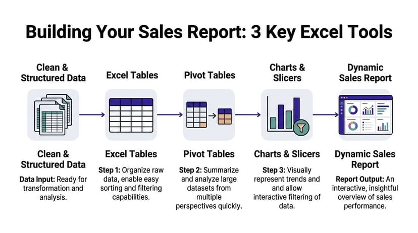
1. Convert the raw range into an Excel Table
Select your dataset and press Ctrl + T.
That small step changes a lot. An Excel Table expands automatically when you paste in new rows. Formulas copy down consistently. Filters become easier to manage, and charts and PivotTables built from a Table are much easier to refresh reliably.
Name the Table something useful like SalesData. Don’t leave it as Table1.
Why this matters:
If your monthly refresh requires redefining source ranges, your process is fragile. A proper Table gives your workbook structure.
2. Build the first PivotTable around one real question
Start with a simple question such as: which reps generated the most revenue by region this quarter?
Insert a PivotTable from the SalesData table and use a layout like this:
| Pivot Area | Field Example |
|---|---|
| Rows | Sales Rep |
| Columns | Region |
| Values | Sum of Revenue |
| Filters | Quarter or Close Date |
That gives you a report people can read immediately.
If quota is part of your dataset, add it as another value field. If conversion is a priority, use count of opportunities and closed deals in a second PivotTable or create a calculated field outside the pivot.
The biggest mistake here is trying to answer every question in one PivotTable. Don’t. Build one core summary per decision.
For a detailed walkthrough, this guide on how to create pivot table covers the mechanics well.
3. Add PivotCharts and Slicers for stakeholder views
Here, one workbook becomes several reports without duplicated effort.
A PivotChart turns your summary into a readable visual. A Slicer gives non-technical users clickable filters. That matters because most executives don’t want to interact with field lists and value settings.
Here’s a simple setup that works well:
- CEO sheet: Revenue trend chart, quota summary, and region slicer
- Sales Manager sheet: Rep-by-rep revenue chart, pipeline table, and rep slicer
- Finance sheet: Revenue by month, forecast support view, and period slicer
Build one base PivotTable structure, then duplicate and adapt the report sheets. Don’t duplicate the raw data.
What works and what doesn’t
A few trade-offs are worth knowing early.
- What works: One clean table, multiple small pivots, clear slicers, and charts with one message each.
- What doesn’t: One giant dashboard trying to satisfy every stakeholder at once.
- What works: Standardized date fields and category labels before the pivot stage.
- What doesn’t: Fixing category logic directly inside every chart.
If you’re learning how to make sales reports that stay usable after month one, this is the core pattern. Clean table first. Pivot logic second. Presentation layer last.
Automate Your Entire Reporting Workflow with 1 AI Command
The manual method works. It also repeats itself.
You export the CRM file. You clean text fields. You merge quotas. You build a table. You create pivots. You add charts. Then someone asks for a different version for leadership, and you do half of it again.
Teams that use automation for sales reporting can reduce manual task time by 70 to 80%, improve forecast accuracy by 25%, and save professionals over 3 hours per week on tasks like cleaning data and building pivot tables (Quotapath).

What one command can replace
Inside Excel, an AI agent can handle the sequence that usually burns time:
- Clean the source sheet
- Standardize labels
- Create a PivotTable
- Insert a chart
- Apply formatting
- Generate a second report view for another audience
That matters most when your job is not to prove you know Excel clicks. Your job is to get to the insight faster.
A practical prompt looks like this:
Clean this sales export, standardize rep names and regions, create a pivot report showing revenue by rep and region, add a bar chart, and place an executive summary on a new sheet.
That’s the shift. You stop issuing formulas one by one and start giving outcome-based instructions.
One option for this inside Excel is Elyx AI, which acts as an AI add-in that executes multi-step spreadsheet workflows from natural language. In practice, that means the agent can perform the cleaning, pivot creation, chart generation, and formatting work instead of only suggesting what you should click.
AI is especially useful for audience-specific reporting
This is the part most guides skip.
The primary bottleneck in reporting often isn’t making one chart. It’s making three versions of the same analysis from one dataset without rebuilding everything manually. AI helps because you can ask for derivative views directly.
For example:
- Executive version: “Create a summary sheet with revenue, quota progress, and year-over-year comparison.”
- Manager version: “Create a rep-level sheet showing revenue, deals closed, and conversion by region.”
- Operations version: “Create a sheet that flags missing owner names, blank stages, and duplicate opportunity IDs.”
That’s far closer to how analysts work.
If you’re also stitching together apps around Excel, this roundup of free Zapier alternative tools is useful for thinking through broader automation options around intake, routing, and workflow triggers.
A short demo helps make the workflow concrete:
The key point isn’t that AI replaces judgment. It doesn’t. You still choose the KPI, the audience, and the business question. AI handles the repetitive spreadsheet mechanics so you can spend more time checking the story the data is telling.
4 Best Practices for Sales Reports That Drive Decisions
A sales report can be clean, fast, and still not be useful. The final step is making it actionable.
Story-driven reports that add narrative and interpretation can increase executive buy-in by as much as 40% compared with plain data dumps (Forecastio). That matches what most analysts see in practice. Leaders rarely need more rows. They need clearer meaning.
1. Add context next to the number
A chart without explanation forces the reader to guess.
Use a text box beside the chart to explain the likely reason behind a change. If revenue dipped while pipeline stayed healthy, say that. If one region missed target because several deals slipped periods, say that.
Numbers start the conversation. Context is what makes someone act.
2. Keep each visual focused
One chart should answer one question.
A good bar chart compares reps. A good line chart shows trend over time. A bad chart tries to show reps, products, margin, and regions in one visual. That usually creates confusion instead of insight.
If you need help tightening layout and chart choices, these dashboard design best practices are a practical reference.
3. Use a steady reporting cadence
People trust reports that arrive in a predictable rhythm.
Daily or weekly views are useful for near-term execution. Monthly or quarterly views work better for broader performance and planning. What matters most is consistency. If the structure changes every cycle, comparison becomes harder and trust drops.
4. Ask users what decision the report supports
This sounds obvious, but many teams skip it.
After you share a report, ask the stakeholder one question: What decision did this help you make? If they can’t answer, the report may be well built but poorly designed. Use that feedback to simplify, reframe, or split the report into better audience views.
That’s the true standard for how to make sales reports. Not whether the workbook looks polished, but whether someone can use it to decide faster and with more confidence.
If you want Excel to do more than display data, Elyx AI is built for that workflow. It works as an AI Excel add-in that executes tasks directly in your spreadsheet, including cleaning messy sales exports, creating PivotTables, generating charts, and producing audience-specific report views from a plain-language request. For analysts who spend too much time rebuilding the same report every month, that’s a practical way to move from spreadsheet maintenance to analysis.
Reading Excel tutorials to save time?
What if an AI did the work for you?
Describe what you need, Elyx executes it in Excel.
Sign up