A Practical Excel Pivot Table Tutorial for Real-World Data Analysis

If you've ever stared at a massive spreadsheet and wished you could just ask it for a summary, you're in the right place. A Pivot Table is one of Excel's most powerful tools for doing exactly that, letting you condense thousands of rows of data into a clear, interactive report without writing a single formula.
This guide will walk you through building your first report from scratch, providing practical steps and real-world examples to help you solve concrete data problems.
Your First Steps to Building a Pivot Table
Jumping into a huge dataset can feel overwhelming, but creating a Pivot Table is a surprisingly straightforward process. It’s less about complex functions and more about interacting with your data. You take a flat list of information—like a long log of sales records—and "pivot" it to see connections, totals, and patterns you’d otherwise miss.
Spending too much time on Excel?
Elyx AI generates your formulas and automates your tasks in seconds.
Sign up →This tool isn't new; it's a cornerstone of data analysis. Microsoft introduced PivotTables in 1993, and they quickly became essential for business intelligence. As businesses started collecting vast amounts of transaction records, PivotTables became the go-to for making sense of it all. As Microsoft puts it, it’s “an interactive way to quickly summarize large amounts of data,” which is a perfect description. You can even check out a brief history of PivotTables on Microsoft's support page to see their evolution.
Preparing Your Data for Analysis
Before you can build a Pivot Table, you need to ensure your data is properly structured. This is the single most important step for a successful outcome. Pivot Tables need clean, organized data to work their magic.
Think of it like building a house—a solid foundation is non-negotiable. For your data, this means following a few simple rules:
- No Gaps: Your data must be in a single, continuous block. Ensure there are no completely blank rows or columns breaking up the dataset.
- Clear Headers: Every column needs a unique name in the very first row. These headers will become the fields you use to build your report.
- Consistent Data Types: Keep the data within each column consistent. For example, a "Sales" column should only contain numbers, and a "Date" column should only contain dates.
Pro Tip: My go-to move is to convert the data range into an official Excel Table before I even think about making a pivot. Just click anywhere in your data and press Ctrl+T. This little trick makes your data source dynamic, so when you add new rows later, a simple refresh of your Pivot Table pulls in the new information automatically. No more manually adjusting the source range!
The entire process boils down to three simple actions: prepare your data, insert the Pivot Table, and then arrange the fields to create the view you need.
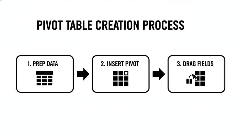
Once you realize it's just a simple sequence, Pivot Tables become a lot less intimidating and much more powerful.
Understanding the Pivot Table Fields Pane
After you insert a Pivot Table from the Insert tab, the PivotTable Fields pane will appear on the right side of your screen. This is your command center. You'll see a list of all your column headers (these are your "Fields") at the top and four empty boxes at the bottom.
Getting comfortable with these four areas is the key to building any report you can imagine. Each box has a specific job, and how you arrange your fields dictates the structure and content of your final report.
Here’s a practical breakdown of what each area does.
The Four Areas of a Pivot Table Explained
| Field Area | Primary Function | Common Use Case Example |
|---|---|---|
| Rows | Creates the row labels for your report. | Dragging "Product Category" here lists each category down the side. |
| Columns | Creates the column headers across the top of your report. | Dragging "Region" here shows each sales region across the top. |
| Values | Summarizes the numerical data (e.g., sum, count, average). | Dragging "Sales Amount" here calculates total sales for each category. |
| Filters | Adds a high-level filter for the entire report. | Dragging "Year" here lets you view the report for a specific year. |
By dragging and dropping your fields into these boxes, you build the report in real-time. For instance, if you drag "Region" to the Rows box and "Sales" to the Values box, you'll instantly see total sales broken down by each region.
It’s that simple. This drag-and-drop interface is what makes Pivot Tables an incredible tool for quickly exploring and understanding your data.
How to Sort, Filter, and Group Your Data
Once you’ve built a basic Pivot Table, you have a solid summary. But the real power comes from asking specific questions of your data. This is where you move from simple reporting to true analysis. Refining your report with sorting, filtering, and grouping turns a static summary into a dynamic tool that can answer questions on the fly.
Let's dig into how you can slice and dice your information to find exactly what you’re looking for. These actionable tips will help you highlight top performers, uncover hidden trends, and gain valuable insights.
Sorting for Clarity and Insight
By default, Excel often sorts row labels alphabetically. While that’s organized, it rarely tells the most important story. What you really want to know is which product is generating the most revenue, or which region is underperforming.
This is where sorting by value is essential. Instead of sorting by product name from A-Z, you can sort by its total sales from largest to smallest.
It's incredibly easy. Just right-click any number in your Values column—say, a cell under "Sum of Sales"—and choose Sort > Sort Largest to Smallest. Instantly, your entire table reorders itself, putting your best-performing items right at the top. This one-click action provides immediate focus and is far more effective than manually scanning a long list.
Moving Beyond Basic Filters with Slicers
Sure, the little dropdown arrows in a Pivot Table work for filtering, but they can feel a bit clunky for complex analysis. For a much more interactive and visually intuitive experience, you should use Slicers.
Think of Slicers as stylish, interactive buttons for filtering your data. Instead of digging through a dropdown menu, you see all your options laid out and can filter your report with a single click.
Here’s a practical example of how to set one up:
- Click anywhere inside your Pivot Table. The PivotTable Analyze tab will appear in the ribbon.
- Go to that tab and click Insert Slicer.
- A pop-up will appear. Just check the box for the field you want to filter by, like "Region" or "Product Category."
Excel adds a floating panel with buttons for each item. Clicking a button instantly filters the Pivot Table and any connected charts, making your report feel more like a professional dashboard. You can even add multiple Slicers (one for Region, another for Year) to create powerful, layered views of your data.
A Quick Word on Timelines: If you’re working with dates, there’s a special type of slicer called a Timeline. You'll find it right next to the Slicer option. It creates a visual timeline that lets you filter by years, quarters, months, or even days just by dragging a slider. It's a fantastically intuitive way to analyze performance over specific time periods.
The Power of Grouping Data
Grouping is one of the most powerful and practical features in a Pivot Table. It lets you create custom categories on the fly, without ever altering your original source data. It’s perfect for rolling up detailed information into a clean, high-level summary.
For example, a raw list of daily sales dates is often too granular for a quarterly business review. You don't need to see hundreds of individual dates. You can group them.
-
Group by Date: Right-click any date in your row or column labels and select Group. A dialog box will pop up, letting you consolidate the dates into Days, Months, Quarters, and Years. Just select "Months" and "Quarters," and Excel will automatically create a neat hierarchical view.
-
Group by Numbers or Text: This works for more than just dates. You can group numerical data into ranges (like customer age brackets) or create custom sales territories from a list of states. Just select the items you want in a group (hold Ctrl while you click to select multiple), right-click, and choose Group. You can then rename the new group to something meaningful.
This ability to create new analytical layers is a game-changer for deeper analysis. For more advanced techniques, check out our guide on how to group data in Excel. Mastering these skills will elevate you from a basic user to a true power user.
Diving into Advanced Calculations and Custom Formulas
Once you've moved past basic sums and counts, you start to unlock the real analytical power of Pivot Tables. This is where you graduate from simply organizing your numbers to asking complex business questions and getting answers directly within your report. The true power comes alive when you use custom calculations to create new metrics and find insights buried deep in your source data.

Let's walk through some practical examples of how to create these custom calculations, turning your static summaries into dynamic analytical tools.
Beyond the Default: Changing Your Summary Calculation
When you drag a number field into the Values area, Excel defaults to calculating a Sum. That's often what you need, but what if you're trying to find the average sale price, the single largest transaction, or the total number of sales made?
Luckily, changing this is a quick two-click fix.
In the Values area of the PivotTable Fields pane, just click on the field you want to modify (like "Sum of Sales"). A small menu will pop up; from there, select Value Field Settings. This opens a new window where you can choose a different calculation.
You’ll find useful options like Count, Average, Max, and Min. This simple adjustment lets you analyze your data from completely different angles without ever touching the original dataset.
Creating Your Own Metrics with Calculated Fields
What happens when the metric you need to analyze simply doesn't exist in your source data? Imagine your table has "Revenue" and "Cost" columns, but the business question you need to answer is about "Profit Margin." Instead of adding a new formula column to your source data, you can build it right inside the Pivot Table using a Calculated Field.
A Calculated Field is a custom formula that operates on other fields in your report. To create one, click anywhere inside your pivot table, go to the PivotTable Analyze tab, and select Fields, Items, & Sets > Calculated Field.
Let's create that profit margin field as a real-world example:
- Name: Give it a clear name, like "Profit Margin."
- Formula: Type your formula using your existing fields. In this case, it would be
= (Revenue - Cost) / Revenue. - Click Add, then OK.
Instantly, a new "Profit Margin" field appears in your pivot table, calculating the margin for every row and column. This is incredibly efficient because the calculation is part of the pivot table itself and updates automatically when your data refreshes. Mastering this feature can significantly reduce time spent on manual calculations.
The key benefit here is that you're adding business logic directly to your analysis without altering the source data. This keeps your original dataset clean and makes your pivot table a self-contained, powerful analytical tool.
Telling a Story with "Show Values As"
One of the most powerful—and often overlooked—features is Show Values As. This option can instantly transform the numbers in your pivot table to show relative comparisons, making trends and proportions immediately visible.
To use it, right-click on any value in your pivot table and hover over Show Values As. You'll see a list of powerful display options that solve common business questions:
- % of Grand Total: This shows each value as a percentage of the total. It's perfect for seeing which product category contributes most to overall sales.
- % of Column Total: Use this to compare each value to the total for its column, which is great for understanding the product mix within a specific region.
- Difference From: This lets you calculate the change from one item to another, like comparing this month's sales to last month's.
- Running Total In: Creates a cumulative total, ideal for tracking progress toward a goal over time.
Using these options turns a table of numbers into a clear narrative. You can immediately spot which region is growing fastest or how a product's sales have trended over the year. When you need to extract specific data points from these complex tables, it also helps to know formulas like GETPIVOTDATA. For a deeper dive, you can learn more about the GETPIVOTDATA function in our article.
Turning Your Data into a Visual Story with Pivot Charts
Data on its own can be dry. While a Pivot Table is brilliant for summarizing numbers, a Pivot Chart is what makes your insights truly stand out. It transforms your summarized data into a visual story that people can understand in seconds.
The best part is that Pivot Charts are directly linked to your Pivot Table. They're not static images; they are dynamic. When you filter your table by a specific region or group dates by quarter, the chart updates instantly. This dynamic link is the first step toward creating an interactive dashboard.
Creating Your First Pivot Chart
You don't need to be a design expert to create effective visuals. Making a Pivot Chart is surprisingly simple.
Just click anywhere inside your Pivot Table. The PivotTable Analyze tab will appear in the Excel ribbon. Click that, then select PivotChart. Excel will open a menu with various chart options and will even suggest a few that it thinks will work best with your data.
For example, if you’re analyzing sales figures across different product categories, a classic bar or column chart is an excellent choice for a quick comparison. If you're tracking sales over several months, a line chart will tell that story much more effectively.
Choosing the Right Chart for Your Data
The type of chart you choose has a huge impact on how your data is interpreted. Picking the right one is key to communicating your message clearly; the wrong one can be confusing or even misleading.
Here are a few actionable tips for common business scenarios:
- Bar or Column Charts: These are your go-to for comparing different groups, such as sales performance by region or product-to-product comparisons. They make it immediately obvious which items are the top or bottom performers.
- Line Charts: If you're analyzing data over a period of time—daily, monthly, or quarterly sales—a line chart is the best choice. It’s perfect for spotting trends, growth, or seasonal patterns.
- Pie Charts: Use these with caution. They are only effective when showing parts of a whole with a small number of categories (a maximum of six is a good rule of thumb). A good use case is showing the revenue percentage from your main product lines.
A common mistake is trying to cram too much information into a single chart. If it looks busy, it's not effective. It's almost always better to create two simple, clear charts than one that's a confusing mess.
Building a Simple Interactive Dashboard
Now, let's combine these elements to build a simple dashboard. A dashboard is essentially a single worksheet where you arrange your charts and add interactive controls, like Slicers. It becomes a one-stop shop for others to explore the data without having to interact with the Pivot Tables themselves.
First, create a couple of different Pivot Tables from your main dataset, each focused on answering a specific question (e.g., one shows sales by region, another tracks sales over time). Then, create a Pivot Chart for each one.
Next, cut and paste these charts onto a new, blank worksheet and arrange them logically. To make it interactive, go back to one of the Pivot Tables and add a Slicer for a field like "Year" or "Product Category."
To make that one Slicer control all your charts, right-click it and choose Report Connections. A box will appear listing all the Pivot Tables in your workbook. Simply check the box for every Pivot Table you want that Slicer to filter.
That's it. Now, when a user clicks a button on the Slicer, every chart on your dashboard will update instantly. You’ve just turned a static report into a dynamic analytical tool that empowers anyone to find their own answers.
Let AI Do the Heavy Lifting for You
Let's be honest: the most time-consuming part of data analysis isn't always the analysis itself. It’s the tedious prep work—cleaning, formatting, and organizing—that must happen before you can even create a Pivot Table. This is precisely where AI tools can be a game-changer. An AI assistant like Elyx.AI is not here to replace your Excel skills; it's designed to amplify them by automating the repetitive tasks that consume your time.

Imagine typing a plain-English request like, "show me total sales by month for the North region," and watching the correct Pivot Table appear instantly. That’s what happens when you integrate AI into your workflow. You can shift your focus from the how of building the table to the why of what the data is telling you.
From Manual Clicks to Simple Commands
Building a Pivot Table manually is a click-heavy process: insert the table, drag and drop fields, tweak settings, and verify the results. It works, but it can be slow and repetitive.
AI flips that entire process on its head. Instead of navigating menus, you simply tell the AI what you want using everyday language. This is a massive help, especially if you’re not a Pivot Table expert. You don't have to remember which field goes into which box—you just state your objective. This approach is also fantastic for making quick changes, like adding a calculated field or switching from a sum to an average. To see how this concept applies more broadly, check out this ultimate guide to AI automation and agentic workflows.
AI-Powered Data Cleaning and Prep
Every data analyst knows this truth: your Pivot Table is only as good as the data behind it. One typo, an inconsistent name, or a wrong date format can compromise your entire analysis. This is where an AI assistant really shines, automating the cleanup with surprising accuracy.
Here are a few common problems AI can solve for you:
- Fixing Inconsistencies: It can automatically find and standardize entries, such as converting "N.Y.", "NY", and "New York" into a single, clean "New York."
- Translating Headers: Working with a dataset from an international colleague? An AI tool can translate column headers on the fly so your PivotTable Fields list makes sense instantly.
- Correcting Formats: It can identify numbers stored as text or mixed-up date formats and correct them across your entire dataset, saving you significant manual effort.
Delegating these tasks to an AI not only saves time but also drastically reduces the risk of human error, ensuring you can trust your data.
To see the difference, let’s compare the traditional method with an AI-assisted workflow.
Manual Pivot Table Tasks vs AI-Assisted Workflow
| Task | Traditional Excel Method | AI-Assisted Method with Elyx.AI |
|---|---|---|
| Data Cleaning | Manually find/replace inconsistencies, format cells, and fix typos. | Automatically standardizes data, corrects formats, and cleans inconsistencies with a single command. |
| Pivot Table Creation | Click Insert > PivotTable, then drag and drop fields into the correct areas. | Type a natural language prompt like, "summarize sales by region and product." |
| Calculated Fields | Navigate to PivotTable Analyze > Fields, Items, & Sets > Calculated Field, and write the formula manually. | Ask the AI to "create a field for 10% commission on sales" and it generates the formula. |
| Troubleshooting | Search online forums or use the "Show Field List" to re-check field placements and settings. | Ask, "Why isn't my total correct?" and get step-by-step guidance on how to fix the issue. |
As you can see, the AI approach doesn't just accelerate the process; it makes it more intuitive and less prone to frustrating errors.
Get Smarter Suggestions for Your Analysis
A great AI assistant does more than just follow instructions—it acts as an analytical partner. Once your Pivot Table is ready, tools like Elyx.AI can suggest the best way to visualize your findings, such as recommending a line chart for time-series data or a bar chart for categorical comparisons. You can learn more about how AI for Excel boosts productivity in our article.
This intelligent guidance helps you move from data to insight more quickly and present your findings in the most compelling way. By automating the grunt work, you free yourself up to focus on what humans do best: thinking critically, identifying trends, and making strategic decisions.
Tackling Common Pivot Table Headaches
Even experienced users run into frustrating Pivot Table issues. Some problems pop up so frequently they feel like a rite of passage for anyone serious about Excel. This section provides solutions to those common roadblocks that can bring your analysis to a halt.
Think of this as your go-to troubleshooting guide. Understanding why these issues occur will not only help you fix them faster but also give you a deeper understanding of how Pivot Tables work.
Why Won't My Pivot Table Update with New Data?
This is the most common question users face. You've pasted new data into your source sheet, you hit "Refresh," and… nothing happens. The new rows are ignored.
The Problem: The issue is almost always a fixed data range. When you first created the Pivot Table, you likely defined its source as a specific range, like A1:G500. When you add data in row 501, your Pivot Table doesn't know it exists.
The Solution: The best way to solve this permanently is to convert your source data into an official Excel Table before creating your pivot. Just click anywhere in your data and press Ctrl+T. Excel Tables are dynamic, meaning they automatically expand to include new rows. From then on, a simple refresh is all it takes to pull in your latest data.
How Can I Show Items That Have No Data?
By default, Pivot Tables only show items that have data. If a product had zero sales in April, it simply won't appear in that month’s report. But what if you need to see those gaps to understand what's missing?
The Solution: You can force Excel to show these empty items. Here's how:
- Right-click on any row or column label in your Pivot Table.
- Select Field Settings from the context menu.
- Click the Layout & Print tab.
- Check the box that says Show items with no data.
This is invaluable for compliance reports or performance reviews where you must account for every single item, whether it has activity or not.
A common follow-up question is how to turn those new blank cells into zeros. Easy. Right-click your table, go to PivotTable Options, and on the Layout & Format tab, find "For empty cells show:" and type a 0 in the box.
Is It Possible to Group Text Fields into Custom Categories?
Absolutely. This feature is a massive time-saver for creating on-the-fly analysis. Let's say you have a list of U.S. states but want to analyze sales by custom regions. You don't have to add a "Region" column to your source data.
The Solution: You can build these groupings directly within the Pivot Table.
Imagine you want to group cities into custom sales territories. Hold down the Ctrl key and click to select the cities for your first group (e.g., "Seattle," "Portland," "Boise"). With them highlighted, right-click and choose Group.
Excel creates a new field (e.g., "City2") and a generic item named "Group1." Just click on "Group1" and rename it to something meaningful, like "Pacific Northwest." Repeat this for all your custom territories, and you've created a new layer of analysis without touching your source data.
What’s a #SPILL Error and How Do I Fix It?
If you're using a modern version of Excel with dynamic arrays, you might encounter the #SPILL! error. This happens when your Pivot Table tries to expand or refresh, but something is blocking its path on the worksheet.
The Problem: It could be anything—a note you typed, another table, or even a merged cell.
The Solution: Excel helpfully flags the problem by putting #SPILL! in the top-left cell where your table should be. The fix is simple: just clear out the cells that are in the way or move your Pivot Table to an area with more open space.
Tired of wrestling with these manual fixes? Elyx.AI plugs directly into Excel, letting you generate perfect Pivot Tables, clean up messy data, and write complex formulas just by asking in plain English. See how it works and take your analysis to the next level by visiting https://getelyxai.com.
Reading Excel tutorials to save time?
What if an AI did the work for you?
Describe what you need, Elyx executes it in Excel.
Sign up