How to Group Data in Excel: A Practical Guide for Data Analysis

Staring at a massive spreadsheet can be overwhelming. Raw data, in its unprocessed form, is just a wall of numbers and text. The key to transforming this data into actionable insights lies in learning how to group data in Excel. This is a fundamental skill for any analyst, enabling you to summarize information, identify trends, compare performance, and ultimately, make smarter, data-driven decisions.
Why is Grouping Data in Excel a Critical Skill?
Imagine you're a sales manager with a spreadsheet containing thousands of individual transaction rows. In that raw state, the data is just noise. But once you group it, you can instantly answer critical business questions: Which regions are our top performers? What are our best-selling products? How do sales this quarter compare to last? Grouping isn't just about making your worksheet look tidy—it's about empowering your data to tell a clear and compelling story.
This guide provides a practical walkthrough of the most effective methods for grouping data in Excel. We'll cover everything from the dynamic flexibility of PivotTables and the automation power of Power Query to modern dynamic array functions like GROUPBY and the emerging role of AI. You'll learn which tool is best suited for specific tasks, so you can spend less time manipulating data and more time extracting valuable insights from it.
Spending too much time on Excel?
Elyx AI generates your formulas and automates your tasks in seconds.
Sign up →Choosing the Right Grouping Strategy
The most effective approach depends on your specific needs. What is the size and complexity of your dataset? Do you need a quick, one-off summary, or are you building a report that needs to be updated automatically? Selecting the right tool from the outset will save you significant time and effort.
This decision tree offers a visual guide to help you choose the most efficient tool for your scenario.
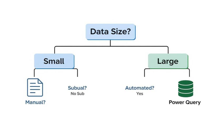
As you can see, a simple tool like the Subtotal feature is perfect for smaller, straightforward tasks. However, when dealing with large or complex datasets that require repeatable analysis, the robust capabilities of Power Query are a better fit.
Pro Tip: Mastering these techniques is more than a time-saver; it’s a powerful career skill. The ability to distill complex data into a clear, concise summary is one of the most valuable competencies an analyst can possess. It transforms raw information into a solid foundation for strategic action.
The impact on business timelines is substantial. A financial analyst performing manual data consolidation can easily spend 8-12 hours per week on this task. In contrast, teams using structured tools like PivotTables and Power Query report reducing their data preparation time by 65-75%. This translates into a significant amount of saved labor each month, a finding supported by productivity analyses from platforms like Numerous.ai.
Choosing the Right Excel Grouping Method
Here's a quick comparison to help you choose the best data grouping technique for your specific project and skill level.
| Method | Best For | Complexity | Flexibility |
|---|---|---|---|
| Outline (Group/Ungroup) | Quick, manual hiding of rows/columns for simple presentation. | Low | Low |
| PivotTables | Interactive, dynamic summaries and multi-level analysis. | Medium | High |
| Subtotal Feature | Fast, hierarchical summaries for sorted, list-based data. | Low | Medium |
| Power Query (Group By) | Automating repeatable grouping on large or messy datasets. | High | High |
| Formulas (e.g., GROUPBY) | Creating custom, fully dynamic summaries within the worksheet grid. | Medium | High |
Ultimately, the "best" method is the one that aligns with your immediate goal. For a quick visual summary, Subtotal or Outline is sufficient. For in-depth, repeatable analysis, PivotTables and Power Query are your indispensable powerhouses.
PivotTables: Your Go-To for Flexible Data Grouping
When you require maximum flexibility for grouping and summarizing data, PivotTables are the definitive solution. They allow you to slice, dice, and reorganize large datasets in seconds without altering your original source data, making them both powerful and safe for exploratory analysis.
Consider a comprehensive sales report. Instead of an endless list of transactions, a PivotTable can instantly reveal which products are top sellers, which sales regions are meeting their targets, or how revenue is trending month-over-month. This is how you transform a wall of data into genuine business intelligence.
Grouping Numbers into Custom Bins
One of the most powerful features of a PivotTable is its ability to group numerical data into custom ranges or "bins." Instead of analyzing every individual customer age or order value, you can create logical brackets to uncover patterns that would otherwise remain hidden.
For example, with customer data, you could group by age to identify your key demographics.
- Create age brackets like "21-30", "31-40", and "41-50".
- Summarize product sales by price points, such as "$0-$50", "$51-$100", and "$101+".
This is remarkably easy to implement. Right-click any number in the Row Labels of your PivotTable and select Group. A dialog box will appear where you can define the start, end, and interval (the "By" field) for your ranges.
Let Excel Group Your Dates Automatically
This is where PivotTables truly shine. When you add a date field to a PivotTable, Excel automatically recognizes it and can group the dates by years, quarters, and months. This feature is invaluable for identifying seasonal trends or tracking performance over time.
If you're new to the initial setup, our complete walkthrough on creating PivotTables in Excel will get you started. Once your PivotTable is built, simply drag your date field into the Rows or Columns area. If Excel doesn't group it automatically, a right-click on any date and a selection of Group will allow you to choose the time periods you need.
This automatic date grouping is a significant time-saver. A task that would otherwise require complex formulas—such as summarizing sales for every quarter across multiple years—becomes a two-click operation. You can move directly from raw data to meaningful analysis in seconds.
Creating Custom Groups from Text Fields
What if the data you want to group isn't a number or a date? For instance, you might want to combine several cities into a custom sales territory, such as grouping Boston, New York, and Philadelphia into an "East Coast" region.
PivotTables handle this with ease. Here’s the process:
- Select Your Items: In the PivotTable, hold down the
Ctrlkey and click the text labels you want to combine (e.g., "Boston," "New York"). - Group Them: Right-click your selection and choose Group.
- Name Your Group: Excel will create a generic label like "Group1." Simply click on that cell and type a more descriptive name, like "East Coast."
This manual grouping method provides complete control to organize your data in a way that aligns with your business logic, transforming a scattered list of items into a clean, strategic overview.
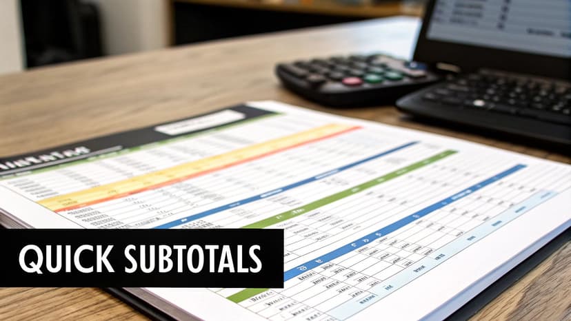
Creating Quick Summaries with Subtotal and Outline
While PivotTables are ideal for deep-dive analysis, sometimes you just need a quick summary directly within your dataset. You don't always need to build a separate table to find the answers you're looking for.
This is where Excel's Subtotal and Outline features are invaluable. They are the perfect tools for creating fast, straightforward, and hierarchical reports that are easy to navigate.

Think of this as the best way to present static reports where you want to show high-level totals while giving your audience the ability to drill down into the details with a single click.
Automating Summaries with the Subtotal Command
The Subtotal command is an excellent tool for automatically inserting summary rows into a sorted list. For example, if you have a long inventory list and want to see the total stock for each product category, Subtotal can accomplish this in seconds.
However, there is one critical rule to follow:
- Sort your data first. This is non-negotiable. To get subtotals for each product category, you must sort by the 'Product Category' column before proceeding.
- Once sorted, navigate to the Data tab, find the Outline group, and click Subtotal.
- In the dialog box, you'll specify the summary. You'll tell Excel which column to monitor for changes ('Product Category'), which calculation to use (e.g., SUM or COUNT), and which column to apply the calculation to ('Stock Quantity').
After clicking OK, Excel inserts the summary rows and creates a convenient outline on the left side of your sheet, providing collapsible levels that transform a flat list into an interactive report.
The Subtotal command, available for over two decades, remains a workhorse in business intelligence. It serves as a great reminder that not every analysis requires a complex tool. This legacy feature is still utilized in approximately 35% of enterprise spreadsheets, highlighting its enduring utility even as Microsoft promotes more modern BI tools. For more context, check out this video exploring self-service BI trends.
Manual Control with the Outline Group Tool
What if you don't need calculations and simply want to organize your spreadsheet into clean, collapsible sections? For this purpose, the manual Group tool is the perfect solution. You can find it next to Subtotal under Data > Outline.
This feature is ideal for structuring a project plan with phases and sub-tasks or creating a budget where you can hide detailed line items under high-level categories.
Simply select the rows or columns you want to group, then click Group. Excel instantly adds + and - symbols in the margin, allowing you to expand or collapse that section with a click. It's a simple yet highly effective way to make a dense spreadsheet much more presentable.
Automating Grouping Workflows with Power Query
When you find yourself performing the same data grouping and reporting tasks on large datasets week after week, manual methods are no longer efficient or sustainable. This is precisely the challenge Power Query was designed to solve. It functions as Excel’s built-in data automation engine, enabling you to create repeatable workflows that save significant time and reduce errors.
Unlike a PivotTable or the Subtotal feature, Power Query doesn't just produce a summary. It builds a repeatable sequence of steps—a query—that can be executed again on new data with a simple refresh. Every transformation you make is recorded, creating a robust, automated process that operates behind the scenes.
Getting Started with the Group By Feature
The core of Power Query's summarization capability is its Group By feature. This tool lets you collapse thousands of rows into a concise summary table based on your specified criteria. You'll find this command on both the Home and Transform tabs within the Power Query Editor.
Let's walk through a common business scenario: you have a long list of sales transactions and need to calculate the total revenue for each salesperson.
- First, load your data into the Power Query Editor by selecting your data range and going to Data > From Table/Range.
- With your data loaded, click the Group By button.
- In the dialog box, specify that you want to group by the 'Salesperson' column.
- Next, define the calculation. Create a new column named 'Total Revenue' and set it to Sum the 'Order Amount' column.
After clicking OK, Power Query generates a new table with exactly what you need: each salesperson and their total sales. The best part is that this entire process is now saved as a repeatable query.
Advanced Grouping with Multiple Columns and Aggregations
Power Query's capabilities extend to more complex scenarios. It truly excels when you need to group by multiple columns or calculate several different metrics simultaneously.
Imagine you need to analyze sales not just by salesperson, but also by region and product category. At the same time, you want to see the total revenue, the number of transactions, and the average sale value for each group.
For this, you would use the Advanced option in the Group By dialog box. This unlocks the ability to define multiple grouping levels and add several aggregations.
For example, you could configure it to:
- Group by: 'Region', then add a second grouping level for 'Product Category'.
- Aggregate 1: Create a 'Total Revenue' column (Sum of 'Order Amount').
- Aggregate 2: Add a 'Number of Sales' column (Count of Rows).
- Aggregate 3: Create an 'Average Sale Value' column (Average of 'Order Amount').
By setting this up once, Power Query creates a durable, automated workflow. The next time you receive an updated sales file, you don't repeat any of these steps. You simply click 'Refresh', and your perfectly grouped summary table updates in seconds.
To master these powerful data pipelines, our Excel Power Query tutorial is an excellent next step. This is an essential skill for anyone tasked with producing consistent, error-free reports on a regular basis.
Grouping Data on the Fly with Dynamic Array Formulas
The introduction of dynamic arrays has fundamentally changed how formulas work in Excel. We can now create powerful, flexible data summaries with a single formula, eliminating the need for helper columns and complex, multi-step processes. The key benefit is that these summaries update automatically the moment your source data changes.

At the forefront of this new approach is the GROUPBY function. It acts as a lightweight, formula-driven PivotTable that lives directly on your worksheet, making it the ideal choice for creating live summaries that must remain current without manual intervention.
Create Instant Summaries with the GROUPBY Function
The GROUPBY function is a game-changer for anyone who regularly summarizes data. It is remarkably simple to use, requiring only three pieces of information: the column to group by, the values to aggregate, and the calculation to perform (e.g., SUM, COUNT, AVERAGE). This single function can often reduce formula complexity by 40-50% compared to older, more cumbersome combinations. You can find an excellent deep dive into this powerful function on XelPlus.com.
Imagine you have a sales report and want to see the total sales for each product category. The formula is as simple as it gets:
=GROUPBY(CategoryColumn, SalesColumn, SUM)
Press Enter, and Excel generates a clean, two-column table directly on your sheet, listing each unique category and its corresponding total sales.
Key Takeaway: The power of GROUPBY lies in its real-time responsiveness. If you change a number or add a new sale to your source data, the summary table updates instantly. This makes it perfect for building live dashboards and reports where up-to-the-minute information is critical.
Adding More Detail and Sorting
The GROUPBY function's optional arguments allow you to build much more sophisticated summaries without adding complexity.
If you need to group by more than one criterion, simply include another column in the formula. To see sales broken down by both 'Region' and 'Category', you would expand the formula like this:
=GROUPBY(RegionColumn, CategoryColumn, SalesColumn, SUM)
This creates a multi-level summary instantly. You can also add arguments to control headers, filter out irrelevant data (such as sales below a certain value), or sort your results—all from within a single, elegant formula.
What If You Don't Have GROUPBY?
If you are using an older version of Excel that does not support dynamic array functions like GROUPBY, you can still create a dynamic summary table using a classic combination: UNIQUE and SUMIFS.
This two-part approach works effectively:
- Get a Unique List: First, use the
UNIQUEfunction on your category column to generate a clean, "spilled" list of all unique product categories. - Sum for Each Item: In the adjacent cell, write a
SUMIFSformula that sums the sales for each category by referencing your new unique list.
While it requires two formulas instead of one, the UNIQUE and SUMIFS combination is a robust and fully dynamic alternative that delivers the desired result when GROUPBY is not available.
Using AI to Group Your Data Instantly
https://www.youtube.com/embed/tBT7qmrFMlA
What if you could simply describe the summary you need and have Excel build it for you? This is now a reality with the latest AI-powered data analysis tools. By describing your requirements in plain English, artificial intelligence can perform the necessary grouping and summarization tasks for you. Tools like Microsoft Copilot and other AI add-ins are fundamentally changing how users interact with their data.
Instead of manually configuring PivotTable fields or constructing a complex formula, you can now simply ask. A prompt like, "Group my sales data by city and show the total revenue for each," can produce the exact summary table you need in seconds. This dramatically saves time and makes powerful data analysis accessible to users of all skill levels.
From Prompts to Perfect Summaries
The true power of AI in Excel is its ability to translate natural language into precise commands. It understands your intent, allowing you to request complex groupings that would normally require several manual steps.
For instance, after generating an initial summary, you could follow up with: "Now create a bar chart showing the top five cities." The AI understands the context, builds upon the previous action, and delivers the chart—all without you needing to navigate menus. It can even generate the ideal GROUPBY formula to create a dynamic summary that updates automatically as your source data changes.
This is more than just a productivity boost; it's about transforming data analysis into a conversational experience. You focus on what you need to discover, while the AI handles the how, effectively empowering anyone to become a power user.
This conversational approach is also making significant inroads in specialized fields. For example, in FinOps, leveraging AI and automation for cluster analysis demonstrates how intelligent grouping can uncover complex patterns far beyond the reach of standard Excel functions alone.
AI as Your Excel Co-Pilot
Modern AI is not just a command-taker; it can also serve as an intelligent guide. If you're unsure which grouping method is best for a particular task, you can ask for a recommendation. AI can explain why a PivotTable might be more suitable than a GROUPBY formula for your specific dataset, or vice versa.
This interactive guidance facilitates learning on the job. You not only get the result but also understand the logic behind the chosen method. To explore this new workflow further, resources on the role of AI in Excel are an excellent place to start.
Ultimately, the future of data grouping in Excel is less about memorizing steps and more about clearly articulating the insights you want to uncover.
Common Questions About Grouping Data
Even with a good understanding of the techniques, you may encounter challenges when grouping data in Excel. Here are solutions to some of the most common issues.
Why Is the Group Option Grayed Out?
It's a frequent frustration: you right-click in a PivotTable, but the Group option is grayed out and unavailable. In most cases, the problem lies within your source data, not the PivotTable itself.
- Mixed Data Types: The column you are trying to group likely contains a mix of data types, such as numbers and text in the same column, or blank cells. Excel cannot group numerical or date-based data if it encounters inconsistent formats.
- Incorrect Selection: You may have accidentally selected cells from different fields that cannot be grouped together, such as a date cell and a product name.
The solution is almost always to clean your source data. Return to your main table and ensure the entire column you intend to group has a consistent format. Use Find & Replace to remove hidden spaces and apply filtering to locate and correct blank cells.
Can I Group Data Without a PivotTable?
Yes, absolutely. While PivotTables are excellent for creating summaries, they are not the only option for grouping data.
For visual organization, the manual Group command (Data > Outline) is perfect. It allows you to create collapsible sections with plus/minus buttons, which is ideal for tidying up a large report without performing calculations.
For building automated and repeatable summary reports, Power Query's Group By feature is the superior choice. And if you need a fully dynamic summary that updates in real time directly on your worksheet, the modern GROUPBY function is a brilliant, formula-based solution.
A key skill is knowing which tool fits the situation. Quick visual cleanup calls for the Outline tools, whereas building a repeatable report is a job for Power Query. Mastering each one makes you far more efficient.
For teams aiming to achieve proficiency across all of Excel's capabilities, from basic formulas to advanced data modeling, professional Microsoft Excel training can build powerful, organization-wide skills.
How Do I Ungroup My Data?
Reverting to your original, ungrouped view is as straightforward as grouping. The steps depend on the method you used initially.
- In a PivotTable: Right-click any item within the group and select Ungroup.
- With the Outline Tool: Select the grouped rows or columns, navigate back to the Data > Outline menu, and click Ungroup.
- In Power Query: In the Applied Steps pane on the right side of the editor, locate the "Grouped Rows" step. Click the 'X' next to it to remove the grouping action.
Ready to stop wrestling with manual data grouping and let AI do the heavy lifting? Elyx.AI integrates directly into your worksheet, allowing you to generate complex formulas, create PivotTables, and build insightful summaries with simple text commands. Streamline your entire workflow and turn raw data into clear insights instantly. Start your free trial of Elyx.AI today.
Reading Excel tutorials to save time?
What if an AI did the work for you?
Describe what you need, Elyx executes it in Excel.
Sign up