Why business intelligence projects fail: Avoid BI Project

Many believe BI fails because the dashboard tool was wrong or the data warehouse was slow. That happens, but it usually isn't the root cause.
Failure shows up in the last mile. Data gets extracted, cleaned by hand in Excel, copied into side spreadsheets, adjusted with undocumented formulas, emailed around, and debated in meetings. By the time an insight reaches the person who should act on it, trust is already gone.
That's why business intelligence projects fail so often. The problem isn't only the platform. It's the gap between enterprise reporting and the daily workflow where people make decisions.
Spending too much time on Excel?
Elyx AI generates your formulas and automates your tasks in seconds.
Sign up →The 80 Percent Failure Rate of Modern BI Projects
Gartner's forecast indicates that by 2027, eight out of ten analytics projects will fail globally, an 80% failure rate for BI initiatives (iwis.io summary of Gartner forecast). That number should change how you think about BI immediately.
This isn't an IT inconvenience. It's a business failure. Companies buy platforms, connect data sources, build dashboards, and still don't change decisions on pricing, forecasting, staffing, or operations.
In practice, most failed BI programs follow a familiar pattern. Leadership approves a tool. A team starts building reports. Stakeholders ask for "visibility." Everyone talks about metrics. Very few people define which business decision should improve, who owns that decision, and what action should happen when a number moves.
Why failure starts before the dashboard launches
A BI project becomes fragile when it starts as a technical rollout instead of a decision system. If nobody defines the management mandate, the project drifts into report production. Teams then optimize charts instead of outcomes.
That's why a solid Business Intelligence program has to start with business operating logic, not a list of visuals. The dashboard is the output. The decision process is the product.
A lot of teams also overestimate what "data-driven" means. A dashboard on a screen doesn't create action by itself. Decision-making improves only when the metric is trusted, interpreted the same way across functions, and tied to a clear response. If you're trying to build that culture, this guide on https://getelyxai.com/en/blog/what-is-data-driven-decision-making is a useful companion.
Practical rule: If a KPI changes and nobody knows who should respond, you don't have business intelligence. You have reporting.
Where the last mile breaks
The final breakdown often happens outside the BI platform. Finance exports data into Excel to "clean it up." Operations keeps a local tracker because the dashboard doesn't answer follow-up questions. Sales asks for CSVs because the number on screen doesn't match their pipeline view.
None of that is a side issue. That's the core issue.
When users leave the system to finish the work manually, BI hasn't been adopted. It has been bypassed.
5 Core Reasons Your BI Strategy is Failing
Most failed BI efforts can be traced to five pressure points. If one breaks, the rest start wobbling. If two or three break at once, the dashboard may still launch, but the initiative won't last.
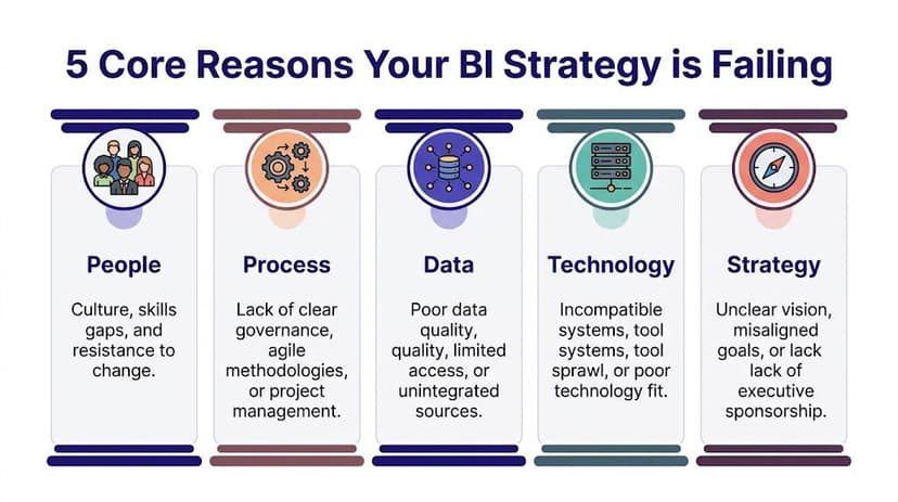
People
Users don't resist BI because they hate analytics. They resist workflows that don't help them do their job faster or better.
Finance analysts, controllers, and operations leads often need to ask follow-up questions on the fly. If the official dashboard can't support that, they'll go back to Excel. That's rational behavior, not bad behavior.
Common people problems include:
- Weak user involvement: End users see the report late and don't trust it.
- Skill mismatch: The tool expects self-service analysis, but the team only received a dashboard walkthrough.
- Silent workarounds: Users keep parallel spreadsheets because they need flexibility.
Process
A weak process is like building a road with no destination. The project moves, but nobody knows whether it arrived.
Many teams start with requests like "we need a sales dashboard" or "we need more visibility." Those aren't business questions. They're output requests. Good BI starts with a painful decision: which customers are churning, where margin is leaking, which process is slipping.
This matters even more when choosing KPIs. If the metric set is vague, every department interprets success differently. This primer on https://getelyxai.com/en/blog/understanding-key-performance-indicators helps frame KPIs as decision tools rather than reporting clutter.
Data
Data is the foundation. If it shifts, every polished report on top of it becomes suspect.
Ian Jackson, a managing partner with over 20 years of experience, put it bluntly: "The single reason why BI projects fail comes down to data integrity" (mrc-productivity.com). The Metro Bank example shows why this matters. A flawed data feed contributed to a failure to flag over 60 million transactions, leading to a £16.7 million regulatory fine.
That wasn't a dashboard styling issue. It was a trust issue rooted upstream.
Poor data doesn't create small errors. It creates confident decisions built on the wrong facts.
Technology
Some teams buy an enterprise-grade platform when they really need a fast way to answer recurring operational questions. Others stay stuck with manual spreadsheet processes long after they need governed reporting.
Technology failure usually looks like one of these:
- Too much tool complexity: Users need analysts to answer every question.
- Poor fit for workflow: The platform works for executives but not for front-line analysts.
- Disconnected stack: Data lives in too many systems and definitions change across them.
Strategy
Strategy is the frame that keeps all the other parts aligned. Without it, BI becomes a collection of reports with no operating purpose.
A strong BI strategy answers:
| Question | Why it matters |
|---|---|
| What decision are we trying to improve? | Keeps reporting tied to action |
| Who owns the outcome? | Prevents orphan dashboards |
| What must happen when a KPI changes? | Turns insight into workflow |
| Which team defines the metric? | Reduces disputes and rework |
If those answers are fuzzy, the initiative is already drifting.
7 Warning Signs Your BI Project is in Trouble
You don't need to wait for a postmortem to see that a BI initiative is slipping. The warning signs show up early, usually in meetings, exports, and side conversations.
One major pattern is solving the wrong problem. A 2017 Gartner report noted 85% of big data projects fail, and a 2019 analysis found 87% of data science projects never reach production, largely because teams chase fuzzy goals and weak business alignment (datascience-pm.com).
The checklist
Use this scorecard with your team. If you answer "Yes" to several high-severity items, the project needs intervention now.
| Warning Sign | Yes / No | Severity (Low, Med, High) |
|---|---|---|
| Stakeholders ask for CSV or Excel exports after every dashboard review | High | |
| Teams argue over whose number is correct | High | |
| The project goal is a report, not a business decision | High | |
| Users rely on manual spreadsheet adjustments outside the BI tool | High | |
| KPI definitions change depending on department | Med | |
| Nobody owns follow-up action when a metric moves | High | |
| The team spends more time cleaning data than discussing actions | Med |
What each sign usually means
If users constantly request exports, the BI layer isn't answering the underlying question. It may show the summary, but not support investigation.
If meetings turn into number reconciliation sessions, trust in the data model has already weakened. At that point, even a visually strong dashboard will underperform.
If the project charter says "build a dashboard for leadership," stop and rewrite it. That's a delivery task, not a business objective.
A practical self-test
Ask these three questions in your next status meeting:
- Can we name one decision this BI output should improve?
- Can one person clearly define each KPI used in the report?
- Can users answer follow-up questions without leaving the workflow?
If the answer is no, you likely have a last-mile design problem.
Many teams discover the issue while cleaning and reshaping data for reporting. That's where preprocessing discipline matters. This guide to https://getelyxai.com/en/blog/what-is-data-preprocessing is useful if your team keeps patching source issues inside spreadsheets right before reporting deadlines.
If your dashboard needs a manual Excel rescue every week, the BI project isn't healthy. It's being kept alive by analyst effort.
1 Cautionary Tale of a Million-Dollar BI Failure
A mid-sized company launches a major BI program. The budget is large enough to get executive attention, a new platform, outside consultants, and a full roadmap. Everyone calls it transformative.
Then the cracks appear.
The sponsor wants a flagship dashboard for leadership, but doesn't define the operating decisions it should support. Sales wants pipeline visibility. Finance wants margin control. Operations wants service tracking. The project team tries to satisfy everyone in one solution.

How it unravels
The data model pulls from old systems with inconsistent naming. The BI team standardizes what it can, but business users still keep local Excel files to "fix" categories and fill missing values.
Training focuses on navigation, not interpretation. Users learn where to click, but not how to trust the data or act on it. Within weeks, the same questions come up in every review: Why doesn't this match finance? Can I get the raw export? Can someone add my manual adjustment?
The dashboard goes live, but adoption stalls. Leadership thinks the tool underdelivered. Users think the numbers are wrong. Analysts become human middleware, exporting data and rebuilding views manually every reporting cycle.
Why the money didn't matter
This kind of BI failure isn't caused by a lack of effort. It's caused by misalignment.
The team bought software before defining workflow. They treated Excel as a bad habit instead of a real part of how work gets done. They measured launch, not behavior.
That's why even expensive BI programs fail. The system looks complete on paper, but the last mile never got designed.
9 Practical Strategies to Ensure BI Success
Most BI recovery plans fail because they're too broad. "Improve adoption" sounds good, but nobody knows what to do on Monday morning. The better approach is to tighten the operating model.

Start narrower than you want
Pick one painful business question
Don't launch with a broad ambition like "improve reporting." Start with a question that already creates friction. For example: which accounts are slipping, which products are delaying cash collection, or which region needs pricing review.Define the decision owner early
Every metric should have an owner who can act on it. If a KPI drops and nobody is accountable for response, the project will turn into passive reporting.Write KPI definitions in plain language
Don't leave "active customer," "qualified lead," or "on-time delivery" open to interpretation. Put definitions where users can see them.
Fix data before polishing visuals
Assign stewardship for every critical source
A source system without an owner becomes a recurring BI problem. Someone must validate fields, monitor quality, and approve definition changes.Create a repeatable validation step
Before a new dashboard goes live, compare outputs against known operational totals and edge cases. Don't assume the transformation logic is correct because the chart looks right.Design for the Excel reality
Many teams pretend spreadsheet work should disappear immediately. It won't. A better approach is to standardize what still happens in Excel, reduce manual handling, and make the path from spreadsheet analysis to governed BI clearer.
Field note: The fastest route to adoption is often not replacing Excel. It's reducing the risky parts of Excel work.
A good dashboard only helps if people can read it quickly and use it correctly. For teams refining that layer, https://getelyxai.com/en/blog/dashboard-design-best-practices is worth reviewing.
Build workflow, not just reporting
Plan the Day 1 action path
Decide what users should do after seeing the number. Escalate? Investigate? Reforecast? Contact a manager? That response path belongs in the project plan.Train users on questions, not clicks
Many BI rollouts over-focus on interface training. Teach users how to interpret exceptions, drill into causes, and connect the insight to action. Teams that want to master BI engineering often underestimate how much this human layer matters.
Here's a useful walkthrough on building stronger reporting habits:
- Review adoption with evidence
Don't declare success at go-live. Review where users still export, where they still reconcile manually, and where they still ask for side spreadsheets. Those friction points tell you what to improve next.
What works better than a big-bang rollout
A successful BI program usually looks less dramatic than a failed one. It starts smaller. It solves a real business problem. It respects user workflow. It tightens trust in data before expanding scope.
That sounds slower, but it's often faster in practice because the team stops rebuilding the same report three different ways.
A 3-Step Action Plan for Excel and BI Teams
The spreadsheet is where many BI projects gradually lose control. Not because Excel is bad, but because teams use it as an ungoverned last-mile patch.
Existing content rarely delves into this issue. It points to the role of Excel in a 79% BI adoption failure rate, notes that professionals spend 3+ hours weekly on repetitive Excel tasks, and describes the shadow-BI pattern where spreadsheet work undermines enterprise systems (Tellius summary).

Step 1 Automate data integrity checks in Excel
If analysts manually trim spaces, split text, remove duplicates, normalize dates, and patch null values every reporting cycle, the process is fragile.
Start with a single recurring worksheet and standardize the cleaning steps. Even without new software, create a repeatable checklist:
- Check duplicates: Use
COUNTIFto flag repeated IDs. - Normalize blanks: Replace inconsistent empty values before building pivots.
- Validate dates: Confirm Excel recognizes them as dates, not text.
- Lock formulas: Prevent accidental overwrites in reporting tabs.
For example, this formula helps detect duplicates in a customer ID column:
=COUNTIF($A:$A,A2)>1
How it works:
COUNTIF($A:$A,A2)counts how many times the value in cellA2appears in column A.$A:$Alocks the lookup range to the full column.>1returns TRUE when the value appears more than once.
That gives you a fast duplicate flag before the data reaches a pivot table or dashboard input.
Step 2 Handle analysis where users already work
The last mile often breaks because the BI tool answers the first question, but not the second or third one.
Users need to ask things like:
- Why did margin drop in one region but not another
- Which customers changed category this month
- What caused the forecast variance
Excel remains useful here because it supports ad hoc investigation. The goal isn't to fight that behavior. The goal is to make it safer, faster, and more repeatable.
A clean example is a SUMIFS formula for controlled reconciliation:
=SUMIFS($F:$F,$B:$B,H2,$C:$C,I2)
How it works:
$F:$Fis the values column to sum, such as revenue.$B:$B,H2limits the sum to rows matching a region inH2.$C:$C,I2adds a second condition, such as product line or month.
This is simple, auditable, and often more reliable than a copied subtotal from a side sheet.
If your team still builds regular spreadsheet summaries from raw exports, tighten the handoff into reporting with a documented template. This guide to https://getelyxai.com/en/blog/business-intelligence-report is a good reference point.
Step 3 Use Excel as a bridge, not a parallel universe
The mature approach is not "ban spreadsheets." It's "control the workflow."
Create one sanctioned workbook structure for recurring analysis. Separate raw data, cleaned data, calculations, and presentation tabs. Name assumptions clearly. Keep metric definitions visible. Limit manual overrides and document any that remain.
Excel becomes dangerous when every analyst invents their own reporting logic. It becomes powerful when the workflow is standardized.
This is how small teams de-risk BI without waiting for a full platform redesign. They make the last mile dependable first.
Beyond Failure Your Next 3 Steps in BI
The lesson is simple. BI usually doesn't fail because teams lack dashboards. It fails because the workflow between data, analysis, and action is broken.
The biggest mistake is treating that break as a user problem. It isn't. When people export data, patch it in Excel, and rebuild the same logic manually, they're exposing a design gap in the BI system.
Do these next
Diagnose the current state
Use the warning signs above and get honest about exports, reconciliation, and side spreadsheets.Automate one painful spreadsheet task this week
Pick the data-cleaning step your team repeats most often and make it consistent.Propose one business question worth solving well
Not "build a dashboard." Ask a concrete question tied to a decision and owner.
Small wins matter here. A trusted report used in one real workflow is worth more than a large BI rollout that nobody believes.
The teams that recover fastest don't chase perfect architecture first. They tighten data integrity, simplify the last mile, and build adoption where people already work.
If your team is stuck in manual Excel cleanup, repetitive pivot building, and last-mile reporting chaos, Elyx AI is built for exactly that gap. It works inside Excel as an autonomous agent, executing multi-step workflows like data cleaning, pivot table creation, chart generation, formatting, and trend analysis from a plain-language request, so analysts can spend less time operating spreadsheets and more time making decisions.
Reading Excel tutorials to save time?
What if an AI did the work for you?
Describe what you need, Elyx executes it in Excel.
Sign up