What Is Regression Analysis? A Complete Guide to Predict Outcomes in Excel

At its heart, regression analysis is a statistical tool that helps you understand the relationship between one main outcome you care about (the dependent variable) and one or more factors that might influence it (the independent variables). For Excel users, this isn't just theory; it's a practical way to find patterns in your data and make accurate predictions about the future.
It’s all about moving from gut feelings to data-driven decisions, right within your spreadsheet.
Understanding Regression Analysis From the Ground Up

Spending too much time on Excel?
Elyx AI generates your formulas and automates your tasks in seconds.
Sign up →Let's use a practical Excel-based example. Imagine you run an e-commerce store and track your daily sales and advertising spend in a spreadsheet. You've noticed that when you spend more on ads, sales seem to go up, but that's just an observation. Regression analysis is how you prove it and quantify it. It helps you answer the question: "Exactly how many more dollars in sales do I generate for every extra dollar I spend on ads?"
It does this by modeling the relationship between those two columns in your spreadsheet—ad spend and sales. In this scenario, your sales figures are what you're trying to predict, making them the dependent variable. The ad spend, the factor you believe is driving sales, is your independent variable.
The Core Idea Behind Prediction
The real magic of regression is its ability to draw a "line of best fit" through a scatter plot of your data points. If you created a chart in Excel with ad spend on one axis and sales on the other, this line would cut right through the middle, showing the general trend.
This line isn't just a visual guide; it gives you a powerful formula. Suddenly, you can use that formula to forecast next month's sales based on a planned ad budget. This is what it means to move from making decisions based on hunches to making them based on data you already have in Excel.
Of course, to get a reliable result, you need to know your data is clean first. This preliminary step, often called data profiling, is critical. You can learn more about why it matters in our guide on what data profiling is.
The term 'regression' actually has a pretty interesting backstory. It was coined by a statistician named Francis Galton back in the late 19th century. He was studying the heights of parents and their children and noticed that the children of very tall parents tended to be a bit shorter—they "regressed" toward the average height. This concept was eventually broadened into the powerful statistical tool we use today.
Core Concepts of Regression Analysis at a Glance
To make sense of any regression model, you need to understand its basic parts. This quick table breaks down the key terms you'll encounter when working in Excel.
| Concept | Simple Explanation | Example in an Excel Spreadsheet |
|---|---|---|
| Dependent Variable | The main thing you are trying to predict or explain. It's the "outcome." | A column for 'Total Monthly Sales' or 'Customer Satisfaction Score' |
| Independent Variable | The factor(s) you think influence the dependent variable. These are the "predictors." | Columns for 'Advertising Spend,' 'Website Traffic,' or 'Temperature' |
| Relationship | How the variables are connected—positively (both go up) or negatively (one up, one down). | Higher ad spend leads to higher sales (positive). |
With these building blocks in place, you’re ready to start asking smarter questions and uncovering the stories hidden in your Excel data.
Getting to Know the Main Types of Regression Models
Regression analysis isn't a one-size-fits-all tool. Think of it more like a specialized toolkit, with different instruments designed for specific jobs. The right model for you really depends on the kind of data you have in your spreadsheet and, most importantly, the question you're trying to answer.
Let's break down the three most common types you'll run into, all of which can be performed in Excel.
This graphic gives a great overview of how the main regression types are organized, all stemming from the core idea of regression.
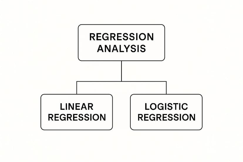
As you can see, both Linear and Logistic models are branches of Regression Analysis. They just represent two different paths for making predictions, depending on the kind of outcome you're interested in.
Simple Linear Regression
This is regression in its purest form. It's perfect for exploring the relationship between just two columns of data: a single independent variable and a single dependent variable. Imagine plotting those two columns as a scatter chart in Excel—simple linear regression is all about finding the single straight line that best fits through those dots.
For example, a manager might want to see if more training hours lead to better employee performance scores. They could use simple linear regression in Excel to connect the 'Performance Score' column (the dependent variable) with the 'Training Hours' column (the independent variable). It helps answer direct questions like, "On average, how much does a performance score go up for every extra hour of training?"
Key Takeaway: Use Simple Linear Regression when you want to measure a clear, one-to-one relationship. It’s the perfect starting point for predictive analysis, especially in Excel, because it’s so straightforward to interpret.
Of course, it’s great for isolating one factor, but most business outcomes aren't that simple. That brings us to our next model.
Multiple Linear Regression
In the real world, things are messy. A product's sales figures aren't just a result of your ad budget. They're also pushed and pulled by things like price, website traffic, the time of year, and what your competitors are doing. This is where Multiple Linear Regression comes into play. It takes the basic idea of linear regression and expands it, letting you use several independent variables (multiple columns in Excel) to predict one dependent variable.
This model gives you a much richer, more complete picture. For instance, you could use it in Excel to forecast your next quarter's sales by looking at the combined effect of:
- Ad Spend: A column with your marketing budget.
- Website Traffic: A column with visitors to your online store.
- Seasonality: A column with a numerical value for the time of year (e.g., 1 for Q1, 4 for Q4).
By analyzing all these drivers together, multiple linear regression delivers a more accurate and nuanced forecast. It shows you which levers have the biggest impact, helping you make smarter decisions about where to put your resources.
Logistic Regression
So what happens when the answer you’re looking for isn't a number, but a "yes" or "no"? That’s the job for Logistic Regression. Instead of predicting a continuous value like sales dollars or a performance score, it predicts the probability of something happening.
This makes it the go-to tool for all sorts of binary questions that pop up in business. A SaaS company, for example, could use logistic regression in Excel to get ahead of customer churn. By feeding the model data from columns like 'Customer Usage,' 'Support Tickets Filed,' and 'Subscription Length,' it can calculate the likelihood that any given customer will cancel their subscription.
You'll see it used all over the place:
- Loan Applications: Predicting if an applicant will be approved or denied (1 or 0).
- Marketing: Figuring out if a user will click on an ad (Click or No Click).
- Healthcare: Assessing a patient’s risk for a certain condition (High Risk or Low Risk).
Unlike linear regression, which draws a straight line, logistic regression uses a clever S-shaped curve. This ensures its predictions always stay where they should be for probabilities: between 0% and 100%.
Picking the right model is the first and most critical step toward making solid, data-driven predictions. And with tools like Excel—and a little help from AI add-ins like Elyx.AI—running these analyses is more accessible than ever. It's how you move from just asking "what happened?" to confidently predicting "what will happen next?"
How to Run a Regression Analysis in Excel, Step by Step

Theory is one thing, but getting your hands dirty in a spreadsheet is where the real learning happens. The good news? You don't need fancy, expensive software to run a regression. You can do it right inside Microsoft Excel, a tool you probably already have open.
Excel has a powerful, but slightly hidden, feature called the Analysis ToolPak. We'll walk through how to switch it on, set up your data, and generate your first predictive model.
Step 1: Activate the Analysis ToolPak
First things first, let's make sure the tool is ready to go. The Analysis ToolPak comes with Excel but often isn't enabled by default. Don't worry, it's a quick, one-time fix.
- Open Excel Options: Head to File > Options. This opens up the main settings window for Excel.
- Find the Add-ins Menu: On the left-hand side, click on Add-ins.
- Manage Your Add-ins: Look at the very bottom of the window. Make sure the dropdown menu next to "Manage" says Excel Add-ins, then click the Go… button.
- Check the Box: A small pop-up will appear. Just check the box next to Analysis ToolPak and click OK.
That's it! You'll now see a new Data Analysis button on the Data tab in your Excel ribbon. This is your command center for regression. To learn more about what else you can do, check out our guide on the best Excel add-ins for data analysis.
Step 2: Get Your Data Organized
This step is critical. For regression to work, Excel needs to clearly understand what you're trying to predict and what you're using to predict it. Your data must be organized in clean columns.
Let's stick with a simple, classic example: trying to predict a house's price based on its size.
- Dependent Variable (Y Range): This is the thing you want to predict. In your spreadsheet, create a single column named Price and list all the house prices.
- Independent Variable (X Range): This is your predictor. Create another column named Square Footage and list the corresponding size for each house.
A Quick Tip: Before you run anything, give your data a quick scan. Look for empty cells or text mixed in with your numbers. These little issues can cause big errors, so cleaning them up first will save you a headache later. AI-powered tools within Excel can automate this data cleaning process for you.
The math that powers this—the method of least squares—isn't new. It was pioneered by mathematicians like Legendre and Gauss, with Gauss publishing some of the key ideas way back in 1821. He laid the groundwork for finding the "best fit" line that we still rely on today.
Step 3: Run the Regression
With the ToolPak enabled and your data lined up, you're ready for the main event. This is where Excel takes over and crunches the numbers for you.
- Click the Data tab, then find and click the Data Analysis button.
- A window will pop up with a list of analysis tools. Scroll down, select Regression, and hit OK.
- Now you'll see the Regression dialog box, which is where you tell Excel exactly what to do.
This is where you'll point Excel to your variables. Here’s a breakdown of the key settings:
- Input Y Range: Click the little icon and select your entire column of dependent variable data (the house prices). Make sure to include the column header.
- Input X Range: Do the same thing for your independent variable (the square footage). If you were running a multiple regression, you'd simply select all the predictor columns at once.
- Labels: Be sure to check this box! It tells Excel that the first row of your selection contains headers, which makes your final report much easier to understand.
- Output Options: You can choose where to put the results. I almost always select New Worksheet Ply. It keeps your original data untouched and gives the output its own clean sheet.
- Residuals: It's a great habit to check the Residuals and Residual Plots boxes. These outputs help you check how well your model actually fits the data, which is something we'll dive into next.
Once you've filled everything out, click OK. In a flash, Excel will generate a detailed summary of your regression analysis. Congratulations, you've just built your first predictive model!
How to Make Sense of Your Excel Regression Output
Okay, you've run the analysis, and now Excel has generated a new sheet with a block of numbers and text. It looks pretty intimidating at first glance, but don't worry. This is where your data starts to reveal its secrets. The trick is knowing which numbers to focus on.
Think of this output as a scorecard for your model. It tells you how well the factors you chose (your independent variables) actually predict the outcome you're trying to understand (your dependent variable). Let's break down the three most important pieces of this puzzle.
R Square: How Much of the Story Does Your Model Tell?
The very first number to look for is the R Square. You might also see it called the "coefficient of determination." In simple terms, this metric tells you what percentage of the change in your outcome can be explained by the factors in your model. The value is always between 0% and 100%.
Let's say you're trying to predict your monthly website traffic using your social media ad budget. If you get an R Square of 60%, it means your ad spend accounts for 60% of the ups and downs in your traffic. The remaining 40% is caused by other things not in your model, like email campaigns, SEO efforts, or even viral trends.
R Square is the "storytelling power" of your model. A higher value means your chosen factors do a better job of explaining the result.
But a word of caution: chasing a perfect 100% isn't the point. In complex fields like marketing or finance, an R Square of 50% could be fantastic. Context is everything.
Coefficients: What's the Real-World Impact?
Next up, find the Coefficients. These are the most practical, actionable numbers in the entire report. They tell you the exact impact each of your predictor variables has on the outcome.
Remember our house price example? If the coefficient for the "Square Footage" variable is 150, it means that for every additional square foot, the house's price is predicted to increase by $150, all other things being equal.
- A positive coefficient means more of that factor leads to a higher outcome (e.g., more ad spend, more sales).
- A negative coefficient means more of that factor leads to a lower outcome (e.g., higher product price, fewer units sold).
These numbers are the building blocks of your predictive formula. They turn a statistical exercise into a tool you can actually use to make forecasts and business decisions in Excel.
P-values: Is It a Real Connection or Just Random Noise?
Finally, you have to check the P-value next to each coefficient. The P-value answers one crucial question: is this relationship statistically significant, or did it just happen by chance? It’s your built-in reliability check.
As a rule of thumb, the magic number is 0.05.
- P-value < 0.05: Great! The relationship is statistically significant. You can be confident that this factor has a real, measurable effect.
- P-value > 0.05: The relationship is not significant. The connection you're seeing is likely just random noise in the data.
If a variable has a high P-value, it's probably not pulling its weight. You should consider removing it from your model to make it stronger and simpler. It's like a musician playing out of tune—it's better to just quiet that instrument.
To help you keep track, here's a quick cheat sheet for the most important metrics in your Excel output.
Key Excel Regression Metrics Explained
| Metric | What It Tells You | A Good Value Is… |
|---|---|---|
| R Square | The percentage of variation in your outcome that your model explains. | Higher is generally better, but depends entirely on your industry and data. |
| Coefficient | The direct impact of a one-unit increase in a predictor variable on the outcome. | Can be positive or negative; the "size" of the number shows its influence. |
| P-value | The probability that the relationship you're seeing is just due to random chance. | Less than 0.05 is the standard for statistical significance. |
Nailing these metrics is the key to unlocking the insights from your analysis. Of course, once you have the insights, you need to communicate them clearly. For tips on that, check out our guide on data visualization best practices.
By focusing on just the R Square, Coefficients, and P-values, you can cut through the statistical noise and pull out the story your data is waiting to tell.
Real-World Applications of Regression Analysis

The theory behind regression is interesting, but its real power comes alive when you see it in action. All sorts of businesses rely on regression analysis to stop guessing and start building data-driven strategies. It’s the tool that helps them understand the why behind the what, giving them a serious leg up.
Let's move past the abstract and look at a few concrete examples of how this tool helps solve real business problems every single day.
Optimizing Marketing Spend for Better ROI
Every marketing team faces the same classic problem: they have a budget and several channels to spend it on—social media, Google ads, email campaigns, you name it. The million-dollar question is always, "Where do we put our money to get the best ROI?"
This is where regression cuts through the noise. A team can gather data on how much they've spent on each channel and the sales that resulted. From there, they build a multiple regression model to connect the dots.
Key Insight: The model spits out coefficients that tell you, on average, how much sales go up for every extra dollar you pump into a specific channel.
Armed with that knowledge, they can:
- Spot the winners: Instantly see which channels are pulling their weight.
- Shuffle the budget: Move cash from underperforming campaigns to the ones that are actually working.
- Predict the future: Run different budget scenarios to forecast what sales might look like next quarter.
Suddenly, decisions aren't based on gut feelings. They're based on cold, hard data that maximizes their impact and makes it easy to justify their budget.
Predicting Property Values in Real Estate
The real estate market can feel like a total black box. So many different things influence a home's price, and it's tough to keep track of them all. This is a perfect scenario for regression. A real estate firm can use it to predict property values with impressive accuracy.
They can build a model that takes into account all the key independent variables, like:
- Square footage
- Number of bedrooms and bathrooms
- Location (down to the ZIP code)
- The age of the house
The regression equation becomes their secret weapon. It allows them to instantly estimate a new listing's market value, help sellers price their homes competitively, and even spot undervalued properties for investors. In a market that moves at lightning speed, this kind of analytical edge is huge.
Forecasting Revenue and Risk in Finance
In the world of finance, accurate forecasting is everything. Financial analysts constantly use regression to predict a company's future revenue, which is vital information for investors and internal planners alike. It's also a go-to tool for trying to predict stock prices and manage risk. You can find more detail on how regression is applied in finance across the industry.
By modeling the relationship between past revenue and factors like GDP growth, industry trends, or internal projects, analysts can create much more reliable financial forecasts. This helps companies set achievable goals, allocate resources wisely, and give stakeholders a clear, confident picture of what’s ahead.
Got Questions About Regression? We've Got Answers.
Diving into regression for the first time? It's totally normal for a few questions to pop up. Regression is a massive field, but once you get a handle on a few core ideas, a lot of the initial fog starts to clear.
Let's walk through some of the most common questions people have when they're just getting started. Think of this as a quick chat to help you get your bearings and start using this powerful tool with confidence.
What’s the Difference Between Correlation and Regression?
This is, without a doubt, the number one point of confusion. Getting this right is critical.
Think of correlation as the first clue a detective finds. It simply shows that two things are connected somehow. For example, a detective might notice that crime rates go up when ice cream sales increase. That's a correlation—there's a pattern, a link. But it stops there. It doesn't explain why or let you predict anything.
Regression, on the other hand, is the full investigation. It doesn't just spot the connection; it builds a model to explain it.
- Correlation simply says: "Hey, ice cream sales and crime rates seem to move together."
- Regression goes deeper to say: "We can predict that a 10% rise in ice cream sales will be associated with a 2% rise in crime, likely because both are driven by a third factor: hot weather."
So, correlation finds a pattern, while regression models that pattern to help you make predictions.
How Can AI Help with Regression Analysis in Excel?
This is where things get really interesting for modern Excel users. AI is no longer some far-off concept; it’s now a practical assistant that can live right inside Excel through add-ins. These tools essentially give you a data scientist on your shoulder, automating the most tedious and tricky parts of the analysis.
Let's be real—getting your data ready is often 80% of the work. AI tools can cut that down dramatically. They can:
- Clean your data: Instantly fix messy text, find and remove duplicates, and intelligently fill in missing values right in your spreadsheet.
- Suggest the right model: Not sure if you need linear or logistic regression? AI can look at your data and recommend the best fit for the question you're asking.
- Translate the results: Instead of just spitting out the standard Excel statistics table, AI can explain what it all means in plain English. You might get a summary like, "Your ad spend has a significant positive impact on sales, but the day of the week doesn't seem to matter."
By handling the heavy lifting and interpretation, AI frees you up to think about what the insights actually mean for your business, instead of getting bogged down in the technical details of the Analysis ToolPak.
This transforms Excel from a static spreadsheet into a smart, dynamic tool. You can ask complex questions and get clear, actionable answers in seconds.
What Are Common Mistakes to Avoid in Regression Analysis?
Running a regression in Excel is technically easy. Running a good one, however, means sidestepping a few classic mistakes. Keep these in mind, and your results will be far more reliable.
The biggest trap of all is mixing up correlation and causation. Just because two things move in tandem doesn't mean one is causing the other. For instance, the number of firefighters at a fire is highly correlated with the amount of damage. But that doesn't mean sending fewer firefighters will cause less damage! The hidden factor, of course, is the size of the fire.
Another common pitfall is overfitting. This is what happens when your model is too complex and starts memorizing the random noise in your data instead of learning the real underlying trend. An overfit model looks amazing on the data you used to build it, but it will completely fail when you try to use it on new data. It’s like a student who crams for a test by memorizing the practice questions but never learns the concepts—they're guaranteed to fail the final exam.
Finally, always check your assumptions. Linear regression, for example, assumes the relationship between your variables is a straight line. If the real connection is a curve, your model will give you misleading answers. The easiest way to avoid this? Just create a scatter plot of your data in Excel first. A quick look at the chart will tell you if a straight-line model even makes sense.
Ready to stop guessing and start predicting? Elyx.AI integrates directly into your Excel workflow, empowering you to run analyses, clean data, and generate insights with simple, natural language commands. Discover how you can turn your spreadsheets into a predictive powerhouse today. Learn more and get started with Elyx.AI.
Reading Excel tutorials to save time?
What if an AI did the work for you?
Describe what you need, Elyx executes it in Excel.
Sign up