Tracking Operational Performance Indicators in Excel: A Practical Guide

What exactly are Operational Performance Indicators (OPIs), and how can you track them effectively in Excel?
Think of OPIs as the vital signs for your business operations. They are the specific, measurable data points that tell you how well your day-to-day activities are running. We're not talking about high-level, once-a-quarter goals here; we're talking about the real-time health of your core processes, from the factory floor to the customer support desk. This guide will show you how to select, track, and analyze them using the powerful tools you already have: Excel and its built-in AI features.
Understanding Your Business Vitals

Spending too much time on Excel?
Elyx AI generates your formulas and automates your tasks in seconds.
Sign up →A great analogy is the dashboard of your car. You glance at your speed, fuel gauge, and engine temperature not to plan your life's journey, but to make sure your current trip is going smoothly. OPIs do the same for your business operations, giving you that immediate, critical feedback.
It's easy to get OPIs confused with their more famous cousin, Key Performance Indicators (KPIs). While a KPI might track a big-picture goal like "Increase Customer Satisfaction by 10%," an OPI gets into the nitty-gritty. It measures the specific, daily actions that get you there. For a support team, a classic OPI would be "Average Ticket Resolution Time." Improving that daily metric directly feeds into the larger strategic goal.
The Power of Real-Time Measurement
The real magic of OPIs is their immediacy. These aren't metrics you dust off for a quarterly review. They're built for daily, or even hourly, monitoring, allowing you to make smart decisions on the fly.
By keeping a close eye on your OPIs, you can:
- Spot Bottlenecks Instantly: See exactly where a process is getting stuck or breaking down.
- Drive Efficiency: Find clear opportunities to cut waste, lower costs, and use your resources more wisely.
- Elevate Quality: Monitor the consistency and excellence of your output.
- Empower Your Teams: Give people clear, measurable targets that show them how their work directly contributes to success.
An operational KPI is a discrete measurement that a company uses to monitor and evaluate the efficiency of its day-to-day operations. These metrics help management identify which strategies are effective and which are inhibiting the company.
At the end of the day, OPIs shift business management from a game of guesswork to a data-driven science. If you want a better feel for the environments where these numbers are mission-critical, exploring prompts related to operation centers can offer some great real-world context.
This is where powerful tools like Excel come into play. When used correctly, you can build dynamic dashboards that turn a flood of raw data into clear, actionable insights, giving you the precision you need to steer your business in the right direction.
The Four Categories of Operational KPIs
To really get a handle on your business operations, you can't just track metrics at random. It's easy to get buried in data that doesn't tell a clear story. A much smarter approach is to group your operational KPIs into logical categories.
Think of it like this: your operations are supported by four main pillars—Efficiency, Quality, Timeliness, and Financial. If you only focus on strengthening one pillar, say, efficiency, the others might start to weaken and the whole structure could become unstable. A truly healthy business keeps a close eye on all four.
Efficiency and Quality Metrics
Efficiency KPIs are all about how well you're using your resources. Are you getting the most out of your time, money, materials, and people? They cut straight to the chase and help you spot waste. For a warehouse, a key efficiency metric is Inventory Turnover, which shows how fast you’re moving products. A software team might look at Code Commits per Developer to get a feel for their output.
Then you have Quality KPIs, which shift the focus from how you do things to how well you do them. This is where you measure the actual results of your hard work. In manufacturing, First Pass Yield is a classic example—it tells you what percentage of products come out perfect the first time, no rework needed. For a service-based business, the Customer Satisfaction Score (CSAT) is a direct measure of quality from the customer's perspective.
A balanced mix of operational KPIs from all four categories provides a complete picture of your operational performance, preventing blind spots and ensuring all parts of the business are working together effectively.
Timeliness and Financial Metrics
Timeliness is pretty straightforward: it’s all about speed. These KPIs measure how quickly you get things done, from completing a project to delivering a product. An e-commerce store lives and dies by its Order Fulfillment Time. Similarly, a customer support team is constantly trying to improve its Average Ticket Resolution Time.
Finally, we get to the Financial KPIs. These are the metrics that tie everything back to the bottom line. They translate all your operational activities into dollars and cents, showing whether your efforts are actually profitable. Metrics like Cost Per Unit (the total cost to make one item) or Operating Profit Margin (the profitability of your core operations) are essential for sustainable growth.
The infographic below brings these different types of operational indicators together.
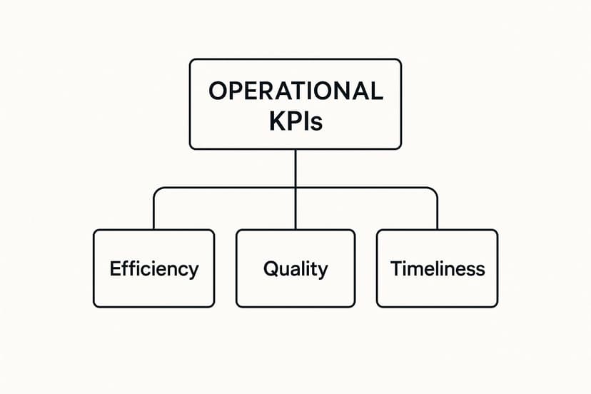
As you can see, efficiency, quality, and timeliness are all distinct but deeply connected parts of your overall operational health.
To make it even clearer, here’s a quick breakdown of common KPIs you might find in each of these four categories.
Key Operational Performance Indicators by Category
This table provides a snapshot of common operational KPIs, organized by category, to help you choose the right metrics for your business goals.
| Category | Example KPI | What It Measures |
|---|---|---|
| Efficiency | Inventory Turnover | The rate at which stock is sold and replaced over a period. |
| Quality | Customer Satisfaction Score (CSAT) | Customer happiness with a product, service, or interaction. |
| Timeliness | Order Fulfillment Time | The total time from when a customer places an order to delivery. |
| Financial | Cost Per Unit | The total expense incurred to produce one unit of a product. |
Selecting a balanced set of KPIs from these areas ensures you have a comprehensive view of your operations, not just a narrow one.
Of course, tracking all this has gotten a lot easier. Today, 78% of organizations use some form of performance management software to monitor their KPIs in real time. And with cloud-based tools expected to make up 65% of the market, this kind of data-driven decision-making is more accessible than ever. You can explore more performance management statistics and trends to see just how much technology is changing the game.
How to Choose the Right KPIs for Your Business

In a world overflowing with data, the real challenge isn’t collecting metrics—it’s picking the right ones. Deciding which operational performance indicators to track can feel like a huge task, but a solid plan helps you focus on what actually moves the needle for your business.
If you don't have a clear framework, you'll find yourself drowning in numbers that look good on a chart but don't give you any real direction.
You’re not alone if this feels familiar. A recent survey from APQC found that nearly 75% of professionals struggle to choose operational KPIs that truly reflect what’s happening in their business. The sheer volume of data we can now access just makes this problem bigger.
The secret is to tie every single indicator back to a specific business goal. Before you start tracking a new metric, ask yourself one simple question: "Will this number help us make a smarter decision?" If the answer is no, it's probably a vanity metric—a distraction, not a tool.
Applying the SMART Framework
The SMART framework is a fantastic tool for cutting through the noise and validating your operational performance indicators. It’s a simple but effective way to ensure every metric you track is purposeful, precise, and practical.
Think of the SMART criteria as a quality control checklist for your metrics. If a potential KPI can't pass all five checks, it probably doesn't belong on your dashboard. This simple filter helps you build a focused and powerful tracking system.
Let's break down what each letter means for your operational KPIs.
-
Specific: Your KPI needs to be crystal clear. "Improve warehouse efficiency" is vague. A specific KPI is "Reduce average order picking time." There’s no confusion about what’s being measured.
-
Measurable: You have to be able to put a number to it. "Get better at customer support" is an ambition, not a metric. "Achieve a Customer Satisfaction (CSAT) score of 95%" is a concrete target you can track.
-
Achievable: Your goals should stretch you, not break you. Aiming to have zero production defects tomorrow is probably unrealistic. A better, achievable KPI is "Reduce the product defect rate by 15% in Q3." It's challenging but possible.
-
Relevant: Does this metric actually matter to your company’s success? For an e-commerce site, website traffic is key. But for a manufacturing plant, "Machine downtime rate" is a far more relevant operational indicator.
-
Time-bound: Every goal needs a deadline. Without one, there's no sense of urgency. "Decrease onboarding time for new hires to 2 weeks by December 31st" sets a clear finish line and pushes the team to act.
Using this framework helps you confidently choose operational performance indicators that offer real insight, drive action, and keep your entire team aligned with your biggest goals.
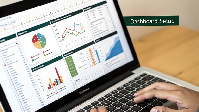
How to Build an OPI Dashboard in Excel
Okay, you’ve picked out the operational performance indicators that matter most to your business. Now what? It's time to bring those numbers to life. An Excel dashboard is your best friend here—it takes all that raw data and turns it into a clear, visual story about your company's health. Think of it as the cockpit of your operations, letting you see everything at a glance.
Building a dashboard doesn't have to be some intimidating, overly technical task. With the right approach, you can create a seriously powerful tool from scratch. If you're new to spreadsheets or just want a quick refresher before you dive in, this simple guide to getting started with Excel is a great place to start.
Step 1: Get Your Data House in Order
Before you even think about fancy charts and graphs, you have to get your data organized. This is the foundation of your entire dashboard, and if the foundation is messy, the whole thing will be shaky. The best way to do this is with a simple, clean table.
Start by creating a dedicated worksheet just for your data—let's call it "Data." In this sheet, each row should be a single entry (like one customer order or a specific service ticket), and each column should be a specific piece of information (like 'Date,' 'Product Name,' 'Order Status,' or 'Time to Resolution').
A few pro tips to keep your data pristine:
- Stay Consistent: Use the exact same terms every single time. Don't mix "Complete" with "completed" or "Shipped" with "shipping." Little inconsistencies can break your formulas later.
- Make it a Table: Click anywhere in your data, then press Ctrl+T (or go to Insert > Table). This simple action makes your data dynamic, much easier to manage, and unlocks some of Excel's most powerful features.
- Keep it Raw: This "Data" sheet is for raw information only. Do all your number-crunching and chart-building on a separate "Dashboard" sheet. This separation keeps everything tidy and easy to troubleshoot.
Step 2: Calculate Your Metrics with Formulas
Now that your data is clean and organized, you can start calculating your OPIs on your "Dashboard" sheet. This is where you'll use Excel formulas to pull insights from all that raw information.
You don't need to be a formula wizard, but two functions are absolute game-changers here: SUMIFS and AVERAGEIFS. These let you add up or average numbers, but only when they meet specific criteria you set. For example, you could quickly figure out the 'Total Sales for Product X in Q2' or the 'Average Resolution Time for High-Priority Tickets.'
Let's say you want to calculate the average time it takes to fulfill an order for a specific region. The formula would look something like this:=AVERAGEIFS(Data_Table[Fulfillment_Time], Data_Table[Region], "North")
This formula simply tells Excel to look at the 'Fulfillment_Time' column and only average the numbers from rows where the 'Region' column says "North." It's that straightforward.
Step 3: Make Your Performance Pop with Visuals
A spreadsheet full of numbers is accurate, but it's not very insightful. Visuals are what tell the story instantly. Excel gives you a whole toolbox to turn your calculated metrics into a display that anyone can understand in a few seconds.
- Conditional Formatting: This is a simple but powerful tool. Use it to automatically color-code cells based on their value. For instance, you could set a rule to make any cell with a defect rate over 5% turn bright red.
- Sparklines: These are mini-charts that live inside a single cell. They're perfect for showing a trend over time right next to the number itself, without cluttering up your dashboard.
- Charts and Graphs: This is the main event. Use bar charts to compare different categories, line charts to track trends, and pie charts (but use them sparingly!) to show how different parts make up a whole.
The real test of a good dashboard is clarity. Can a manager look at it and understand the state of the business in 60 seconds? If a metric isn't immediately obvious, its visualization isn't doing its job.
Step 4: Add Interactive Slicers
The very best dashboards aren't static—they're interactive. This is where Slicers come in. Think of them as fancy filter buttons that let anyone using the dashboard explore the data for themselves. Instead of you having to manually change formulas to see data for a different region or time period, users can just click a button.
Adding a slicer is easy. Click inside your data table, head to the "Insert" tab, and choose "Slicer." From there, just pick the columns you want to filter by, like 'Region,' 'Product,' or 'Team Member.' Excel will create slick-looking buttons that you can place on your dashboard. Once you connect them to your charts, the entire report updates with a single click.
This final step transforms your dashboard from a static report into a dynamic tool for everyday decision-making.
Using AI to Analyze Your Performance Data in Excel
While manually built dashboards are great, bringing artificial intelligence into the mix can completely change the game for analyzing your operational performance indicators. Modern versions of Excel have built-in AI tools that act like an on-demand data analyst, spotting patterns you might have easily missed. It helps you move from just gathering numbers to actually understanding what they mean.
The easiest tool to start with is Analyze Data. You’ll find it on the Home tab. Just click it, and the feature will scan your dataset and automatically suggest pivot tables, charts, and interesting takeaways. It can instantly flag outliers—like a sudden spike in product defects on a Tuesday—or pinpoint trends, such as the most efficient hours for your customer service team.
Ask Questions in Plain English
One of the biggest wins of using AI in Excel is that you don't need to be a wizard with formulas to get sophisticated answers anymore. The Analyze Data feature lets you type questions in plain English, just like you were talking to a colleague. This makes in-depth analysis available to anyone, not just the spreadsheet experts on your team.
So, instead of wrestling with a complicated formula, you can just ask:
- "Which product line had the highest return rate last quarter?"
- "Show me the average order fulfillment time by region as a bar chart."
- "What was the trend for machine downtime in October?"
Excel’s AI figures out what you mean and whips up the right chart or summary table in a flash. This lets you chase down ideas and explore your operational data without getting stuck on the technical side of things. For a closer look at this, our guide on using AI for data analysis explores more advanced techniques.
Uncovering Deeper Insights Automatically
Beyond just answering your questions, Excel's AI is always working in the background to find meaningful connections in your data. It's like having an extra set of eyes that never gets tired. It might find a correlation you never thought to look for, like how a specific supplier's late deliveries are directly impacting your production efficiency.
By using AI, you switch from being reactive—where you have to hunt for answers—to being proactive, where the insights come to you. This saves a massive amount of time and highlights improvement opportunities that would otherwise stay hidden in the data.
This kind of smart analysis turns your spreadsheet from a static list of numbers into a powerful tool for making real business decisions. It gives you the power to find the root cause of bottlenecks, see which processes are working best, and make smart tweaks to improve your company's overall operational health. It’s simply a faster, smarter way to work.
Common OPI Tracking Mistakes and How to Avoid Them
Even the most beautiful, well-designed dashboard can fall flat if it’s not managed properly. Tracking operational performance indicators isn't a "set it and forget it" task. It's a living, breathing process, and a few common pitfalls can quickly turn a powerful tool into a source of total confusion.
Knowing what these mistakes are is the first step to building a tracking system that actually works.
One of the biggest traps teams fall into is metric overload. It's so tempting to want to track everything. But when your dashboard is cluttered with dozens of OPIs, it's impossible to see what truly matters. You end up with noise, not signals. The goal is clarity, not complexity, so focus on the vital few metrics that tie directly to your most important business goals.
Another classic mistake? Treating your KPIs as if they're set in stone. Business priorities shift, markets change, and your indicators need to keep up. A metric that was critical last quarter might be far less relevant today. Make it a habit to regularly review and refresh your OPIs to ensure they still reflect what you're trying to achieve.
Ensuring Data Integrity
Perhaps the most damaging mistake of all is ignoring data quality. If your data is inaccurate or inconsistent, your insights will be flawed, and your decisions will be weak. This completely undermines the entire point of having a dashboard in the first place. Seemingly small errors, like inconsistent naming conventions or a few typos in the source data, can snowball into major problems in your final analysis.
Your operational insights are only as reliable as the data they are built on. Consistently poor data quality will erode trust in your dashboard and hinder your team's ability to make confident, data-driven decisions.
Maintaining high data standards is non-negotiable for trustworthy reporting. If you want to get this right, it's worth exploring these essential data quality best practices.
Finally, don't forget that scale matters. How a company operates at 100 employees is vastly different from how it operates with 10,000. Recent data shows that larger enterprises often achieve higher productivity gains than smaller firms, highlighting how much optimized operations can be a competitive advantage. You can dig into more of these findings in the OECD Compendium of Productivity Indicators.
Frequently Asked Questions
What's the Difference Between an OPI and a KPI?
Think of it this way: KPIs are your destination, and OPIs are the turn-by-turn directions.
A Key Performance Indicator (KPI) is the big-picture goal, like "Increase customer satisfaction by 15%." It tells you if you're winning the game. An Operational Performance Indicator (OPI), on the other hand, measures the day-to-day actions that get you there—things like "Average first response time" or "Number of support tickets resolved per hour."
You can't achieve your KPIs without nailing your OPIs first. OPIs are the granular, ground-level metrics that feed into your high-level success.
How Often Should I Be Looking at My OPIs?
There’s no single right answer here—it really depends on the rhythm of the work you're tracking.
For a fast-paced environment like a customer support team, you might need to check OPIs like Average Handle Time daily, or even hourly, to make real-time adjustments. But for a process with a longer cycle, like the Employee Training Completion Rate, checking in weekly or monthly makes a lot more sense. You need to give the process enough time to produce meaningful data.
Do I Need Expensive Software to Track OPIs?
Not at all. You can get surprisingly far with tools you probably already have.
For many small and mid-sized businesses, Microsoft Excel is a perfectly capable tool for tracking OPIs. With some simple formulas, pivot tables, and charts, you can easily build a dashboard that gives you a clear view of your operational performance.
Ready to take your Excel analysis to the next level? Elyx.AI plugs right into your spreadsheets, letting you ask questions in plain English, get formula suggestions, and find hidden insights without the manual grunt work. Stop fighting with your data and start making better decisions faster. See how it works at https://getelyxai.com.
Reading Excel tutorials to save time?
What if an AI did the work for you?
Describe what you need, Elyx executes it in Excel.
Sign up