How to Use Conditional Formatting in Excel to Instantly Analyze Data

Staring at a wall of data in Excel can feel like trying to find a needle in a haystack. Conditional formatting is the magnet that pulls that needle right out. It's a powerful feature in Excel that automatically changes a cell's appearance—adding colors, icons, or data bars—based on specific rules you set.
This simple tool transforms a static spreadsheet into a dynamic dashboard, making your most important information jump off the page.
From Numbers to Insights with Conditional Formatting
Imagine a typical sales dashboard with hundreds of rows. Manually spotting top performers or finding regions that are falling behind is a tedious task. This is where conditional formatting becomes an indispensable analytical tool. It’s not just about making your spreadsheet look better; it’s about making it tell a story, quickly and clearly.
Spending too much time on Excel?
Elyx AI generates your formulas and automates your tasks in seconds.
Sign up →By setting up a few simple rules, you can visually cut through the noise. For example, you could instantly highlight all sales figures under a certain target, say $2,000, in red. Just like that, underperforming areas are impossible to miss. This turns a sea of numbers into actionable insights, helping you solve the problem of data overload with AI-powered analysis.
If you're new to the concept, there are some great resources to get you up to speed. For a solid primer on the basics, you can explore conditional formatting fundamentals on GCFGlobal.org.
Why It's a Must-Have Skill for Data Analysis
Once you integrate conditional formatting into your workflow, you'll wonder how you ever managed without it. It's more than just a formatting trick; it's a diagnostic tool that helps you answer crucial business questions at a glance.
- Instantly Spot Trends and Patterns: Use color scales to create a heatmap of your data. This makes it incredibly easy to see high and low points, like which months had the best sales or which products are most popular.
- Highlight Errors and Outliers: Working with a massive dataset? Set a rule to flag duplicate entries or any values that fall outside an expected range. It’s a lifesaver for quickly cleaning and validating your information.
- Improve Data Readability for Everyone: A visually organized report is far easier for your team and stakeholders to digest. By highlighting key data points, you ensure your insights are communicated effectively.
When you turn raw data into a visual narrative, you’re no longer just collecting information—you're making faster, more confident decisions. It’s one of the most practical skills you can learn to get more value out of your spreadsheets.
Getting Started: Applying Your First Formatting Rules
Let's apply some of the most useful conditional formatting rules to a real-world business scenario: a project task list. Imagine a spreadsheet with columns for Task Name, Status, and Due Date.
Our goal is to make this list easy to manage at a glance. We want overdue tasks to demand attention, completed items to fade into the background, and data entry errors to be obvious. This is where the magic happens, turning a static data table into a dynamic dashboard.
This simple visual breaks down the logic you'll use for every single rule you create.
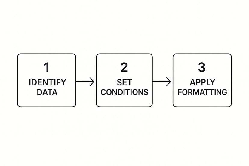
As you can see, it’s a straightforward three-part process: select your data, define the condition (the "if"), and then choose the format (the "then").
Highlighting What Matters Most
First, let's make those urgent tasks impossible to miss.
Start by selecting the entire 'Status' column. Then, navigate to Home > Conditional Formatting > Highlight Cells Rules and select Text that Contains. A dialog box will appear. Type "Overdue" into the box and choose a red fill from the dropdown. Instantly, every overdue task is highlighted.
You can apply the same logic to numerical data. Imagine you're tracking inventory. You could select the 'Stock Quantity' column and use Highlight Cells Rules > Less Than. If you set the value to 20, Excel will automatically flag any item that's running low and needs to be reordered.
The real power of these rules is that they are dynamic. Once set, they update automatically as your data changes. If you update an "Overdue" task to "Complete," the red highlight vanishes. Your visual report is always current.
Finally, let's use formatting to spot-check for errors. Duplicate entries can cause major issues in reports. To catch them, select the column you want to check (like 'Task Name'), go to Highlight Cells Rules, and click on Duplicate Values. Excel instantly highlights any repeated entries, so you can investigate and clean them up in seconds.
With just these three practical rules, you've made your spreadsheet significantly smarter and easier to manage.
Bring Your Data to Life with Bars, Scales, and Icons
Simple color highlights are a great start, but Excel offers more powerful visualization tools that can turn a spreadsheet into an interactive dashboard. These features make your data genuinely easy for anyone to understand at a glance.
Let's dive into these dynamic options to solve the problem of communicating complex data simply.

This idea of moving beyond basic color-coding is a core principle of modern business intelligence. Advanced tools often allow for stacking multiple formatting rules to create sophisticated, color-coded thresholds for key performance indicators (KPIs).
Add Mini In-Cell Charts Using Data Bars
Ever wanted a tiny bar chart right inside a cell? That's what Data Bars provide. They are incredibly useful for comparing values in a list, like monthly sales figures or project completion percentages.
Applying them is simple. Select your numerical data, go to Conditional Formatting > Data Bars, and pick a style. Excel automatically scales the bar's length based on the highest and lowest values in your selection, providing immediate visual context for each number relative to the others.
Data Bars are a go-to for adding instant visual context without clutter. You get the clarity of a chart without having to build one, making your numbers much easier to compare on the fly.
Build Heatmaps with Color Scales
Next up are Color Scales. These apply a color gradient across a range of cells, effectively creating a heatmap. This is perfect for visualizing the intensity of data, such as customer satisfaction scores or daily website traffic, allowing you to see the "hot" and "cold" spots immediately.
For example, a two-color scale (green for high, red for low) instantly flags problem areas and highlights successes. To get the most out of these, it helps to be familiar with general data visualization best practices.
Signal Status Instantly with Icon Sets
Finally, we have Icon Sets. These are fantastic for adding quick, unambiguous visual cues to your data using symbols like traffic lights, arrows, or star ratings.
Consider a project tracking sheet. You could use a traffic light icon set to show the status of each task:
- Green Circle: On schedule
- Yellow Circle: At risk
- Red Circle: Behind schedule
These icons communicate status much faster than text alone. They are a universal language that streamlines reporting. If you want to dig deeper into making your data more visual, our guide to data visualization best practices offers more actionable tips.
Unlocking Advanced Formatting with Custom Formulas
The built-in rules are great, but the real power of conditional formatting is unlocked when you write your own formulas. This allows you to create truly dynamic and intelligent spreadsheets that respond to complex conditions in your data.
For example, you can make an entire row change color based on the value in a single cell. Imagine a project where the "Delayed" status cell turns red—that's helpful. But what if the entire row for that delayed project lit up? That's an unmissable visual cue, and it's exactly what custom formulas enable.

This level of control separates a good report from a great one. Getting started with formulas might feel daunting, but the logic is straightforward once you understand the key concepts.
The Secret to Highlighting Entire Rows
To make an entire row change color based on one cell's value, you need to use mixed cell references. This is the key to creating row-based rules.
A1is a relative reference. As the rule is applied down a column, it looks atA2,A3, etc.$A$1is an absolute reference. The$locks both the column and row.$A1is a mixed reference. This is our solution. The column is locked, but the row is relative.
Let's return to our project dashboard. To highlight every row where the status in column C is "Delayed," you would select your data range (e.g., A2:F20) and create a new rule using the formula: =$C2="Delayed".
The
$locks column C, telling Excel to always look there for the status. However, the row number2is relative, so Excel checks C2, then C3, then C4, and so on. This simple formula applies the formatting to the entire row whenever the condition in column C is met.
Mastering these formulas is a major time-saver. If you're ever stuck, an AI-powered Excel formula builder can be a huge help. It can generate the exact formula you need in seconds, letting you create specific formatting rules without the headache.
Let AI Write Your Complex Rules for You
What if you could create powerful, custom formatting rules without ever writing a formula? While manual formulas offer ultimate control, they can be complex and time-consuming. This is where AI tools are revolutionizing Excel, bridging the gap between a complex analytical idea and a perfectly formatted sheet.

AI add-ins, such as our Elyx.AI tool, let you describe your formatting goal in plain English. You simply type what you want to achieve, and the AI translates your request into the precise formula Excel needs. This makes advanced data analysis accessible to everyone, regardless of their formula-writing skills.
From Plain English to Perfect Formatting
Here’s a practical example. Imagine you're a sales manager who needs to spot deals requiring immediate attention. Instead of struggling with cell references and operators, you could just ask the AI:
"Highlight all rows where the profit in Column E is less than 10% of the revenue in Column D."
The AI generates the correct formula—=($E2/$D2)<0.1—that you can copy directly into the conditional formatting rule manager. This not only saves time but also eliminates the small errors that can derail your analysis. Knowing how to clearly state your requirements is a key skill, which also applies to customizing AI solutions for specific business needs on a larger scale.
This AI-driven approach is a game-changer for anyone who understands their data but isn't an Excel formula expert. It's why these tools are gaining popularity. In fact, over 80% of businesses already use conditional formatting to improve report accuracy, leading to productivity boosts of up to 30% during data review.
By integrating AI into your Excel workflow, you can build incredibly insightful and dynamic reports without getting bogged down by technical details. This modern approach to spreadsheet management allows you to focus on analysis, not syntax.
Answering Your Top Conditional Formatting Questions
As you use conditional formatting more, you'll likely run into a few common questions. Here are practical answers to help you solve them quickly and get back to your analysis.
Why Isn't My Conditional Formatting Working?
This is a common issue, and the solution is usually simple. The most frequent cause is the order of your rules. Excel evaluates rules from top to bottom in the "Manage Rules" window and stops at the first one that is true. If a rule at the top conflicts with one below it, the top rule will always take precedence. Reorder your rules to ensure the most specific ones are at the top.
Another common culprit is incorrect cell references in your formulas. A small mistake with absolute ($A$1), relative (A1), or mixed ($A1) references, like a missing $ sign, can prevent a rule from applying correctly across your dataset.
Can I Make an Entire Row Change Color?
Absolutely! This is one of the most powerful uses of conditional formatting. To do this, you need to create a custom formula.
Select the entire range of data you want to format (e.g., A2:F50). Then, go to New Rule and choose "Use a formula to determine which cells to format." The formula must lock the column you're checking but keep the row relative.
For instance, to highlight any row where the status in column D is "Completed," your formula would be
=$D2="Completed". The dollar sign before the D is crucial—it tells Excel to always look at column D, while the relative row number 2 allows it to check every row in your selection.
How Do I Find Every Cell That Has Conditional Formatting?
If you've inherited a complex spreadsheet, finding all the existing rules can be a challenge. Excel has a built-in tool for this.
Go to the Home tab, click Find & Select in the "Editing" group, and choose Conditional Formatting. Excel will instantly highlight every cell on the sheet that has one or more formatting rules applied, making it easy to review or clean them up.
What's the Best Way to Copy Formatting to Other Cells?
The Format Painter is the perfect tool for this job. It's fast, simple, and intelligently adjusts cell references as it copies the rules.
- First, click on a cell that has the formatting you want to copy.
- Next, click the Format Painter icon (the paintbrush) on the Home tab.
- Finally, click and drag over the new cells where you want to apply the formatting.
This method copies all the underlying conditional formatting rules without forcing you to recreate them manually, ensuring consistency across your worksheet.
Tired of trying to remember formula syntax? With Elyx.AI, you can just tell Excel what you want in plain English and let AI handle the rest. Give our free trial a spin and see how simple your spreadsheet work can become.
Reading Excel tutorials to save time?
What if an AI did the work for you?
Describe what you need, Elyx executes it in Excel.
Sign up