7 Proven Tips on How to Organize Data in Excel

Staring at a chaotic spreadsheet can feel overwhelming. Before you even think about building charts or running calculations, the secret to how to organize data in Excel is simply getting the structure right. It all starts with a few foundational rules: a single header row at the top, no merged cells, and absolutely no blank rows or columns chopping up your dataset.
7 Foundational Tips for Organizing Excel Data
A messy spreadsheet isn't just an eyesore—it's a direct path to faulty reports and hours of wasted time. The first move toward taming your data is to enforce a clean, predictable format from the get-go. This means treating your raw data like a proper database, where every row is a unique record and every column is a specific field.
For instance, think of a raw sales export. A poorly organized version might have scattered notes, multiple headers, or merged cells for regions. A well-organized one will have clean columns like TransactionID, SaleDate, Region, Product, and SaleAmount, with each row representing one single sale. This simple, methodical approach is the bedrock of any reliable analysis you'll do later, especially when leveraging AI tools that expect structured data.
Spending too much time on Excel?
Elyx AI generates your formulas and automates your tasks in seconds.
Sign up →Before you touch a single formula, take a moment to review your data against these essential rules. They are the non-negotiables for creating a dataset that Excel—and any AI integrated with it—can actually work with.
| Principle | Why It's Critical for AI and Analysis | Quick Action |
|---|---|---|
| One Header Row | Excel and AI tools use the first row to identify columns for sorting, filtering, and PivotTables. Multiple headers will break these features. | Delete any extra title rows above your main header. Make sure every column has a unique, descriptive name. |
| No Gaps | Blank rows or columns act like walls, stopping Excel from auto-detecting your entire data range (e.g., using Ctrl + A). | Find and delete any completely empty rows or columns within your data. |
| Atomic Data | Each cell must hold only one piece of information. "New York, NY" in one cell is a problem for analysis. | Split combined data. Use "Text to Columns" to separate a full address into Street, City, and State columns. |
| Consistent Data Types | Mixing text and numbers in a column (like "N/A" in a sales column) prevents calculations and causes errors. | Ensure all values in a numeric column are numbers. Use 0 for no value, and keep text notes in a separate "Notes" column. |
These aren't just suggestions; they're the difference between a functional dataset and a spreadsheet that fights you every step of the way.
Spending just 10 minutes structuring your data correctly up front will save you hours of headaches later. This initial cleanup directly impacts the accuracy of everything that follows, from a simple SUM to a complex AI-driven forecast.
This simple workflow below shows how to turn that raw, messy data into something truly useful.
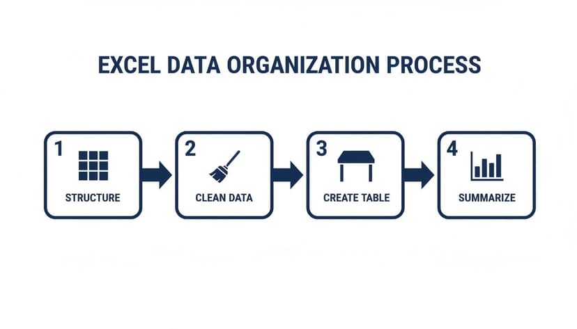
As you can see, organization isn't one single task. It's a clear process: you Structure the layout, Clean the inconsistencies, formalize it with a Table, and then, finally, Summarize it to find insights.
3 Built-In Tools to Tidy Up Your Data in Excel
Let's be honest: messy data is the single biggest roadblock to getting reliable insights. Once you have a basic structure for your spreadsheet, the real work begins—cleaning up the actual information inside the cells. This isn't just a "nice-to-have"; it's what separates a trustworthy analysis from one that's built on a house of cards.
The good news is you don't need to be a formula wizard to tackle the most common data messes. Excel has a few powerhouse features built right in. Let’s walk through three essential tools that are crucial for preparing data for both manual analysis and AI-powered tasks.
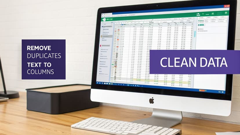
1. Zap Redundancies with Remove Duplicates
Duplicate entries are a classic data headache. They inflate your dataset, skew your calculations, and can make you question your results. With Excel’s Remove Duplicates feature, you can fix this in seconds.
Here’s how to do it:
- Click anywhere inside your data range or Excel Table.
- Go to the Data tab in the ribbon.
- Click Remove Duplicates.
- In the pop-up box, check the columns that define a duplicate. For instance, checking just the 'Email' column will get rid of any records sharing the same email address.
This is a deceptively simple action that massively improves your data quality before you even start analyzing.
2. Split Combined Data with Text to Columns
Ever get a spreadsheet where a 'Full Name' column needs to be separated into 'First Name' and 'Last Name'? That's where Text to Columns comes to the rescue. This tool is brilliant for splitting data from one cell into several.
Think of a column with data like "ProductA-Red-Large". You can use Text to Columns to break that into three clean columns: 'Product', 'Color', and 'Size'. All you have to do is tell Excel what character, or delimiter, is separating the data—it could be a comma, a space, or in this case, a hyphen. It’s also incredibly useful for parsing addresses or log file data.
3. Enforce Consistency with Data Validation
Typos and inconsistent formatting are the silent assassins of data integrity. One person types "USA," another enters "United States," and a third puts "U.S.A." To Excel, those are three completely different countries, which will throw off your reports. Data Validation is your first line of defense against this.
Data Validation is your spreadsheet's gatekeeper. By setting rules for what can be entered into a cell, you enforce consistency from the start, which is far easier than cleaning up a mess later.
A perfect use case is creating a dropdown list for a 'Status' column. Instead of letting people type freely, you can provide a predefined list with options like 'Open', 'In Progress', and 'Closed'. This guarantees every entry is uniform, making filtering and summarizing your data a breeze. An AI tool trying to analyze this column will perform much more accurately with standardized inputs.
Beyond these tools, getting into the habit of solid data hygiene practices will keep your information reliable. For those looking to speed things up even more, you can learn about automating these tasks with our guide to AI for data cleaning in Excel.
2 Reasons to Ditch Data Ranges and Embrace Excel Tables
Once you've cleaned up your data, your next move is a game-changer: convert that simple grid of cells into an official Excel Table. This is more than just a formatting trick; it's probably the single most important thing you can do to organize data properly. Just select your data and hit Ctrl+T. What you get is a smarter, more resilient spreadsheet.

If you're working with a plain range of cells, you're creating headaches for yourself down the road. Every time you add new data, you have to manually update your formulas and charts to include the new rows. An Excel Table eliminates that problem completely.
1. The Problem with Static Data Ranges
The magic of an Excel Table is that it’s dynamic. It knows where it begins and ends. When you paste a new row of sales data at the bottom, the table automatically expands to include it. This means any chart, PivotTable, or formula referencing that table updates instantly—no manual adjustments required. This dynamic nature is essential for AI tools that connect to your Excel files, ensuring they always have the most current data.
The second you convert a range into a Table, your spreadsheet stops being a dumb grid. It becomes a structured database that actively helps you manage your information, rather than fighting you every step of the way.
2. Make Your Formulas Readable with Structured References
One of the best perks of using Tables is something called structured references. This feature replaces cryptic cell references with plain, easy-to-read names. For example, to calculate the average of a "Revenue" column in a table named "Sales", the formula is:
=AVERAGE(Sales[Revenue])
Explanation:
=AVERAGE(...): This is the Excel function to calculate the average.Sales: This is the name of your Excel Table.[Revenue]: This is the structured reference to the "Revenue" column within the "Sales" table.
Suddenly, your formulas are self-documenting. The advantages are huge:
- Clarity: Formulas read like plain English, describing exactly what you’re calculating.
- Fewer Errors: You're referencing entire columns by name, so you don't have to worry about catching the right start and end rows.
- Easy Maintenance: Need to rename a column? Just change the header. Every formula using that column will update automatically.
If you ever find yourself wrestling with complex calculations, learning how to write formulas in Excel is essential, and Tables make that process infinitely more intuitive.
Finally, Tables come with fantastic built-in tools. You get filter buttons on every column header and can add a 'Total Row' with a single click. This special row lets you instantly get a SUM, AVERAGE, or COUNT for any column without writing a formula yourself.
From Tidy Data to Real Answers with PivotTables
You’ve put in the work to get your data cleaned up and organized in a proper Excel Table. Now for the fun part: turning all those rows and columns into actual answers. This is where you stop being a data organizer and start becoming a data detective. Your best tool for the job? The PivotTable.
Forget complex formulas. A PivotTable is the fastest way I know to summarize thousands of rows of data into a clear, meaningful report.

With a PivotTable, you can instantly tackle critical business questions like, "What were our total sales per region?" or "Which product categories drove the most revenue last quarter?" It’s all about dragging, dropping, and discovering.
Building Your First Summary Report
Getting started is surprisingly simple. Just click anywhere inside your data table, go to the Insert tab, and hit the PivotTable button.
You'll then see the PivotTable Fields pane. This is your control panel. It lists all your column headers, and you just drag them into four key areas to build your report:
- Rows: What do you want to group your data by? (e.g., Region, Product).
- Columns: A second layer of grouping (e.g., Quarter, Status).
- Values: The numbers you want to calculate (e.g., drag Sale Amount here for a sum).
- Filters: To narrow down the whole report (e.g., Year).
For example, drag Region to Rows and Sale Amount to Values, and you’ll immediately get a report showing total sales for each region. It really is that fast.
Add Some Interaction with Slicers and Timelines
A static report is useful, but an interactive one is a game-changer. This is where Slicers and Timelines come in. They are user-friendly, visual filters that let anyone explore the data.
Instead of fiddling with dropdown menus, a Slicer gives you clean, clickable buttons. Add a Slicer for Product Category, and with one click, the entire PivotTable instantly updates to show data for just that category.
Slicers and Timelines turn a simple report into a dynamic dashboard. They empower your team to ask their own questions and find their own answers, making data exploration a self-service activity.
Timelines are a special kind of Slicer for dates, giving you a slick visual slider to filter by years, quarters, months, or days. It’s perfect for spotting trends. These interactive elements are key for building dashboards that executives depend on for quick insights, a common task in many market analysis studies. To see how this is evolving, check out our guide on the next generation of AI for data analysis.
2 Ways to Automate Repetitive Tasks with AI and Power Query
Doing all this data cleanup by hand is not only tedious, but it's also where mistakes creep in. The final piece of the puzzle is making the whole process repeatable.
Let’s look at two fantastic ways to do this: Power Query and AI-powered agents.
1. Build Repeatable Workflows with Power Query
You'll find Power Query under the Get & Transform Data tab. Its job is to let you build a hands-off workflow for grabbing, cleaning, and loading your data—a process often called ETL (Extract, Transform, Load).
Imagine you get a messy sales report every month. You always have to:
- Delete the top 5 junk rows.
- Split the 'Product Code' column.
- Filter out returned orders.
Instead of doing this manually every time, you do it just once inside Power Query. It records every single step. Next month, all you have to do is hit Refresh, and Power Query reruns your entire sequence automatically.
Power Query turns a recurring data headache into a one-time setup. It guarantees consistency and lets you spend your time analyzing the data, not just preparing it.
This is a game-changer, especially for tasks like exporting clean Excel data to another system. For example, if you need to convert Excel data to XML for SEPA for bank remittances, an automated workflow ensures the output is always correct.
2. The Next Level of Automation with AI Agents
Power Query is amazing for automating a fixed set of steps you've defined. But AI agents take this a step further. Instead of building the workflow yourself, you just tell the AI what you want in plain English.
It’s like having an Excel expert sitting next to you. You can pull up a chat window and type a request like:
"Clean this sales data by removing duplicates in the 'OrderID' column, turn it into an official table, and then make a pivot report showing total sales by region and product category."
An AI agent, such as Elyx, can understand a complex, multi-step command like that. It will then perform the entire task—deduplicating, formatting, and building the PivotTable—right inside your spreadsheet without you having to click through all the menus.
This is a totally different way to organize data in Excel. You're no longer just automating a pre-set routine; you're getting dynamic, on-the-spot help. If you want to see how this works, you can learn more about the power of AI in Excel. It’s a powerful approach that lets you get through complex data organization tasks in a fraction of the time.
3 Frequently Asked Questions About Organizing Data in Excel
Even after you've learned the ropes, a few common headaches always seem to pop up when organizing data in Excel. Let's tackle some of the most frequent questions with practical, actionable answers.
1. What's the best way to handle dates in Excel?
This is a big one. The most important thing you can do is give your dates their own dedicated column and ensure Excel sees them as dates, not just as text.
When you use a proper date format (like MM/DD/YYYY or DD-MON-YYYY), you unlock all of Excel's powerful time-based tools. You can sort events chronologically, filter a report by month or year, or calculate the number of days between two project milestones. A common mistake is to put text like "TBD" or "N/A" in a date column. This will immediately break your filters and calculations.
2. How can I combine data from two different sheets?
Trying to combine data with VLOOKUP can get messy fast. The best and most reliable tool for this job is Power Query.
Power Query is built right into Excel and is designed for these kinds of tasks. Here’s the process:
- First, load both of your data sets into the Power Query editor.
- To add columns from one table to another, use the Merge function, linking them with a common field like a CustomerID.
- To stack two similar tables on top of each other, use the Append function.
Once your data is combined, you load it back into a new, unified sheet. The best part? This process is repeatable. When your source data changes, just hit "Refresh," and Power Query does all the work for you. For more ways to make your workflows hands-off, you might be interested in exploring our guide on how AI can automate these steps.
3. My formulas break when I add new data. How do I fix this?
This is an incredibly common Excel problem. It almost always happens because your formulas are using static cell ranges, like SUM(B2:B100). As soon as you add data in row 101, your formula doesn't see it.
The permanent fix is to convert your data into an official Excel Table. Just select your data and press Ctrl+T.
By turning your range into a Table, your formulas no longer rely on fixed cell addresses. Instead, they use "structured references" that refer to column names, like
SUM(SalesTable[Amount]). These references automatically expand as you add or remove rows.
Adopting Tables makes your formulas future-proof. You can add thousands of new records, and your calculations will always be accurate without you ever having to manually update a range again. It’s a fundamental shift that adds incredible stability to your spreadsheets.
Ready to stop wrestling with manual tasks and let AI handle the heavy lifting? With Elyx AI, you can describe your entire workflow in plain English—from cleaning data to creating complex PivotTables—and watch it happen autonomously. Get back hours every week and focus on what truly matters. Start your free 7-day trial of Elyx AI today.
Reading Excel tutorials to save time?
What if an AI did the work for you?
Describe what you need, Elyx executes it in Excel.
Sign up