How to Improve Forecast Accuracy in Excel with AI

Want to improve your forecast accuracy? The most critical step is one you absolutely cannot skip: cleaning your data. It doesn't matter how sophisticated your Excel model is; its predictions will only ever be as good as the information you feed it. Think of it like building a house—without a solid foundation of clean data, even the most impressive forecasting model will eventually collapse under the weight of its own errors. This guide provides practical, actionable steps to build more reliable forecasts directly within your spreadsheets, leveraging both native Excel tools and the power of artificial intelligence.
Start with a Foundation of High-Quality Data
The real secret to a reliable forecast isn't some complex, black-box formula. It's the disciplined, upfront work of getting your dataset in order. As you get deeper into forecasting, you quickly learn that this initial phase is where you create the most value. It’s the difference between a prediction that guides smart business decisions and one that sends you down the wrong path.
Too many users jump straight into modeling and then wonder why their results are off. The problem almost always traces back to the source data, which is usually riddled with common issues that can sabotage any analysis from the start.
Spending too much time on Excel?
Elyx AI generates your formulas and automates your tasks in seconds.
Sign up →Why Dirty Data Kills Forecasts
Messy data isn't just an inconvenience—it actively works against you. Inaccurate or inconsistent information can completely skew your results, leading to flawed conclusions and poor strategic moves. For instance, a simple mistake like duplicate sales entries can artificially inflate your historical performance, causing you to set wildly unrealistic targets for the future.
Common issues found in raw spreadsheets include:
- Duplicate Entries: The same transaction or record appears multiple times, giving you an exaggerated view of what actually happened.
- Missing Values: Gaps in your data, like a missing sales figure for a key holiday, can break your calculations or distort averages.
- Inconsistent Formatting: Dates written as "Jan 1, 2024" in one row and "01/01/2024" in another can prevent Excel from recognizing them as part of the same time series.
- Outliers: Extreme values, often from a simple typo during data entry, can dramatically pull your entire forecast in the wrong direction.
Trying to fix these issues manually in Excel is not only tedious but also a recipe for introducing new errors. That's why having a structured data cleaning process is so important.
Practical Data Cleaning in Excel
The good news is that Excel has powerful tools to help you build that solid data foundation. Power Query is an excellent starting point for automating tasks like removing duplicates and standardizing formats. It lets you create a repeatable workflow, so you can apply the exact same cleaning steps to new data with a single click.
For dealing with missing values that cause errors in formulas, IFERROR is a simple but effective solution. Let's say you're calculating the percentage change in sales, but some cells from the previous month are blank, resulting in #DIV/0! errors.
You can wrap your calculation like this:=IFERROR((B2-A2)/A2, 0)
Explanation:
(B2-A2)/A2is your primary calculation for percentage change (Current Month – Previous Month) / Previous Month.IFERROR(..., 0)tells Excel: if the primary calculation results in an error (like dividing by zero), return0instead of the error code. This keeps your dataset clean and ready for analysis.
This flowchart shows exactly how you get from a jumbled dataset to a reliable business prediction.
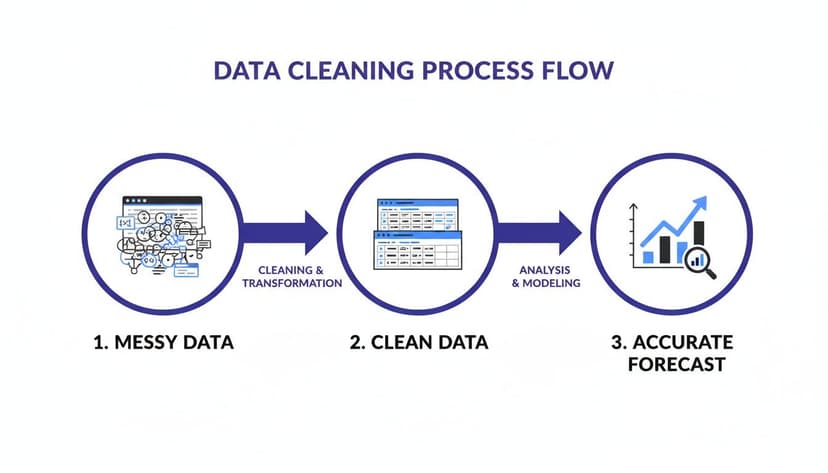
As you can see, turning that raw, messy information into a clean, organized state is the essential bridge to an accurate forecast.
Automating the Cleanup with AI in Excel
While Excel's tools are effective, the cleaning process still takes valuable time. This is where AI tools integrated into Excel, like Elyx.AI, can be a game-changer. Instead of manually performing each step—removing duplicates, finding and replacing errors, standardizing text—you can describe the entire process in one simple instruction.
For example, you could tell Elyx.AI: "Clean this sales data. Remove all duplicate rows based on the Order ID. Fill any blank cells in the 'Revenue' column with the average revenue of the column. Standardize all dates in the 'Order Date' column to MM/DD/YYYY format."
The AI agent takes that command and runs the whole multi-step workflow on its own, turning your messy spreadsheet into an analysis-ready dataset in seconds. By automating this foundational work, you not only save hours but also ensure the process is done consistently every single time.
If you want to go deeper, check out these data cleaning best practices to really sharpen your approach. It’s the best way to make sure your forecasting efforts always start on solid ground.
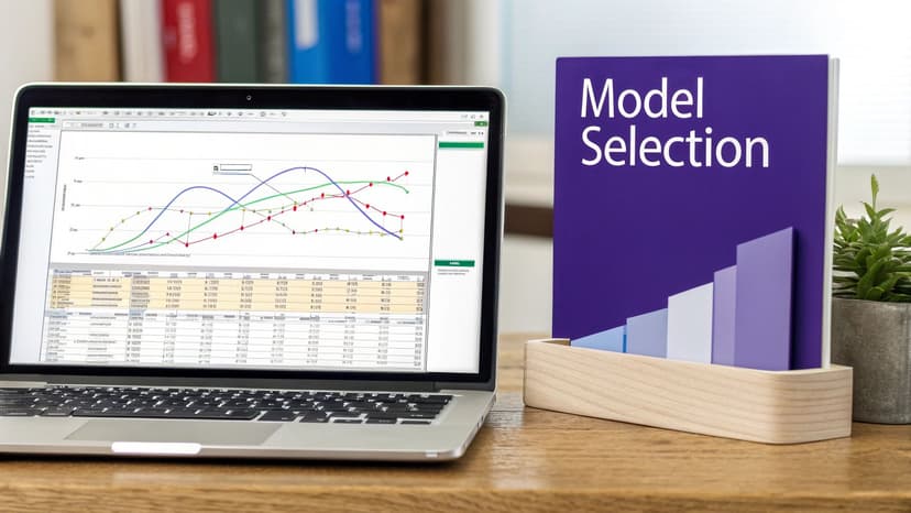
Choose the Right Forecasting Model in Excel
Once your data is clean and organized, you must select the right tool for the job. Excel is loaded with forecasting models, but you can't use the same approach for every scenario. Choosing the right model is often the single most important decision you'll make for improving your forecast accuracy.
We'll walk through some of the most practical models built into Excel, see where they shine in real-world business scenarios, and help you match the right approach to your unique data.
Simple Moving Averages for Stable Trends
Let's start with one of the most straightforward yet reliable methods: the Moving Average. This technique is perfect when you need to smooth out short-term noise to see the real underlying trend. It's your go-to model when your data is volatile but doesn't have any major seasonal swings.
Imagine you're tracking weekly sales. Some weeks are up, others are down, making it tough to see the overall direction. A 3-week moving average helps you cut through that volatility. In Excel, this is incredibly easy using the AVERAGE function. If your weekly sales are in column B, the formula in cell C4 for a 3-week moving average would be:
Explanation:
AVERAGE(...)calculates the arithmetic mean of the numbers provided.B2:B4specifies the range of cells to average—in this case, the current week and the two previous weeks.- By dragging this formula down the column, you get a rolling average that smooths the data, making the trend easier to spot.
For products with stable demand, this simple step can make a huge difference.
Capturing Seasonality with Exponential Smoothing
But what if your business has predictable peaks and valleys, like a retailer whose sales explode every holiday season? A simple Moving Average won't work here. For that, you need a model that understands seasonality, and Excel's Exponential Smoothing is a fantastic choice.
The FORECAST.ETS function is a powerhouse built for this exact scenario. It breaks down your data into three key components:
- Trend: The general up or down direction of your numbers.
- Seasonality: A repeating pattern over a set period (like quarterly or yearly).
- Error: The random, unpredictable noise.
Unlike a basic average, this method gives more weight to your most recent data, so it adapts faster to changes. It automatically spots seasonal patterns and projects them forward. For example, to forecast a future value based on historical sales (A2:A12) and dates (B2:B12), your formula might look like this:
=FORECAST.ETS(B13, A2:A12, B2:B12, 4, 1)
Explanation:
B13is the target date you want to forecast for.A2:A12is the range of your historical sales values.B2:B12is your timeline (the dates corresponding to the sales values).4specifies the length of the seasonal pattern (e.g., 4 for quarterly data).1tells Excel to complete missing data points by interpolating.
Of course, there are many other business forecasting methods you can explore to find the perfect fit for your data's unique story.
Excel Forecasting Models: When to Use Each
| Forecasting Model | Best For | Excel Formula/Tool | AI Application (Elyx.AI) |
|---|---|---|---|
| Moving Average | Smoothing out random noise in data with no clear trend or seasonality. | =AVERAGE(range) |
Ask Elyx.AI to "Apply a 3-period moving average to my weekly sales data." |
| Exponential Smoothing | Data with clear trends and seasonal patterns, like holiday sales spikes. | FORECAST.ETS(...) |
Prompt: "Use exponential smoothing to forecast next quarter's sales based on my historical data." |
| Linear Regression | Identifying a straight-line relationship between two variables (e.g., ad spend and sales). | FORECAST.LINEAR(...) or TREND function. |
Ask: "Run a linear regression to predict sales based on my marketing budget." |
| Forecast Sheet | Quickly creating visual forecasts with confidence intervals, best for simple time-series data. | Data Tab > Forecast Sheet | Prompt: "Create a forecast chart for the next 12 months with 95% confidence intervals." |
Each of these tools has its place, and knowing which one to use is key to building a reliable forecast.
The AI Advantage in Model Selection
Choosing between these models can still be tricky. Does your data have seasonality? Is the trend strong enough for regression? This is where artificial intelligence within Excel can give you a massive leg up. AI-powered tools like Elyx.AI can analyze your dataset and recommend the optimal model automatically.
Instead of guessing, you can just ask: "Analyze my monthly sales data and suggest the best forecasting model. Then, apply it to project sales for the next six months."
The AI will examine your data for trends, seasonality, and other patterns, then select and apply the most appropriate algorithm. It brings a new level of precision, as adaptive AI models learn from their own mistakes, continuously refining their predictions for better results over time. This approach turns a complex statistical decision into a simple conversation.
Use AI to Find the Patterns Hiding in Your Data
Traditional Excel functions are great for spotting basic trends, but they often fall short when you need to understand the why behind those trends. Real competitive advantage comes from digging deeper—from understanding the complex interplay between all the factors that drive your business. This is where AI steps in, moving beyond simple prediction into powerful, multi-variable analysis.
AI tools can sift through several variables at once, uncovering subtle connections that are practically invisible to the human eye. They can link your internal data (like sales figures) with external forces (like marketing spend, competitor promos, or even economic shifts) to paint a much richer, more accurate picture of what's to come.
Looking Beyond a Single-Variable Forecast
Standard time-series forecasting in Excel usually relies on just two variables: time and the metric you're predicting (e.g., sales). It's a decent starting point, but it assumes that the past is the only thing that dictates the future. We all know reality is far more complex.
This is where AI agents built into Excel, like Elyx.AI, change the game. You can start asking more sophisticated questions right inside your spreadsheet. Instead of just dragging a trendline forward, you can start probing the root causes behind your performance.
For example, you could provide datasets for sales, regional marketing spend, and website traffic, and then simply ask: "Analyze how our last marketing campaign impacted sales in the northeast region, considering website traffic from that area."
What you’ve just done is prompt the AI to run a multi-variable regression analysis on the fly. It will hunt for correlations, quantify the impact of your marketing, and give you a data-backed answer in seconds. This is one of the core benefits of using AI in Excel—it turns a calculation tool into a powerful strategic analysis partner.
A Real-World Scenario: Weather and Retail Foot Traffic
Imagine you manage a chain of retail stores. You know foot traffic fluctuates, but you suspect external factors are at play. By combining your daily traffic numbers with historical weather data for each store's location, you can unlock a new layer of insight.
With an AI tool integrated into Excel, you could start a conversation to explore that connection:
- "Is there a correlation between weekend rainfall and foot traffic in our downtown locations?"
- "What's the average impact of a sunny day on weekday sales versus a cloudy day?"
- "Build a model that predicts foot traffic based on next week's weather forecast."
Trying to do this manually in Excel would involve complex statistical modeling. With an AI agent, it’s as simple as asking a question. The AI might discover that a 10% increase in rainfall consistently leads to a 15% drop in foot traffic. Now you can adjust staffing and inventory with much more confidence, turning data into actionable strategy.
For a deeper look at how AI can be applied to prediction, this complete guide to AI trading has some great parallel insights.
When you use AI to understand the hidden drivers behind your numbers, you stop reacting to the past and start proactively shaping your future.
Measure Your Forecasts to Prove Their Value
You’ve built a forecast. That's the first step, but how do you know if it's any good? Measuring performance is the step that separates a wild guess from a genuine, data-driven strategy. It’s how you prove the value of your work and pinpoint exactly where you need to improve.
Without solid metrics, you’re flying blind. You have no objective way of knowing if your new model is any better than the old one. Let's dig into the essential metrics that will give you a clear scorecard on your forecast’s reliability, all calculated within Excel.
Key Metrics for Forecast Accuracy in Excel
The go-to metric for most practitioners is the Mean Absolute Percentage Error (MAPE). It measures the average size of your errors as a percentage, making it incredibly easy to understand and compare, whether you’re forecasting sales for a $10 widget or a $10,000 piece of equipment. A lower MAPE is always better.
Here's how you can calculate it right in Excel. Imagine your actual sales are in column A and your forecasts are in column B, running from row 2 to 11. The formula is:
=AVERAGE(ABS(A2:A11 - B2:B11) / A2:A11)
Explanation:
A2:A11 - B2:B11calculates the error for each period.ABS(...)takes the absolute value of each error, so positive and negative errors don't cancel each other out./ A2:A11converts each absolute error into a percentage of the actual value.AVERAGE(...)computes the mean of all those percentage errors.
Another vital metric is Bias, which tells you if you're consistently forecasting too high or too low. A model can have a great MAPE but still be terribly biased, a sneaky problem you need to root out.
Key Forecast Accuracy Metrics in Excel
| Metric | Excel Formula Example | What It Tells You |
|---|---|---|
| MAPE | =AVERAGE(ABS(Actuals - Forecasts) / Actuals) |
The average percentage error of your forecast. Great for a high-level view and comparing different models. |
| Bias | =SUM(Forecasts) / SUM(Actuals) - 1 |
Reveals if your model consistently over- or under-forecasts. A positive result means you're too high; negative means too low. |
| MAE | =AVERAGE(ABS(Actuals - Forecasts)) |
The Mean Absolute Error. It shows the average error in the same units as your data (e.g., dollars or units sold). |
| RMSE | =SQRT(SUMXMY2(Actuals, Forecasts) / COUNT(Actuals)) |
Root Mean Square Error. Similar to MAE but penalizes larger errors more heavily, making it sensitive to big misses. |
Tracking a combination of these gives you a much richer understanding than just looking at one number in isolation.
The Critical Role of Backtesting
Once you have your metrics, you need a bulletproof way to test your model. That’s where backtesting comes in. The idea is to validate your model against historical data it has never seen before to ensure it isn't just "predicting" the past it was trained on—a classic trap known as overfitting.
Here’s a practical way to set this up in Excel:
- Split Your Data: Divide your historical data. Use the first 80% as your "training set" to build the model.
- Hold Out the Rest: The final 20% is your "validation set." Pretend this data doesn't exist when you're training the model.
- Test and Measure: Use your model to forecast the period covered by the validation set. Then, calculate your accuracy metrics (like MAPE) by comparing your new predictions to the actual historical data you held back.
This process gives you a more honest assessment of how your model is likely to perform in the real world. For a deeper dive into how different inputs can affect your model's outputs, check out our guide to sensitivity analysis in Excel.
Automating Your Performance Scorecard with AI
Manually calculating these metrics and running backtests every time you tweak a model is tedious. This is where AI tools like Elyx.AI can revolutionize your workflow. Instead of messing with formulas, you can just tell the AI what you need.
For instance, you could simply ask Elyx.AI: "Using the first 80% of my historical sales data, build an exponential smoothing forecast for the last 20%. Then, calculate the MAPE to measure its accuracy."
The AI agent will perform the entire backtesting process in seconds and hand you a clean, instant scorecard. This makes it incredibly easy to experiment with different models and fine-tune your approach, turning a tedious validation task into a quick, repeatable action. Tracking these metrics is fundamental to any real improvement. You can discover insights about tracking forecast accuracy on ForecastPro.com for more on this.
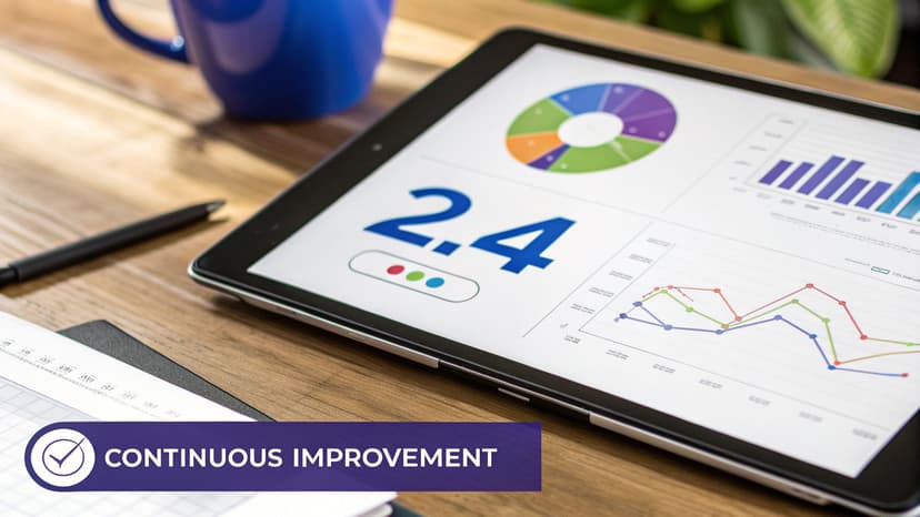
Create a Cycle of Continuous Improvement
Great forecasting isn't a one-and-done project. It’s a living process that should get smarter and more reliable over time. The most accurate forecasting systems are based on a simple but powerful idea: a continuous feedback loop. This final stage is about turning forecasting from a periodic task into an ongoing, intelligent system by regularly comparing actual results against your predictions, spotting where things went wrong, and using those insights to refine your models.
Establishing a Regular Review Cadence
First, you need to set a rhythm. Without a set schedule for reviewing your performance, even the best intentions tend to fall by the wayside. The goal is to make forecast review a non-negotiable part of your operational routine. This creates accountability and carves out dedicated time for refinement.
A structure that works well for many teams looks something like this:
- Weekly Reviews: Quick check-ins for front-line managers to review short-term forecasts and spot immediate pipeline issues.
- Monthly Reviews: Team leaders dig into broader patterns, comparing the month's actuals to the forecast and discussing major variances.
- Quarterly Reviews: At the executive level, this connects forecasting to bigger strategic planning and ensures alignment with high-level business goals.
These reviews shouldn't just be about the numbers. They need to be collaborative discussions about your underlying assumptions and new opportunities. For more on refining operational workflows, check out our guide on business process improvement techniques.
Performing Variance Analysis in Excel
The core activity of your review meetings is variance analysis—comparing what you thought would happen with what actually happened. Excel is perfect for this.
Let’s say you have a spreadsheet with three columns: Forecasted Sales, Actual Sales, and Product ID. First, calculate the percentage variance with this formula:
=(C2-B2)/B2
(Assuming Actuals in C2 and Forecast in B2)
Explanation:
C2-B2calculates the raw variance (the difference)./B2divides the variance by the original forecast to express it as a percentage.- Format the cell as a percentage to make it easy to read.
After calculating this for all products, use Excel's sorting and filtering tools to instantly see your biggest wins and misses. Sort the percentage variance column from smallest to largest to see where you significantly under-forecasted. Sort from largest to smallest to see where you were too optimistic. This simple analysis is your roadmap for improvement.
Automating the Feedback Loop with AI
Manually updating spreadsheets, recalculating metrics, and flagging variances every month is a time sink. An AI agent like Elyx.AI can turn this chore into an automated, intelligent workflow. Instead of performing each step yourself, you can give the AI a single command.
For instance, you could ask Elyx.AI: "Update my monthly forecast sheet with last month's actual sales data from the 'Actuals' tab. Then, recalculate the MAPE for each product category and create a new table listing all products with a forecast error greater than 10%."
In seconds, the AI executes this multi-step workflow. It pulls new data, runs calculations, performs variance analysis, and hands you an actionable list of areas needing attention. This automation ensures consistency and frees you to focus on the strategic work—understanding why the variances occurred and how to adjust your model. It transforms forecasting from a stressful monthly task into a powerful system that drives better business outcomes.
Common Questions About Forecasting in Excel
As you work on your forecasts, certain questions often come up. Here are straight-to-the-point answers to help you get past common hurdles.
How Much Historical Data Do I Need?
The rule of thumb is to have at least two or three full business cycles worth of data. If your sales always spike in the summer, you need data from at least two or three summers to give your model enough context to learn the seasonal pattern. However, quality always trumps quantity. Two years of clean, accurate data will produce a far more trustworthy forecast than ten years of a messy spreadsheet.
Can I Combine Different Forecasting Methods in Excel?
Yes, and you absolutely should! This strategy is often called "ensembling," and it’s a powerful way to get more reliable results. For example, you might create one forecast with a moving average and another with exponential smoothing. By averaging them together, you can often smooth out the errors from each individual model.
This is simple to do in Excel. If you have two forecasts in columns C and D, you can create the combined forecast in column E with a quick formula:
=AVERAGE(C2, D2)
AI tools take this a step further by automatically testing different models and assigning weights based on historical performance, creating a blended forecast that's much more robust.
What Is the Biggest Mistake People Make When Forecasting in Excel?
Hands down, the single biggest mistake is skipping proper data cleaning. It’s the least glamorous part of the process, so it's tempting to jump straight to forecasting formulas. This is where most forecasts fail. Seemingly minor issues like duplicate entries, random gaps, or inconsistent date formats will wreck your results. Taking the time to properly clean and prepare your data is the single most important thing you can do to improve forecast accuracy. Everything else is built on that foundation.
Ready to stop wrestling with manual tasks and start getting instant, accurate insights? Elyx.AI is an AI agent that lives inside Excel, automating everything from data cleaning to advanced analysis with simple text commands. Transform your forecasting process and get back hours every week. Try it for free at https://getelyxai.com.
Reading Excel tutorials to save time?
What if an AI did the work for you?
Describe what you need, Elyx executes it in Excel.
Sign up