5 Steps On How To Create A Report In Excel (2026 Guide)

Staring at a spreadsheet with thousands of rows of data is a feeling most of us know all too well. It's easy to feel overwhelmed, but with the right game plan, you can turn that mountain of raw numbers into a clear, insightful story.
Learning how to create a report in excel isn't just about plugging numbers into cells. It’s about following a proven workflow to build a dynamic dashboard that helps your team make real business decisions. This process, enhanced by the power of artificial intelligence, takes you from a messy data dump to a polished, interactive final product. The goal is for you to leave with a new skill, not just superficial text.
From Raw Data To An Actionable Excel Report
We've all been there: staring at a massive, intimidating spreadsheet, wondering where to even start. The real goal is to get beyond a static grid of numbers and create something that delivers immediate value and clarity. This guide will walk you through the entire process, providing practical explanations and actionable tips to solve this concrete problem.
Spending too much time on Excel?
Elyx AI generates your formulas and automates your tasks in seconds.
Sign up →This approach is designed to solve common headaches like tedious manual data cleaning and the endless cycle of repetitive formatting. Modern tools are completely changing how this work gets done. For example, an Excel AI add-in can now shrink hours of manual work into just a few minutes of automated magic, a prime example of AI's growing role in Excel.
A great report doesn't just present data; it answers questions. It anticipates what the user needs to know and presents the answers in a clear, accessible format.
Think of it as a simple, three-step journey. You start with the raw materials, put them through an analysis engine, and end up with something that drives action. This little diagram breaks it down perfectly.
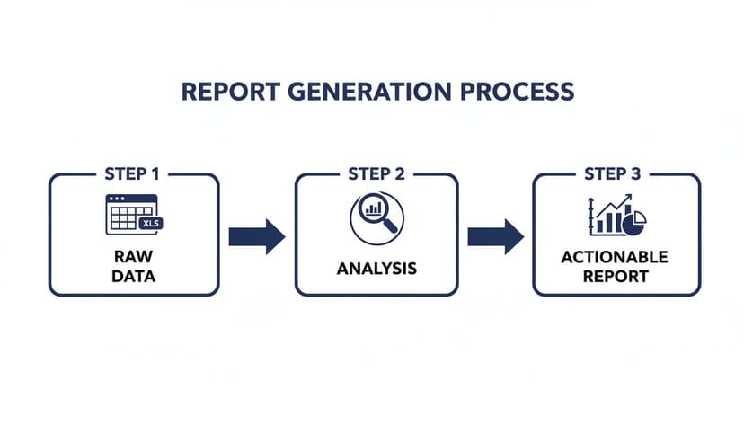
The image really drives home the point that an actionable report is the final destination, not the starting point. It's the result of a structured process that begins with raw data and moves through a crucial analysis phase.
By the time you finish this guide, you’ll have a clear roadmap for building reports that are not only accurate but also genuinely insightful and easy for anyone to navigate.
1. Plan Your Report and Prepare Your Data
Before you even open Excel, let's talk about the two most important questions you need to answer. I’ve seen countless reports fail before they even start because the creator skipped this crucial planning phase.
First, what specific question is this report trying to answer? Are you trying to figure out why sales are down? Or which marketing campaign drove the most leads? Get specific.
Second, who is this report for? A high-level summary for your CEO needs to be brief and to the point, while a detailed breakdown for a project manager will require a lot more granularity. Your audience dictates everything.
With a clear goal in mind, it’s time to roll up your sleeves and get into the data. This is often the most tedious part of the process, but getting it right here saves you a world of headaches later.
Organize Your Source Data
The foundation of any good Excel report is clean, well-structured source data. Think of it like a simple grid: every column is a specific piece of information (like "Date" or "Sale Amount"), and every row is a single record.
Avoid merged cells and random blank rows at all costs—they will break your formulas and pivot tables later on.
Often, you'll be working with data from other systems. For example, you might need to convert a CSV to an XLSX file before you can really start digging in.
A tip from experience: Always, always work on a copy of your raw data. This is your safety net. If you make a mistake, you can just go back to the original file and start over without losing your source of truth.
Clean and Standardize Your Information
Garbage in, garbage out. It’s a cliché for a reason. Inconsistent formatting, typos, and extra spaces can completely throw off your analysis. Fortunately, Excel has some great tools to help you clean things up.
Here’s a practical example of how to fix a common data mess using an Excel formula:
- Annoying Extra Spaces: Use the
TRIM()formula. It’s a lifesaver for getting rid of leading or trailing spaces that make " New York " and "New York" look like two different places to Excel.- Formula:
=TRIM(A2) - Explanation: If cell
A2contains the text" New York ", this formula will return"New York", removing the unnecessary spaces before and after the text.
- Formula:
Data Preparation Checklist: 5 Key Checks
Here’s a simple table outlining the essential checks I perform on every dataset before I start my analysis. It helps ensure everything is accurate from the get-go.
| Checklist Item | Why It's Important | Quick Excel Tip |
|---|---|---|
| Remove Duplicates | Prevents inflated counts and inaccurate sums. | Go to Data > Remove Duplicates. |
| Check for Extra Spaces | Ensures proper grouping and filtering. | Use the =TRIM() formula in a helper column. |
| Standardize Casing | "USA" and "usa" are seen as different values. | Use =UPPER() or =LOWER() for consistency. |
| Handle Blank Cells | Missing data can cause errors in calculations. | Use Find & Select > Go To Special > Blanks. |
| Correct Data Types | Dates stored as text won't sort correctly. | Use the Format Cells option or Text to Columns. |
Nailing these cleaning steps means you can trust the numbers in your final report. If you’re dealing with really messy files, leveraging artificial intelligence for data cleaning can be a powerful alternative.
2. Summarize Your Data With Pivot Tables
Now that your data is clean and properly structured, it’s time for the fun part: analysis. This is where you start turning all those rows and columns into actual insights. In Excel, the undisputed king of data summarization is the Pivot Table.
Frankly, if you're building a report in Excel, you're almost certainly going to be using a Pivot Table. They are the engine behind any dynamic report, allowing you to slice, dice, and group huge datasets without wrestling with a single formula. Think of it as an interactive summary that lets you instantly rearrange your data to see it from different angles. It's the quickest way to answer questions like, "What were our top-selling products in the West region last quarter?"
Despite their incredible power, a lot of people find them intimidating. But once you get the hang of the basic mechanics, you'll wonder how you ever managed without them.
Building Your First Pivot Table
Getting a Pivot Table started is surprisingly simple.
Just click on any single cell inside your clean data table. From there, go to the Insert tab in the Excel ribbon and click PivotTable. A small dialog box will pop up; Excel is usually smart enough to select your entire data range automatically. I almost always choose to place the Pivot Table on a new worksheet to keep things organized.
Click OK, and you'll be greeted by the PivotTable Fields pane on the right side of your screen. This is your command center. It’s broken down into four simple drag-and-drop areas:
- Rows: Drag a field here (like "Region" or "Customer Name") to create the rows of your summary.
- Columns: This creates your column headers. Think "Product Category" or "Month."
- Values: This is where the numbers go. Drop in fields like "Sales" or "Quantity" to be summed, counted, or averaged.
- Filters: This adds a top-level filter that can control the entire table.
Let’s say you have a table of sales transactions. To see your total sales by region, you’d simply drag the "Region" field to the Rows box and the "Sales Amount" field to the Values box. That's it. Excel instantly calculates and displays the total sales for each region.
A Real-World Scenario
Let's take that a step further. What if you also want to see how those regional sales are broken down by product category? Easy. Just drag the "Product Category" field into the Columns area. Now your report shows each region's sales, neatly organized by category.
But what if your boss doesn't care about the total dollar amount and instead wants to know the number of individual sales?
No problem. In the Values area, click the field (it probably says "Sum of Sales Amount") and select Value Field Settings. In the new window, just change the calculation from Sum to Count. You can also pick Average, Max, Min, and more.
This flexibility is what makes Pivot Tables so essential. You can explore your data, test hypotheses, and uncover trends in just a few clicks. For those who want to push their analytical skills even further, our guide on AI-driven data analysis is a great next step. Mastering these fundamentals is the key to learning how to create a report in Excel that’s not just static, but truly dynamic.
3. Visualize Your Insights With 5 Key Charts
Raw numbers and tables tell you what happened, but a good chart shows you why it matters. Visuals are the secret to making your insights pop, revealing trends and outliers in a way that a spreadsheet full of numbers never could.
After you’ve organized your data with a Pivot Table, the next move is to bring it to life visually. The simplest way to do this is with a PivotChart.

Just click anywhere inside your finished Pivot Table, head over to the Insert tab, and pick a chart. The best part? The chart is now directly connected to your table. Any filter or change you apply to the Pivot Table will instantly update the chart. It's a dynamic duo.
Choosing The Right Chart For Your Data
The trick is to match the chart to the story you're telling. Here are the 5 essential chart types I rely on and when to pull them out of your toolkit.
Line Chart: This is your go-to for showing trends over time. Want to track monthly sales, website traffic, or quarterly performance? A line chart makes it easy to spot growth, dips, and seasonal patterns at a glance.
Bar Chart: The undisputed champion for comparing different categories. Use a bar or column chart to stack up sales figures across your team, compare performance between regions, or see which products are the most popular.
Pie Chart: Use this one carefully! A pie chart works best when you need to show parts of a whole, where everything adds up to 100%. Think market share between a few major competitors. If you have more than five or six slices, it becomes cluttered and hard to read.
Scatter Plot: Perfect for uncovering relationships between two different numbers. A scatter plot helps you answer questions like, "Are we selling more when we spend more on ads?" or "Is there a connection between employee training hours and their performance scores?"
Combo Chart: This is a powerful hybrid, usually mixing a bar and a line chart. It's fantastic for showing a main value alongside a secondary one. For example, you could display monthly sales volume (as bars) with the average sale price (as a line) on the same chart.
Designing For Clarity, Not Clutter
Once you've picked your chart, it's time to clean it up. The goal is to make the key insight impossible to miss, not to bury it under a mountain of "chart junk." A clean visual is central to many advanced Excel use cases.
A great chart doesn't need a lot of explanation. Its title should tell the main story, and the visual itself should be clean enough to be understood in seconds.
Start by removing anything that doesn't add value—things like unnecessary gridlines, borders, or flashy backgrounds. Use color to guide the eye. For example, you could make one bar a different, brighter color to highlight a top performer.
Most importantly, give your chart a descriptive title that tells the story for you, like "Q3 Sales Grew 15% in the North Region." Let the chart do the heavy lifting.
4. Let People Explore the Data with Interactive Slicers
A report that just sits there is fine, but one that invites people to play with the data? That’s where the real value is. Once your pivot tables and charts are built, it's time to make your report dynamic. This is how you shift from simply presenting information to creating a tool for genuine exploration.
The secret ingredient here is a brilliant Excel feature called Slicers. Forget clunky dropdown filters. Slicers are basically stylish, interactive buttons that let anyone filter the entire report with a single click. Imagine your manager wanting to see just the "North America" numbers or performance for the "Electronics" category—they just click a button, and the dashboard instantly responds. This makes your work accessible to everyone, not just Excel pros.
Getting Your First Slicer on the Page
Putting a slicer into your report is surprisingly simple.
Start by clicking anywhere inside one of your pivot tables. From there, head up to the PivotTable Analyze tab on the ribbon and find the Insert Slicer button.
Excel will then show you a list of all the fields available in your data, like "Region," "Product Category," or "Sales Rep." Go ahead and check the boxes for the filters you want to offer. For most sales reports, giving users control over "Region" and "Product Category" is a great place to start.
Click OK, and you'll see these slick, new filter panels pop up on your sheet. You can drag them around and resize them just like any other shape or image, so you can position them perfectly for a clean, professional-looking dashboard. The moment someone clicks a button on the slicer, the pivot table it’s connected to (and any chart based on that table) will update in a flash.
The real magic of Slicers isn't just filtering one chart; it's about controlling your entire dashboard from a single click. This is what separates a simple report from a true analytical tool.
Connecting Slicers to All Your Charts
Here’s the pro tip that really brings your dashboard to life. When you first create a slicer, it only controls the pivot table you created it from. But you can—and should—connect it to every relevant pivot table and chart in your report.
It’s easy to do. Just right-click on your slicer and select Report Connections. A small window will appear listing every pivot table in your workbook. Simply tick the checkbox next to each one you want that slicer to control.
Do this for every slicer you’ve added. Now, when a team lead clicks the "North America" button, every single chart on your dashboard will sync up instantly, from sales trends to product breakdowns. This creates a powerful, cohesive experience that lets people discover their own insights without having to ask you for a dozen different views.
5. Automate Your Reporting Workflow With Artificial Intelligence
Okay, you've walked through all the manual steps to build a solid report in Excel. But let's be honest, it's a lot of work. What if you could take that whole process—which can easily eat up a few hours—and shrink it down to just a few seconds? This is where AI stops being a buzzword and starts being a game-changer for your workflow.

Meet Elyx AI. Think of it as an AI agent that lives right inside your spreadsheet and can handle complex, multi-step tasks all on its own. Instead of manually cleaning your data, building pivot tables piece by piece, and then formatting every single chart, you just describe what you want in plain English.
The hard truth about manual reporting is that it’s risky. Manual data entry often leads to costly errors. Elyx AI was built to fix this exact problem. You don't have to remember complex formulas or mess around with pivot table settings anymore. Just tell the agent what you need, and it builds a professional, fully formatted report in seconds.
From Plain English To a Finished Report
Let's picture a real-world scenario. You've just been handed a raw data file with the latest quarterly sales numbers. Normally, you’d be settling in for at least an hour of clicking and typing. With an AI agent, you just open it and type a simple request.
For instance, you could just say: "From my Q4 sales data, create a pivot table showing total sales by region. Then, generate a bar chart visualizing the top 5 regions and format the final report using our official company colors."
Elyx AI reads that sentence, understands your data's structure, and then does all the work for you. It cleans the data, builds the pivot table, creates the bar chart, and even applies your brand's specific colors without you having to do a thing.
This isn't just about saving time; it's about eliminating the tedious work where common—and costly—mistakes happen. This approach frees you from the how of building reports so you can focus on the why—analyzing the results and making strategic decisions. You can see more of what's possible by exploring the capabilities of Excel AI.
The Power of AI-Driven Automation
This move from manual tasks to AI-driven automation is a huge shift in how we work with data. It makes powerful analysis available to everyone on the team, not just the resident Excel guru.
If you're curious about the principles behind this kind of technology and want to get a stronger grasp on the fundamentals, an AI Course can be a great place to start.
Ultimately, tools like Elyx AI become your expert partner. They handle the repetitive, time-sucking tasks with incredible speed and accuracy. This gives you back valuable hours to focus on the high-impact work that actually moves the business forward.
2 Common Questions (And Quick Fixes) for Excel Reports
Once you start building reports in Excel, you'll inevitably hit a few common roadblocks. Don't worry, everyone does. Here are the answers to a couple of questions I see all the time—getting these right will save you a ton of headaches down the road.
How Do I Get My Report to Update With New Data Automatically?
This is the big one. You spend hours creating the perfect report, and then the next month's data comes in. You find yourself manually re-selecting ranges and updating formulas, which is a recipe for errors and wasted time.
The secret here is to use Excel Tables. Seriously, this one feature will change your reporting life.
Before you even think about creating a pivot table, just click anywhere inside your data and press Ctrl+T. Excel will instantly convert that static block of cells into a dynamic, structured table.
Now, build your pivot tables and charts using this table as the source. When new data arrives, simply paste it at the bottom of your table. The table automatically expands to include it. A quick refresh of your pivot table is all it takes to pull in the new information. No more broken formulas or missed rows.
What's the Best Way to Share a Report With People Who Don't Use Excel?
It’s a safe bet that not everyone you're sending your report to will have Excel or know how to navigate a spreadsheet with slicers and pivot tables. Sending the raw .xlsx file can lead to confusion or formatting issues on their end.
The simplest and most professional solution is to share it as a PDF.
Just go to File > Save As and select PDF from the dropdown menu. This creates a clean, static snapshot of your report that looks the same on any computer or phone.
Here’s a pro tip: Before you export, create a dedicated "Dashboard" worksheet. Neatly arrange all your final charts, tables, and slicers on this single sheet. This way, your PDF looks like a polished, intentional one-page summary, not just a messy spreadsheet printout.
While tools like Power BI or SharePoint are great for sharing truly interactive dashboards online, a well-formatted PDF is the gold standard for quick, universal sharing.
Tired of wrestling with these manual steps? Elyx AI acts like an expert analyst sitting next to you, turning simple instructions into fully built reports in seconds. Let AI handle the tedious work. Give Elyx AI a try for free.
Reading Excel tutorials to save time?
What if an AI did the work for you?
Describe what you need, Elyx executes it in Excel.
Sign up