Excel Moving Average Formula: Step-by-Step for Beginners (2026)

Calculating a moving average in Excel involves summing up data points over a specific period and then dividing by the number of those periods. The goal is to smooth out short-term fluctuations in your data, helping you spot the real, underlying trends that might otherwise be lost in the noise.
For example, a 10-day simple moving average calculates the average of the last 10 days of data, giving you one clean data point that represents the recent trend. This guide will walk you through how to do this manually in Excel and how to automate it with AI.
What Are Moving Averages and Why Do They Matter for Data Analysis?
Before we jump into the Excel formulas and AI tools, let's clarify what moving averages do and why they are so valuable.
Spending too much time on Excel?
Elyx AI generates your formulas and automates your tasks in seconds.
Sign up →Imagine you're analyzing daily sales figures for your business in an Excel spreadsheet. One day sales are up; the next, they're down. This volatility makes it difficult to determine if your business is actually growing or just experiencing random fluctuations.
A moving average acts as a filter for that noise. By averaging your data over a set window—say, 30 days for sales or 12 months for revenue—you get a single, flowing line that clearly shows which way your numbers are headed. This is precisely why moving averages are a cornerstone of effective data analysis in Excel.
The Three Core Types of Moving Averages
All moving averages aim to clarify trends, but they use different methods. The type you choose depends on how much importance you want to give to your most recent data.
-
Simple Moving Average (SMA): This is the most straightforward method. It treats every data point in the period equally. An SMA is perfect for identifying long-term, stable trends where you don't want recent spikes or dips to have too much influence. For instance, a retail manager might use a 12-month SMA on revenue data in Excel to see the big picture of year-over-year growth, without getting sidetracked by one unusually slow month.
-
Weighted Moving Average (WMA): This method assigns more importance—or "weight"—to the newest data. For a 10-day WMA, the data from day 10 gets the most weight, day 9 gets a little less, and so on. It’s an excellent choice for short-term forecasting in Excel, where you believe recent events are a better predictor of the future.
-
Exponential Moving Average (EMA): The EMA also gives more weight to recent data, but its calculation is more sophisticated. It includes all past data points, though their influence diminishes over time. This makes the EMA more responsive to changes than an SMA but less volatile than a WMA, hitting a sweet spot that is highly useful for analyzing dynamic data.
For example, a financial analyst tracking a volatile tech stock in Excel would likely use an EMA. It reacts quickly to price shifts, offering timely signals that a slower SMA might miss. In trading, that speed can be the difference between profit and loss.
To help you decide which moving average is right for your specific needs in Excel, here’s a quick breakdown of their strengths and best use cases.
Quick Guide to Moving Average Types
| Moving Average Type | Best For | Key Characteristic |
|---|---|---|
| Simple (SMA) | Identifying long-term, stable trends. | Gives equal weight to all data points in the period. |
| Weighted (WMA) | Short-term forecasting where recent data is more relevant. | Assigns linearly decreasing weight to older data. |
| Exponential (EMA) | Tracking dynamic data that changes quickly, like stock prices. | Gives exponential weight to recent data while retaining older data. |
Ultimately, choosing the right moving average makes your analysis in Excel far more powerful and insightful. Moving averages are a fundamental tool in financial analysis, especially in the stock market, where they help investors cut through the noise. For a deeper dive into the theory, you can find a comprehensive overview of moving averages on Wikipedia.
How to Calculate a Simple Moving Average in Excel
Let's move from theory to practice and calculate a Simple Moving Average (SMA) directly in Excel. The good news is you don't need any special add-ins for this; we'll just be using the built-in AVERAGE function. This is the perfect starting point for smoothing out your data and revealing the underlying trend without complex setups.

To make this practical, let's imagine we're tracking monthly revenue over several years in a spreadsheet. This type of data often looks like a rollercoaster, with spikes and dips that can hide the true growth trajectory. An SMA is the ideal tool to smooth out that noise.
Setting Up Your Data in Excel
First, organize your data in a clean, two-column layout. This is all you need to get started.
- Column A (Date): List your time periods in chronological order (e.g., "Jan-23," "Feb-23," etc.).
- Column B (Revenue): Enter the corresponding revenue figures for each month.
Let’s say we've decided a 3-month SMA is the right choice for our analysis. This is a popular period for identifying short-term trends because it smooths out one-off bad (or great) months while still reacting to recent performance. Remember, for a 3-month window, you cannot calculate a value for the first two months, as you don't have enough historical data yet. Your first calculation will be for the third month.
Building the SMA Formula
With your data set up, it's time to write the formula. We'll start in the cell next to your third data point. If your revenue figures start in cell B2, your first SMA calculation will go in cell C4.
The formula is surprisingly simple: =AVERAGE(B2:B4)
That's all there is to it. You're telling Excel to calculate the average of the values in cells B2, B3, and B4—your first three months of revenue. The result in C4 is the first point of your smoothed trendline, representing the average revenue for the period ending in March 2023.
Pro Tip: This formula uses relative references, which is a huge time-saver in Excel. When you drag the formula down, Excel automatically adjusts the range for each new row. The next cell will calculate
=AVERAGE(B3:B5), then=AVERAGE(B4:B6), creating the "moving" average without any manual adjustments.
To apply the formula to the rest of your data, click the small square at the bottom-right corner of cell C4 (the fill handle) and drag it down to the last row of your revenue column. Instantly, your new column will populate with the smoothed revenue trend.
Visualizing Your SMA with an Excel Chart
A column of numbers is useful, but a chart makes the trend instantly clear. Plotting your raw data against the SMA is often an "aha!" moment, as you can see how the smoothed line cuts through the monthly volatility.
Here's how to create a quick visualization in Excel:
- Select Your Data: Highlight all three columns—Date, Revenue, and your new SMA column.
- Insert a Chart: Go to the
Inserttab on the Excel ribbon and choose aLine with Markerschart. - Customize Your Chart: Excel will generate a chart with two lines: your jagged monthly revenue and your much smoother SMA line. Take a moment to add a clear title, label your axes, and ensure the legend clearly identifies each line.
This visual makes it much easier to tell a story with your data. You can point to exactly where the SMA is climbing, showing a solid growth trend, or where it’s starting to flatten, signaling a potential change in momentum. If you want to dive deeper, you can find more useful tricks in our guide to essential Excel formula examples.
Advanced Moving Averages in Excel: WMA and EMA
A Simple Moving Average (SMA) is a fantastic tool for getting a high-level view of long-term trends, but it has one key limitation: it treats all data points equally. In many real-world scenarios, what happened yesterday is far more relevant than what happened last month.
This is where more advanced averages come into play. When you need faster, more responsive signals, you’ll want to turn to the Weighted Moving Average (WMA) and the Exponential Moving Average (EMA). Both are designed to give more significance to recent data, providing a more nuanced analysis, especially for fast-moving data like weekly sales figures or stock prices.
Calculating a Weighted Moving Average in Excel
A Weighted Moving Average is a logical step up from an SMA. The concept is straightforward: you assign a heavier "weight" to more recent data points, pulling the average closer to what's happening right now.
Let's imagine tracking a stock's closing price over a five-day period in Excel. We assign a weight to each day, with the most recent day having the highest weight.
- Day 1: $150 (Weight: 1)
- Day 2: $152 (Weight: 2)
- Day 3: $151 (Weight: 3)
- Day 4: $155 (Weight: 4)
- Day 5: $154 (Weight: 5)
To calculate the WMA, you multiply each price by its assigned weight, sum the results, and then divide by the sum of the weights.
Thankfully, Excel's SUMPRODUCT function does all the heavy lifting for us. If your prices are in cells B2:B6 and your weights are in C2:C6, the formula is simple:
=SUMPRODUCT(B2:B6, C2:C6) / SUM(C2:C6)
This single formula provides an average that is heavily influenced by the most recent price on Day 5, giving you a more current snapshot of the trend.
Calculating an Exponential Moving Average in Excel
The Exponential Moving Average (EMA) takes the concept of "recency" even further. It's a favorite among technical analysts because it incorporates all historical data while still giving exponentially more weight to the most recent data points. The result is a smooth, yet highly responsive, line that is brilliant for tracking momentum.
The math behind the EMA involves a smoothing factor, often represented by the Greek letter alpha (α), which dictates the weight placed on the latest data point.
You calculate it with a simple formula: α = 2 / (N + 1), where N is your time period.
For a 20-day EMA, the smoothing factor is 2 / (20 + 1) = 0.095. This means the most recent price gets about 9.5% of the weight, and the previous day's EMA value carries the remaining 90.5%.
It's this recursive quality—where each new calculation builds on the last—that makes the EMA so effective. It never truly forgets old data; it just lets its influence fade over time.
This infographic breaks down the EMA calculation process.
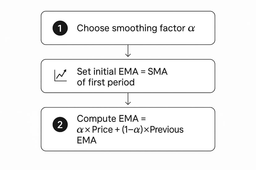
As you can see, once you have your smoothing factor and a starting point, it becomes a simple, repeatable calculation in Excel.
A Step-by-Step Process for Calculating EMA in Excel
Let's put this into practice in a spreadsheet. Since every EMA calculation requires the previous day's EMA, we need a starting point. The standard solution is to begin with a Simple Moving Average for the first period.
Here’s how to do it in Excel:
- Choose Your Period (N): First, decide on the length of your EMA. We’ll use a 10-day period for this example.
- Calculate the Smoothing Factor (α): Using our formula, 2 / (N + 1), the calculation is 2 / (10 + 1) = 0.1818. It's best practice to calculate this once in a separate cell (e.g.,
G1) and lock it in your main formula using an absolute reference ($G$1). - Establish Your Starting Point: You cannot calculate the EMA for the first 10 days because there's no "previous EMA" to reference. For the first value (on day 10), simply calculate the SMA for the first 10 days. If prices are in column B, your formula in cell
C11would be=AVERAGE(B2:B11). - Enter the EMA Formula: Now you're ready. Starting from day 11, you can use the true EMA formula. In cell
C12, you would type:= (B12 * $G$1) + (C11 * (1 - $G$1)). In this formula,B12is today's price,$G$1is our locked-in smoothing factor, andC11is yesterday's EMA.
Because of this structure, about 18.18% of the weight in our 10-day EMA is given to the most recent price. This responsiveness is invaluable in financial markets. If you want to dive even deeper into the mechanics, the Corporate Finance Institute offers some great insights into moving average calculations.
Once the first EMA formula is in place, just drag the fill handle down your column. You’ve now created a dynamic and powerful average that will give you a real edge in your analysis.
The Fastest Way: Let AI Calculate Moving Averages in Excel
Mastering Excel formulas is a valuable skill, but it can be time-consuming and prone to error. One typo can derail your entire analysis. What if you could skip the manual setup and get straight to the insights? This is where an AI tool integrated directly into Excel becomes a game-changer, turning complex calculations into a simple conversation.
With an AI add-in like Elyx.AI, you can calculate and chart moving averages with a single instruction written in plain English. This automated approach handles all the tedious tasks—writing formulas, applying them to columns, and configuring charts. It frees you up to focus on interpreting what the data is telling you.
From Complex Formulas to Simple Instructions
Instead of meticulously building formulas, an AI assistant lets you state your goal directly. Imagine you have a dataset of monthly sales in column C and want to visualize the long-term trend. The manual method involves setting up the AVERAGE function, handling the initial blank cells, and then building a chart from scratch.
With an AI tool, the process is transformed.
You just describe what you need.
For example, you could type: "Calculate a 12-month simple moving average for the sales data in column C and plot both the original sales and the moving average on a line chart."
That one sentence is all it takes. The AI understands the request, locates the data, generates the correct moving average formula in a new column, and produces a clean, perfectly labeled chart—all in seconds.
Here’s how an AI tool like Elyx.AI can take a prompt and instantly generate both the data column and a corresponding chart.

As you can see, the AI doesn't just run the numbers; it visualizes the result for you, making the trend immediately apparent without any manual charting effort.
Practical AI Prompts for Moving Averages
The real power of this approach is its flexibility. You can adjust your analysis on the fly without rewriting a single formula. For anyone trying to figure out how to calculate moving averages for different scenarios, success comes down to crafting clear, specific prompts.
Here are a few practical examples for sales forecasting:
- To spot short-term momentum: "Create a 3-month exponential moving average for column B and highlight any months where sales crossed above the EMA."
- For a long-term view: "Generate a 50-day and a 200-day simple moving average for the stock prices in column D. Plot them on the same chart."
- For a head-to-head comparison: "Calculate both a 10-period SMA and a 10-period WMA for the user engagement data in column F. Place the results in a side-by-side table."
Each prompt is a complete analytical package, handling calculation, formatting, and visualization in one step. This conversational method saves time and makes sophisticated analysis more accessible.
The True Advantage of AI-Powered Automation in Excel
Using AI to automate moving average calculations is about more than just speed; it's about shifting your focus from process to strategy. When you aren't bogged down in the details of formula syntax, you can dedicate more mental energy to the bigger questions.
AI-driven tools handle the "how," freeing you up to concentrate on the "why." You can test different time periods, compare various average types, and spot trends much faster, leading to smarter, more agile decisions.
This efficiency is crucial when market conditions are constantly changing. Being able to instantly model different scenarios—like comparing a 20-day EMA against a 50-day SMA—gives you a significant analytical advantage. And if you want to get the most out of these tools, mastering prompt optimization is key. When you embrace automation, Excel transforms from a simple calculator into a dynamic partner in your analysis.
Turning Moving Averages Into Actionable Insights
Calculating a moving average in Excel is the first step, but the real value comes from turning that smooth line on your chart into a strategic advantage. A moving average is just data until you know how to interpret it. Learning to read its signals is how you move from tracking numbers to making sharp, evidence-based decisions.

This is the bridge from raw calculation to genuine insight, helping you answer critical questions like, "Is our growth accelerating?" or "Are we hitting a plateau and need to change course?"
Reading the Signals in Your Data
A classic signal, especially in financial analysis, is the moving average crossover. This occurs when a short-term average (e.g., a 20-day EMA) crosses over a long-term one (e.g., a 50-day SMA).
When the shorter-term line climbs above the longer one, it often signals growing upward momentum—a "buy" signal for traders. Conversely, when it dips below, it can be an early warning of a downward trend.
However, the slope of a single moving average line also tells a compelling story:
- A steep upward slope indicates a strong, accelerating uptrend.
- A gradual upward slope suggests steady, sustainable growth.
- A flattening line can mean momentum is slowing or the market is consolidating.
- A downward slope indicates a clear downtrend.
By simply observing the angle and direction of the line, you can get an immediate sense of the trend's strength and stability. This is incredibly useful whether you're analyzing stock prices, monthly revenue, or website traffic in Excel.
Using Moving Averages as Dynamic Support and Resistance
In financial charting, moving averages often act as dynamic support and resistance levels. During an uptrend, a stock's price might pull back to its 50-day moving average, "bounce" off it, and then continue its climb. In this scenario, the average acts as a floor, or support.
In a downtrend, the opposite occurs. The moving average can become a ceiling, or resistance, capping any temporary price rallies. Identifying these levels helps analysts define smarter entry and exit points. This is why moving averages are a staple in many key sales forecasting methods.
Moving averages are also a cornerstone of statistical modeling and time series analysis. Statisticians use them to smooth out noisy data, removing seasonal spikes and random fluctuations to reveal the underlying trend more clearly.
Ultimately, learning to read these signals turns your moving average from a simple Excel formula into a powerful forecasting tool. The calculation is just the beginning; mastering the interpretation is what provides a true strategic edge.
Common Questions About Moving Averages
As you start working with moving averages in Excel, a few common questions are likely to arise. Addressing these early on will save you time and help you produce more reliable insights.
Let's walk through some of the most frequent questions people have when using this powerful tool.
What Is the Best Period to Use for a Moving Average?
This is the most common question, and the answer is: it depends entirely on your goal. There's no single "best" number, but here are some guiding principles:
-
Short-term periods (e.g., 10 or 20 days) create a line that follows the data closely. It's sensitive and reacts quickly to recent changes, making it ideal for short-term analysis, like spotting immediate shifts in weekly sales.
-
Long-term periods (e.g., 50 or 200 days) smooth out the data significantly, revealing the major, underlying trend by filtering out daily volatility. This is best for a "big picture" view.
A highly effective technique is to use both. Plotting a 50-day and a 200-day moving average on the same chart allows you to see the medium-term momentum within the context of the long-term trend.
How Should I Handle Gaps or Missing Data in Excel?
Missing data points can distort your moving average and lead to incorrect conclusions. Excel’s AVERAGE function will simply skip over empty cells, which can quietly skew your results without warning.
A better approach is to address the gap before you calculate the average. You could fill the blank by carrying forward the last known value or by taking an average of the data points immediately before and after the gap. If you’re using an AI tool like Elyx.AI, you can often instruct it on how to handle missing values automatically.
The key is to be intentional. Allowing a function to skip missing data can compromise the integrity of your analysis. Taking a moment to clean your data ensures your trendline is reliable.
Can I Use Excel's Data Analysis ToolPak Instead?
Yes, the Data Analysis ToolPak has a "Moving Average" feature that is useful for a quick, one-off analysis. It generates a static trendline without requiring you to write any formulas.
However, its output isn't dynamic. If your source data changes, you must rerun the tool. The formula-based methods discussed in this guide are dynamic—your moving average updates automatically when your data changes. For ongoing reports or dashboards, formulas are far more practical and efficient.
When Should I Choose an EMA Over an SMA?
Choose an Exponential Moving Average (EMA) when you believe the most recent data is a better predictor of the future. A Simple Moving Average (SMA) is democratic; it gives every data point in the period an equal vote.
An EMA, by contrast, gives more weight to the newest data points, causing it to react faster to changes. This responsiveness is critical in fast-paced fields like stock trading, where recent events have a greater impact. If timeliness is your priority, the EMA is almost always the better choice.
Ready to stop wrestling with formulas and start getting insights instantly? Elyx.AI integrates directly into your spreadsheet, letting you calculate moving averages, create charts, and analyze data using simple, plain-English commands. Take the manual work out of your analysis and unlock the power of AI in Excel. Try Elyx.AI today!
Reading Excel tutorials to save time?
What if an AI did the work for you?
Describe what you need, Elyx executes it in Excel.
Sign up