How to Analyze Sales Data in Excel: A Practical Guide

So, you have a spreadsheet filled with sales data. The real question is, how do you turn that wall of numbers into something that actually helps you make smarter business decisions?
The secret isn't about being a math genius. It's about following a clear, practical process, specifically within Excel. You start by organizing your raw data, then you use powerful tools like Excel's Pivot Tables to summarize it, and finally, you create charts to see the story your numbers are telling. This is how you transform a basic spreadsheet into a source of real-world business intelligence.
Building Your Foundation for Sales Analysis in Excel
Forget about tedious manual calculations and getting lost in endless spreadsheet tabs. There’s a modern framework for sales analysis right inside Excel that combines its best features with the power of artificial intelligence to pull out powerful insights. You don't need a data science degree to spot the trends that can boost your revenue; you just need a good roadmap.
Spending too much time on Excel?
Elyx AI generates your formulas and automates your tasks in seconds.
Sign up →Moving from raw data to a strategic decision is a logical journey. This simple flow shows you the main stages, from getting your data in order to presenting your findings visually.
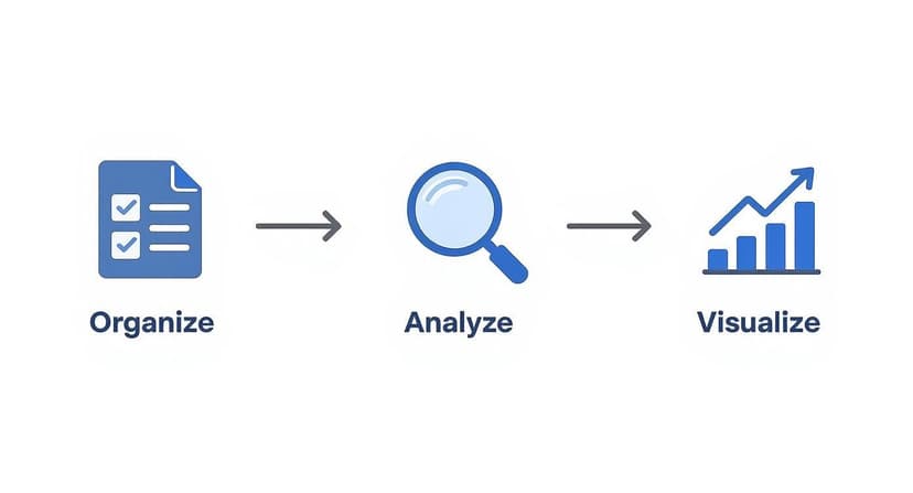
As you can see, everything starts with clean, organized data. You can't get to the good stuff—the analysis and visuals—without getting this first step right.
Why This Framework Matters
Taking a structured approach means your conclusions will be built on solid ground. Before you even think about complex analysis, it’s critical to have a firm grasp of how to track sales in the first place. That foundational knowledge ensures the data you’re collecting is actually relevant and accurate from day one.
Ultimately, the goal is to work smarter, not harder. To do that, we’ll focus on five key stages throughout this guide.
Here’s a quick overview of the workflow we’re going to build.
Your Sales Analysis Workflow at a Glance
| Stage | Key Excel Tools | Primary Goal |
|---|---|---|
| 1. Organize & Clean Data | Tables, Text to Columns, Flash Fill, Power Query | Create a clean, consistent, and structured dataset that's ready for analysis. |
| 2. Define Key Metrics (KPIs) | Formulas (SUM, AVERAGE, COUNTIF) | Decide which numbers truly matter for your business goals and calculate them. |
| 3. Analyze & Summarize | Pivot Tables, Slicers, AI-driven functions | Slice and dice your data to uncover patterns, trends, and outliers. |
| 4. Visualize Your Findings | Charts (Bar, Line, Pie), Conditional Formatting | Turn complex numbers into simple charts and graphs that tell a clear story. |
| 5. Interpret & Act | Dashboards, Forecasting tools | Translate the data into actionable strategies and smart business decisions. |
By mastering these stages, you’ll be able to turn your sales data from a simple historical record into a powerful tool for spotting future opportunities.
The Growing Role of AI in Sales Analysis
It's no secret that AI-driven insights are becoming a huge part of sales. In fact, 81% of sales teams now use AI tools to help develop their pipeline. What's the result? They’ve seen their cost per lead drop by as much as 65%.
On top of that, companies that actively measure their pipeline data are 10% more likely to see their sales increase year after year. It’s clear proof that a data-first approach delivers real, tangible results.
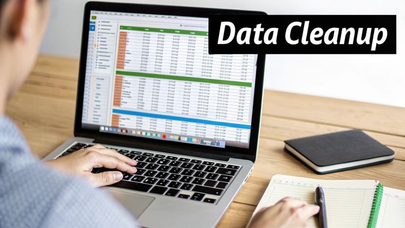
How to Prepare and Clean Your Sales Data in Excel
Before you can spot a single trend or build a meaningful chart, you have to get your hands dirty. Your sales data needs to be clean, consistent, and reliable. Trust me, trying to analyze a messy spreadsheet is like building a house on a shaky foundation—the whole thing will be flawed and you won't be able to trust your conclusions.
This is often the most time-consuming part of the whole process, but it's absolutely the most critical. We're talking about fixing all those little frustrating issues that can completely throw off your analysis: duplicate entries from a sloppy data import, blank cells where a sales total should be, or inconsistent names like "USA," "U.S.A.," and "United States" all pointing to the same country.
Fixing these problems one by one is a real headache. The good news is that Excel has some powerful built-in tools to speed things up, and modern AI add-ins can pretty much automate the entire chore.
Tackling Common Data Messes in Excel
Let's walk through how to handle the most common data quality problems you'll run into. For example, duplicate records can make it look like a product is flying off the shelves when it's really not, completely inflating your sales numbers.
Excel’s Remove Duplicates feature is your best friend here. Just highlight your data, head to the "Data" tab, and click it. Excel will scan and get rid of any rows that are exact copies. Simple.
But that's just the start. Inconsistent formatting is another huge one.
- Extra Spaces: The
TRIM()formula is a lifesaver. It strips out any annoying spaces before or after the text in a cell. So,TRIM(" Apple iPhone ")becomes"Apple iPhone". This guarantees your product names are uniform, which is essential for accurate grouping in a PivotTable. - Text Inconsistencies: Use the Find and Replace tool (Ctrl+H) for this. In a few clicks, you can replace every instance of "USA" and "U.S.A." with the standardized "United States."
- Empty Cells: Blanks are notorious for causing errors in your formulas. You can wrap calculations in an
IFERROR()formula to output a zero instead of an error, or just filter for the blanks and decide if you should delete the row or track down the missing info.
After you've pulled in your raw numbers, getting good at data parsing in Excel is a key skill for structuring and cleaning everything up efficiently.
Using AI for Faster and Smarter Data Cleaning in Excel
While those manual tricks work, they get old fast, especially when you're staring down a massive spreadsheet. This is where AI tools that plug right into Excel, like Elyx.AI, really change the game. Instead of trying to remember the right formula or clicking through menus, you can just tell the AI what you want in plain English.
Pro Tip: With an AI assistant, you can type natural language prompts like, "Standardize all country names in column D to their full names," or "Remove all leading and trailing spaces from the Product Name column." The AI just handles it for you.
This approach doesn't just save you a ton of time; it also catches things a human eye might miss. An AI tool can instantly spot outliers—like a single sale for $50,000 when most are around $500—and flag them for you to check out. To see more of these techniques in action, take a look at our guide on how to clean data in Excel.
Adopting this kind of automation is part of a bigger shift toward using technology to work smarter in sales. Think about it—the reason everyone uses a CRM is because it works. Companies using a CRM see sales jump by up to 29%, productivity by 34%, and forecast accuracy by 42%. Embracing AI for data prep is the same mindset: use smart tools to get better results, faster.
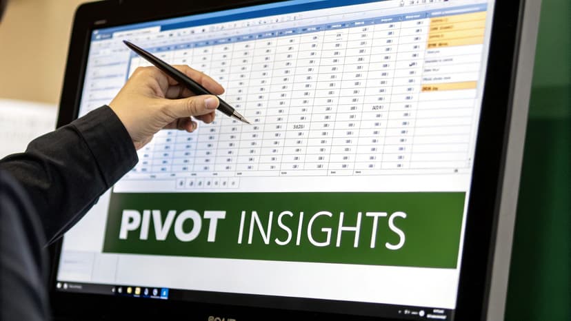
Analyzing Sales Data with Pivot Tables and AI in Excel
Alright, your data is clean and organized. Now for the fun part: turning all those numbers into actual business intelligence. This is where you stop being a data janitor and start becoming a data detective. In Excel, your number one tool for this job is, without a doubt, the Pivot Table.
Honestly, if you learn one thing in Excel for sales analysis, make it Pivot Tables. They are the fastest, most powerful way to slice, dice, and summarize thousands of rows of data into a format that makes immediate sense.
With a Pivot Table, you can dynamically rearrange—or "pivot"—your data on the fly. You can go from a massive, overwhelming spreadsheet to a clear summary of sales by region, a list of top-performing products, or a scorecard for your sales reps. It's all done with a few simple drag-and-drop actions.
Unlocking Your Data with Pivot Tables
Getting started is surprisingly simple. Just select your entire data set, head to the "Insert" tab, and click "PivotTable." Excel will pop open a new sheet with a PivotTable Fields pane, which is basically your command center.
This is where the real magic begins. Let's say your data has columns for Region, Product, Salesperson, and Sale Amount. You can answer some huge business questions in seconds:
- Which region brings in the most cash? Drag
Regionto the "Rows" box andSale Amountto the "Values" box. Boom. You’ve got a clean summary of sales totals for every region. - Who are my top performers? Just swap out
RegionforSalespersonin the "Rows" box. Now you have a sales leaderboard. - What's selling best where? Add
Productto the "Rows" box right underRegionto get a beautiful, nested breakdown.
For a more detailed walkthrough, we've put together a complete guide on creating Pivot Tables in Excel that covers all the nuts and bolts.
Advanced Pivot Table Techniques for Deeper Analysis
Once you get the hang of the basics, you can start digging even deeper. Calculated Fields are a total game-changer. They let you create brand-new metrics right inside your Pivot Table without messing with your original data. For instance, if you have Revenue and Cost, you can whip up a Profit Margin calculated field to see what’s truly profitable.
Another feature I love is Slicers. Think of them as user-friendly, visual filters. Instead of fiddling with dropdown menus, you get clean, clickable buttons for things like years, products, or regions. Slicers turn a static report into an interactive dashboard that even your non-Excel-savvy colleagues can use to explore the data.
A well-built Pivot Table can answer more questions in five minutes than you could in an hour of manual sorting. It’s the heart and soul of efficient sales analysis in Excel.
Going Beyond Pivot Tables with Essential Formulas
While Pivot Tables are fantastic for summarizing data, sometimes you just need to pluck a specific number out of your dataset. That's where formulas come in. A few key formulas can give you incredibly granular control.
The SUMIFS formula, for example, is one I use constantly. It lets you add up numbers that meet several conditions at once. Need to find the total sales for "Product X" in the "North Region" during "Q1"? SUMIFS will give you that single, precise number without needing to build a whole new report.
And you can't get by without VLOOKUP or its much-improved successor, XLOOKUP. These are your go-to tools for mashing data together from different sheets. If you have sales transactions in one table and customer details in another, you can use XLOOKUP to pull in customer names or locations, making your sales data that much richer.
Essential Excel Formulas for Sales Analysis
Here’s a quick reference guide I keep handy for the formulas that do the heavy lifting in sales analysis. They save me a ton of time.
| Formula | What It Does | Sales Analysis Example |
|---|---|---|
| SUMIFS | Sums values in a range that meet multiple criteria. | =SUMIFS(sales_column, region_column, "West", product_column, "Laptop") to get total laptop sales in the West region. |
| COUNTIFS | Counts cells that meet multiple criteria. | =COUNTIFS(salesperson_column, "John Doe", deal_size_column, ">5000") to count how many deals over $5,000 John Doe closed. |
| AVERAGEIFS | Calculates the average of values that meet multiple criteria. | =AVERAGEIFS(profit_column, month_column, "January", category_column, "Electronics") to find the average profit for electronics in January. |
| VLOOKUP/XLOOKUP | Finds and retrieves data from a specific column in a table. | =XLOOKUP(product_ID, product_table, product_price) to pull the price for a specific product ID into your sales log. |
Mastering these will let you answer highly specific questions that a Pivot Table might be too broad to handle.
Automating Analysis with AI in Excel
Knowing how to build these reports manually is a crucial skill, but let's be real—it can be tedious. This is where new AI tools like Elyx.AI are changing the game within Excel.
Instead of manually dragging and dropping fields, you can just type a prompt in plain English, like, "Create a Pivot Table showing total sales by salesperson and region."
The AI takes your request and builds the report for you instantly. It's a massive time-saver and makes complex analysis much more approachable, letting you spend less time clicking and more time thinking about what the data actually means.
Telling Your Data Story with Compelling Charts in Excel
A Pivot Table gives you the hard numbers, but let's be honest—rows and columns of data don't exactly get people excited. If you want to grab your team's attention and actually drive decisions, you need to tell a story. That’s where charts in Excel come in. They turn a dense spreadsheet into a clear, visual narrative that anyone can grasp in seconds.
A sharp, well-made chart is the difference between a report that gets a quick glance and one that kicks off a meaningful conversation. It’s what transforms your raw analysis into real business intelligence.

Choosing the Right Chart for Your Sales Data
The secret to a great visual is picking the right chart for the job. If you use the wrong one, you risk confusing your audience or, even worse, making the data misleading. You wouldn't use a screwdriver to hammer a nail, and the same logic applies here.
Here are the most common charts I use in sales analysis and what they're best for:
- Line Chart: This is your go-to for showing trends over time. Nothing beats a line chart for tracking things like monthly revenue, quarterly growth, or the week-by-week impact of a new marketing campaign.
- Bar Chart (or Column Chart): Perfect for making comparisons. Want to see which sales region is leading? Or which products are your best-sellers? A bar chart makes the answer obvious at a glance.
- Pie Chart: Use this one carefully. A pie chart is really only good for one thing: showing parts of a whole, like the percentage of sales coming from each product category. If you have more than a few slices, it gets messy fast.
- Scatter Plot: This one is a bit more advanced, but it's great for spotting relationships between two different things. For example, you could plot your ad spend against sales to see if more spending actually leads to more revenue.
Choosing the right visual from the start makes your key message pop.
Practical Design Tips for Clear and Professional Visuals
A chart can be the right type but still fail if it's poorly designed. A cluttered, confusing visual will make your hard work look unprofessional. The goal here is clarity, not a piece of modern art.
Stick to these simple rules to keep your charts clean and effective:
- Simplify Your Color Palette: Use your company’s brand colors or just a couple of colors that look good together. Resist the urge to make every bar a different color—it’s just distracting.
- Use Clear and Concise Labels: Make sure your axes are labeled and give your chart a title that tells the reader exactly what they're looking at. "Q3 Sales Performance by Region" is a whole lot better than a generic title like "Sales."
- Remove Unnecessary Clutter: Ditch the extra gridlines, borders, and shadows. The simpler the chart, the more the data stands out.
Your goal is to communicate, not decorate. A clean, simple chart that gets the point across will always beat a flashy, confusing one.
Accelerating Visualization with AI in Excel
Building charts in Excel is easy enough, but it gets tedious when you have to do it over and over. This is where modern AI tools built right into Excel, like Elyx.AI, can be a game-changer for your workflow.
Instead of navigating menus, you can just type what you want in plain English.
Think about typing: "Create a line chart showing monthly revenue for the last year."
The AI instantly understands and builds the chart for you, correctly formatted and ready to go. This doesn't just save a ton of time; it also helps people who aren't Excel wizards create professional-looking visuals without the learning curve. It can even suggest the best chart type for your data automatically.
For bigger tasks, you can prompt AI to build an entire dashboard. A request like, “Generate a dashboard with charts for sales by region, top 5 products, and monthly revenue trends” can create a full report in seconds. What used to be a half-day project can now be done in minutes, leaving you more time to actually think about what the data is telling you.
How to Forecast Future Sales and Identify Trends in Excel
Looking at what already happened is useful, but the real magic happens when you use that data to make educated guesses about the future. That’s sales forecasting in a nutshell: shifting from simply reporting on the past to predicting what's coming next. It's how you get ahead of demand, manage your inventory better, and set sales targets that are ambitious but actually achievable.
And you don’t need some fancy, expensive software to get started. Excel has a surprisingly powerful set of tools built right in. The goal here is to start making proactive decisions instead of just reacting to whatever the market throws at you.
Simple Forecasting with Moving Averages
One of the easiest ways to dip your toes into forecasting is with a moving average. This technique is great because it smooths out the random spikes and dips in your sales data, letting you see the real trend underneath.
It works by averaging out sales over a set number of recent periods. For instance, a three-month moving average simply takes the average of the last three months of sales data. Is revenue generally heading up, down, or staying flat? A moving average cuts through the monthly noise to give you a quick, clean answer.
But it has its limits. A simple moving average treats all data points as equally important and, more critically, it doesn't understand seasonality. If your business always has a huge spike in sales around the holidays, a moving average won't see it coming. For that, you need a smarter tool.
Advanced Projections with FORECAST.ETS
When your sales follow a predictable rhythm—like higher sales every summer—Excel’s FORECAST.ETS function is your best friend. This function runs on an algorithm called Exponential Triple Smoothing. It sounds intimidating, but it's designed to automatically handle three key things for you:
- The underlying trend: It figures out the general upward or downward slope of your sales over time.
- Seasonality: It finds those repeating cycles, like a big jump in Q4 every single year.
- Random noise: It smooths out the one-off, unpredictable variations.
Imagine you have monthly sales figures for the past three years. To predict what the next quarter will look like, you'd use FORECAST.ETS and point it to your target date, your past sales numbers, and the timeline. Excel does all the heavy lifting and gives you a forecast that actually respects the natural ebb and flow of your business. It's a game-changer for any company with seasonal sales.
Key Takeaway: A moving average is a solid starting point for seeing a basic trend. But for a far more accurate picture,
FORECAST.ETSis the way to go because it automatically accounts for the seasonal patterns in your sales history.
The Role of AI in Modern Sales Forecasting
The methods we've covered are powerful, but they mostly look at one thing: your past sales. Modern forecasting, especially when powered by AI, can dig much, much deeper. It can spot complex patterns and weigh external factors that a simple Excel formula would never catch. For a closer look at these newer approaches, check out our post on different business forecasting methods.
AI tools that plug into Excel, like Elyx.AI, can sift through your historical data and find correlations you probably wouldn't think to look for. It might discover, for example, that a marketing campaign on a certain social media platform consistently causes a sales lift two weeks later.
This is all part of a bigger shift toward sales intelligence. The global market for these tools was valued at around USD 4.40 billion and is projected to reach USD 10.25 billion by 2032. That growth is being driven by AI that enables things like dynamic forecasting and automated lead scoring. You can read the full research on the sales intelligence market to see where things are headed.
By bringing AI into the mix, you stop asking "What will our sales be?" and start asking "What will our sales be if we boost our ad spend by 20%?" It turns forecasting from a passive report into an active, strategic tool that can give you a real competitive edge.
Got Questions? We've Got Answers.
As you get your hands dirty with sales data, you're bound to run into a few questions. Let's tackle some of the most common ones that come up.
What Sales Metrics Actually Matter?
It's easy to get lost in a sea of numbers. While every business is a little different, there are a handful of metrics that almost always tell a crucial part of the story. If you're just starting out, focus on these.
Here are the heavy hitters:
- Sales Revenue: This is the big one—the total cash you've brought in from sales. It’s your baseline for performance.
- Customer Lifetime Value (CLV): Think of this as the total worth of a customer over the entire time they do business with you. It’s a powerful number for long-term planning.
- Customer Acquisition Cost (CAC): How much does it cost, on average, to land a new customer? You'll want to compare this directly to your CLV. If your CAC is higher than your CLV, you have a problem.
- Sales Cycle Length: How long does it take your team to close a deal, from first contact to signed contract? A shorter cycle usually points to an efficient sales process.
- Lead Conversion Rate: What percentage of your leads actually turn into paying customers? This metric tells you how effective your sales funnel really is.
Start with these five, and you'll have a solid foundation. From there, you can add others that are specific to your industry or current business goals.
I'm Not a Tech Whiz. Can I Still Use AI in Excel?
Absolutely. You don't need a degree in computer science to make AI work for you in Excel. Modern tools are built for regular business folks, not coders.
The best part is that you can just talk to them in plain English. Instead of fumbling with formulas, you can type a simple request like, "show me a breakdown of sales by region" or "make a bar chart of monthly revenue." The AI does the grunt work and builds the Pivot Table or chart for you.
It's a game-changer. This levels the playing field, so anyone on the team can pull powerful insights from data without needing to be an Excel guru. You get to focus on what the numbers mean, not on how to crunch them.
How Often Should I Be Doing This Analysis?
The right rhythm really depends on the speed of your business. If you're in a fast-paced field like e-commerce, you'll probably want to do a weekly review. This lets you react quickly to what's happening with marketing campaigns or pricing.
For most other businesses, a deep dive on a monthly basis is perfect. It’s the ideal cadence for spotting trends and seeing if you're on track to hit your targets. Beyond that, make sure to do quarterly and annual reviews to inform your big-picture strategy and build smarter forecasts for the future.
What's the Single Biggest Mistake People Make?
Hands down, the most common pitfall is jumping into analysis with messy data. If your spreadsheet is a minefield of duplicate entries, typos, weird formatting, and blank cells, your results will be completely useless.
It doesn't matter how fancy your charts or formulas are. If the source data is flawed, you're just analyzing garbage. This is the classic "garbage in, garbage out" scenario. Always, always take the time to clean up your data first. It’s the most critical step for getting insights you can actually trust.
Ready to stop wrestling with spreadsheets and let AI do the heavy lifting? With Elyx.AI, you can clean your data, generate pivot tables, and create insightful charts in seconds—all by using simple, natural language prompts directly in Excel. Transform your sales analysis workflow and start making smarter decisions today. Explore what you can achieve at https://getelyxai.com.
Reading Excel tutorials to save time?
What if an AI did the work for you?
Describe what you need, Elyx executes it in Excel.
Sign up