Top 8 Descriptive Statistics Examples for Excel Mastery

Buried in a sea of numbers? The first step to making sense of any dataset is understanding its fundamental characteristics. This is where descriptive statistics shine. Far from being just academic terms, concepts like mean, median, and standard deviation are your essential tools for summarizing data and uncovering the stories hidden within your Excel sheets. They transform raw data from an overwhelming spreadsheet into a clear, concise summary that highlights key trends, central values, and the overall shape of your information.
This guide moves beyond theory to provide practical, real-world descriptive statistics examples you can apply immediately in Excel. We'll walk through 8 crucial measures, showing you not just what they are, but how to calculate and interpret them in a business context. You’ll learn how to quickly find the average sale, identify the most common customer complaint, or measure the volatility of your stock prices, all within the familiar environment of a spreadsheet.
Moreover, we’ll demonstrate how you can leverage AI tools directly within Excel to automate these calculations. This transforms complex analysis into a simple, conversational task, empowering you to make smarter, data-driven decisions instantly. Get ready to turn your raw numbers into actionable insights.
Spending too much time on Excel?
Elyx AI generates your formulas and automates your tasks in seconds.
Sign up →1. Mean (Arithmetic Average)
The mean, or arithmetic average, is the cornerstone of descriptive statistics. It represents the central tendency of a dataset by providing a single value that summarizes the entire set. To calculate it, you simply sum all the numerical values and then divide by the total count of those values. This calculation gives you a "typical" value, making it one of the most intuitive and widely used descriptive statistics examples.

Strategic Analysis: Using Mean in Business
In a business context, the mean provides a quick and powerful performance benchmark. For instance, a marketing team can calculate the average click-through rate (CTR) across multiple ad campaigns to establish a baseline. An operations manager might track the mean response time for customer service inquiries to gauge team efficiency.
Key Insight: The mean is most powerful when used to compare performance over time or against a set target. A single mean value has limited context, but comparing this month's average sales per employee to last month's reveals trends and informs strategy.
Practical Application & Tips for Excel
Excel makes calculating the mean effortless with the =AVERAGE() function. If you have a column of sales data (e.g., A2:A100), you can find the mean instantly by entering =AVERAGE(A2:A100) into a cell. For AI-powered analysis in Excel, you can use an integrated AI assistant by simply asking, "What is the average of the sales column?"
Here are some actionable tips for using the mean effectively:
- Check for Outliers: A single extremely high or low value can significantly skew the mean. Use Excel's conditional formatting or create a quick chart to visually inspect your data and identify these anomalies.
- Pair with the Median: When your data is skewed (not symmetrically distributed), the median often provides a more accurate picture of the central point. Calculating both offers a more complete story.
- Provide Context: Always report the sample size (n) alongside the mean. An average of 9.5 from 1,000 customer ratings is more reliable than an average of 9.5 from just four ratings.
2. Median (Middle Value)
The median represents the exact middle point of a dataset after it has been arranged in ascending order. Unlike the mean, which can be easily distorted by unusually high or low values, the median provides a truer measure of central tendency for skewed data. If a dataset has an even number of values, the median is calculated by averaging the two middle numbers. This resistance to outliers makes it one of the most reliable descriptive statistics examples for real-world analysis.

Strategic Analysis: Using Median in Business
In business, the median is crucial for understanding data where extreme values are common, such as income, real estate prices, or employee salaries. For instance, a human resources department analyzing company salaries would use the median to find the typical compensation, as a few high executive salaries would artificially inflate the mean. Similarly, a real estate firm uses the median home price to give potential buyers a realistic expectation of the market, ignoring the skew from multi-million dollar mansions.
Key Insight: The median reveals the "typical" experience by ignoring the noise from outliers. When the median and mean are significantly different in your Excel sheet, it signals a skewed distribution, prompting a deeper investigation into what is driving the disparity.
Practical Application & Tips for Excel
Excel simplifies finding the median with the =MEDIAN() function. For a list of employee salaries in cells B2 through B150, you would enter =MEDIAN(B2:B150) to find the middle salary. Using an AI tool in Excel, you can simply ask, "What is the median of the salaries in column B?" to get an instant answer without writing a formula.
Here are some actionable tips for using the median effectively:
- Use for Skewed Data: Always prefer the median over the mean when analyzing datasets with potential outliers, such as income, wealth, or housing prices.
- Compare with the Mean: Calculate both the median and the mean. A large gap between them is a clear indicator that your data is skewed and warrants further analysis.
- Contextualize Your Reporting: When reporting on financial data like average household income, using the median provides a more accurate and relatable figure for the general public than a skewed mean.
3. Mode (Most Frequent Value)
The mode is the value that appears most frequently in a dataset. Unlike the mean or median, which only work with numerical data, the mode is versatile and can be used with categorical (nominal) data, making it a unique measure of central tendency. A dataset can have one mode (unimodal), two (bimodal), multiple modes (multimodal), or no mode at all if every value occurs with the same frequency. It is one of the most practical descriptive statistics examples for identifying popular choices or common occurrences.

Strategic Analysis: Using Mode in Business
In business, the mode directly answers the question, "What is the most popular?" For a retail business, knowing the modal shoe size is crucial for inventory management. A restaurant owner uses the mode to identify the most frequently ordered dish, influencing menu design and ingredient purchasing. This statistic helps pinpoint customer preferences and operational patterns with absolute clarity. To see a real-world application of identifying the most frequent outcome, you can explore common patterns like the most common football scores, which helps in predictive analytics.
Key Insight: The mode is the go-to metric for making decisions based on popularity and frequency. It provides direct, actionable intelligence for inventory, marketing, and product development by highlighting what customers choose most often.
Practical Application & Tips for Excel
In Excel, you can find the mode using the =MODE.SNGL() function for a single mode or =MODE.MULT() for datasets with multiple modes. For categorical data, a PivotTable is the best tool to create a frequency table that reveals the most common entry. With an AI assistant, you can simply ask, "What is the most frequent product category in column C?" to get an instant answer.
Here are some actionable tips for using the mode effectively:
- Ideal for Categorical Data: Use the mode for non-numerical data like product names, customer feedback categories, or color preferences, where calculating a mean or median is impossible.
- Create Frequency Tables: Visualizing your data in a frequency table or bar chart is the fastest way to identify the mode and understand the distribution of all categories.
- Acknowledge Multiple Modes: If your data is bimodal or multimodal, it could indicate distinct customer segments. For example, if both small and extra-large t-shirts are popular, you might be serving two different customer bases.
- Combine with Other Metrics: Use the mode alongside other statistics. Knowing the most common customer rating (mode) is useful, but knowing the average rating (mean) provides a more complete picture of overall satisfaction.
4. Standard Deviation (Measure of Spread)
Standard deviation measures the dispersion or spread of data points around the mean. A low standard deviation indicates that values are clustered close to the average, suggesting consistency, while a high standard deviation means the values are spread out over a wider range. It's calculated as the square root of the variance, making it one of the most practical descriptive statistics examples because it's expressed in the same units as the original data.
Strategic Analysis: Using Standard Deviation in Business
In business, standard deviation is critical for risk assessment and quality control. A financial analyst uses it to measure stock price volatility; a higher standard deviation signals a riskier, more unpredictable investment. In manufacturing, a low standard deviation in product dimensions is essential for quality control, indicating that the production process is precise and consistent.
Key Insight: Standard deviation gives the mean its context. Knowing the average customer wait time is 10 minutes is useful, but knowing the standard deviation is 2 minutes versus 15 minutes reveals whether the customer experience is consistent or wildly unpredictable.
Practical Application & Tips for Excel
Excel provides simple functions for this calculation: =STDEV.P() for an entire population or =STDEV.S() for a sample of data. For a sample of customer wait times in cells B2:B200, you would use =STDEV.S(B2:B200). With AI tools, you can simply ask, "Calculate the standard deviation for the wait time data," to get an instant result and interpretation.
Here are some actionable tips for using standard deviation effectively:
- Pair with the Mean: Always report the standard deviation alongside the mean. This combination provides a much fuller picture of the data's distribution.
- Apply the Empirical Rule: For data that is normally distributed (bell-shaped curve), roughly 68% of data falls within one standard deviation of the mean, 95% within two, and 99.7% within three. This is a powerful shortcut for understanding data spread.
- Establish Control Limits: In operations and manufacturing, use the mean plus or minus two or three standard deviations to set upper and lower control limits in Excel. Any data point falling outside this range signals a potential issue that needs investigation.
5. Range (Simplest Measure of Variability)
The range is the most straightforward measure of variability in a dataset. It quantifies the spread of your data by calculating the difference between the maximum and minimum values. While it relies only on these two extreme points, its simplicity makes it an excellent starting point for understanding data dispersion, especially for those without a deep statistical background. This accessibility solidifies its place among essential descriptive statistics examples.
Strategic Analysis: Using Range in Business
In business operations, the range offers a quick assessment of consistency and extremes. A quality control manager, for instance, can monitor the range of product weights to quickly spot manufacturing inconsistencies. A finance department might analyze the range of monthly expenses to understand spending volatility and identify potential areas for budget control.
Key Insight: The range is highly effective for identifying potential problems or opportunities at a glance. A wide range in customer satisfaction scores (e.g., from 1 to 10) signals a highly inconsistent customer experience that requires immediate investigation, even before calculating more complex metrics.
Practical Application & Tips for Excel
Calculating the range in Excel is a simple two-step process using the =MAX() and =MIN() functions. For a list of customer ages in cells C2:C100, you would use the formula =MAX(C2:C100) - MIN(C2:C100) to find the range instantly. To streamline this and prevent data entry errors, you can use built-in features to control the data's scope. Find out how you can set these boundaries with these Excel data validation examples.
Here are some actionable tips for using the range effectively:
- Be Wary of Outliers: Since the range only uses the highest and lowest values, it is extremely sensitive to outliers. A single data entry error can drastically inflate the range, giving a misleading picture of variability.
- Report Min and Max: Don't just report the range value itself. Stating that the salary range is $115,000 is less informative than saying salaries run from $35,000 to $150,000.
- Use for Initial Checks: The range is perfect for a quick, initial check of your data's spread. Follow it up with more robust measures like the interquartile range (IQR) or standard deviation for a deeper analysis.
6. Frequency Distribution (Data Organization Method)
A frequency distribution is a fundamental method for organizing and summarizing raw data. It groups data into distinct categories or intervals (called bins) and shows how many observations fall into each one. This tabular or graphical summary transforms a chaotic list of numbers into an understandable pattern, revealing the underlying shape and spread of the dataset. It is one of the most powerful initial steps in data analysis and a core concept among descriptive statistics examples.
Strategic Analysis: Using Frequency Distribution in Business
In business, frequency distributions are crucial for segmenting customers, analyzing performance, and identifying operational patterns. For example, a retail manager can create a frequency distribution of customer purchase values (e.g., $0-50, $51-100, $101-150) to identify the most common transaction sizes. A product manager might analyze user engagement by grouping daily screen time into bins (e.g., 0-15 mins, 16-30 mins), revealing key usage habits.
Key Insight: Frequency distribution exposes the concentration and dispersion of data points. It quickly answers questions like "What are our most popular price points?" or "Which age group is our primary audience?" This moves analysis beyond simple averages to understand the full picture.
Practical Application & Tips for Excel
Excel’s FREQUENCY function or its Analysis ToolPak for histograms can create these distributions automatically. With AI tools, you can simply highlight your data and ask, "Create a frequency distribution of customer ages with an interval of 10 years." This initial grouping is a key part of the data exploration process. To dig deeper, you can learn more about data profiling methods here.
Here are some actionable tips for using frequency distributions effectively:
- Choose Appropriate Bin Sizes: The number of intervals is critical. Too few can hide important details, while too many can make the pattern noisy. Experiment in Excel to see what best reveals the underlying story of your data.
- Use Both Absolute and Relative Frequencies: Show both the raw count (absolute) and the percentage of the total (relative) for each category. Percentages make it easier to compare distributions across datasets of different sizes.
- Visualize with Histograms: A histogram (a type of bar chart) is the standard visual representation of a frequency distribution. Excel's chart tools can generate these quickly, making it easy to spot the distribution's shape, center, and spread at a glance.
7. Percentiles and Quartiles (Position-Based Measures)
Percentiles and quartiles are measures of position that describe how a value ranks relative to others in a dataset. A percentile indicates the value below which a specific percentage of observations fall. Quartiles are special percentiles that divide the data into four equal parts: the first quartile (Q1) is the 25th percentile, the second (Q2) is the 50th percentile (which is also the median), and the third (Q3) is the 75th percentile. These are powerful descriptive statistics examples because they are resistant to outliers and reveal the spread and distribution of data.
This concept map illustrates the relationship between the key quartiles, showing how they divide an ordered dataset into distinct segments.
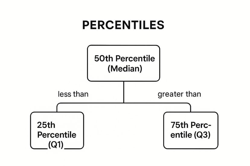
The visualization shows that Q1, the median, and Q3 are not just random points but specific positional markers that each represent a 25% cumulative portion of the dataset.
Strategic Analysis: Using Percentiles in Business
In business, percentiles are invaluable for benchmarking and setting performance standards. A sales manager can use the 80th percentile of sales performance to identify top performers and set aspirational targets. In operations, a logistics company might track the 95th percentile of delivery times to understand its worst-case performance, which is crucial for managing customer expectations and service-level agreements (SLAs).
Key Insight: Percentiles provide context about relative standing. Knowing a product's average rating is useful, but knowing it's in the 90th percentile of all products in its category is a powerful marketing message and a clear indicator of market leadership.
Practical Application & Tips for Excel
Excel provides dedicated functions to calculate these measures: =PERCENTILE.INC(A2:A100, k) where 'k' is the percentile you want (e.g., 0.25 for Q1) and =QUARTILE.INC(A2:A100, q) where 'q' is the quartile (1, 2, or 3). With AI tools, you can simply ask, "What are the quartiles for the customer satisfaction scores in column B?"
Here are some actionable tips for using percentiles and quartiles:
- Visualize with Box Plots: A box plot is the perfect visual companion for quartiles. Excel can generate these charts to display Q1, the median (Q2), Q3, and the interquartile range (IQR), providing an instant snapshot of the data's central tendency, spread, and skewness.
- Identify Outliers with IQR: The interquartile range (IQR = Q3 – Q1) is a robust measure of spread. A common method to flag potential outliers is to identify any data points that fall below Q1 – 1.5 * IQR or above Q3 + 1.5 * IQR.
- Use for Skewed Data: When data is not symmetrically distributed, the mean and standard deviation can be misleading. Percentiles provide a more accurate and intuitive description of the distribution, making them ideal for metrics like income or website load times.
8. Correlation Coefficient (Relationship Measure)
The correlation coefficient is a powerful metric that quantifies the strength and direction of a linear relationship between two numerical variables. It ranges from -1 to +1, where -1 indicates a perfect negative relationship, +1 indicates a perfect positive relationship, and 0 suggests no linear association. By calculating this value, you can understand how two variables move in relation to each other, making it a fundamental tool in exploratory data analysis and one of the most insightful descriptive statistics examples.
Strategic Analysis: Using Correlation in Business
In business, correlation analysis helps uncover hidden relationships that can drive strategic decisions. A marketing team might find a strong positive correlation (e.g., r=0.75) between social media engagement and website traffic, justifying increased investment in content. In finance, portfolio managers use correlation to diversify assets; a negative correlation between two stocks means one tends to rise when the other falls, reducing overall portfolio risk. For a practical application of correlation, explore how a stock correlation calculator can boost your portfolio analysis.
Key Insight: Correlation does not imply causation. A strong positive correlation between ice cream sales and shark attacks doesn't mean one causes the other; a third variable (summer heat) is likely influencing both. This highlights the importance of critical thinking alongside statistical calculation.
Practical Application & Tips for Excel
Excel’s =CORREL() function makes this calculation straightforward. To find the relationship between advertising spend (A2:A100) and sales revenue (B2:B100), you would use the formula =CORREL(A2:A100, B2:B100). For AI-driven insights, you can ask an integrated tool, "Show me the correlation between advertising spend and sales revenue and create a scatter plot."
Here are actionable tips for using the correlation coefficient:
- Visualize First: Always create a scatter plot in Excel before calculating correlation. It helps you visually confirm if a linear relationship exists and spot potential outliers.
- Beware of Non-Linearity: The standard correlation coefficient only measures linear relationships. Two variables could have a strong curved relationship that the coefficient would fail to capture.
- Context is Crucial: A correlation of 0.40 might be significant in social sciences but weak in physics. The interpretation depends entirely on the domain and context.
- Explore Further: Use correlation as a starting point for deeper investigation. If two variables are correlated, it might be a clue for more advanced trend analysis. You can discover more by reading about trend analysis methods to uncover the full story behind your data.
Descriptive Statistics Methods Comparison
| Measure / Method | Implementation Complexity 🔄 | Resource Requirements ⚡ | Expected Outcomes 📊 | Ideal Use Cases 💡 | Key Advantages ⭐ |
|---|---|---|---|---|---|
| Mean (Arithmetic Average) | Low (simple calculation) | Low (basic arithmetic) | Central value representing average | Normally distributed data without outliers | Uses all data points; widely accepted |
| Median (Middle Value) | Moderate (requires sorting) | Low to moderate | Middle value, robust to outliers | Skewed data; ordinal/interval data with outliers | Resistant to extreme values |
| Mode (Most Frequent Value) | Low (frequency count) | Low | Most frequent value(s) | Categorical/nominal data; identifying popular items | Applicable to all data types |
| Standard Deviation (Spread) | High (complex formula) | Moderate (all data needed) | Quantifies data variability | Assessing data spread, quality control, risk | Crucial for variability and hypothesis testing |
| Range (Simplest Variability) | Very low (subtract max-min) | Very low | Quick estimate of data spread | Initial data exploration; small datasets | Extremely easy and fast |
| Frequency Distribution | Moderate (grouping and counting) | Moderate (data organization) | Pattern and distribution shape | Large datasets; preparing data for visualization | Reveals data patterns and modes |
| Percentiles and Quartiles | Moderate (requires sorting) | Moderate | Position-based data division points | Skewed data; outlier detection; comparative analysis | Robust to outliers; detailed insights |
| Correlation Coefficient | Moderate to high (statistical calc) | Moderate | Strength and direction of relation | Exploring linear relationships between variables | Standardized relational measure |
Supercharge Your Statistical Analysis with AI in Excel
Throughout this guide, we've explored a wide range of descriptive statistics examples, moving from foundational concepts to practical applications across various industries. We've seen how measures of central tendency like the mean, median, and mode pinpoint the heart of a dataset. We’ve also delved into measures of variability, such as standard deviation and range, which reveal the spread and consistency of your data.
From organizing raw numbers with frequency distributions to understanding data positioning with percentiles and quartiles, each example serves a distinct purpose. The goal isn't just to calculate these figures in Excel but to interpret them, turning abstract numbers into a compelling narrative about business performance, market trends, or operational efficiency. Mastering these techniques is the first and most critical step in any data-driven decision-making process.
From Manual Calculation to Intelligent Analysis
The true power of descriptive statistics lies in their ability to provide a quick, digestible snapshot of complex information. However, the traditional process in Excel, while powerful, can be manual and time-consuming. You have to remember specific formulas, correctly select data ranges, and then piece together the interpretations yourself. This workflow can slow down your analysis and create a barrier for those who aren't Excel formula experts.
This is precisely where AI integration transforms the game. Imagine being able to bypass the syntax and communicate your analytical needs in plain English. Instead of typing =AVERAGE(B2:B101), you could simply ask your spreadsheet, "What is the average sales figure for Q3?" This shift from manual command to conversational query is revolutionizing how professionals interact with their data, making sophisticated analysis accessible to everyone.
Key Takeaways and Actionable Next Steps
To truly leverage the power of descriptive statistics in Excel, it's essential to move beyond rote calculation and embrace strategic application.
Here are your actionable next steps:
- Revisit Your Own Data: Take a dataset you work with regularly in Excel, whether it's sales figures, website traffic, or project timelines. Apply the measures we've discussed, such as mean, median, standard deviation, and range. Don't just find the numbers; ask what they mean for your business goals.
- Combine, Don't Isolate: The most powerful insights come from using multiple descriptive statistics together. A high average (mean) might look great, but if the standard deviation is also massive, it points to instability and risk. Always look at the complete picture.
- Embrace AI for Speed and Clarity: Start integrating AI tools into your Excel workflow. Use them to automate the repetitive calculations of descriptive statistics. This frees up your mental energy to focus on the higher-level strategic questions: "Why is the data shaped this way?" and "What should we do about it?"
By consistently applying these principles, you will transform from someone who simply reports numbers into a strategic partner who uncovers the stories hidden within the data. These foundational descriptive statistics examples are your launchpad for building a more insightful, efficient, and impactful analytical workflow.
Ready to stop wrestling with formulas and start having a conversation with your data? Elyx.AI integrates directly into Excel, allowing you to perform complex descriptive analysis using simple, natural language. Get instant calculations, summaries, and visualizations without ever leaving your spreadsheet by visiting Elyx.AI and supercharge your productivity today.
Reading Excel tutorials to save time?
What if an AI did the work for you?
Describe what you need, Elyx executes it in Excel.
Sign up