10 Dashboard Design Best Practices to Build Clear, Engaging Excel Dashboards

In today's data-driven environment, a well-crafted Excel dashboard is no longer a luxury; it's a vital tool for making rapid, intelligent decisions. Many professionals, from financial analysts to project managers, find themselves wrestling with cluttered spreadsheets, struggling to distill raw data into a narrative that drives action. The line between a dashboard that gathers digital dust and one that becomes an essential part of daily operations is drawn by design. A powerful dashboard isn't about cramming in every possible metric; it’s about presenting the right information with absolute clarity.
This is where effective dashboard design best practices come into play. A great design transforms a complex dataset into a clear, intuitive, and interactive story. It guides the user's eye to the most critical insights, enabling them to understand performance at a glance and drill down for deeper analysis without feeling overwhelmed. This approach saves time, reduces cognitive load, and empowers teams to move from simply viewing data to making strategic, data-backed decisions.
This guide provides a comprehensive framework with 10 actionable best practices for creating exceptional dashboards directly within Excel. We'll move beyond generic advice and focus on specific techniques, from establishing a clear information hierarchy and selecting the perfect chart for your data to ensuring accessibility and performance. We will also explore how you can leverage AI tools, such as Elyx.AI, to automate complex tasks and accelerate your workflow. By the end, you will have a practical roadmap to build dashboards that not only look professional but actively guide your team toward measurable business outcomes.
Spending too much time on Excel?
Elyx AI generates your formulas and automates your tasks in seconds.
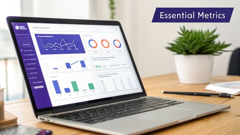
Sign up →1. Clarity and Simplicity – Focus on Essential Metrics
The most effective dashboard design best practices begin with one foundational principle: clarity. An effective dashboard is not a data dump; it's a focused narrative that answers specific business questions at a glance. The goal is to minimize cognitive load, the mental effort required to process information, by presenting only the most critical metrics. By removing visual clutter and non-essential data points, you empower users to absorb key insights quickly and make faster, more informed decisions.
This approach, popularized by data visualization pioneers like Edward Tufte and Stephen Few, directly opposes the "more is more" philosophy. Instead of overwhelming users with every available metric, a clear dashboard serves a specific purpose for a specific audience. For example, a Salesforce dashboard for a sales manager might only show pipeline value, conversion rate by stage, and new leads this month. Anything else is noise.
Actionable Tips for Implementation
- Interview Stakeholders: Before building, ask users, "What three decisions do you need to make with this data?" This focuses the dashboard on actions, not just information.
- Separate Tactical from Strategic: Create distinct dashboards. A tactical dashboard might show daily support tickets, while a strategic one displays quarterly customer satisfaction trends. This ensures each view is relevant to its specific timeframe and purpose.
- Use Drill-Downs for Detail: Offer a clean, high-level view by default. Allow users who need more granular information to click on a chart or metric to "drill down" into the underlying data, rather than cluttering the main screen.
- Leverage AI for Data Prep: Before visualization, use AI tools to clean and summarize your dataset. This is a crucial step for achieving simplicity. With powerful AI-driven data analysis, you can automatically identify and aggregate the most relevant metrics, ensuring your dashboard is built on a foundation of clarity from the start.
2. Hierarchical Information Architecture – Progressive Disclosure
Effective dashboard design best practices rely on guiding the user's attention, not overwhelming it. This is where hierarchical information architecture, often implemented through a technique called progressive disclosure, becomes essential. Instead of displaying every piece of data at once, this approach presents a high-level summary first. Users can then choose to dive into more detailed information as needed, creating an intuitive and uncluttered experience that supports exploration without causing confusion.
Pioneered by user experience experts like Don Norman and information visualization researcher Ben Shneiderman, this principle follows the mantra: "Overview first, zoom and filter, then details-on-demand." It acknowledges that different users have different needs. An executive might only need the top-line revenue summary, while an analyst needs to investigate the specific sales transactions driving that number. A well-designed hierarchy serves both audiences from a single, clean interface.
Actionable Tips for Implementation
- Follow the 80/20 Rule: Design your main dashboard view for the 80% of users who only need 20% of the information (the key summaries). The remaining granular data should be accessible via drill-downs.
- Design for Workflows, Not Data Structures: Organize your information hierarchy based on how users actually think and make decisions, not just how the database is structured. Interview stakeholders to map their analytical journey.
- Use Breadcrumbs for Navigation: As users drill deeper into data, provide clear navigational cues, like breadcrumbs (e.g., Sales > North America > Q4), so they always know where they are and how to get back.
- Automate Hierarchical Grouping: Before building, organize your data into logical groups. For Excel users, this can be time-consuming. However, AI-powered tools like Elyx.AI can automatically analyze your dataset and suggest logical hierarchies, streamlining the process of creating pivot tables and drill-down-ready charts.
3. Consistent Color Palette and Visual Design Language
Effective dashboards communicate through a unified visual language, and color is its most powerful vocabulary. A consistent color palette and design system transform a collection of charts into a cohesive, professional, and intuitive experience. This practice involves using color strategically to convey meaning, such as green for positive trends and red for alerts, rather than for mere decoration. By standardizing typography, spacing, and component styles, you reduce the user's cognitive load, allowing them to interpret data faster and with greater confidence.

This principle is a cornerstone of modern design systems like Google's Material Design and Apple's Human Interface Guidelines. The goal is to create predictability; users shouldn't have to relearn what a color or style means on each new screen. For instance, a financial services dashboard consistently using red for losses and green for gains makes performance indicators instantly recognizable. Similarly, a healthcare dashboard might use specific colors to denote patient status, ensuring critical information is understood without ambiguity.
Actionable Tips for Implementation
- Establish a Color Meaning Guide: Before building, define what each color represents (e.g., blue for revenue, orange for expenses). Document this guide and apply it consistently across all dashboards to create a shared visual language for your organization.
- Prioritize Accessibility: Use tools like Adobe Color or Coolors to build accessible palettes. Test your color combinations with color-blindness simulators to ensure your dashboard is usable for everyone. Avoid relying solely on red-green combinations to convey meaning.
- Leverage Conditional Formatting Intelligently: In Excel, use conditional formatting to apply your color rules automatically. For example, you can highlight sales figures below target. The formula
=A2<B2(where A2 is the actual value and B2 is the target) can be applied to a cell range, which then triggers a specific fill color (e.g., light red) to provide an immediate visual cue for underperformance. - Automate Consistency with AI: Maintaining a consistent visual style across complex reports can be time-consuming. You can instruct AI tools like Elyx to apply your predefined design language instantly. By providing a prompt like, "Format this report using our corporate colors: #0A2342, #2CA58D, and #8493A8," you can ensure every chart and table adheres to your brand guidelines automatically, making it one of the most efficient dashboard design best practices for teams.
4. Real-Time Data Updates and Performance Optimization
A dashboard's value diminishes rapidly if its data is stale or if it takes too long to load. The best dashboards strike a crucial balance between data freshness and performance, ensuring users receive timely information without frustrating delays. This involves making strategic decisions about how often data needs to update, from true real-time for an operations center monitoring live metrics to hourly refreshes for a sales manager's pipeline view.
This practice, championed by platforms like Tableau and Power BI, recognizes that not all data requires millisecond-level updates. The goal is to align the data refresh cycle with the speed of business decisions. For example, a stock trading dashboard needs near-instant updates, while a monthly marketing ROI report does not. Optimizing this balance is a core component of effective dashboard design best practices, as it directly impacts usability and user adoption. A slow, unresponsive dashboard will be abandoned, no matter how beautiful its visualizations are.
Actionable Tips for Implementation
- Define Necessary Freshness: Instead of defaulting to real-time, ask stakeholders how often they make decisions based on the data. Often, hourly or daily updates are more than sufficient and significantly improve performance.
- Optimize Backend Queries: Use indexed queries and materialized views for complex, resource-intensive calculations. This pre-computes the heavy lifting, allowing the dashboard to load results quickly rather than running complex calculations on the fly.
- Cache Summary Data: Load high-level summary metrics from a cached source for near-instant dashboard rendering. Allow users to drill down into more detailed, less frequently updated data, which can take longer to load.
- Automate Data Refreshes: Use workflow automation to schedule data updates in tools like Excel, ensuring the information is current without manual intervention. For instance, setting up an AI-powered automation workflow can refresh your dataset from a source database every morning at 8 AM, so the dashboard is ready for the team.
5. Interactive Elements and User Control Without Cognitive Burden
Static dashboards provide a snapshot, but interactive dashboards empower users to ask and answer their own questions. This practice involves adding controls like filters, slicers, and drill-downs, allowing users to segment data and explore insights relevant to their specific needs. However, the key is to provide this flexibility without introducing a cognitive burden. The goal is strategic interaction, not a free-for-all of confusing options that overwhelms non-technical users.
This approach was pioneered by software like Tableau and Qlik, which introduced dynamic filtering as a core feature. A well-designed interactive dashboard, such as an Excel report with Slicers for sales territory and account, transforms a one-way data presentation into a two-way analytical conversation. It gives users a sense of control and allows a single dashboard to serve multiple analytical purposes, significantly boosting its utility and adoption rate.
Actionable Tips for Implementation
- Limit Key Filters: To prevent "analysis paralysis," restrict the primary dashboard view to 4-5 essential filters. For an Excel-based sales report, this might be Region, Product Category, and Date Range.
- Provide Sensible Defaults: Always load the dashboard with a useful, pre-selected filter state, such as the current quarter or the most relevant business unit. This ensures users see meaningful data immediately.
- Show Current Selections: Prominently display the active filters (e.g., "Region: North America," "Date: Q2 2024") so users always understand the context of the data they are viewing.
- Add a Reset Button: Include a simple "Reset Filters" button that returns the dashboard to its original, default state. This encourages exploration by giving users an easy way to start over.
- Use AI for Interactive Tables: You can quickly build the foundation for an interactive report in Excel. After organizing your data into a table, you can ask Elyx.AI to "add interactive filters to this report for [dimension]," and it can help structure the data with slicers for dynamic exploration.
- Test Filter Combinations: Before deploying, check for edge cases where certain filter combinations result in no data or misleading charts. Ensuring a good experience in these scenarios is crucial. For guidance on creating intuitive controls, it's helpful to review broader user experience design best practices.
6. Appropriate Visualization Selection – Right Chart for Right Data
Choosing the right chart is one of the most critical dashboard design best practices, as it directly impacts how accurately and quickly users can interpret data. An appropriate visualization doesn’t just look good; it communicates the underlying message with precision. Selecting a chart based on the data's characteristics and the analytical question you're answering prevents misinterpretation and ensures insights are obvious, not obscured. The goal is to match the visualization type to the data's story, letting the visual format do the heavy lifting of communication.
This principle, championed by data visualization experts like Stephen Few and Cole Nussbaumer Knaflic, moves chart selection from an aesthetic choice to a strategic one. For example, using a line chart to show sales trends over several quarters clearly illustrates growth or decline over time. In contrast, trying to show the same time-series data with a pie chart would be confusing and ineffective. The right chart makes the intended insight intuitive, while the wrong one forces the user to work harder to understand the information, if they can at all.
Actionable Tips for Implementation
- Map Questions to Chart Types: Before choosing a visual, clearly define the question you're answering. For comparisons, use bar or column charts. For trends over time, use line charts. For understanding parts of a whole, use a pie or treemap chart.
- Avoid Common Pitfalls: Steer clear of using pie charts for more than three or four categories, as it becomes difficult to compare segment sizes. Similarly, only use line charts for continuous data, typically over a time series, not for comparing distinct categories like regional sales.
- Prioritize Comparison: For most business use cases, bar charts are superior to pie charts for comparing values. The human eye is better at judging and comparing lengths than it is at comparing angles or areas, making bar charts a more reliable choice for showing relative performance.
- Leverage AI for Chart Suggestions: When unsure, lean on AI to guide your choice. For instance, in Elyx.AI for Excel, you can highlight your data and request the AI to "generate appropriate charts to show regional sales comparison." The tool will analyze the data structure and select the optimal visualization, such as a bar chart, saving time and preventing poor choices.
7. Data Accuracy and Validation – Transparency About Data Quality
A visually stunning dashboard is useless if the data it displays is untrustworthy. One of the most critical dashboard design best practices is ensuring data accuracy and being transparent about its quality. Users must have complete confidence in the numbers they see; otherwise, the entire purpose of the dashboard is undermined. This involves implementing rigorous validation processes and clearly communicating the data's source, recency, and any potential limitations.
This principle, championed by data governance frameworks and financial regulatory bodies, treats the dashboard not just as a visual layer but as a certified source of truth. By providing context like when the data was last refreshed or how a metric is calculated, you build trust and empower users to make decisions with a clear understanding of the information's reliability. A dashboard for a financial report, for instance, might explicitly state "Excludes pending transactions," preventing misinterpretation.
Actionable Tips for Implementation
- Display Data Lineage: Always include a "Last Updated" timestamp and the data source directly on the dashboard. This simple addition answers the most common user questions about data freshness.
- Document Calculations: Create an accessible data dictionary or use tooltips to explain how key metrics are calculated. This transparency removes ambiguity and ensures everyone interprets the data consistently.
- Implement Validation Rules: Proactively catch errors before they reach the dashboard. In Excel, you can use a formula to flag anomalies. For example,
=IF(A2 > AVERAGE(A:A)*3, "Review", "")checks if a value in cell A2 is more than three times the average of the column. This flags potential data entry mistakes for review, helping to avoid common Excel errors that can skew your data. - Use AI for Quality Assurance: Leverage AI tools to automate data integrity checks. With Elyx, you can issue a simple prompt like, "Clean this dataset and report any quality issues found," to automatically identify and flag inconsistencies, duplicates, or missing values before they are visualized.
- Communicate Limitations: Be upfront about any known data gaps or limitations. A note like "Data from before 2023 excludes legacy system entries" manages expectations and prevents users from drawing inaccurate historical comparisons.
8. Mobile Responsiveness and Accessibility – Multi-Device & Inclusive Design
In today's distributed workforce, data insights are needed everywhere, not just at a desktop. Effective dashboard design best practices must account for users on tablets, smartphones, and with varying abilities. Designing for mobile responsiveness and accessibility ensures that your dashboard is usable and valuable to everyone, regardless of device or disability. A responsive layout automatically adapts to different screen sizes, while an accessible design complies with standards like WCAG (Web Content Accessibility Guidelines) to support users with visual, motor, or cognitive impairments.

This dual focus is no longer a "nice-to-have"; it's a fundamental requirement for modern business intelligence. Platforms like Salesforce and Power BI now offer robust mobile applications that render dashboards effectively on smaller screens. Similarly, government and public-sector dashboards are often legally required to meet accessibility standards like Section 508. By prioritizing this from the start, you create a more inclusive, flexible, and ultimately more effective tool that empowers your entire team to act on data from any location.
Actionable Tips for Implementation
- Adopt a Mobile-First Mindset: Design for the smallest screen first. This forces you to prioritize the most critical information and naturally leads to a cleaner, more focused design on all devices.
- Ensure Large Touch Targets: For mobile users, interactive elements like buttons and filters should be easy to tap. Aim for a minimum size of 44×44 pixels to prevent user frustration.
- Test with Screen Readers: Use tools like NVDA or JAWS to experience your dashboard as a visually impaired user would. This reveals whether your charts have proper alt text and if the navigation is logical.
- Use Excel's Accessibility Checker: When creating dashboards in Excel, especially with tools like Elyx.AI, leverage the built-in "Check Accessibility" feature (found under the Review tab). This tool automatically flags issues like missing alt text for charts, unclear hyperlink text, and problematic color contrast, providing direct suggestions for creating a compliant and user-friendly report.
9. Contextual Information and Metadata – Tell the Story Behind the Numbers
Data without context is just noise. One of the most critical dashboard design best practices is to embed contextual information directly into your visualizations. This means going beyond simply displaying a number and explaining what it signifies. Context transforms raw data into a compelling story, answering the "so what?" and "why?" that immediately follow a metric observation. By adding benchmarks, annotations, and clear metadata, you guide the user's interpretation and prevent them from drawing incorrect conclusions.
This narrative approach, advocated by data storytellers like Cole Nussbaumer Knaflic, ensures that dashboards do more than just report; they inform and persuade. For example, a sales dashboard showing "Revenue up 15%" is informative, but "Revenue up 15% (vs. target of 12%)" is actionable intelligence. Similarly, an operations dashboard noting an "Increase in lead time" becomes truly useful when annotated with "due to supplier delays (April 3-10)." This layer of meaning eliminates guesswork and empowers users to understand the full picture instantly.
Actionable Tips for Implementation
- Add Target Lines and Bands: Visualize goals directly on your charts. A simple line showing the monthly sales target or a shaded band indicating the acceptable range for customer churn immediately tells users if performance is good or bad.
- Include Variance Calculations: Don't make users do the math. Display variances like "Actual vs. Budget" or "vs. Previous Period" directly. In Excel, you can use the formula
=(A2-B2)/B2to calculate the percentage variance between an actual value (A2) and a budget (B2). This provides immediate context on performance. - Use Brief Explanatory Notes: For significant outliers or unexpected trends, add a short, clear annotation directly on the chart. A simple text box can explain a sudden spike or dip, providing immediate clarity.
- Leverage AI for Summaries: Use AI to generate concise narrative insights. Prompt an AI tool to "analyze this data and write a one-sentence business summary" to create an executive summary at the top of your dashboard. This provides a high-level takeaway before users even look at the charts.
- Clearly Label Units and Timeframes: Ensure every chart and metric is clearly labeled with its unit (e.g., $, %, days) and the relevant time period. For more complex calculations, you can learn more about how to structure them with helpful resources on Excel formulas.
10. Actionable Insights and Decision-Focused Metrics
An effective dashboard does more than just display data; it drives action. This principle of dashboard design best practices prioritizes metrics that directly support specific business decisions. Instead of showcasing vanity metrics that look good but offer little substance, a decision-focused dashboard answers the crucial "so what?" question for every data point presented. It bridges the gap between information and implementation, turning passive data consumption into an active decision-making tool.
This approach, championed by thought leaders like Avinash Kaushik, shifts the focus from historical reporting to forward-looking guidance. For example, an operations dashboard shouldn't just show that machine downtime was 25 minutes. It should trigger an action, such as "Machine downtime >15 min = trigger maintenance alert," transforming a simple observation into an immediate, value-driven response. This ensures the dashboard serves as a strategic asset, not just a data repository.
Actionable Tips for Implementation
- Map Metrics to Actions: For every KPI on your dashboard, explicitly define the action it enables. Ask stakeholders, "This metric helps us decide to do what?" If there's no clear answer, the metric is likely noise.
- Establish Decision Thresholds: Work with business leaders to set clear thresholds that trigger specific actions. In Excel, you can use an IF formula to create an alert. For example,
=IF(A2<2000000, "Defer Spending", "OK")in a cell can translate a cash position (A2) into a direct, actionable recommendation based on a predefined threshold. - Distinguish Leading from Lagging Indicators: Prioritize leading indicators (e.g., pipeline growth) that predict future outcomes over lagging indicators (e.g., last quarter's revenue) that only report on the past. This enables proactive, rather than reactive, decision-making.
- Automate Action Recommendations: Use AI to analyze your data and suggest next steps. For instance, you can use prompts like "identify the top 3 business issues and recommend actions based on this data." With modern AI tools for Excel, you can embed these insights directly into your workflow, making it easier for users to act on the information presented.
Top 10 Dashboard Design Best Practices Comparison
| Approach | 🔄 Implementation Complexity | ⚡ Resource Requirements | 📊 Expected Outcomes | ⭐ Ideal Use Cases | 💡 Key Advantages / Tips |
|---|---|---|---|---|---|
| Clarity and Simplicity – Focus on Essential Metrics | Low–Medium — select metrics and simplify layout | Moderate — stakeholder interviews, design time | Faster decisions, lower cognitive load, higher adoption | Role-specific KPI dashboards (finance, analysts, execs) | Prioritize single metrics; remove clutter; use drill-downs; use ElyxAI to prepare focused datasets |
| Hierarchical Information Architecture – Progressive Disclosure | Medium — design clear summary→detail flows and navigation | Moderate — data grouping, interaction setup, testing | Serves diverse users; loads faster by summary-first | Executive summaries with analyst drill-downs; multi-level reporting | Use breadcrumb/drill-down; design by workflows; ElyxAI can build hierarchical Excel summaries |
| Consistent Color Palette and Visual Design Language | Low–Medium — create/design system and apply consistently | Low — palette creation, accessibility testing, style guide | Professional, predictable visuals; brand reinforcement | Branded reports, public dashboards, compliance contexts | Limit colors; define meanings; test for color-blindness; ElyxAI can apply corporate colors automatically |
| Real-Time Data Updates and Performance Optimization | High — architecture, caching, incremental loads, monitoring | High — infra, engineering, monitoring, higher costs | Fresh data, responsive UX, scalable handling of large datasets | Trading, operations centers, near-real-time monitoring | Balance refresh frequency with cost; use caching/materialized views; ElyxAI can schedule dataset refreshes |
| Interactive Elements and User Control Without Cognitive Burden | Medium — filter logic, UI constraints, clear labeling | Moderate — UX design, testing, some backend work | Flexible exploration, improved engagement, fewer duplicate dashboards | Analyst exploration; configurable stakeholder reports | Limit to 4–5 key filters; set sensible defaults and reset; ElyxAI can prepare filter-ready Excel tables |
| Appropriate Visualization Selection – Right Chart for Right Data | Medium — requires visualization expertise and matching rules | Low–Moderate — design skill and validation | Clear, accurate insights; reduced misinterpretation | Time series trends, comparisons, correlations, geospatial analysis | Match chart to question (line for trends, bar for comparisons); ElyxAI suggests appropriate chart types |
| Data Accuracy and Validation – Transparency About Data Quality | Medium–High — validation rules, metadata and audit trails | Moderate–High — governance, documentation, tooling | Greater trust, fewer errors, compliance readiness | Finance, regulated reporting, centralized analytics | Display sources and refresh timestamps; implement validation; ElyxAI can clean data and report quality issues |
| Mobile Responsiveness and Accessibility – Multi-Device & Inclusive Design | High — responsive layouts, touch and accessibility patterns | High — design, development, extensive device & a11y testing | Access from any device, inclusive audience, legal compliance | Field teams, remote users, public dashboards, accessibility-required apps | Prioritize mobile-first layouts, WCAG checks, touch targets; ElyxAI outputs accessible Excel files on request |
| Contextual Information and Metadata – Tell the Story Behind the Numbers | Medium — requires SME input, annotations, and upkeep | Moderate — content creation and periodic maintenance | Better interpretation, fewer misreads, improved storytelling | Executive reports, anomaly explanations, board presentations | Add targets, variance notes, one-line executive summaries; ElyxAI can auto-generate contextual insights |
| Actionable Insights and Decision-Focused Metrics | High — define decision rules, thresholds, and recommendation logic | High — domain expertise, validation, governance | Faster action, measurable outcomes, stronger ROI | Operational alerts, performance management, decision support systems | Map metrics to actions and thresholds; validate recommended actions; ElyxAI can identify top actions and recommend steps |
Your Next Step: Building Smarter Dashboards, Faster
We’ve journeyed through the core principles of effective dashboard design, from establishing a clear information hierarchy to ensuring your data is accurate and accessible. The difference between a cluttered, confusing spreadsheet and a powerful, decision-driving dashboard lies in the deliberate application of these best practices. It’s not about using every chart type available or packing every cell with data; it’s about strategic curation and intentional design. A truly great dashboard tells a clear story, answers critical business questions at a glance, and empowers users to take meaningful action.
By internalizing the dashboard design best practices covered in this guide, you are equipping yourself to transform raw data into a strategic asset. You move from being a data reporter to a data storyteller, guiding your audience toward insights they might have otherwise missed. The goal is to create an intuitive experience where the data speaks for itself, supported by thoughtful layout, consistent visual cues, and interactive elements that invite exploration without overwhelming the user.
Recapping the Pillars of Great Dashboard Design
To truly master this skill, let's distill our key takeaways into an actionable framework. Think of these as the non-negotiable foundations for every dashboard you build from now on:
- Clarity Above All: The primary goal is comprehension, not complexity. Your dashboard should immediately answer the question, "What is happening and why does it matter?" This starts with selecting only the most essential metrics and presenting them without unnecessary decoration.
- Structure is King: A logical flow, guided by a strong visual hierarchy, directs the user’s attention from high-level summaries to granular details. Use progressive disclosure to reveal information as needed, preventing cognitive overload.
- Trust is Everything: A beautiful dashboard with inaccurate data is worse than useless; it's dangerous. Prioritize data accuracy, include context, and be transparent about your data sources and refresh rates. This builds user confidence and ensures decisions are based on solid ground.
- Actionability is the Point: A dashboard's ultimate value is measured by the decisions it enables. Every element, from the KPIs you choose to the drill-down capabilities you offer, should be geared toward helping users identify trends, spot anomalies, and decide what to do next.
From Theory to Practice: Your Action Plan
Knowing these principles is the first step, but consistent application is what builds expertise. The next time you open Excel to create a report, don’t just start pulling in data. Pause and ask yourself these critical questions:
- Who is my audience and what is their single most important question?
- What are the 3-5 key metrics that will answer that question?
- How can I arrange these metrics to tell a logical story, from summary to detail?
- Which chart type will represent each piece of data most honestly and clearly?
- How can I use color, typography, and spacing to guide the eye and reduce clutter?
This deliberate, user-centric approach is the hallmark of professional dashboard design best practices. It ensures that the final product is not just a collection of charts but a cohesive, powerful tool for business intelligence. Remember, a dashboard is a living product. It requires feedback, testing, and iteration to reach its full potential.
Ultimately, mastering dashboard design is about creating value. It’s about saving your colleagues time, eliminating ambiguity, and empowering your organization to make smarter, faster, data-driven decisions. The principles we've discussed provide the roadmap. Now it’s time to apply them, refine your skills, and build the dashboards that will drive your business forward.
Ready to apply these best practices without the manual effort? Elyx AI acts as your personal data assistant directly within Excel, transforming your raw data into stunning, insightful dashboards with simple text commands. Stop wrestling with formulas and formatting, and start focusing on the story your data is telling by visiting Elyx AI to see how it can revolutionize your workflow.
Reading Excel tutorials to save time?
What if an AI did the work for you?
Describe what you need, Elyx executes it in Excel.
Sign up