How to Track Customer Satisfaction Metrics in Excel (+ AI Tips)

Customer satisfaction metrics are your business's report card, graded directly by your customers. They are key performance indicators that tell you exactly how people feel about your products, services, and overall experience. When tracked in a familiar tool like Excel, they become a powerful, accessible way to guide your strategy.
Think of them as your company's vital signs. By monitoring these metrics, you can see what's healthy and what needs immediate attention before you start losing customers. Instead of guessing what your customers want, you can start knowing what they need, all by leveraging data you can analyze and visualize directly in a spreadsheet.
Why Tracking Metrics in Excel Matters More Than Ever
In today's crowded market, just having "satisfied" customers isn't enough to guarantee loyalty or growth. Customer satisfaction metrics provide a clear, data-backed look into the health of your customer relationships, turning vague feelings into concrete numbers you can track, analyze, and act on within Excel.
Spending too much time on Excel?
Elyx AI generates your formulas and automates your tasks in seconds.
Sign up →These numbers tell a powerful story about what your customers think and can help predict what they'll do next. A high score often means more repeat business and positive word-of-mouth marketing. A dipping score, on the other hand, is an early warning that revenue could drop. Consistently watching these metrics in an organized dashboard allows you to make smart, strategic decisions instead of just going with your gut.
Moving Beyond Satisfaction to True Loyalty
The real challenge today isn't just making customers happy; it's earning their genuine loyalty. Recent research shows a surprising gap between customers who say they're satisfied and those who are truly loyal—the ones who stick around, trust you, and recommend you to others.
The Qualtrics XM Institute's Global Consumer Study, which surveyed nearly 24,000 people, found something interesting. While satisfaction levels seem pretty stable, key loyalty signals like consumer trust and the intent to buy again are actually dropping. This proves that satisfaction alone won't keep a customer in your corner for the long haul.
This is precisely why tracking the right customer satisfaction metrics is so critical. They help you pinpoint the exact friction points in your customer's journey and figure out what moves will build the kind of trust that creates lasting loyalty.
"Your most unhappy customers are your greatest source of learning." – Bill Gates
This quote gets to the heart of why these metrics are so powerful. They don't just measure wins; they shine a light on opportunities. Every piece of feedback, good or bad, is a chance to make things better and strengthen your customer relationships. The goal is to build a business that truly revolves around the customer, and that journey starts by listening to what the data is telling you.
Understanding the Three Core Customer Metrics
To understand what your customers are really thinking, you need a way to measure it. That's where a trio of powerful customer satisfaction metrics comes in. Each one gives you a different piece of the puzzle, a unique lens through which to view the health of your customer relationships.
Think of them as specialists you'd call in. One checks for long-term loyalty, another takes a snapshot of in-the-moment happiness, and the third tells you how easy you are to do business with.
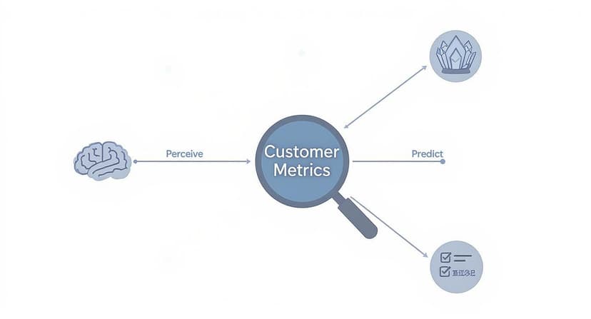
By using these metrics in tandem, you’re not just collecting numbers—you’re building a complete picture of your customer's journey. This allows you to spot exactly where things are going wrong (or right!) and get much better at predicting what customers will do next.
Net Promoter Score (NPS): Your Loyalty Forecast
First up is the Net Promoter Score (NPS). This one isn't about a single transaction; it's about the big picture. It measures long-term customer loyalty and the overall strength of your brand.
You’ve probably seen the classic NPS question:
"On a scale of 0-10, how likely are you to recommend our company/product/service to a friend or colleague?"
It’s a simple question, but the answers tell a powerful story. Customers are grouped into three distinct categories:
- Promoters (scores of 9-10): These are your champions. They're the ones who will sing your praises and bring you new business.
- Passives (scores of 7-8): They're happy enough, but they aren't loyal. A better offer from a competitor could easily sway them.
- Detractors (scores of 0-6): These are unhappy customers. Worse, they can actively damage your reputation with negative reviews and word-of-mouth.
To find your NPS, you subtract the percentage of Detractors from the percentage of Promoters. The result is a score from -100 to +100 that gives you a crystal-clear look at customer loyalty. For a more detailed breakdown, our guide shows how to handle a Net Promoter Score calculation right in Excel.
Customer Satisfaction Score (CSAT): Your Real-Time Happiness Check
While NPS gives you that long-term view, the Customer Satisfaction Score (CSAT) is all about the here and now. It’s the perfect tool for getting instant feedback on a specific interaction, like right after a support call, a recent purchase, or a product delivery.
The question is direct and to the point:
"How satisfied were you with your [interaction/purchase/service] today?"
Customers typically respond on a 1-5 scale, from "Very Unsatisfied" to "Very Satisfied." To get your score, you take the number of happy customers (those who gave a 4 or 5), divide it by the total number of responses, and multiply by 100. A high CSAT percentage means you're nailing those key moments in the customer journey.
Customer Effort Score (CES): Your Friction Finder
Finally, we have the Customer Effort Score (CES). This metric zeroes in on how much work a customer has to put in to get something done, whether it's resolving a problem, buying a product, or just finding an answer. The idea is simple: make things easy, and customers will stick around.
In fact, a staggering 96% of customers who have a high-effort experience report being disloyal.
A typical CES question looks like this:
"To what extent do you agree or disagree with the following statement: The company made it easy for me to handle my issue."
Customers answer on a scale from "Strongly Disagree" to "Strongly Agree." Here, a lower average score is what you’re aiming for—it’s a clear sign of a smooth, hassle-free experience.
To make it even clearer, let's break down how these three metrics stack up against each other.
Comparing the Core Customer Satisfaction Metrics
This table helps you see at a glance what each metric does best, so you can pick the right one for the job.
| Metric | What It Measures | Example Question | Best Used For |
|---|---|---|---|
| NPS | Overall brand loyalty and likelihood to recommend. | "How likely are you to recommend us to a friend?" | Gauging long-term customer relationships and predicting business growth. |
| CSAT | Immediate satisfaction with a specific interaction or transaction. | "How satisfied were you with your recent support call?" | Getting real-time feedback on key touchpoints like sales or customer service. |
| CES | The ease of a customer's experience. | "How easy was it to get your issue resolved?" | Identifying and removing friction points in the customer journey to boost loyalty. |
The smartest companies know that no single metric tells the whole story. By tracking NPS, CSAT, and CES together, businesses get a holistic view that helps them consistently outperform the competition in both customer retention and growth. Of course, to track them well, you need the right customer satisfaction measurement tools in your corner.
Building Your Metrics Dashboard in Excel
Knowing your customer satisfaction metrics is a great start, but the real magic happens when you bring them to life. An Excel dashboard is the perfect way to do that. It transforms endless rows of survey data into a clear, visual story you can actually use. Think of it as your command center for customer happiness.
This guide will walk you through building a simple but powerful dashboard from the ground up. We'll start with organizing your data, move on to calculating your key scores with formulas, and finish by turning those numbers into insightful visuals. The goal is to create one central place for all your customer feedback that updates itself as new responses roll in.
Step 1: Structure Your Raw Data
Before you can build anything, you need a solid foundation. How you organize your raw survey data in Excel is probably the most important step for getting accurate, hassle-free results later. A clean, well-structured table is what makes all the formulas and charts work smoothly.
Think of it like organizing your kitchen before you start cooking. You want every ingredient in its place so you can grab what you need without a frantic search.
- Create a Data Table: Start by setting up a simple table where each row represents a single customer response. A best practice is to place this data on a separate tab, perhaps named "RawData".
- Use Clear Column Headers: Give each column a straightforward name, like "Response ID," "Date," "NPS Score," "CSAT Score," and "Customer Comments."
- Keep It Consistent: Make sure your data formats are uniform. For instance, all dates should follow the same format (e.g., MM/DD/YYYY), and all scores should be numbers.
Getting this right from the start means Excel can read and calculate your data without throwing errors, setting you up for success in the next step.
Step 2: Calculate Metrics with Excel Functions
With your data neatly organized, it's time to put Excel to work. We'll use a few essential functions—COUNTIF, SUMIF, and AVERAGEIF—to automatically calculate your NPS, CSAT, and CES scores. It's best practice to put these formulas on a separate "Dashboard" tab that pulls information from your "Raw Data" tab.
Let's take Net Promoter Score as an example. First, you need to count your Promoters, Detractors, and the total number of responses.
- Count Promoters:
=COUNTIF(RawData!C:C, ">=9") - Count Detractors:
=COUNTIF(RawData!C:C, "<=6") - Count Total Responses:
=COUNTA(RawData!C:C)
Once you have these totals, the NPS calculation is simple: ((Promoters - Detractors) / Total Responses) * 100. In the same way, you can use a function like AVERAGEIF to quickly get your average CSAT score.
A pro tip: by referencing entire columns in your formulas (like
C:C), your dashboard will automatically update every time you paste new survey responses into your data sheet. No more manual recalculations.
Step 3: Visualize Your Data
The final step is to turn all those calculated numbers into charts and graphs on your main dashboard. After all, a picture is worth a thousand numbers. Visuals make it so much easier to spot trends and understand performance at a glance.
Here’s a simple example of what a customer satisfaction survey dashboard could look like in Excel.

This dashboard uses basic pie charts and bar graphs to show overall satisfaction and highlight specific feedback areas, making the key takeaways jump right off the page. If you're ready to create even more compelling visuals, check out our complete Excel dashboard tutorial for more advanced techniques.
How to Analyze Customer Feedback with AI in Excel
Your quantitative customer satisfaction metrics, like CSAT or NPS, are great for telling you what your customers are feeling. But to really get to the heart of the matter—the why behind those scores—you have to dig into their open-ended comments.
Let's be honest, manually sifting through hundreds of comments is a soul-crushing task. It's slow, inefficient, and it’s easy to miss the forest for the trees. But what if you could uncover those deep insights in minutes, right inside the spreadsheet you're already using? With AI in Excel, you can.
An AI add-in like Elyx.AI completely changes the game. Forget the tedious manual work. Instead, you use simple, intuitive formulas to analyze all that qualitative feedback right next to your quantitative data. This approach finally bridges the gap between the numbers and the stories, giving you the complete picture of your customer experience.
From Comments to Categories with AI Formulas
Picture this: you have a spreadsheet with customer CSAT scores in one column and their written feedback right next to it. The first step is to quickly get a sense of the overall feeling, or sentiment, behind each comment. With AI, you can do this instantly with a formula.
For example, using Elyx.AI, you can just type a formula like =ELYX.AI("Classify the sentiment of this comment as Positive, Negative, or Neutral", [cell with comment]). Drag that formula down the column, and boom—the AI automatically categorizes every single comment for you.
This screenshot shows just how fast an AI formula can tear through raw customer reviews and make sense of them.

The formula quickly classifies the feedback, letting you filter and immediately see that a low CSAT score corresponds with negative sentiment about "slow shipping." You've just connected a score to a specific, real-world business problem. No guesswork involved.
Extracting Actionable Themes from Feedback
Sentiment is a fantastic starting point, but the real gold is in identifying the recurring themes. What are people talking about over and over again? You guessed it—there's an AI formula for that, too.
For a deeper dive into gathering insights from all your customer interactions, check out this guide on mastering customer feedback analysis. It can help you refine your approach even further.
To pull out themes in Excel, you could use a prompt like =ELYX.AI("Extract the main topic from this comment, like 'Product Quality' or 'Customer Support'", [cell with comment]).
This workflow transforms your spreadsheet from a static list of data into an intelligent analysis tool. By combining numerical scores with AI-driven text analysis, you can quickly spot your biggest strengths and most urgent weaknesses.
This process gives you a clean list of actionable topics tied directly to what your customers are saying. You might discover that 15% of negative comments mention "slow shipping" while 20% of positive comments praise your "helpful support."
You can learn more about putting these kinds of solutions into practice by exploring the possibilities of using AI for Excel. These insights allow you to prioritize improvements with real confidence, because you know you’re tackling the issues that matter most to your customers.
Connecting Better Metrics to Business Growth
So, why obsess over customer satisfaction metrics? It’s not about chasing high scores for a report. It’s about forging a clear, measurable link between how your customers feel and how your business actually performs.
When you see your NPS or CSAT scores start to climb, you’re not just looking at a happier audience. You’re seeing a powerful preview of future revenue. These numbers are the pulse of your business.
A small bump in these metrics can have a huge ripple effect, especially on customer retention. Happy customers stick around. And keeping a customer is far cheaper and more effective than constantly hunting for new ones. Every point you gain in your satisfaction scores is a direct win for your budget.
From Satisfaction to Profitability
The line between a happy customer and a healthy bottom line is surprisingly direct. Higher satisfaction scores almost always lead to a higher Customer Lifetime Value (CLV).
Simply put, satisfied customers buy more, they come back more often, and they stay with you longer. This creates a reliable, predictable stream of revenue you can build on.
But it gets better. These loyal customers become your most powerful marketing team. They start telling their friends, family, and colleagues about you, generating the kind of word-of-mouth buzz that money can't buy. It's an organic growth engine that builds both your customer base and your brand reputation.
Investing in customer experience isn't just a cost center; it’s one of the smartest investments a business can make for sustainable, long-term growth. It’s the foundation upon which loyalty, reputation, and profitability are built.
The Financial Impact of Great Service
The numbers don't lie: great service isn't just a nice-to-have anymore. It’s a core expectation.
Customer service has become a massive differentiator in a crowded market. An overwhelming 99% of consumers say it’s a key factor when they decide where to spend their money. The stakes are high, too—a staggering 73% of consumers will jump ship to a competitor after just a few bad experiences.
On the other hand, the rewards for getting it right are massive. Research shows that three in four consumers are willing to spend more with companies that deliver an excellent customer experience. It’s proof that focusing on your customer satisfaction metrics is a direct path to boosting both loyalty and revenue.
If you're curious, you can read more about these customer experience findings to see just how critical great service has become.
Common Questions About Customer Metrics
Once you start digging into customer satisfaction metrics, you're bound to have questions. It's only natural. This last section tackles some of the most common hurdles people run into, giving you clear, practical answers so you can put these metrics to work.
The whole point is to move from just knowing the theory to confidently taking action, especially when using a tool you already have, like Excel.
How Often Should I Measure Customer Satisfaction?
This is a great question, and the answer is: it depends entirely on what you're trying to learn. Think of some metrics as a quick snapshot and others as a long-exposure photograph.
-
Transactional Metrics (CSAT & CES): These are all about the "here and now." You want to measure them right after a specific event happens. Send a CSAT survey immediately after a customer buys something, or a CES survey the moment a support ticket is resolved. This gives you raw, in-the-moment feedback when the experience is still fresh.
-
Relational Metrics (NPS): Since Net Promoter Score gauges overall loyalty to your brand, you don't want to bombard people with it. Sending it out quarterly or even every six months is a good rhythm. This gives you a clear view of long-term trends without annoying your customers.
What Is a Good Score for These Metrics?
Everyone wants to hit a 100, but what's considered "good" can swing wildly from one industry to another. It's often more helpful to focus on improving your own numbers rather than constantly comparing yourself to others. Still, a few general benchmarks can help you get your bearings.
For NPS, anything above 20 is pretty solid, and a score over 50 is widely considered excellent. With CSAT, which is typically on a 1-5 scale, aiming for a 4 or higher (or 80%) is a great sign that your customers are happy.
The most important benchmark isn't what your competitor scored; it's what you scored last quarter. Your real goal should be steady, measurable improvement over time. That internal focus is the secret to building a business that truly listens to its customers.
Can I Track These Metrics Without Expensive Software?
Yes, you absolutely can. You don't need to shell out for a fancy, specialized platform right away. As we've shown throughout this guide, a tool you probably use every day—Microsoft Excel—is more than capable of becoming your customer metrics command center.
It's easy to collect survey data with free tools like Google Forms and then pull it into Excel for analysis. And when you bring in an AI assistant like Elyx.AI, you can turn that simple spreadsheet into a smart system that tracks scores and even makes sense of written feedback, all without a massive budget.
How Can I Get More Customers to Respond to Surveys?
It’s a common frustration: you send out a survey and hear nothing back. The good news is that a few small tweaks can make a huge difference. The key is to make giving feedback as quick and painless as possible for your customers.
Here are a few tips you can use right away:
- Keep it short and sweet. For quick feedback after a purchase, stick to one or two questions max. The less work it is, the more likely they'll do it.
- Time it right. Send your survey request immediately after the interaction. Don't wait a week.
- Make it mobile-friendly. Most people will open your survey on their phone, so make sure it looks good and works well on a small screen.
- Explain the "why." A simple sentence like, "Your feedback helps us improve," shows customers you actually value their time and opinion.
Ready to stop guessing what your customers think and start knowing? With Elyx.AI, you can analyze customer comments, identify key themes, and connect feedback to your metrics right inside Excel. Transform your data into actionable insights today by visiting https://getelyxai.com.
Reading Excel tutorials to save time?
What if an AI did the work for you?
Describe what you need, Elyx executes it in Excel.
Sign up