Create a Pivot Table: 11 Steps to Mastery in Excel

Tired of drowning in spreadsheets? If you've ever found yourself manually filtering, sorting, and summing data just to answer basic business questions, then you need to master the Pivot Table. It's hands-down Excel's most powerful tool for turning data chaos into clear, actionable insights, and with new AI capabilities, it's more accessible than ever.
The core idea is simple. A Pivot Table takes a flat list of data—like a massive log of sales transactions—and lets you dynamically reorganize it. You can slice, dice, and group your information to spot patterns that were completely hidden before. Want to see total sales by region, product, or quarter? A Pivot Table can do that in seconds, often without writing a single formula. This guide will walk you through the entire process, from data prep to advanced visualization.
4 Foundational Rules for Accurate Pivot Tables
To get started, you just select your data, head to the Insert tab, and click PivotTable. That's it. This is the fastest way to summarize huge datasets, turning thousands of rows into an interactive summary with just a few clicks.
Spending too much time on Excel?
Elyx AI generates your formulas and automates your tasks in seconds.
Sign up →But there's a catch. The real key is making sure your source data is set up correctly first. Getting this right from the start prevents 90% of the most common errors people run into.
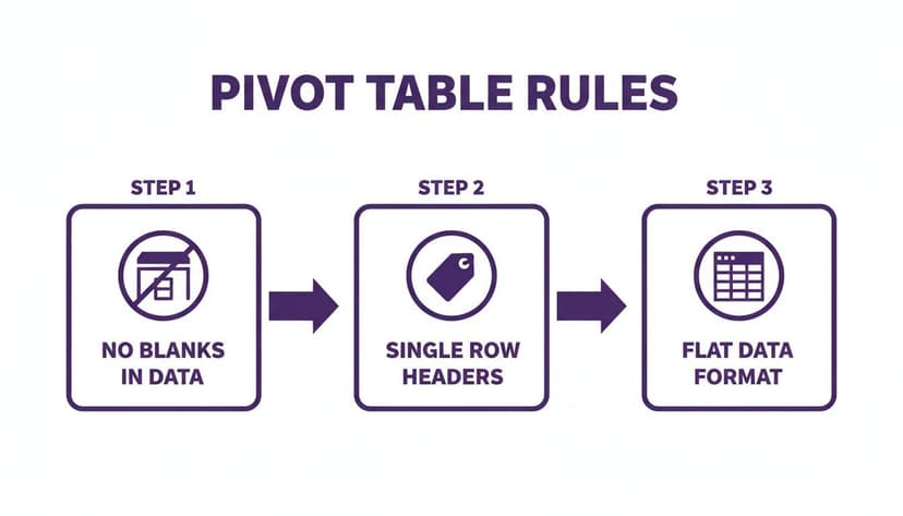
Your data needs to follow four simple rules:
- No Blank Rows or Columns: Empty rows or columns can trip up Excel, causing it to misread your data range.
- Unique Column Headers: Every single column needs its own distinct, single-row header (like 'Sales Date', 'Product ID', 'Revenue'). No merged cells!
- A Flat Data Format: Your data has to be in a simple table format, where each row represents a single record. Think of it like a database table.
- Consistent Data Types: Don't mix text and numbers in a single column. For example, a "Sales" column should only contain numbers, not text like "N/A".
This structured approach isn't just a "best practice"; it's a hard requirement for getting accurate reports. One retail chain I worked with cleaned up their sales data for pivot tables and cut reporting errors by over 30%, which helped them boost sales by 15% in just six months. The impact is real. You can dig into the full effect of structured data in this IDC report.
To make this crystal clear, here’s a quick checklist I use to prep my data.
Source Data Checklist for a Perfect Pivot Table
| Checklist Item | Why It Matters | How to Fix It (with Formulas) |
|---|---|---|
| Unique Column Headers | Pivot Tables use headers to create fields. Duplicates or blanks will cause errors. | Manually name every column. Use Find & Select > Go To Special > Blanks to find empty headers. |
| No Blank Rows/Columns | Gaps in your data can make Excel think your table ends prematurely. | Select the entire blank row/column, right-click, and choose Delete. |
| Consistent Data Types | Mixing text and numbers in one column messes up calculations. | Use the ISNUMBER() or ISTEXT() formulas to check data types. For example, =IF(ISNUMBER(A2), A2, 0) will replace any text in cell A2 with 0. This formula checks if the value in cell A2 is a number. If it is, it returns the value itself. If not, it returns 0, ensuring your column is purely numeric. |
| Data is in a "Flat" Format | Each row must be a single, complete record. No subtotals or nested headers. | Remove any summary rows. Unmerge all cells. Each piece of information should have its own column. |
| No Merged Cells | Merged cells are a Pivot Table's worst enemy. They break sorting, filtering, and field creation. | Select your data range, go to the Home tab, and click the Merge & Center dropdown to Unmerge Cells. |
Nailing this setup is what makes the magic happen.
A well-structured dataset is the secret ingredient to a powerful Pivot Table. Time spent cleaning your data upfront will save you hours of troubleshooting later.
And today, this process is getting even easier. With the rise of AI assistants in Excel, like Elyx AI, the entire workflow—from cleaning the data to generating the final report—can be automated with a simple instruction. You can explore other powerful Excel use cases that AI can simplify. This shift lets you focus less on the grunt work and more on the strategic insights your data is waiting to show you.
How to Build a Pivot Table in 3 Steps
With your data cleaned up and ready to go, it's time for the fun part: creating the pivot table. This is where you'll transform that static sheet of data into an interactive analysis tool. The best part? The core process is pretty much the same whether you're on a Windows PC, a Mac, or using Excel on the web.
Step 1: Select Your Data
First, you need to tell Excel what data to use. Just click on any single cell inside your data set. That's it. Excel is smart enough to figure out the boundaries.
Step 2: Insert the PivotTable
Next, head up to the Insert tab in the ribbon and click the PivotTable button. A small window will pop up asking you to confirm the data range (which Excel usually gets right) and where you want to put the new table. I almost always recommend placing it on a new worksheet—it keeps everything clean.
Step 3: Arrange Your Fields
Once you hit OK, two things happen. A blank pivot table placeholder appears on your sheet, and the PivotTable Fields pane shows up on the right. This pane is your command center. It is split into two parts: a list of your column headers (now called "fields") at the top, and four empty boxes below.
Understanding these four boxes is the absolute key:
- Rows: Drag a field here to create the row labels for your report. If you drop a 'Region' field here, you'll get a unique list of all your regions running down the side.
- Columns: This works just like the Rows area, but it organizes your data horizontally across the top of the table.
- Values: This is the engine room. Any field you drop in here gets calculated. For numbers, Excel will default to a Sum. For text, it will default to a Count.
- Filters: This lets you apply a big-picture filter over your entire report. For example, you could filter the whole table to show data for just a single year.
The real magic of pivot tables is that you’re just dragging and dropping fields into these boxes. You don't have to write a single formula. It’s all about arranging your data to tell a story. Of course, understanding what's happening behind the scenes helps, and our guide on Excel formulas can fill you in on the calculations that pivot tables handle for you.
A Practical Example: Answering Business Questions in Seconds
Let's make this real. Imagine we have a simple sales report with columns for 'Date', 'Region', 'Product', and 'Sales Amount'.
Your boss asks, "What are the total sales for each region?" No problem. You just drag the 'Region' field into the Rows box and the 'Sales Amount' field into the Values box. Boom. Instantly, you have a perfect summary of total sales for North, South, East, and West.
Remember those foundational rules we covered for prepping your data? This is where they pay off.
Sticking to these principles—no blank rows or columns, a single header row, and a flat data structure—is what makes this process so seamless.
Now, your boss follows up: "Great. Now show me which products are selling in each of those regions." Easy. Just grab the 'Product' field and drag it into the Rows box, right underneath the 'Region' field you already placed there. The pivot table instantly expands, giving you a detailed breakdown of product sales within each region.
This is the power of a pivot table—it lets you explore your data and answer new questions on the fly, just by dragging and dropping.
12 Powerful Customizations to Master Your Pivot Table
Building a basic pivot table is a great first step, but the real magic happens during customization. This is where you transform a simple data summary into an interactive, insightful report that can answer much deeper business questions. Honestly, these adjustments are what separate a novice from a true Excel pro.
Let's walk through twelve powerful techniques to get the most out of your pivot tables.
1. Change Summary Calculations
By default, Excel sums numbers you drop into the Values area. But what if you need to know the number of sales transactions, not the total dollar amount?
Easy. Just right-click any number in the Values area, hover over Summarize Values By, and pick a different function like Count, Average, Max, or Min.
2. Format Numbers for Clarity
A number like 150345.78 is an eyesore. Good formatting is non-negotiable for professional reports. Simply right-click a value in your table and choose Number Format. From there, you can apply Currency, Percentage, or Accounting formats.
3. Sort Data to Find Top Performers
Sorting is your best friend for quickly spotting outliers or top performers. Want to see your best-selling product? Right-click on any value in that column and select Sort > Sort Largest to Smallest.
4. Group Data by Dates
This is an essential feature. If you have a column of daily sales data, a pivot table can automatically roll it up into months, quarters, and years. Just right-click on any date in your row or column labels and hit Group. A dialog box will pop up where you can select Months, Quarters, and Years.
5. Create Calculated Fields for Custom Metrics
What if your source data doesn't have the exact metric you need, like a 5% sales commission? This is where a Calculated Field comes in.
- Click anywhere inside your pivot table.
- Head to the PivotTable Analyze tab.
- Click Fields, Items, & Sets, then Calculated Field.
- Give your field a name (like "Commission") and type in the formula (e.g.,
= 'Sales Amount' * 0.05).
This creates a new metric without altering your source data, a huge plus for data integrity. The formula = 'Sales Amount' * 0.05 multiplies the value in the 'Sales Amount' field by 5% for each row, dynamically calculating the commission within the pivot table itself.
6. Use Slicers for Interactive Filtering
Slicers are a game-changer for making reports interactive. Instead of clunky dropdown menus, you get clean, user-friendly buttons for filtering. To add one, click your pivot table, go to the PivotTable Analyze tab, and choose Insert Slicer.
Slicers and Timelines are what turn a static report into a living dashboard. They let your audience explore the data on their own terms, which always leads to better, more engaged discussions.
7. Add Timelines for Date Filtering
A Timeline is a slicer designed specifically for dates. It gives you a sleek, slidable timeline where you can filter by years, quarters, months, or days. You can find it right next to the Slicer button under PivotTable Analyze > Insert Timeline.
8. Apply Conditional Formatting
Want to make key data points pop? Use Conditional Formatting. You can automatically highlight cells that are over a certain value, within a target range, or in the top 10%. These visual cues draw the eye to the most important information.
9. Change the Report Layout
Excel offers three main report layouts: Compact, Outline, and Tabular. The default is Compact, but I almost always switch to Tabular from the Design tab > Report Layout. The Tabular layout puts each field in its own column, which is much easier to read.
10. Repeat All Item Labels
When you have multiple row fields (like Category and Sub-Category), Excel hides repeating labels by default. A quick fix is to go to the Design tab, click Report Layout, and select Repeat All Item Labels. It makes a world of difference.
11. Show Values as a Percentage
Sometimes a raw number isn't as useful as its proportion. You can show values as a percentage of the grand total, a column total, or a row total. Just right-click a value, go to Show Values As, and pick an option like % of Grand Total. This is fantastic for understanding market share. For more complex calculations, AI-driven data analysis tools can automate these kinds of insights.
12. Refresh Your Data
A pivot table is a snapshot—it doesn't update automatically when your source data changes. To pull in the latest information, just right-click anywhere inside the pivot table and hit Refresh.
Visualizing Your Insights with Pivot Charts in 3 Steps
Rows and columns of numbers can make people's eyes glaze over. A table gives you precise details, but a good chart tells a story at a glance. Pivot Charts are a living, breathing visual layer built right on top of your Pivot Table.

Any change you make to the Pivot Table—filtering, sorting, or swapping a field—instantly reflects in the chart. This transforms a static report into an interactive dashboard.
Step 1: Choosing the Right Chart for Your Story
Getting a chart up is the easy part. Just click anywhere inside your Pivot Table, find the PivotTable Analyze tab, and hit PivotChart. The real skill is picking the right type of chart.
- Bar/Column Charts: Your workhorses for comparing categories, like sales rep performance or product sales.
- Line Charts: Nothing beats a line chart for showing a trend over time, such as monthly growth or seasonal cycles.
- Pie Charts: Use sparingly. Pie charts are only effective for showing parts of a whole where all slices must add up to 100%, like a market share breakdown.
A well-chosen chart doesn't just display numbers; it provides an immediate, intuitive answer to a business question. The goal is always clarity over complexity.
Step 2: Tips for Professional Chart Presentation
Excel's default charts are functional but rarely look polished. A few tweaks can make a world of difference. Your main objective is to eliminate visual noise.
First, give your chart a descriptive title. "Q3 Sales Performance by Region" is much better than "Sum of Sales." Next, remove clutter. You can right-click the gray field buttons on the chart and select "Hide All Field Buttons on Chart." I also remove most gridlines and add data labels so people can see key numbers without squinting.
Step 3: Use AI for Faster Visualization
For a truly professional touch, you can manually adjust colors to match company branding. Or, you can leverage AI to accelerate the entire process. With modern AI add-ins, you can simply ask, "Create a bar chart showing sales by region and format it with our company colors." The AI handles the creation and formatting, saving you valuable time. If you want to accelerate this whole process, you might want to look into some of the best Excel AI tools that can handle chart creation and formatting for you.
Automating Pivot Tables with AI: The Future is Here
Once you're comfortable creating pivot tables manually, you'll see where AI assistants like Elyx AI can revolutionize your workflow. They turn what used to be a series of tedious steps into a single, conversational request. This is where you stop just operating Excel and start focusing entirely on strategy.
Instead of hunting through menus, you can use plain English. Think about typing, “Create a pivot table showing total sales by region and product category, and add a bar chart.” The AI handles the rest.
The image above shows how it works. An AI agent reads your command, identifies the right data, and builds the entire pivot table for you. The benefits are immediate: you save time, slash the risk of human error, and make powerful analysis accessible even to non-experts.
From Clicks to Conversation
This is a fundamental shift in how we interact with data. Elyx AI becomes your expert assistant, taking care of the mechanical work so you can ask the important questions. It doesn't just stop at building the table; it can generate a matching Pivot Chart and apply professional formatting based on your request. You can find out more about how this Excel AI add-in functions.
This move toward conversational data analysis is a big deal. Projections suggest that by 2026, the adoption of AI-driven analytics will jump by 35%. Tools that automate pivot tables are expected to boost efficiency by as much as 25%. Imagine a finance team just typing 'build pivot on Q4 forecasts by department,' and the AI instantly structures it perfectly.
This automation gives you back your most valuable resource: time. When you’re not bogged down in data prep, you can focus on understanding what the numbers are telling you and making smarter decisions. To take it a step further, think about pairing this with tools for automating financial data analysis.
The ultimate goal of using AI to create pivot tables is to reduce the time between getting raw data and discovering a key insight. By automating the technical steps, you get to the "why" behind the numbers much faster.
3 Common Pivot Table Problems and Their Solutions
Even seasoned Excel users hit snags with pivot tables. Let's walk through the three most common "why isn't this working?!" moments and how to solve them.
1. Why Can’t I Click the PivotTable Button?
It’s frustrating when the PivotTable button is grayed out, but the fix is usually simple. Check if you're still editing a cell (blinking cursor). If so, just hit the Escape key. The other common culprits are using the older "Shared Workbook" feature (go to Review > Unshare Workbook) or having multiple worksheets grouped (right-click a sheet tab and choose Ungroup Sheets).
2. How Do I Get My Pivot Table to Update?
A pivot table is a snapshot in time—it doesn’t automatically see changes you make to your original data. You have to give it a nudge.
For simple data changes within your existing range, just right-click anywhere on the pivot table and hit Refresh.
But what if you’ve added entirely new rows or columns? A standard refresh won't pick those up. In that case, go to the PivotTable Analyze tab, find Change Data Source, and simply drag your selection to include all the new data.
3. Can I Pull Data from Multiple Sheets into One Pivot Table?
Yes, absolutely! The best built-in tool for this is Power Query, found under the Data tab. Power Query is perfect for grabbing data from several different sheets (or even separate workbooks), combining it into one master table, and then using that table as the source for a single, unified pivot table.
For more advanced situations where you have separate but related tables (like a Sales table and a Products table), you can use Excel's Data Model to create relationships between them before building your pivot table.
Stop wasting hours on manual Excel work. Elyx AI acts as your personal data analyst, creating complex pivot tables, charts, and entire reports from a single instruction. Start your free trial and see how much time you can save. Get started with Elyx AI today.
Reading Excel tutorials to save time?
What if an AI did the work for you?
Describe what you need, Elyx executes it in Excel.
Sign up