12 Key Insights to Master Your Business Intelligence Report in Excel

Ever feel like you're drowning in data but starving for insights? That's where a business intelligence (BI) report comes in. It cuts through the noise of raw numbers from sales, marketing, and operations, turning them into a clear picture that helps you make smarter, faster decisions.
Think of it as your company's GPS. Instead of guessing which way to turn, you get a data-driven map showing you exactly where you are, where you're headed, and the best route to get there. This guide provides practical explanations and actionable tips to help you leave with a new skill: creating powerful BI reports in Excel, enhanced with AI.
What Is a Business Intelligence Report? A Practical Definition

Spending too much time on Excel?
Elyx AI generates your formulas and automates your tasks in seconds.
Sign up →At its heart, a business intelligence report is a tool that brings data to life. It organizes and visualizes complex information so anyone, from the front lines to the C-suite, can understand what’s happening in the business at a glance. It's much more than a data dump; it provides context, spots trends, and shines a light on the metrics that truly matter.
Here’s a simple analogy: raw data is like a giant pile of LEGO bricks. Useless on its own. A BI report is the instruction manual and the finished starship, putting all those pieces together into something meaningful. It helps you answer critical questions like, "Which of our products drove the most profit last quarter?" or "Why did our customer acquisition cost spike in May?"
From Raw Data to 3 Strategic Actions
The real purpose of a BI report is to empower people to take action. Instead of getting bogged down in messy spreadsheets, stakeholders get a clean, curated summary that tells a story. This simple shift moves a company from constantly putting out fires to proactively planning its next move.
A huge part of this is having the right information to begin with. For example, mastering competitive intelligence gathering is essential for building BI reports that give you a complete picture of the market, not just what's happening inside your own walls.
Ultimately, a good BI report helps with a few key things:
- Performance Monitoring: Are we hitting our targets? It tracks your Key Performance Indicators (KPIs) against your goals.
- Trend Identification: It points out patterns, like a sudden dip in sales or a steady rise in customer engagement.
- Opportunity Discovery: It can uncover hidden gems—a new market to explore, a process to make more efficient, or a new way to save money.
- Informed Decision-Making: It gives you a solid foundation of facts, so you're not just relying on gut feelings.
A great business intelligence report doesn't just present numbers; it delivers insights. The goal is to make the data so clear that the right action becomes obvious.
The Role of Excel and AI in Your Reports
For years, Excel has been the workhorse for creating reports. But let's be honest: manually cleaning data, wrestling with pivot tables, and designing charts is a massive time sink. This is where modern AI tools are really changing the game.
AI assistants built for Excel, like ElyxAI, can automate nearly the entire reporting process. They handle the tedious tasks, freeing you up to focus on what the data actually means instead of how to build the report. To see just how much this can change your workflow, check out these diverse Excel use cases for AI. It’s all about turning your complex data into your biggest advantage.
The 4 Essential Types of BI Reports
Not all BI reports are created equal. Trying to use one report for every situation is like trying to fix a watch with a sledgehammer—you need the right tool for the job. Choosing the right report type means you’re delivering the perfect amount of detail to the right audience, which is what makes data truly useful.
Think about it: a CEO needs a very different view of the company than a warehouse manager does. Understanding these differences is the first step toward building a report that actually drives action, instead of just getting buried in an inbox.
Let's break down the four essential types.
1. Strategic Reports
Strategic reports are the 30,000-foot view of the business, built specifically for the C-suite and senior leadership. Their purpose isn't to get bogged down in daily minutiae but to track progress against long-term goals and high-level Key Performance Indicators (KPIs).
These reports are usually generated on a monthly or quarterly basis and focus on broad trends. They answer the big-picture questions like, "Are we on track to hit our annual revenue goals?" or "Is our market share growing?" The data here is heavily summarized to give a quick, clear snapshot of the company's overall health.
2. Analytical Reports
If strategic reports tell you what happened, analytical reports dig into why it happened. These are the tools of data analysts, business analysts, and department heads who need to go deep. The goal here is to get to the root cause of a trend or anomaly through more complex analysis.
An analytical report might be used to figure out why customer churn suddenly spiked last quarter or to compare the ROI of several different marketing campaigns. These reports are often built on an as-needed basis to answer a specific business question and are packed with granular data, detailed charts, and thorough explanations.
The true power of a BI report lies in its ability to match the right level of detail with the audience's needs. A frontline manager needs operational data now, while an executive needs strategic trends over time.
3. Operational Reports
Operational reports are all about the here and now. Designed for frontline managers and their teams, these reports monitor daily activities, often in real time. The whole point is to track performance against immediate targets and keep the day-to-day functions of the business running smoothly.
You'll see these reports updated constantly—daily, hourly, or even minute-by-minute. Common examples include:
- A call center dashboard tracking agent call volumes and average wait times.
- A factory floor report monitoring production output and defect rates.
- A website traffic report showing real-time visitor counts and conversions.
The focus is on immediate, actionable insights. If a metric on an operational report is off, the team can jump in and fix the problem right away.
4. Tactical Reports
Tactical reports are the bridge connecting high-level strategy with daily operations. Mid-level managers—like heads of sales or marketing—use them to track the performance of specific projects and departmental initiatives.
These are typically run weekly or bi-weekly, looking at a shorter timeframe than strategic reports but a longer one than operational reports. A marketing manager might use a tactical report to check the progress of a quarterly campaign, while a sales manager uses one to see how the team is tracking against their monthly quotas. They help managers make adjustments to keep their department's work aligned with the company's bigger goals.
The 1 Table for Choosing the Right BI Report Type
Picking the right report type can feel tricky, but it really boils down to understanding who needs the information and what they plan to do with it. This table breaks down the key differences to help you decide.
| Report Type | Primary Audience | Purpose | Data Frequency | Example Use Case |
|---|---|---|---|---|
| Strategic | C-Suite, Executives | Monitor long-term goals and overall business health | Monthly, Quarterly | Tracking annual revenue growth and market share |
| Analytical | Data Analysts, Dept. Heads | Investigate trends and answer specific business questions | Ad-hoc, As Needed | Analyzing the cause of a sudden drop in sales |
| Operational | Frontline Managers, Teams | Monitor real-time activities and daily performance | Real-time, Hourly, Daily | A call center dashboard showing live wait times |
| Tactical | Mid-Level Managers | Track departmental and project-level performance | Weekly, Bi-weekly | A sales manager reviewing team quota attainment |
Ultimately, matching the report to its purpose ensures that your insights don't just inform but also empower people to make smarter, faster decisions in their roles.
The 7 Key Components of an Effective Report
A great business intelligence report isn't just a jumble of charts and numbers. It’s a story that guides your team from data to a smart decision. Think of it like a blueprint for a house—without a solid foundation and a clear plan, you just get a mess. Each piece has a specific job to do, making the report clear, credible, and most importantly, actionable.
Just like a good story, an effective report needs a beginning, a middle, and an end. It should set the scene, present the core findings, and wrap up with a clear "what's next." If you skip any of these parts, you risk leaving your audience confused or unsure of what to do.
Let's walk through the seven essential building blocks that turn raw data into a powerful business tool.
1. Clear Title and Date Range
This sounds basic, but it’s the first thing everyone sees and it’s surprisingly easy to get wrong. A clear title instantly tells the reader what they're looking at. Don't just call it "Sales Data." Be specific: "Q3 2024 Regional Sales Performance Review."
Just as important is the date range. Always state the exact period the report covers (e.g., "October 1st – December 31st, 2024"). This simple step provides immediate context, prevents people from misinterpreting trends, and makes sure everyone is on the same page from the get-go.
2. An Executive Summary
Before anyone gets lost in the weeds, give them a quick overview right at the top. This is your report’s "elevator pitch"—a short, punchy paragraph summarizing the most critical insights and conclusions.
Let’s be real: executives and busy stakeholders don't have time to read every page. An executive summary lets them get the main takeaways in under a minute. It answers one simple question: "If I only read one thing here, what do I need to know?"
3. Key Performance Indicators (KPIs)
Think of KPIs as the vital signs for your business goals. They are the specific, measurable metrics that tell you if you're on track or falling behind. A good BI report puts the most relevant KPIs front and center, often showing them next to targets or numbers from a previous period for comparison.
For example, a marketing report would be lost without:
- Customer Acquisition Cost (CAC): How much are we spending to get each new customer?
- Conversion Rate: What percentage of people are taking the action we want them to?
- Return on Ad Spend (ROAS): For every dollar we put into ads, how much are we getting back?
Stick to a handful of truly important KPIs. Throwing in too many metrics just creates noise and buries the real story.
4. Data Visualizations
Our brains are wired to process images way faster than text or spreadsheets. That’s why data visualizations—charts, graphs, and maps—are non-negotiable for making complex data easy to digest. The trick is picking the right visual for the job.
A well-chosen chart doesn't just display data; it reveals the story hidden within it. A bar chart is perfect for comparing categories, a line chart is king for showing trends over time, and a pie chart can illustrate parts of a whole.
For instance, use a line chart to track monthly revenue and a bar chart to compare how different sales teams are performing. The right visuals make insights practically jump off the page. You can learn more about how new tools are making this easier in our guide to AI-powered data analysis.
5. Detailed Data and Tables
While charts give you the 30,000-foot view, tables provide the ground-level detail. After you show a trend in a chart, it's good practice to include a table with the underlying numbers. This builds trust and lets the more data-hungry people on your team dig into the specifics if they want to. It’s all about balancing the "what" (the visual) with the "why" (the raw data).
6. Contextual Analysis and Insights
Numbers on their own are meaningless. This is where you, the expert, connect the dots for your audience. You need to explain why the numbers look the way they do. Did that big marketing campaign actually cause the sales spike? Did a competitor’s new promotion lead to a dip in our market share?
Jot down a few brief, insightful comments next to your charts and tables. This narrative is what elevates a report from a simple data dump to a strategic tool that explains what happened and why it matters.
7. Recommendations and Next Steps
Finally, and most importantly, a great report must drive action. Based on everything you've shown, what should the business do now? This is the whole point of the exercise. Your recommendations need to be clear, specific, and tied directly to the insights in the report.
For example, if your report shows a product is lagging, a weak recommendation is "We should improve sales." A strong one is: "Allocate an additional 15% of the marketing budget to promote Product X in the Northeast region, where it shows the most potential for growth." This gives your team a clear path forward, turning your hard-earned insight into real-world impact.
Your 5-Step Workflow for Building a BI Report in Excel
Alright, we’ve covered the theory. Now it’s time to roll up our sleeves and get practical. Building a professional BI report from scratch in Excel is a core skill for any data professional. Once you master this manual process, you’ll not only have total control over your data but also see exactly where AI can jump in to save you a ton of time.
This workflow breaks everything down into five clear, manageable steps. By following along, you'll understand the mechanics behind a great report and build a solid foundation for any analysis you tackle in the future.
This whole process is about moving from raw data to real insight.
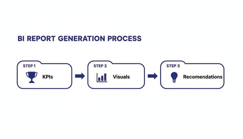
As you can see, a successful report always starts with clear goals, uses visuals to tell the story, and ends with actionable recommendations.
Step 1: Define Your Goals and KPIs
Before you even think about opening Excel, stop and ask one critical question: What decision will this report help someone make? A report without a clear purpose is just a page of numbers. Start by thinking about who this report is for and what they need to know.
Once you’ve nailed down the "why," you can define the Key Performance Indicators (KPIs) you'll use to track progress. If you're building a sales report, that might mean tracking revenue per region, conversion rates, or average deal size. A good rule of thumb is to stick to just three to five core KPIs to keep your report focused and impactful.
Step 2: Gather and Clean Your Data
This is where the real work begins. It’s often the most time-consuming part of the process, but it's absolutely non-negotiable. Remember the old saying: garbage in, garbage out. Your insights are only as good as your data. Pull your information from all the necessary places, whether that’s a CRM export, a database, or another spreadsheet.
With the raw data loaded into Excel, it’s time to clean. This means tackling a host of common problems:
- Removing duplicates: You need to be sure every record is unique to avoid skewing your totals.
- Fixing structural errors: Hunt down pesky extra spaces, inconsistent capitalization, or merged cells that can wreak havoc on your formulas.
- Handling missing values: Decide on a strategy. Should you delete rows with blank cells or fill them in with a sensible default?
A classic headache is messy text data, like product names or city names entered with hidden spaces at the beginning or end. These invisible errors will stop your PivotTables from working correctly.
Luckily, a simple Excel formula is your best friend here. For instance, to clean up a cell that looks like " Product A ", you can use the TRIM function.
=TRIM(A2)
Explanation: This formula grabs the text in cell A2 and neatly snips off any leading or trailing spaces. Drag this formula down the entire column, and you’ll have uniform data ready for analysis. Getting your data into shape is a crucial skill, and you can learn more about how to streamline AI data cleaning in our guide.
Step 3: Structure Data with Excel Tables
Once your data is sparkling clean, it's time to give it some structure. The single best way to do this in Excel is to convert your data range into an official Excel Table. This isn’t just about making it look pretty; it unlocks a suite of powerful features.
Just click anywhere inside your data and press Ctrl + T. That’s it. Now you have a proper table with benefits like automatic formatting, easy sorting and filtering, and, most importantly, dynamic range expansion. When you add new rows of data, the table automatically grows, ensuring any connected charts or PivotTables stay up to date without you having to lift a finger.
Step 4: Analyze with PivotTables and Charts
Now for the fun part: the analysis. With your data clean and structured, PivotTables are your go-to tool. They let you summarize massive datasets in seconds without writing a single complex formula. You can slice, dice, and group your data to instantly spot trends.
For example, you could drag your "Region" field into the Rows area and "Sales Amount" into the Values area to get an instant summary of sales by region. From there, you can create PivotCharts directly from your PivotTable to bring those numbers to life. Because the chart is linked to the table, any filter you apply to your data will automatically update the visual.
Step 5: Design an Intuitive Dashboard
The final step is to bring everything together on a single, cohesive dashboard. This is the "front door" to your report. Create a new, clean sheet in your workbook and start arranging your most important charts, KPI summaries, and tables on one screen.
A well-designed dashboard tells a story at a glance. It should guide the user's eye from high-level summaries down to more detailed charts, making the key insights impossible to miss.
Make it interactive! Add slicers and timelines so users can filter the entire dashboard by date, product category, or region. This turns your static report into a dynamic analytical tool, empowering your audience to explore the data and answer their own questions.
How to Automate Your Report with AI in Excel in 1 Step

The five-step manual workflow gets the job done, but let’s be honest—it’s a major time sink. What if you could get from a messy spreadsheet to a polished dashboard with just one simple instruction? That’s not a hypothetical anymore. It's exactly what AI automation brings to the table, right inside Excel.
We're not talking about an AI that just suggests a few formulas or offers tips. Imagine an AI agent acting as your personal data expert, one that can handle complex, multi-step projects all on its own. This completely changes the game, moving you from being a data wrangler to a genuine strategic analyst.
From Manual Steps to a Single Prompt
Think back to the manual process: cleaning, structuring, creating PivotTables, building charts, and designing the layout. Each of those steps demands your full attention and a solid grasp of Excel. With an AI tool like ElyxAI, you can skip the grunt work and focus entirely on the result.
You just tell it what you need in plain English. For instance, you could give it a prompt like this:
"From this raw sales data, create a business intelligence report showing Q3 revenue by product category and sales rep. Then, visualize the top 5 reps in a bar chart and format the report with a professional blue and grey theme."
That one sentence sets off a complete, automated workflow. The AI doesn't just write a formula for you; it executes the entire sequence from beginning to end.
Breaking Down the AI Automation Process in 4 Stages
When you give the AI your request, it thinks like a human analyst. It figures out your goal, breaks it down into logical steps, and gets to work—only it does it all in a matter of seconds.
Here’s a look at what happens behind the scenes with that example prompt:
- Data Cleaning: First, the AI scans your raw data for all the usual suspects. It automatically gets rid of duplicates, trims extra spaces, and standardizes date formats so your numbers are reliable.
- PivotTable Creation: Next, it builds a PivotTable to summarize the Q3 revenue, organizing the data by product category and sales rep, just as you asked.
- Chart Generation: The AI then whips up a clean bar chart from the PivotTable, making sure to highlight only the top five sales reps to spotlight your star performers.
- Formatting and Design: Finally, it adds the professional polish. The whole report gets a consistent blue and grey color scheme, proper titles are added, and the layout is neat and easy to read.
A task that could easily take an hour of clicking, typing, and formatting is finished before you can even grab a coffee. The demand for this kind of efficiency is soaring. In fact, market research shows that companies worldwide are planning to spend $72.1 billion on business intelligence software in the coming year.
The Strategic Advantage of AI Automation
The real win here isn't just about saving time on tedious tasks. It's about freeing up your brainpower for the work that actually matters. When you aren't bogged down in the mechanics of report building, you can dedicate your energy to figuring out what the data is telling you.
You can jump straight from "How do I build this chart?" to "Why did these five reps crush their goals?" or "What does our top product's performance say about our market strategy?" This is a crucial shift. It elevates your role from a technical operator to a strategic advisor, letting you focus on the insights that drive real business decisions. Our guide on AI automation in Excel dives deeper into how this change can unlock a whole new level of productivity and impact.
The 6 Common Mistakes to Avoid in BI Reporting
Crafting a great business intelligence report is a bit of an art. When you get it right, you deliver crystal-clear insights that lead to smart, confident decisions. But when you get it wrong, you end up with a confusing mess that undermines all the hard work you put into gathering the data. The stakes are high—an impressive 94% of organizations see business intelligence as critical to their success. You can discover more insights about BI's strategic value from Dresner Advisory Services in their full report.
Even seasoned analysts can fall into a few common traps that weaken their reports. Avoiding these pitfalls is the key to making sure your audience not only understands the information but actually trusts it enough to act on it.
Let's walk through the six most frequent mistakes and how you can steer clear of them.
1. Information Overload
This is probably the most common mistake of all: cramming way too much into a single report. It’s tempting to include every metric and chart you can think of, just to prove how thorough you’ve been. But that approach usually backfires. You end up burying the most important insights under a mountain of noise, leaving your audience completely overwhelmed and unsure where to look.
A truly great BI report is focused. It zeroes in on a few critical KPIs that directly support the report's main purpose.
2. Choosing the Wrong Visualization
A picture might be worth a thousand words, but the wrong one just tells a confusing story. Using a pie chart to show a trend over time, or a line chart to compare different product categories, can actively mislead your audience. Each chart type has a job to do, and picking the wrong one can obscure the very insight you're trying to highlight.
Before you drop a chart into your report, ask yourself: "What's the one relationship I want to show here?"
- Use a line chart to show how something changes over time.
- Use a bar chart to compare values between different groups.
- Use a scatter plot to see if there's a relationship between two different variables.
3. Ignoring Your Audience
A report built for a data analyst should look completely different from one made for the CEO. Analysts might want to dig into granular data and complex charts, while an executive just needs a high-level summary with the key takeaways. If you don't tailor the content and complexity to your audience, you're guaranteed to lose their attention.
Always think about who you're building the report for. What's their role? How familiar are they with the data? And what do they need to know to do their job better?
4. Lack of Context
Numbers without context are just trivia. Showing a sales figure of $50,000 for the month doesn't mean much on its own. Is that good? Is that bad? You have to provide context to give the numbers meaning.
Compare current performance to previous periods (like last month or last year), established goals, or even industry benchmarks. This is how you turn a simple number into a powerful story about performance.
A business intelligence report should answer not just "what happened?" but also "so what?". Providing context is how you bridge that gap and turn data points into a compelling narrative.
5. Poor Data Quality
Your report is only as good as the data it’s built on. Simple errors like duplicates, typos, or inconsistent formatting can completely invalidate your findings and, frankly, destroy your credibility. A single mistake can lead to flawed conclusions and bad business decisions.
Diligent data cleaning isn’t an optional step—it’s the foundation of any trustworthy analysis. For a deeper dive, check out our guide on how to handle common Excel errors that can impact your data quality.
6. No Clear Action or Recommendation
Finally, the biggest mistake is creating a report that’s purely informational and doesn't lead anywhere. A good report should always point toward a clear, actionable recommendation. After presenting your findings, you have to answer the question, "Okay, so what should we do now?"
Without that final step, your report is just an interesting observation, not a tool for driving the business forward.
3 FAQs on BI Reports in Excel
As you start your journey with business intelligence, you’re bound to have some questions. It’s completely normal. Getting a handle on these concepts is the first step to creating reports that actually make a difference. Let's clear up a few of the most common ones.
The demand for these skills is exploding. The global business intelligence market is on track to more than double, from $31.34 billion to $63.17 billion by 2034. If you're curious about what's fueling this growth, you can read the full research about the BI market and see the trends for yourself.
How Often Should I Update My BI Report?
There’s no magic number here—it all comes down to who’s using the report and what decisions they need to make. The right schedule is the one that matches the pace of the business.
- Operational reports, tracking things like website traffic or helpdesk tickets, need to be fresh. Think daily, or even real-time, to catch problems the moment they appear.
- Tactical reports are for managers keeping an eye on projects or marketing campaigns. A weekly update usually hits the sweet spot.
- Strategic reports are for the big-picture view, helping executives steer the ship. These are perfectly fine with monthly or even quarterly updates.
What’s the Real Difference Between a BI Report and a Dashboard?
Let's use a car analogy.
A dashboard is your car's instrument panel—the speedometer, the fuel gauge, the warning lights. It gives you a live, at-a-glance view of what’s happening right now. It’s all about immediate awareness.
A BI report, on the other hand, is like the detailed diagnostic report you get from your mechanic. It goes deeper, offering context, trends over time, and analysis to explain why things are happening. Dashboards are for monitoring; reports are for deep understanding and strategic planning.
Can AI Actually Find Insights in My Report?
Yes, and this is where things get really interesting. Modern AI tools are no longer just for building the report; they're becoming your analytical partner.
For example, once you’ve created your report, you can use an AI agent like ElyxAI to dig through the data for you. You could literally ask it, "What are the most significant trends in this sales data?" The AI will then analyze everything, point out patterns you might have missed, and even write up a summary of its findings. It’s like having an analyst on-demand, helping you get to the "so what" much faster.
Ready to spend less time building reports and more time acting on them? With Elyx AI, you can automate your entire BI reporting process right inside Excel. From cleaning data to creating polished charts, it all happens with a simple command.
Start your free 7-day trial of ElyxAI and see how much time you get back.
Reading Excel tutorials to save time?
What if an AI did the work for you?
Describe what you need, Elyx executes it in Excel.
Sign up