11 Essential Tips for Formatting a Worksheet in Excel

Formatting an Excel worksheet is all about making your data talk. It's the process of taking a wall of raw numbers and turning it into a clear, professional report that anyone can understand at a glance. This skill is what transforms a confusing data dump into a powerful story that helps drive smart decisions.
1. Why Mastering Excel Formatting Is a Game Changer
Let's be honest, good formatting isn't just about making a spreadsheet pretty. It's the critical skill that makes your data truly useful. Think of it as the final polish that separates a rough draft from a published report. When your data is laid out clearly, your audience can spot the key takeaways in seconds instead of getting lost in a sea of numbers. That clarity is everything when it comes to accuracy and making the right call.
This isn't a new concept. When Microsoft Excel first hit the scene in the 1980s, it was a massive step up from paper ledgers. By 1990, companies that jumped on board were already seeing an estimated 25% reduction in the time it took to prepare reports. Fast forward to today, in busy finance departments where an analyst might whip through over 50 worksheets a week, sloppy formatting can lead to 12% misinterpretation errors, based on a survey of 500 firms.
Spending too much time on Excel?
Elyx AI generates your formulas and automates your tasks in seconds.
Sign up →The True Cost of Poor Formatting
A messy worksheet is more than just an eyesore; it has real-world consequences. It can directly lead to:
- Wasted Time: Your colleagues and managers have to spend extra time just trying to figure out what they're looking at. They'll be asking for clarification or, even worse, redoing the work themselves.
- Costly Errors: When key figures are buried or easily misread, it can lead to bad analysis and even worse business decisions. A misplaced decimal point or an overlooked negative sign can have serious financial repercussions.
- Damaged Credibility: Handing over a disorganized, inconsistent report just doesn't look good. It subtly undermines your professionalism and attention to detail. A clean, well-structured document, on the other hand, builds trust and shows you care about the quality of your work.
A well-structured sheet isn't a chore; it’s a strategic tool. It communicates competence and ensures that the insights you've worked hard to uncover are actually seen and understood by your team and leadership.
Ultimately, getting good at formatting a worksheet in Excel is a surefire way to boost your professional impact. You'll find countless practical applications for this skill in almost any business role. When you can turn raw data into an intuitive and visually engaging report, you make sure your analysis gets the attention it deserves.
2. Building Your Foundation with Cell Formats and Styles
Before you even think about charts and complex formulas, you have to get the basics right. I'm talking about the foundational tools that control how your data actually looks and behaves. Getting cell formatting right isn't just about making things pretty; it's about making sure your numbers tell the right story at a glance.
Think of it as a simple, three-step journey. You start with a messy pile of raw data, apply some smart formatting, and end up with a clear, professional report that anyone can understand.
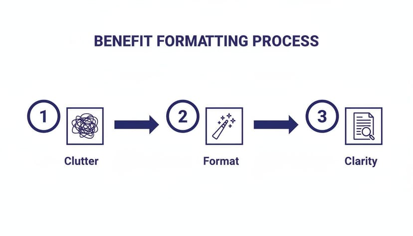
This process is the bridge between a confusing data dump and an insightful, polished worksheet.
Mastering Number Formats
One of the first places you should look is the Number group on the Home tab. It’s the most common formatting task, and getting it wrong can be a disaster, especially with financial data.
Here's a quick rundown of the big three:
- Number: Your go-to for general numeric data. You can easily control decimal places and add a thousands separator to make large numbers readable.
- Currency: This format sticks the currency symbol right next to the number (like $1,234.56). It’s perfect for lists where you want that symbol to be front and center.
- Accounting: This is my personal favorite for financial reports. It neatly aligns all the currency symbols on the left and the decimal points in a straight vertical line. This creates a clean, scannable look that just feels more professional.
Just by switching a column of sales figures from General to Accounting, you can instantly make the entire table look cleaner and far easier to read.
Enhancing Readability with Fonts and Alignment
Numbers are only half the battle. How you handle your text can make or break your worksheet's usability. Simple tweaks to fonts and alignment can keep your sheet from feeling cluttered.
For instance, got a cell with a long product description? Instead of making the column a mile wide, just use the Wrap Text feature. It’s a simple click, but it keeps everything neat and contained.
The real goal here is to reduce cognitive load. Every formatting choice you make—from aligning dollar signs to wrapping long text—should make it easier for someone to grasp the information without having to fight the layout.
Consistent fonts and a little strategic bolding also work wonders to guide your reader's eye. But don't do this one cell at a time. There's a much better way.
Creating Consistency with Cell Styles
Instead of manually setting the font, color, and number format over and over again, use Cell Styles. This feature, also on the Home tab, lets you package up all your formatting choices into a single, reusable style.
Applying a style is just one click. It’s a huge time-saver and guarantees your formatting stays consistent across the entire workbook.
The best part? If you need to change the look of your report, you don't have to hunt down every cell. Just modify the style, and every cell using it will update instantly. This is how you maintain a professional, consistent look across all your work. And when you're ready to pair that great formatting with powerful calculations, check out our guide on essential Excel formulas and functions.
3. Using Conditional Formatting to Visualize Data
Sometimes, a plain grid of numbers just doesn't cut it. To really get a feel for what your data is trying to tell you, you need it to come alive. That’s exactly what conditional formatting does—it turns a static spreadsheet into a dynamic dashboard that visually reacts to the values within it.
Think of it as setting up smart alerts. Instead of manually digging through rows to find what’s important, you create rules that automatically highlight key information for you. This simple visual layer makes spotting trends, risks, and opportunities almost instantaneous. It’s one of the most powerful tools in your Excel arsenal for making data-driven decisions on the fly.

Set Up Smart Rules to Automate Insights
Let’s say you’re looking at a sales report with hundreds of entries. Finding your top performers by hand would be a nightmare. But with a quick conditional formatting rule, you can instantly highlight the top 10% of sales in green. Just like that, your best results pop right off the screen.
Here are a few other common ways to put these rules to work:
- Highlight Cells Rules: This is great for flagging numbers that fall outside a certain range. For example, automatically color any sales figures below your target in red, or highlight duplicate customer IDs to catch errors.
- Top/Bottom Rules: Need to see your best and worst performers? Use this to instantly find your top 10 products by revenue or your bottom 5 sales regions.
- Icon Sets: These are perfect for at-a-glance status updates. Think traffic light icons (red, yellow, green) to show inventory levels or project deadlines.
And it’s not just for numbers. You can apply rules to text, too. A simple rule that highlights any cell containing the word "Overdue" can instantly turn a project tracker into a clear priority list.
Build Visual Dashboards with Data Bars and Color Scales
You can push this even further by turning your cells into mini charts. This is a brilliant way to build simple, effective dashboards without ever leaving your worksheet.
Data Bars, for example, are incredibly useful. If you have a column showing task completion percentages, applying data bars will place a small bar inside each cell, with its length corresponding to the percentage. You get an immediate, intuitive sense of progress across the entire project.
Color Scales work like a heatmap. Imagine you have customer satisfaction scores. By applying a red-to-green color scale, low scores automatically get shaded red, mid-range scores yellow, and high scores green. You can spot problem areas in seconds.
To give you a better idea of how versatile this feature is, here are some common business scenarios where conditional formatting is a lifesaver.
Common Conditional Formatting Use Cases
| Business Scenario | Recommended Formatting Rule | What It Achieves |
|---|---|---|
| Tracking monthly sales against a target of $50,000. | Highlight Cells > Less Than > $50,000 (Red Fill) | Instantly flags underperforming months that need attention. |
| Managing project task deadlines. | Highlight Cells > A Date Occurring > In the next 7 days (Yellow Fill) | Provides a clear visual cue for upcoming deadlines. |
| Monitoring product inventory levels. | Icon Sets (e.g., Traffic Lights) | Shows stock status at a glance: Green (high), Yellow (low), Red (out of stock). |
| Identifying top-performing employees from sales data. | Top/Bottom Rules > Top 10% (Green Fill) | Quickly recognizes and rewards high achievers without manual sorting. |
| Finding duplicate entries in a customer contact list. | Highlight Cells > Duplicate Values | Helps maintain data integrity by making duplicates easy to spot and remove. |
These are just a few examples, but they show how you can turn raw data into actionable intelligence with just a few clicks.
The real magic of conditional formatting is that it automates your analysis. It's not just about making things colorful; it's about building a system where your data tells you where to look.
It’s no wonder this is a favorite feature among data professionals. One analysis found that teams using conditional formatting improved their ability to spot trends by 55%. In another survey of 1,000 finance teams, 62% said they spent 4-6 hours every week on manual formatting—a task where these rules can reduce time spent by over 40%.
Of course, powerful formatting relies on clean data. Before you start creating rules, it’s essential to ensure your dataset is accurate. For those looking to streamline that initial step, learning about AI-powered data cleaning can be a huge help.
4. Give Your Data a Professional Structure with Excel Tables
A lot of people think a regular block of cells and a formal Excel Table are the same thing. They’re not. In fact, one of the easiest and most powerful formatting moves you can make is turning that raw data into an official Table.
It's as simple as hitting a single keyboard shortcut: Ctrl+T. That one command instantly gives your worksheet structure, functionality, and a much more professional look.

This simple conversion is a game-changer if you're serious about effective formatting a worksheet in Excel. You’re no longer looking at a static grid of numbers; you now have a dynamic, easy-to-manage dataset.
The Instant Perks of Using Excel Tables
The moment you convert a range into a Table, you'll see a few immediate upgrades that make your data much easier to handle. These aren't just cosmetic tweaks—they're real functional improvements that save you time and prevent headaches.
Here’s what you get right away:
- Automatic Banded Rows: The alternating row colors make the table so much easier to read, especially when you're trying to follow a long row of data across the screen.
- Built-in Filtering and Sorting: Forget about manually adding filters. A Table automatically puts filter buttons in each header, letting you sort or filter any column with a single click.
- Dynamic Range Expansion: This is probably the best feature. When you add a new row or column, the Table just grows to include it. Any formulas or charts you have that point to the Table will update automatically. No more manual range adjustments!
An Excel Table isn't just a pretty format; it's a smart object. It understands its own boundaries, which allows it to automatically manage your data as you add or remove information.
Write Cleaner Formulas with Structured References
Beyond the visual and functional benefits, Tables completely change the way you write formulas. Instead of dealing with clunky cell ranges like C2:C100, you get to use structured references. These are just plain-English names that refer to different parts of your Table.
Let's say you have a sales log that you've turned into a Table called "SalesData." If you want to sum up the "Sales" column, your formula becomes =SUM(SalesData[Sales]). It's so much clearer than =SUM(C2:C100), right? It’s basically self-documenting, making it way easier to understand and troubleshoot later.
Better yet, when you add new sales figures, the SalesData[Sales] reference automatically expands to include them. Your totals will always be correct, without you having to lift a finger.
Of course, formatting is just one piece of the puzzle. Sometimes you need to completely reshape your data for analysis. If you ever need to transpose your data in Excel to flip columns into rows, starting with a well-structured Table makes that process much smoother. By getting into the habit of using Tables, you're building a reliable foundation for whatever analysis you need to do down the road.
5. Creating Perfect Reports for Printing and Sharing
We've all been there. You spend hours making a worksheet look perfect on screen, only to have it turn into a complete mess when you hit "Print" or "Save as PDF." Data gets awkwardly sliced in half, columns spill onto a second page, and text shrinks to an unreadable size.
It’s a classic Excel frustration, but taking a few moments to dial in your print settings can make all the difference. This final touch ensures that what your boss or client holds in their hands looks just as sharp and organized as it did on your monitor.
Defining What Gets Printed
First things first, you need to tell Excel exactly what part of your sheet you want to share. It's rare that you'll need to print every single cell, especially if you have scratch calculations or raw data off to the side. This is where the Print Area comes in.
Just highlight the specific range of cells you want in your final report, head over to the Page Layout tab, click on Print Area, and then choose Set Print Area.
This simple command tells Excel to ignore everything else. Your final document will be clean, focused, and free of any backstage clutter.
Think of the Print Area as drawing a frame around your masterpiece. You're directing your audience's attention squarely on the important stuff, which instantly makes your report look more professional.
Making It All Fit Perfectly
Perhaps the most common printing headache is a report that's almost perfect, but one rogue column spills onto a second page. Before you start manually resizing everything, check out the Scale to Fit options.
You'll find these on the Page Layout tab. You can automatically tell Excel to shrink your content to fit neatly onto a single page. Just set the Width to "1 page" and the Height to "1 page."
This is a lifesaver for creating those concise, one-page summaries that everyone loves in a meeting.
Adding Professional Headers and Footers
A printout of raw data doesn't tell the whole story. To give your report context and a polished, formal structure, you need to add Headers & Footers. This is where you can put essential information like the report title, the date it was run, or page numbers.
The easiest way to do this is to go to the Insert tab and click on Header & Footer. This will switch you to a different view where you can easily add helpful elements, such as:
- The current date (which updates automatically)
- The file or sheet name for easy reference
- Page numbers, like "Page 1 of 4"
These small details transform a simple spreadsheet into a proper, meeting-ready document. It’s a small step that adds a significant amount of professionalism to your work.
6. Let AI Handle the Formatting For You
We've walked through all the best manual ways to format a worksheet in Excel. But what if you could skip most of those steps? Many of us lose hours every week on the same old repetitive tasks—fiddling with column widths, applying number formats, and setting up conditional rules over and over again. This is where AI completely changes the game.
Instead of hunting through menus and dialog boxes, you can use an autonomous agent like Elyx AI to handle complex formatting jobs with a simple text command. It closes the gap between knowing what you want your report to look like and actually spending the tedious minutes to get it there.
From Complex Task to Simple Command
Picture this: you've just dumped a bunch of raw, messy sales data into a sheet. The old way would involve manually applying currency formats, converting the data into a proper table, creating conditional formatting rules, and then trying to make it all fit on one page for printing.
With an AI agent, you can boil that whole process down to a single instruction.
You could just type a command like:"Format this sheet as a sales report. Use the Accounting format for revenue, highlight the top 10% of sales in green, and set it to print on one page."
The AI takes that request and does everything in a flash. A task that used to take a dozen clicks and several minutes is now done in seconds.
This approach completely flips your role. You're no longer the one doing the formatting; you're the one directing the outcome. You get to focus on the 'what,' while the AI handles the 'how.'
This is a massive time-saver for recurring reports. Once you've perfected a prompt, you can reuse it every month to get perfectly consistent formatting with zero manual effort. If you're curious about how this fits into a bigger picture, you can explore general AI automation strategies to see how it applies beyond just spreadsheets.
By bringing AI into your workflow, you can stop wasting time on manual tweaks and start automating how your data looks. For a broader look at what's possible, check out our overview of Excel AI tools.
7. A Few Common Excel Formatting Questions
Even after you get the hang of formatting in Excel, a few common quirks and questions tend to pop up. Let's tackle some of the ones I hear most often.
What’s the Fastest Way to Copy Formatting to Other Cells?
Hands down, the Format Painter is your best friend here. Just click on the cell that has the formatting you want to copy, then head to the Home tab and click the little paintbrush icon. Now, click on the cell (or drag across a range of cells) where you want to apply that same style.
Pro Tip: Need to apply that formatting to a bunch of different cells all over your sheet? Double-click the Format Painter icon. It’ll stay active, letting you click and "paint" as many cells as you like. Just hit the
Esckey when you’re all done.
Why Do My Numbers Look Like ###### or Suddenly Turn into Dates?
This is a classic! If you see a cell filled with pound signs (######), don't panic. It just means the column isn't wide enough to show the full number. The quickest fix is to double-click the right border of the column header—Excel will automatically resize it perfectly.
The numbers-to-dates issue is another common one. This usually happens when Excel gets a bit too "helpful" and misinterprets your data, applying a date format automatically. To fix it, just select the cells, go to the Number Format dropdown on the Home tab, and switch it back to General or Number. If you're running into other weird issues, our guide on fixing common Excel errors can be a real lifesaver.
Is There a Real Difference Between Cell Styles and Just Formatting a Cell Manually?
Yes, and it’s a big one! When you format a cell manually, you’re making a one-off change. Cell Styles, on the other hand, are like pre-packaged formatting templates you can apply over and over with a single click.
The real magic happens when you need to make a change. Let's say you've used a specific style for all your headers. If you decide to change the font color, you don't have to hunt down every header. You just update the Style itself, and every single cell using that style will update instantly. It's a huge time-saver.
Tired of doing all this formatting by hand? If you’re ready to let an AI agent handle the tedious parts, Elyx AI can turn your raw data into a polished, professional report with a simple command. Start your free 7-day trial and see how much time you can save.
Reading Excel tutorials to save time?
What if an AI did the work for you?
Describe what you need, Elyx executes it in Excel.
Sign up